Jacramé
banner
jacra.me
Jacramé
@jacra.me
3 followers 9 following 41 posts
Branding, Graphic & UI/UX designer 🎲🖌️ I make games look prettier! Board games, video games, LANs & events, and more! Posting about art, design, gaming, hiking, philosophy, random thoughts and ideas, WIPs...
Posts Media Videos Starter Packs
Consent-O-Matic does this :"This add-on automatically answers consent pop-ups for you, so you can't be manipulated. Set your preferences once, and let the technology do the rest!" consentomatic.au.dk
Consent-O-Matic
consentomatic.au.dk
Slots & Daggers by Friedemann (Superflight, Summerhouse) is a gem, addictive, catchy tunes, can't wait to play it on Steam Deck store.steampowered.com/app/3631290/...
Slots & Daggers on Steam
A retro mini-roguelike inside a slot machine. Steady your blade - and spin!
store.steampowered.com
Steam Next Fest is about to conclude, here are some of my favourite demos of this edition! ⤵️
Reposted by Jacramé
Hi #PortfolioDay, Dzoan here! I’m a French illustrator/graphic designer/UI-UX designer based in Paris 🇫🇷. I like video games, animation and drawing characters. I’ve also been making designs for charity and gaming events for the last decade.

Bento.me/dzoho
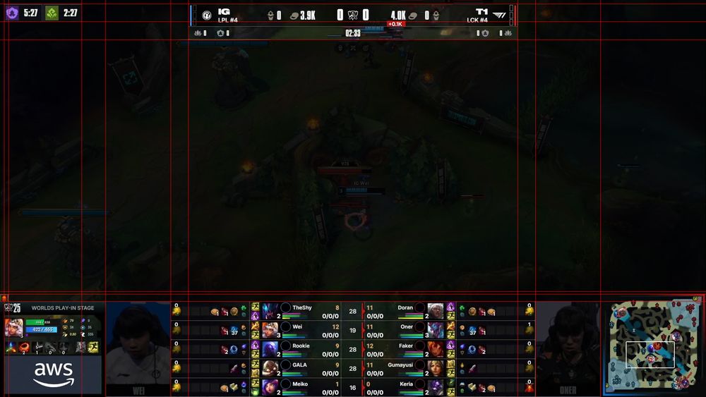
5. Teamfight view instead is much clearer, it could be the default view instead of a temporary one. Riot has to think about which information is relevant to show depending on which device orientation is used, and adapt the overlay accordingly.
4. Riot has the metrics encouraging them to pursue vertical/mobile friendly layout, but there may a lot (too much?) information on screen, while still leaving out some key data (objective timers, champions stats, minimap...). It also forces the observer to consciously think of safe zones
Desert background feels a lot more immersive for sure!
3. The top scoreboard emphasizes the number of kills as the main metric, like how soccer would show goals. I believe this is an outdated way of showing the current game state, a team can still be ahead in gold, but down in kills, economy is much more accurate
2. For starters, it's very minimal, but I feel like there's potential for improvement and streamlining of the different elements shown on screen with a more consistent grid
1. Disclaimer: I don't work for Riot, I do not know their processes, how their production is set up, and given the complexity of their game client, I can only make assumptions based on their stream. I'm sure their designers are more experienced than me, and are putting their best effort into this.
LoL’s international tournaments have faced criticism over the spectator UI this year. Riot seems to be optimizing for vertical formats, but some choices feel dated or less accessible. Been thinking about it for a while, I’ll make a thread with alternative options and ideas/concepts for improvement.
Showerthought: in the age of streaming and Let’s Plays, should games marketed towards streamers and youtubers design their UI with an “audience safe zones” option? HUDs positioned in a way that's unlikely to be covered by cams, chats, or overlays.
From Armin Vit (BrandNew): Designer James Barnard , in a viral video, noticed a misalignment in HBO’s iconic logo animation, investigated, and found the official vector file itself is off, until Gerard Huerta, the logo’s original creator, confirmed it was once perfectly aligned. youtu.be/SbSaoU0dIWs
“Who cares?”
YouTube video by James Barnard
www.youtube.com
Reposted by Jacramé
With the release of the new Pynchon novel this week, I was debating writing a long thread about all of the books and where interested folks might want to start. Thankfully A.O. Scott wrote a pretty reader's guide that's worth a quick read www.nytimes.com/article/thom...
It's crazy to me how many people rely on frameworks instead of having learned the very basic foundations of the web
The awful new logo should not distract you from the great work that went into modernizing Audacity's interface! Superb video that goes in depth on the research and design for Audacity 4 www.youtube.com/watch?v=QYM3...
How We're Redesigning Audacity For The Future
YouTube video by Tantacrul
www.youtube.com
Attached might look better, you could also group all the info together on the right side, name, type, value, so players can expect consistency at a glance and quickly find the info they want
The voice comms add so much to the immersion, it's the thing that drew me to Homeworld, good job!
Reposted by Jacramé
Two Titan frigates, a Berwick class & a Coventry class, engage in battle with two Pirate Frigates, Kongo class & Ryofu class.

Here's the start of the battle, including tactical overlay & target designation.

Running at 32:9 to show what ultra ultra widescreen support looks like.