Our World in Data
@ourworldindata.org
44K followers 17 following 2K posts
Research and data to make progress against the world’s largest problems. Based out of Oxford University (@ox.ac.uk), founded by @maxroser.bsky.social.
Posts Media Videos Starter Packs
Pinned

ourworldindata.org
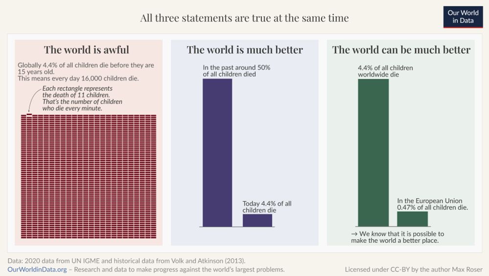
The world is awful. The world is much better. The world can be much better.

All three statements are true at the same time. Understanding this is key to solving big global problems.

We believe data & research can help us understand both the problems we face & the progress that’s possible. 🧵
A chart in three parts showing data on child mortality to make the points that "The world is awful. The world is much better. The world can be much better. All three statements are true at the same time."
ourworldindata.org
This increase in yield output has typically been achieved through a combination of chemical inputs (such as fertilizer, pesticides, and herbicides); improved water use (e.g., irrigation); mechanization and improved farming practices; and the use of higher-yielding crop strains or seeds.
ourworldindata.org
The world can now produce more than three times as much cereal from a given area of land as it did in 1961 (i.e., an increase in yield of 214%).

In the same period, land used for cereal has only increased by 14%.
ourworldindata.org
Let's look at this for cereals, which make up more than half of total caloric intake in many countries and dominate global arable land use by area.

We see in the chart that for cereals, this has been achieved by massively increasing the yield.
ourworldindata.org
Over the last 60 years, the world population has more than doubled.

This has inevitably reduced the land available per person to live and grow food.

How have we managed to feed a rapidly growing population with ever-shrinking land resources?
A line chart showing the change from 1961 to 2023 in global cereal production, yield, land use, and population. All figures are indexed to 1961, which is given a value of zero.

In this time, the world population has more than doubled. And the world can now produce more than three times as much cereal from a given area of land as it did in 1961 (i.e., an increase in yield of 214%). In the same period, land used for cereal has only increased by 14%.

The data sources are the Food and Agriculture Organization of the UN (2025); HYDE (2023); Gapminder (2022); and the UN WPP (2024). The chart is licensed CC BY to Our World in Data.
ourworldindata.org
Hi Cameron, car crashes and other vehicle accidents are included in the "Accidents" category of the chart (along with household or workplace accidents such as falls, machine-related, poisonings, animal bites, and more).
ourworldindata.org
Hi Karl, thanks very much for pointing this out! You're right, drug overdoses were inadvertently being included under "Accidents", in addition to their own category. We've now corrected this in our analysis and the article/chart — it shifted the percentages a small amount, ~1–2%. Thanks again!
ourworldindata.org
Despite this, life expectancy in Africa has risen by almost two decades since 1974.

(This Data Insight was written by Simon van Teutem.)
ourworldindata.org
This gap reflects several overlapping factors: high rates of child and maternal deaths, a heavy burden of infectious diseases such as malaria, HIV/AIDS, and tuberculosis, limited access to quality healthcare and infrastructure, and high levels of poverty.
ourworldindata.org
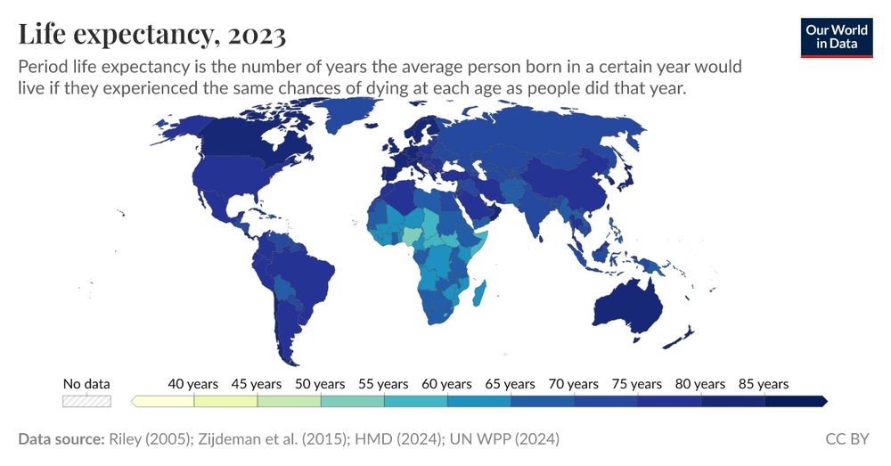
Average life expectancy has converged to a fairly narrow band between 75 and 80 years in North America, Oceania, Europe, Latin America, and Asia. Africa stands out: its average life expectancy is 64 years, over a decade lower than any other region.
ourworldindata.org
Where you are born and stay for much of your life is a strong predictor of how long you’re likely to live. The chart shows the differences in period life expectancy across continents.
ourworldindata.org
Life expectancy in Africa is lower than on other continents
A line graph showing the period life expectancy from 1974 to 2024 across 6 continents. Period life expectancy is the number of years the average person born in a certain year would live if they experienced the same chances of dying at each age as people did that year.

- North America starts at 72 years (1974) and rises to 80 years (2024).
- Europe begins at 71 years and increases to 79 years.
- Oceania starts at 68 years and also increases, reaching 79 years.
- Latin America begins at 61 years and goes up to 76 years.
- Asia starts at 56 years and climbs to 75 years.
- Africa shows the lowest life expectancy, starting at 46 years, but increases to 64 years by 2024.

The data source is cited as "UN, World Population Prospects (2024)". The chart is CC BY to Our World in Data.
ourworldindata.org
Thanks for your comment — we very much agree! This is one post where the alt text was unfortunately omitted, but we otherwise strive to always include it. Thanks as well for the tip about updating settings! That's helpful.
ourworldindata.org
At the other end, we see that conditions like heart disease, stroke, and liver disease are very underrepresented.

Read more about this bias and why it matters in our new article: ourworldindata.org/does-the-new...
Does the news reflect what we die from?
What do Americans die from, and what do the New York Times, Washington Post, and Fox News report on?
ourworldindata.org
ourworldindata.org
In the chart here, we’ve done this for coverage in the New York Times (the results are similar for the other two outlets).

Homicides and terrorism are extremely overrepresented. Homicides received 43 times more coverage than their share of deaths; terrorism received over 18,000 times more.
ourworldindata.org
How over- and underrepresented are different causes of death in the media?

Another way to visualize this data is to measure how over- or underrepresented each cause is.

To do this, we calculate the ratio between a cause’s share of deaths and its share of news articles.
ourworldindata.org
We are a nonprofit, building Our World in Data as a public good that's freely available to everyone.

We just updated the list of people who have supported our work with a donation: ourworldindata.org/funding

We are very grateful to each of you. Thank you so much!
Image with a heart icon and text saying “Thank you for giving to Our World in Data”
ourworldindata.org
This is often the case: the first countries to improve living conditions usually needed much longer than some of those countries catching up later — the latter can learn from what worked elsewhere.

(This Data Insight was written by @maxroser.bsky.social.)
ourworldindata.org
As this chart shows, two centuries ago, about one in three children in Sweden died before they were five years old.

Since then, the child mortality rate in Sweden has declined to 0.3%.

South Korea achieved a similar reduction much faster.
ourworldindata.org
Declining child mortality, fast and slow
The image depicts a line chart illustrating child mortality rates, specifically the estimated percentage of newborns who do not survive past the age of five. The chart has two distinct lines: one representing Sweden in blue and the other representing South Korea in red. 

Starting in the early 1800s, the blue line for Sweden shows a gradual decline in the child mortality rate, fluctuating around 35% at the beginning and continuing to decrease steadily over the years, reaching nearly 0% by 2023. 

In contrast, the red line for South Korea begins more steeply in the mid-20th century, experiencing a rapid decline after 1950, ultimately approaching a very low percentage by 2023. 

The sources for the data are listed at the bottom as Gapminder (2015) and the UN Inter-agency Group for Child Mortality Estimation (2025). The entire chart is labeled as CC BY for Creative Commons licensing.
ourworldindata.org
We wrote this article so that you, the reader, are aware of a significant disconnect between what we often hear and what actually happens.

It’s easy to conflate what we see in the news with the reality of our world, and keeping this mismatch in mind can help you avoid falling into this trap.
ourworldindata.org
Our point is not that we should want or expect the media’s coverage to perfectly match the real distribution of deaths, although we’d argue that it would be better if it were less skewed.