Paul Gardner - Design Lead Creatomatic
twintyfower.bsky.social
Paul Gardner - Design Lead Creatomatic
@twintyfower.bsky.social
4 followers 3 following 16 posts
Twinty Fower - Personal brand of Paul Gardner, Design Lead @creatomatic Web design, Branding & Logo Design and Graphic Design
Posts Media Videos Starter Packs

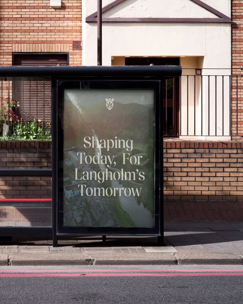
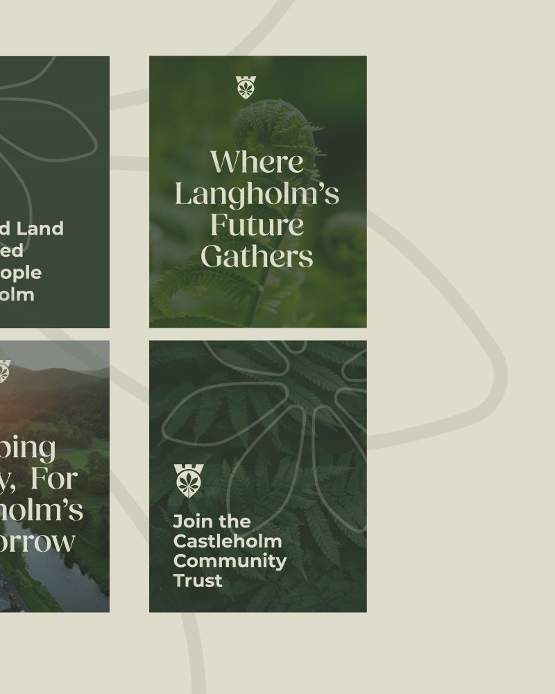
The colour palette draws inspiration from the surrounding countryside, rich in greens and earthy tones, reinforcing the trust’s connection to the land and community.

Proud to see this thoughtful, locally rooted brand come to life.

#BrandIdentity #LogoDesign
We selected a classic serif font to reflect the heritage and gravitas of the trust’s mission, complemented by a clean sans serif to signal its forward-thinking approach.
At the heart of the logo is a location marker, subtly shaped as a Horse Chestnut leaf — a nod to the iconic trees that define the area — paired with castle turrets referencing the historic Langholm Castle. This symbol brings together the natural and historical significance of the trust’s home.

Just wrapped up a brand new identity for Castleholm Community Trust — a project rooted in heritage, community, and a deep connection to place.

Flexitricity – Maximising Revenue Opportunities for Flexible Energy Assets

We recently partnered with Flexitricity —the UK’s leading flexible energy experts—for a brand refresh designed to evolve their visual identity with the lightest of touch.
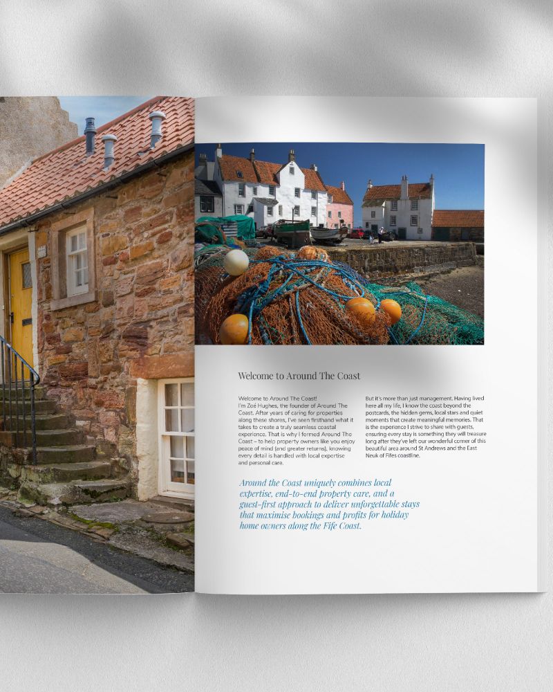
New Logo Reveal: Around the Coast

We loved working on the brand identity for Around the Coast, a property management business set against the stunning backdrop of the Fife coastline.
Brilliant Basics – Paving the way for success.

I’m excited to share the visual identity we recently created for Brilliant Basics @scotgymstagram – a development framework designed to help gymnasts unlock their true potential.
I’ve been refreshing the graphics for Tiger Cycles before adding them to my Behance. It’s always interesting how time changes your perspective on past designs — a portfolio is never really finished. Who else enjoys reworking old projects?

#brandingdesign #creatomatic #logo
Excited to reveal the new visual identity for Dinkies!

Playful logos and colors capture the joy of childhood, with a subtle smile element to highlight the fun at its heart. A place to pause and play—where laughter, imagination, and moments that matter come first.

#brandingdesign #creatomatic #logo
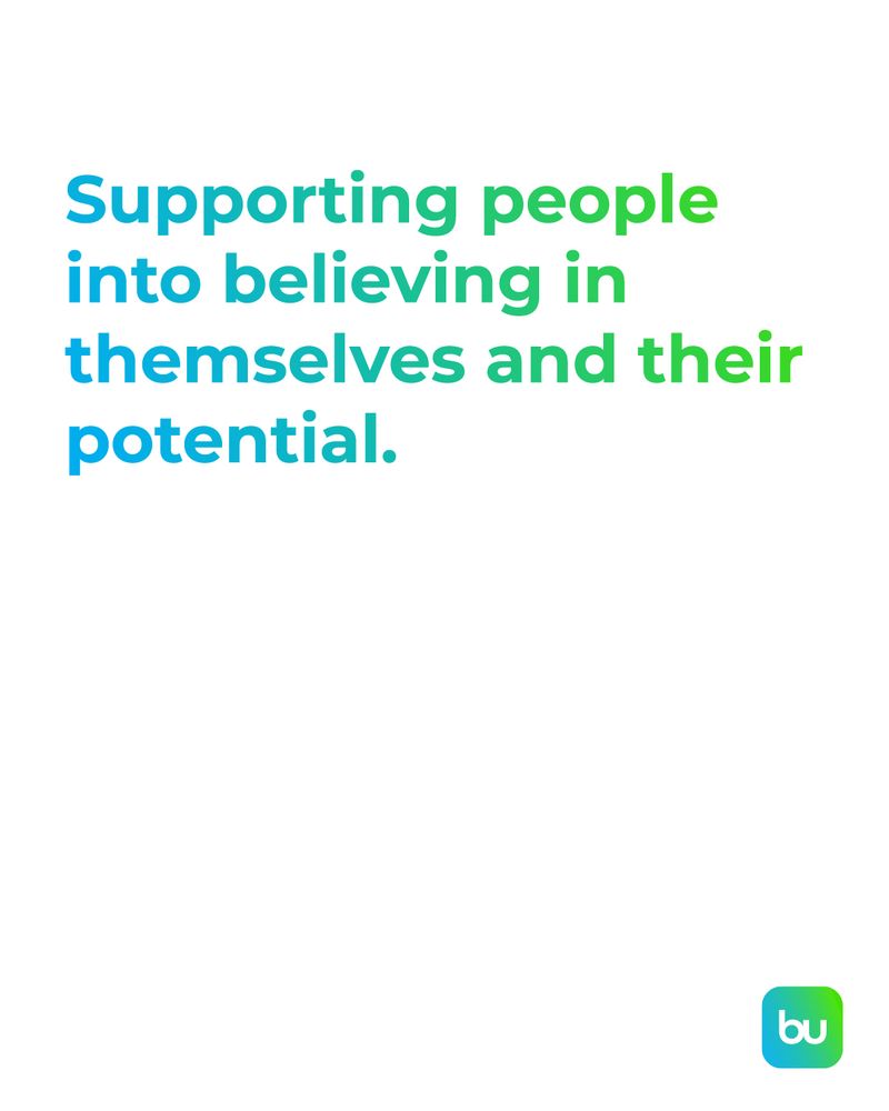
Really enjoyed working on the branding for BuildU Scotland! A truly collaborative process with Nicola Melvin and the Creatomatic team—exploring ideas and crafting a visual identity that reflects BuildU Scotland and their services.
When your wife is the client, work definitely follows you home!

Loved creating a bold visual identity for The Mutt Co.—steering clear of paw prints and puns for something strong, wearable (mutt merch coming soon), and truly unique. Proud of this one!

#brandingdesign #creatomatic #logo
Proud to work with The Borders Carers Centre on their new brand — a fresh logo and website designed for carers in the Borders community.

With accessibility, ease of use, and inclusivity at its core, every element was crafted to support their vital work. Check out the new site!

#webdesign #branding
Excited to reveal the new logo for Foster Your People!

The logo captures the spirit of starting meaningful HR conversations while embracing a modern, people-focused approach. A bold step forward in fostering growth, connection, and innovation!

#brandingdesign #creatomatic #logo
Thrilled to launch the new website for The Crichton in Dumfries! Designing for such a iconic local landmark was an exciting challenge. We kept the design pared back, letting the stunning photography highlight the estate’s beauty.

#webdesign #creatomatic
Loved working on this project, turning Sienna’s concept into a responsive design. Her logo cleverly combined the Midsteeple and the Stag and Unicorn from the Dumfries & Galloway crest. With a few tweaks, we created a logo that truly reflects the Dumfries Town Boards vision!

#brandingdesign #logo
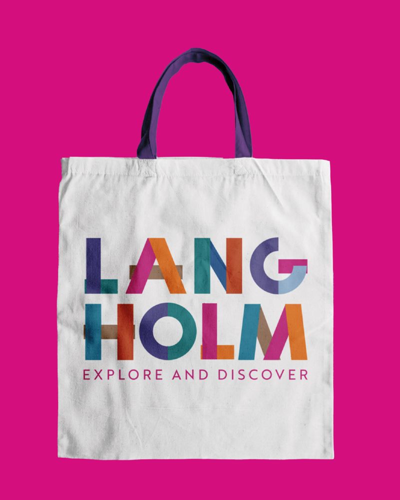
The Langholm brand combines a modular typeface with the Muckle Toun tartan’s colors, honoring the town’s textile heritage and community spirit. It’s a bold reflection of Langholm’s history, events, and identity.

#brandingdesign #creatomatic #logo