


Randy Krum
@rtkrum.bsky.social
Data Visualization & Infographics Designer | Consultant | Author of Cool Infographics | Instructor | Speaker | President at InfoNewt
This past June Apple WWDC25 dropped a game-changing session on Chart3D, bringing Swift Charts into the 3rd dimension. If you're building dashboards or immersive data experiences, this is a must-watch.
developer.apple.com/videos/play/...
developer.apple.com/videos/play/...

Bring Swift Charts to the third dimension - WWDC25 - Videos - Apple Developer
Learn how to bring your 2D Swift Charts to the third dimension with Chart3D and visualize your data sets from completely new...
developer.apple.com
November 12, 2025 at 6:25 PM
This past June Apple WWDC25 dropped a game-changing session on Chart3D, bringing Swift Charts into the 3rd dimension. If you're building dashboards or immersive data experiences, this is a must-watch.
developer.apple.com/videos/play/...
developer.apple.com/videos/play/...
MIT’s Arvind Satyanarayan is pushing for a human-centered approach, where visualizations amplify individual agency, support accessibility, and balance automation with meaning.
news.mit.edu/2025/human-c...
news.mit.edu/2025/human-c...

A human-centered approach to data visualization
MIT Associate Professor Arvind Satyanarayan develops tools for data visualization that amplify creativity and promote human agency. His group’s work, which relies on collaboration and co-design, inclu...
news.mit.edu
November 10, 2025 at 4:11 PM
MIT’s Arvind Satyanarayan is pushing for a human-centered approach, where visualizations amplify individual agency, support accessibility, and balance automation with meaning.
news.mit.edu/2025/human-c...
news.mit.edu/2025/human-c...
This is a good time to revisit this Visual Explanation of Gerrymandering from the Washington Post. Visual explanations build better understanding.
coolinfographics.com/blog/2017/3/...
coolinfographics.com/blog/2017/3/...

A Visual Explanation of Gerrymandering — Cool Infographics
The Washington Post recently published this simple but very effective visual explanation of Gerrymandering: How to steal an election: a visual guide Gerrymandering -- drawing political boundaries...
coolinfographics.com
November 5, 2025 at 5:17 PM
This is a good time to revisit this Visual Explanation of Gerrymandering from the Washington Post. Visual explanations build better understanding.
coolinfographics.com/blog/2017/3/...
coolinfographics.com/blog/2017/3/...
A good reminder to pay attention to how your audience receives your visuals. Their response will show you what’s working and what needs to change.
www.storytellingwithdata.com/blog/the-aud...
www.storytellingwithdata.com/blog/the-aud...

November 5, 2025 at 4:15 PM
A good reminder to pay attention to how your audience receives your visuals. Their response will show you what’s working and what needs to change.
www.storytellingwithdata.com/blog/the-aud...
www.storytellingwithdata.com/blog/the-aud...
I appreciate that the AMA is starting to use infographics to communicate to both patients and doctors, but these designs have a long way to go before they will effective.
www.ama-assn.org/press-center...
www.ama-assn.org/press-center...

November 3, 2025 at 3:25 PM
I appreciate that the AMA is starting to use infographics to communicate to both patients and doctors, but these designs have a long way to go before they will effective.
www.ama-assn.org/press-center...
www.ama-assn.org/press-center...
A compelling visual to make the case for extending enhanced premium tax credits.
www.aha.org/fact-sheets/...
www.aha.org/fact-sheets/...

October 16, 2025 at 3:10 PM
A compelling visual to make the case for extending enhanced premium tax credits.
www.aha.org/fact-sheets/...
www.aha.org/fact-sheets/...
The Planetary Society has a great collection of #infographics and data visualizations about NASA and the state of the U.S. Space Program. coolinfographics.com/blog/2025/10...

The State of the Space Program infographics — Cool Infographics
The Planetary Society has a great collection of infographics and data visualizations about NASA and the U.S. Space Program. Founded in 1980 by Carl Sagan, Louis Friedman, and Bruce Murray, The Plane...
coolinfographics.com
October 14, 2025 at 6:53 PM
The Planetary Society has a great collection of #infographics and data visualizations about NASA and the state of the U.S. Space Program. coolinfographics.com/blog/2025/10...
For all of my fellow book authors, you can now positively determine if pirated copies of your book(s) were illegally used in the training of AI models. coolinfographics.com/blog/2025/10...

Pirated DataViz Books Used to Train AI — Cool Infographics
For all of my fellow book authors, you can now positively determine if pirated copies of your book(s) were illegally used in the training of AI models. Use the search tool here: https://secure.anthro...
coolinfographics.com
October 6, 2025 at 7:26 PM
For all of my fellow book authors, you can now positively determine if pirated copies of your book(s) were illegally used in the training of AI models. coolinfographics.com/blog/2025/10...
New book arrived today! Congrats to Steve Wexler, Jeffrey Shaffer, Andy Cotgreave, and Amanda Makulec!!! 🎉

October 3, 2025 at 8:35 PM
New book arrived today! Congrats to Steve Wexler, Jeffrey Shaffer, Andy Cotgreave, and Amanda Makulec!!! 🎉
Some compelling real-world data graphics from DataViz Weekly featured in Medium. They always spotlight the most interesting projects.
medium.com/data-visuali...
medium.com/data-visuali...

New Data Graphics Worth Checking Out — DataViz Weekly
See how data turns into insight in this DataViz Weekly: Epstein emails, vaccination decline, clothing size differences, and election…
medium.com
October 3, 2025 at 3:05 PM
Some compelling real-world data graphics from DataViz Weekly featured in Medium. They always spotlight the most interesting projects.
medium.com/data-visuali...
medium.com/data-visuali...
For authors of DataViz books like myself, this settlement is important.
authorsguild.org/advocacy/art...
authorsguild.org/advocacy/art...

What Authors Need to Know About the $1.5 Billion Anthropic Settlement - The Authors Guild
Background Bartz v Anthropic is one of the major copyright lawsuits brought by authors against an AI company for using books without permission to train large language models. It was filed by nonfict...
authorsguild.org
September 29, 2025 at 2:47 PM
For authors of DataViz books like myself, this settlement is important.
authorsguild.org/advocacy/art...
authorsguild.org/advocacy/art...
Graphic design is full of jargon; Adobe compiled 50 essential terms every designer should know.
www.adobe.com/express/lear...
www.adobe.com/express/lear...

51 key words all designers should know
Understand the language of design with 51 key words for designers explained.
www.adobe.com
September 23, 2025 at 2:16 PM
Graphic design is full of jargon; Adobe compiled 50 essential terms every designer should know.
www.adobe.com/express/lear...
www.adobe.com/express/lear...
This news with @figma.com is exciting for everyone in data viz who uses the platform. A strong signal that the platform will keep growing and thriving. More stability means more opportunities for us to keep creating impact at the intersection of numbers and design. www.ainvest.com/news/figma-i...

September 18, 2025 at 2:15 PM
This news with @figma.com is exciting for everyone in data viz who uses the platform. A strong signal that the platform will keep growing and thriving. More stability means more opportunities for us to keep creating impact at the intersection of numbers and design. www.ainvest.com/news/figma-i...
Shirley Wu’s piece below breaks down the ways innovation gets stifled and why it happens often. A great reminder that in data visualization, creativity is just as important as data.
www.shirleywu.studio/notebook/202...
#Innovation #Creativity #DataViz #DesignThinking
www.shirleywu.studio/notebook/202...
#Innovation #Creativity #DataViz #DesignThinking

September 16, 2025 at 8:09 PM
Shirley Wu’s piece below breaks down the ways innovation gets stifled and why it happens often. A great reminder that in data visualization, creativity is just as important as data.
www.shirleywu.studio/notebook/202...
#Innovation #Creativity #DataViz #DesignThinking
www.shirleywu.studio/notebook/202...
#Innovation #Creativity #DataViz #DesignThinking
This is an interesting read. The Cymascope project from John Stuart Reid explores the intersection of science, art, and music by making sound waves visible. cymascope.com/musicology/

Musicology - Cymascope
Cymatics Research – Musicology Music, in the absolute sense, is the invisible geometry of the cosmos, a delicate tracery of frequencies that harmonise with each other and from which all matter manifes...
cymascope.com
September 8, 2025 at 2:27 PM
This is an interesting read. The Cymascope project from John Stuart Reid explores the intersection of science, art, and music by making sound waves visible. cymascope.com/musicology/
Illustrations aren’t just decoration — they’re a powerful tool for building brand identity. This article from Blush Design shows how illustrations can elevate branding in a crowded digital space. blush.design/blog/post/il...

August 18, 2025 at 2:21 PM
Illustrations aren’t just decoration — they’re a powerful tool for building brand identity. This article from Blush Design shows how illustrations can elevate branding in a crowded digital space. blush.design/blog/post/il...
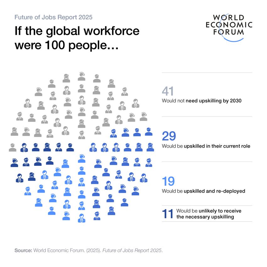
The below article implements the use of infographics to detail global labor market trends. Dozens of #infographics are used to visualize detailed data on the impact of technology and employment. Which one do you like the most? www.weforum.org/publications...
June 11, 2025 at 2:00 PM
The below article implements the use of infographics to detail global labor market trends. Dozens of #infographics are used to visualize detailed data on the impact of technology and employment. Which one do you like the most? www.weforum.org/publications...
The ability to distill complex information into compelling visuals is more crucial now than ever. Visme's latest compilation, showcases how innovative design can transform raw #data into impactful stories.
visme.co/blog/best-da...
visme.co/blog/best-da...
June 9, 2025 at 2:00 PM
The ability to distill complex information into compelling visuals is more crucial now than ever. Visme's latest compilation, showcases how innovative design can transform raw #data into impactful stories.
visme.co/blog/best-da...
visme.co/blog/best-da...
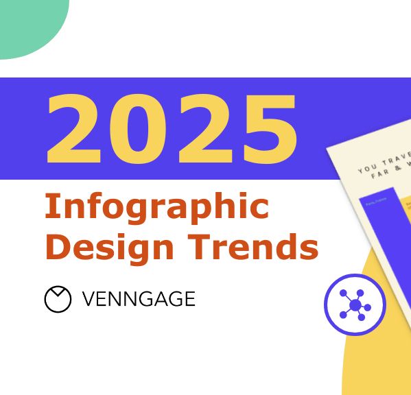
In the below article, #Venngage tries to provide a list of current #infographic design trends. Other than the integration of AI designs, I don't think these are new trends. What design styles do you use for your infographic designs?
venngage.com/blog/infogra...
venngage.com/blog/infogra...
June 6, 2025 at 2:07 PM
In the below article, #Venngage tries to provide a list of current #infographic design trends. Other than the integration of AI designs, I don't think these are new trends. What design styles do you use for your infographic designs?
venngage.com/blog/infogra...
venngage.com/blog/infogra...
Same data. Two visual stories ✈️
This is a powerful reminder of how much visual design choices shape interpretation.
vis.social/@infobeautif...
This is a powerful reminder of how much visual design choices shape interpretation.
vis.social/@infobeautif...
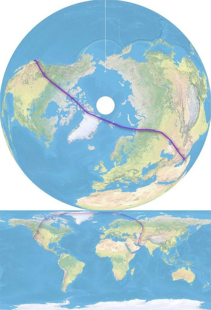
June 5, 2025 at 2:10 PM
Same data. Two visual stories ✈️
This is a powerful reminder of how much visual design choices shape interpretation.
vis.social/@infobeautif...
This is a powerful reminder of how much visual design choices shape interpretation.
vis.social/@infobeautif...
This insightful read from @frank.computer dives into the delicate balance between clarity and creativity in data visualization — and why less can often be more.
www.frank.computer/blog/2025/04...
www.frank.computer/blog/2025/04...

Minimalism and the absurdity of the data-to-ink-ratio
How much minimalism is too much minimalism? I explore this question and propose the most minimalist, highest scoring data-to-ink ratio on a visualization ever made as a thought piece. Why? Well novice...
www.frank.computer
June 3, 2025 at 1:02 PM
This insightful read from @frank.computer dives into the delicate balance between clarity and creativity in data visualization — and why less can often be more.
www.frank.computer/blog/2025/04...
www.frank.computer/blog/2025/04...
Great read from @parabole.bsky.social on how a winding career path can make you better at what you do. My background is in Engineering, Accounting, Manufacturing Ops, Marketing and Product Dev. What's your background, and how did it lead you to data visualization?
www.theplot.media/p/10000-hours
www.theplot.media/p/10000-hours

10,000 hours
Your non-linear career path is actually your secret weapon
www.theplot.media
June 2, 2025 at 1:52 PM
Great read from @parabole.bsky.social on how a winding career path can make you better at what you do. My background is in Engineering, Accounting, Manufacturing Ops, Marketing and Product Dev. What's your background, and how did it lead you to data visualization?
www.theplot.media/p/10000-hours
www.theplot.media/p/10000-hours
When you think of the NEA (National Endowment for the Arts) do you think of #dataviz and #infographics? The NEA helps support some of the tools that we use for data visualization design! www.linkedin.com/posts/proces...

#savethenea #processingfoundation #processing #p5js #opensource… | Processing Foundation
📢 Art Orgs Need Your Voice Now 📢
Last Friday, the National Endowment for the Arts withdrew and canceled grant offers to hundreds of arts organizations of various sizes across the country, hours after...
www.linkedin.com
May 21, 2025 at 6:58 PM
When you think of the NEA (National Endowment for the Arts) do you think of #dataviz and #infographics? The NEA helps support some of the tools that we use for data visualization design! www.linkedin.com/posts/proces...
The Power Tool Manufacturers and Who Really Owns Them-2024 #infographic, provides a nice snapshot view of which companies own which tool brands (and it’s been changing rapidly in the last few years) coolinfographics.com/blog/2024/11...
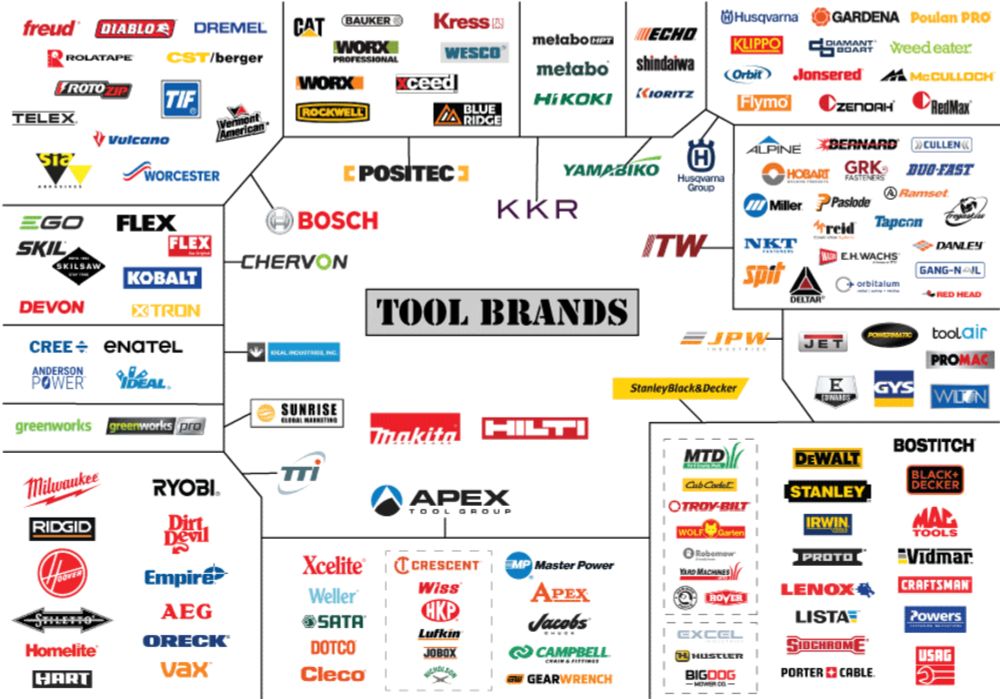
Power Tool Manufacturers and Who Really Owns Them-2024 — Cool Infographics
Power Tool Manufacturers and Who Really Owns Them-2024 infographic, provides a nice snapshot view of which companies own which tool brands (and it’s been changing rapidly in the last few years). You ...
coolinfographics.com
May 20, 2025 at 5:01 PM
The Power Tool Manufacturers and Who Really Owns Them-2024 #infographic, provides a nice snapshot view of which companies own which tool brands (and it’s been changing rapidly in the last few years) coolinfographics.com/blog/2024/11...
Tired of bar charts? The Flerlage Twins share a sleek, smarter alternative that boosts clarity and comparison. A must-read for data pros looking to level up their visuals. #dataviz #BI #analytics
www.flerlagetwins.com/2025/04/the-...
www.flerlagetwins.com/2025/04/the-...
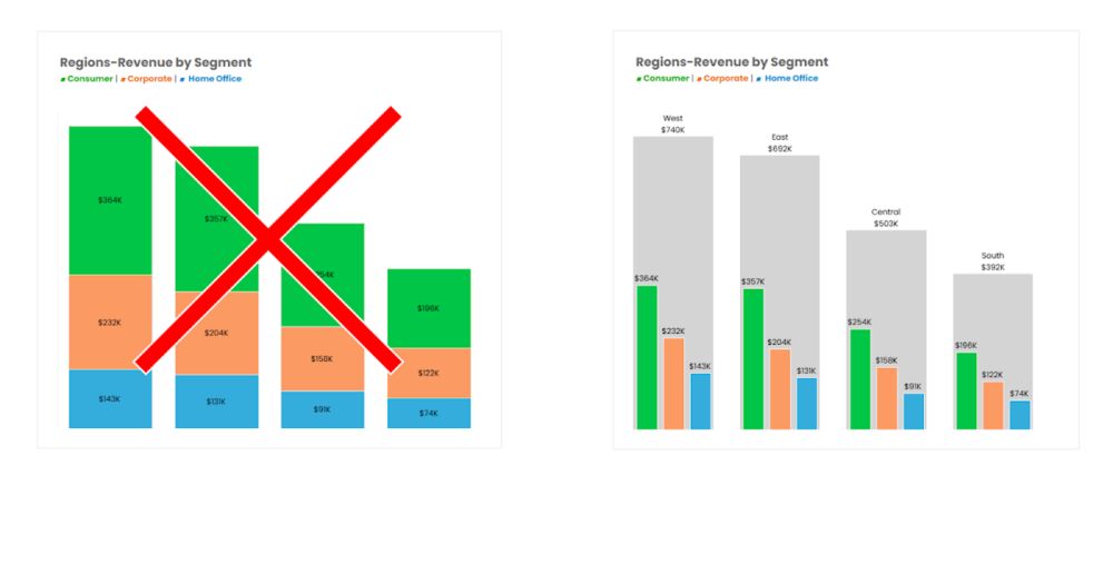
The Best Alternative to Stacked Bar Charts I've Ever Seen! (with Sebastine Amede & Darragh Murray)
The following is a collaborative blog post from Sebastine Amede, Darragh Murray, and me.
www.flerlagetwins.com
May 6, 2025 at 2:31 PM
Tired of bar charts? The Flerlage Twins share a sleek, smarter alternative that boosts clarity and comparison. A must-read for data pros looking to level up their visuals. #dataviz #BI #analytics
www.flerlagetwins.com/2025/04/the-...
www.flerlagetwins.com/2025/04/the-...