


emzie
@garfieldgrrrl.bsky.social
26 year old lesbian with brainrot (it's terminal)
(she/they/he)
swiftie (Miami N2) • reader • artist • art teacher • loser
I love my girlfriend!!!!!!
(she/they/he)
swiftie (Miami N2) • reader • artist • art teacher • loser
I love my girlfriend!!!!!!


Ive been sick for 3 weeks straight multiple doctors appointments nobody can figure out what the fuck is wrong with me I have accumulated $695 in medical debt and literally cant afford to pay it back and everything they test me for is NEGATIVE omg

November 10, 2025 at 10:10 PM
Ive been sick for 3 weeks straight multiple doctors appointments nobody can figure out what the fuck is wrong with me I have accumulated $695 in medical debt and literally cant afford to pay it back and everything they test me for is NEGATIVE omg
let her assist in the tarot reading and she picked out the ONLY oracle card that had a picture of a cat on it

November 10, 2025 at 7:03 PM
let her assist in the tarot reading and she picked out the ONLY oracle card that had a picture of a cat on it
1. Red
LOVE THIS COVER SO ICONIC I FEEL SO MATERNAL TOWARDS IT. the framing of her face with the shadow and the red lipstick being the focus of the picture? YES YES YES. great photograph, perfect font choice, amazing cropping and framing of this image. Chefs kiss its perfect in every way
LOVE THIS COVER SO ICONIC I FEEL SO MATERNAL TOWARDS IT. the framing of her face with the shadow and the red lipstick being the focus of the picture? YES YES YES. great photograph, perfect font choice, amazing cropping and framing of this image. Chefs kiss its perfect in every way

November 9, 2025 at 1:27 AM
1. Red
LOVE THIS COVER SO ICONIC I FEEL SO MATERNAL TOWARDS IT. the framing of her face with the shadow and the red lipstick being the focus of the picture? YES YES YES. great photograph, perfect font choice, amazing cropping and framing of this image. Chefs kiss its perfect in every way
LOVE THIS COVER SO ICONIC I FEEL SO MATERNAL TOWARDS IT. the framing of her face with the shadow and the red lipstick being the focus of the picture? YES YES YES. great photograph, perfect font choice, amazing cropping and framing of this image. Chefs kiss its perfect in every way
2. 1989
LOVE THIS COVER. THE DEFINITION OF ICONIC. IT IS PERFECT
LOVE THIS COVER. THE DEFINITION OF ICONIC. IT IS PERFECT

November 9, 2025 at 1:27 AM
2. 1989
LOVE THIS COVER. THE DEFINITION OF ICONIC. IT IS PERFECT
LOVE THIS COVER. THE DEFINITION OF ICONIC. IT IS PERFECT
3. Evermore
Another one that perfectly matches the vibes and I wouldnt change a thing about it. OK we are out of the woods and you're turning your back now hmmmm
Another one that perfectly matches the vibes and I wouldnt change a thing about it. OK we are out of the woods and you're turning your back now hmmmm

November 9, 2025 at 1:27 AM
3. Evermore
Another one that perfectly matches the vibes and I wouldnt change a thing about it. OK we are out of the woods and you're turning your back now hmmmm
Another one that perfectly matches the vibes and I wouldnt change a thing about it. OK we are out of the woods and you're turning your back now hmmmm
4. Folklore
Love this, matches the vibes PERFRCTLY, taylor why are you so far away! Are we feeling emotionally distant is that what it is
Love this, matches the vibes PERFRCTLY, taylor why are you so far away! Are we feeling emotionally distant is that what it is

November 9, 2025 at 1:27 AM
4. Folklore
Love this, matches the vibes PERFRCTLY, taylor why are you so far away! Are we feeling emotionally distant is that what it is
Love this, matches the vibes PERFRCTLY, taylor why are you so far away! Are we feeling emotionally distant is that what it is
5. Red TV
Love this so much, absolutely adore the warm tones and autumn energy. Could potentially use a tighter crop to more closely mirror the original but its perfect either way
Love this so much, absolutely adore the warm tones and autumn energy. Could potentially use a tighter crop to more closely mirror the original but its perfect either way

November 9, 2025 at 1:27 AM
5. Red TV
Love this so much, absolutely adore the warm tones and autumn energy. Could potentially use a tighter crop to more closely mirror the original but its perfect either way
Love this so much, absolutely adore the warm tones and autumn energy. Could potentially use a tighter crop to more closely mirror the original but its perfect either way
6. The Life of a Showgirl
Love this picture, adore the warm tones to it, and the fracturing of the image is really nice as well. Love the concept behind the image as well. Time will tell if its iconic or not but has strong potential to be
Love this picture, adore the warm tones to it, and the fracturing of the image is really nice as well. Love the concept behind the image as well. Time will tell if its iconic or not but has strong potential to be

November 9, 2025 at 1:27 AM
6. The Life of a Showgirl
Love this picture, adore the warm tones to it, and the fracturing of the image is really nice as well. Love the concept behind the image as well. Time will tell if its iconic or not but has strong potential to be
Love this picture, adore the warm tones to it, and the fracturing of the image is really nice as well. Love the concept behind the image as well. Time will tell if its iconic or not but has strong potential to be
7. TTPD
Such a good representation of this album. Bedrotting, miserable, and down bad. Yes. Love the cropping of the picture, love the framing of the border, love the bit of light cast over her body. Maybe the border could be SLIGHTLY SMALLER but overall amazing
Such a good representation of this album. Bedrotting, miserable, and down bad. Yes. Love the cropping of the picture, love the framing of the border, love the bit of light cast over her body. Maybe the border could be SLIGHTLY SMALLER but overall amazing

November 9, 2025 at 1:27 AM
7. TTPD
Such a good representation of this album. Bedrotting, miserable, and down bad. Yes. Love the cropping of the picture, love the framing of the border, love the bit of light cast over her body. Maybe the border could be SLIGHTLY SMALLER but overall amazing
Such a good representation of this album. Bedrotting, miserable, and down bad. Yes. Love the cropping of the picture, love the framing of the border, love the bit of light cast over her body. Maybe the border could be SLIGHTLY SMALLER but overall amazing
8. Reputation
This one is ICONIC I LOVE IT! The newspaper motif is so strong, I adore it. Its a lot harder to choose from here on bc i love them all. I only wish she was styled differently, a darker top and a cat eye look would have been perfect
This one is ICONIC I LOVE IT! The newspaper motif is so strong, I adore it. Its a lot harder to choose from here on bc i love them all. I only wish she was styled differently, a darker top and a cat eye look would have been perfect

November 9, 2025 at 1:27 AM
8. Reputation
This one is ICONIC I LOVE IT! The newspaper motif is so strong, I adore it. Its a lot harder to choose from here on bc i love them all. I only wish she was styled differently, a darker top and a cat eye look would have been perfect
This one is ICONIC I LOVE IT! The newspaper motif is so strong, I adore it. Its a lot harder to choose from here on bc i love them all. I only wish she was styled differently, a darker top and a cat eye look would have been perfect
9. Speak Now
Love this one and I adore that its a painting. I hope she does more multimedia like this again in the future, its so cool! Just loses points bc her arm has always looked rlly stiff to me, i would've posed her arm a little different bc it looks unnatural being that straight
Love this one and I adore that its a painting. I hope she does more multimedia like this again in the future, its so cool! Just loses points bc her arm has always looked rlly stiff to me, i would've posed her arm a little different bc it looks unnatural being that straight

November 9, 2025 at 1:27 AM
9. Speak Now
Love this one and I adore that its a painting. I hope she does more multimedia like this again in the future, its so cool! Just loses points bc her arm has always looked rlly stiff to me, i would've posed her arm a little different bc it looks unnatural being that straight
Love this one and I adore that its a painting. I hope she does more multimedia like this again in the future, its so cool! Just loses points bc her arm has always looked rlly stiff to me, i would've posed her arm a little different bc it looks unnatural being that straight
10. 1989 TV
Ugh I LOOOVE this one!! Her smile, her hair, the film vibe of the picture, the seagulls!!! BEAUTIFUL! Only loses points for not being a Polaroid like the og, especially when it would've been rlly easy to fake it by making the border wider on the bottom than the other edges
Ugh I LOOOVE this one!! Her smile, her hair, the film vibe of the picture, the seagulls!!! BEAUTIFUL! Only loses points for not being a Polaroid like the og, especially when it would've been rlly easy to fake it by making the border wider on the bottom than the other edges
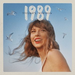
November 9, 2025 at 1:27 AM
10. 1989 TV
Ugh I LOOOVE this one!! Her smile, her hair, the film vibe of the picture, the seagulls!!! BEAUTIFUL! Only loses points for not being a Polaroid like the og, especially when it would've been rlly easy to fake it by making the border wider on the bottom than the other edges
Ugh I LOOOVE this one!! Her smile, her hair, the film vibe of the picture, the seagulls!!! BEAUTIFUL! Only loses points for not being a Polaroid like the og, especially when it would've been rlly easy to fake it by making the border wider on the bottom than the other edges
11. Fearless
Love the movement in the hair, great strong side profile, the closed eyes with the lashes and the white dress YES I love. A tad overexposed in the photo but I think its a stylistic choice. Very iconic for good reason
Love the movement in the hair, great strong side profile, the closed eyes with the lashes and the white dress YES I love. A tad overexposed in the photo but I think its a stylistic choice. Very iconic for good reason

November 9, 2025 at 1:27 AM
11. Fearless
Love the movement in the hair, great strong side profile, the closed eyes with the lashes and the white dress YES I love. A tad overexposed in the photo but I think its a stylistic choice. Very iconic for good reason
Love the movement in the hair, great strong side profile, the closed eyes with the lashes and the white dress YES I love. A tad overexposed in the photo but I think its a stylistic choice. Very iconic for good reason
12. Debut
I feel like this one is so of that era that I cant even be mad lol. I like the butterfly overlay, I feel like theres some fuzziness around her hair bc of how they cut her out to put on this background. A little blurriness in the background too but I still love it. like yeah thats 2006 fr
I feel like this one is so of that era that I cant even be mad lol. I like the butterfly overlay, I feel like theres some fuzziness around her hair bc of how they cut her out to put on this background. A little blurriness in the background too but I still love it. like yeah thats 2006 fr

November 9, 2025 at 1:27 AM
12. Debut
I feel like this one is so of that era that I cant even be mad lol. I like the butterfly overlay, I feel like theres some fuzziness around her hair bc of how they cut her out to put on this background. A little blurriness in the background too but I still love it. like yeah thats 2006 fr
I feel like this one is so of that era that I cant even be mad lol. I like the butterfly overlay, I feel like theres some fuzziness around her hair bc of how they cut her out to put on this background. A little blurriness in the background too but I still love it. like yeah thats 2006 fr
13. Midnights
Its painful to put this SO LOW bc i LOVE the pic of her with the lighter. I just wish it took up more space on the cover. They made her smaller bc they needed to put the tracklist on the front to turn the back into a clock, but as a result theres too much white space.
Its painful to put this SO LOW bc i LOVE the pic of her with the lighter. I just wish it took up more space on the cover. They made her smaller bc they needed to put the tracklist on the front to turn the back into a clock, but as a result theres too much white space.

November 9, 2025 at 1:27 AM
13. Midnights
Its painful to put this SO LOW bc i LOVE the pic of her with the lighter. I just wish it took up more space on the cover. They made her smaller bc they needed to put the tracklist on the front to turn the back into a clock, but as a result theres too much white space.
Its painful to put this SO LOW bc i LOVE the pic of her with the lighter. I just wish it took up more space on the cover. They made her smaller bc they needed to put the tracklist on the front to turn the back into a clock, but as a result theres too much white space.
14. Fearless TV 💛
I like the idea of this one but the execution just doesnt do anything for me. It doesnt feel as iconic as many of her other albums, im not sure how I feel about the color editing on this and wish they'd incorporated the gold/yellow in a more clever way
I like the idea of this one but the execution just doesnt do anything for me. It doesnt feel as iconic as many of her other albums, im not sure how I feel about the color editing on this and wish they'd incorporated the gold/yellow in a more clever way

November 9, 2025 at 1:27 AM
14. Fearless TV 💛
I like the idea of this one but the execution just doesnt do anything for me. It doesnt feel as iconic as many of her other albums, im not sure how I feel about the color editing on this and wish they'd incorporated the gold/yellow in a more clever way
I like the idea of this one but the execution just doesnt do anything for me. It doesnt feel as iconic as many of her other albums, im not sure how I feel about the color editing on this and wish they'd incorporated the gold/yellow in a more clever way
15. Speak Now (Taylor's Version) 💜
Its not horrible and she looks really pretty BUT that chunk of uncurled hair front and center bothers me SO MUCH especially when a few minutes with the clone tool would've fixed it
Its not horrible and she looks really pretty BUT that chunk of uncurled hair front and center bothers me SO MUCH especially when a few minutes with the clone tool would've fixed it

November 9, 2025 at 1:27 AM
15. Speak Now (Taylor's Version) 💜
Its not horrible and she looks really pretty BUT that chunk of uncurled hair front and center bothers me SO MUCH especially when a few minutes with the clone tool would've fixed it
Its not horrible and she looks really pretty BUT that chunk of uncurled hair front and center bothers me SO MUCH especially when a few minutes with the clone tool would've fixed it
16. Lover 🩷
There is just something so Picsart about this cover to me. From taylor being just SLIGHTLY off center looking at the bottom, to the title being way too small in my opinion, the awkward angle of the picture of her and the way shes cut out strangely...the only thing i like are the colors
There is just something so Picsart about this cover to me. From taylor being just SLIGHTLY off center looking at the bottom, to the title being way too small in my opinion, the awkward angle of the picture of her and the way shes cut out strangely...the only thing i like are the colors

November 9, 2025 at 1:27 AM
16. Lover 🩷
There is just something so Picsart about this cover to me. From taylor being just SLIGHTLY off center looking at the bottom, to the title being way too small in my opinion, the awkward angle of the picture of her and the way shes cut out strangely...the only thing i like are the colors
There is just something so Picsart about this cover to me. From taylor being just SLIGHTLY off center looking at the bottom, to the title being way too small in my opinion, the awkward angle of the picture of her and the way shes cut out strangely...the only thing i like are the colors
very important reading happening today

November 5, 2025 at 8:03 PM
very important reading happening today
Lol here's the second one I deleted the card info

November 3, 2025 at 9:17 PM
Lol here's the second one I deleted the card info
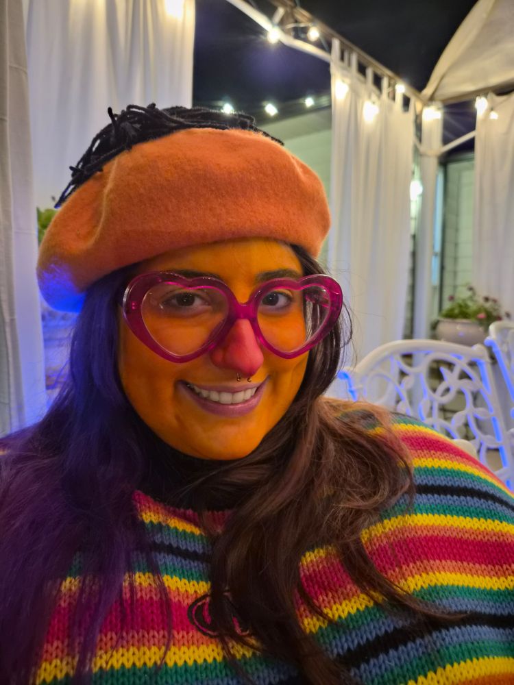
our halloween couples costumes :3


November 2, 2025 at 6:05 PM
our halloween couples costumes :3
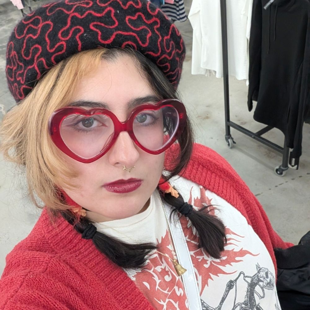
this is how I looked upon reading this post btw. its me im ernie!!!
November 2, 2025 at 2:43 AM
this is how I looked upon reading this post btw. its me im ernie!!!
guess my work halloween costume win a cookie 🧡

October 31, 2025 at 1:23 PM
guess my work halloween costume win a cookie 🧡
