


Jesse Onland
@jdonland.bsky.social
dataviz and statistics | https://jdonland.github.io | views are my own
Reposted by Jesse Onland


Reposted by Jesse Onland

New paper for anyone working with data:
Better data viz - for free, in few clicks.
Below, all N = 111, M = 0.04, SD = 0.27.
One-sided t-tests vs. 0 yield: t(110) = 1.67, p = .049.
Use raincloud plots. Or risk wrong conclusions!
Plot w/ @jaspstats.bsky.social today!
🧪 📊 #PsychSciSky #StatsSky
🧵👇
Better data viz - for free, in few clicks.
Below, all N = 111, M = 0.04, SD = 0.27.
One-sided t-tests vs. 0 yield: t(110) = 1.67, p = .049.
Use raincloud plots. Or risk wrong conclusions!
Plot w/ @jaspstats.bsky.social today!
🧪 📊 #PsychSciSky #StatsSky
🧵👇


August 29, 2025 at 2:10 PM
New paper for anyone working with data:
Better data viz - for free, in few clicks.
Below, all N = 111, M = 0.04, SD = 0.27.
One-sided t-tests vs. 0 yield: t(110) = 1.67, p = .049.
Use raincloud plots. Or risk wrong conclusions!
Plot w/ @jaspstats.bsky.social today!
🧪 📊 #PsychSciSky #StatsSky
🧵👇
Better data viz - for free, in few clicks.
Below, all N = 111, M = 0.04, SD = 0.27.
One-sided t-tests vs. 0 yield: t(110) = 1.67, p = .049.
Use raincloud plots. Or risk wrong conclusions!
Plot w/ @jaspstats.bsky.social today!
🧪 📊 #PsychSciSky #StatsSky
🧵👇
Will Posit's recent transition to hyping slop generation endanger its B Corporation status? Surely you can't be serious about climate targets while shilling this stuff, right?
August 29, 2025 at 2:48 AM
Will Posit's recent transition to hyping slop generation endanger its B Corporation status? Surely you can't be serious about climate targets while shilling this stuff, right?
Reposted by Jesse Onland

July 25, 2025 at 11:37 AM
Embarrassing. Why not just train a slop generator on all the conference submissions and then skip actually running it?

July 17, 2025 at 5:29 PM
Embarrassing. Why not just train a slop generator on all the conference submissions and then skip actually running it?
My struggles with Tableau 📊 seem to boil down to two issues:
1. Too little control over the aesthetic mapping. (E.g. cannot map to position.)
2. Dimensions and measures are treated radically differently (e.g by filtering) in ways that are unintuitive and/or just never what one would want.
1. Too little control over the aesthetic mapping. (E.g. cannot map to position.)
2. Dimensions and measures are treated radically differently (e.g by filtering) in ways that are unintuitive and/or just never what one would want.
July 17, 2025 at 3:05 PM
My struggles with Tableau 📊 seem to boil down to two issues:
1. Too little control over the aesthetic mapping. (E.g. cannot map to position.)
2. Dimensions and measures are treated radically differently (e.g by filtering) in ways that are unintuitive and/or just never what one would want.
1. Too little control over the aesthetic mapping. (E.g. cannot map to position.)
2. Dimensions and measures are treated radically differently (e.g by filtering) in ways that are unintuitive and/or just never what one would want.
Reposted by Jesse Onland

Watch the seismic waves from today's magnitude 7.3 Alaska earthquake ripple across seismic stations in North America.
More ➡️ loom.ly/kaJp5I0
More ➡️ loom.ly/kaJp5I0
July 17, 2025 at 3:26 AM
Watch the seismic waves from today's magnitude 7.3 Alaska earthquake ripple across seismic stations in North America.
More ➡️ loom.ly/kaJp5I0
More ➡️ loom.ly/kaJp5I0
I'm sorry, but if the image slop generator you used for your slides can't produce a world map with South America in it, I'm not buying your data engineering pipeline slop generator.
Pretend tools for pretend work.
Pretend tools for pretend work.
July 15, 2025 at 5:45 PM
I'm sorry, but if the image slop generator you used for your slides can't produce a world map with South America in it, I'm not buying your data engineering pipeline slop generator.
Pretend tools for pretend work.
Pretend tools for pretend work.
Reposted by Jesse Onland

I've written an explainer blog post for my "data strips" #dataviz workbench web app, trying alternative 1-D distribution summary plots. rawdatastudies.com/2025/07/05/d...

Data Strips Experiment
I built a “Data Strips” app to experiment with new ways of graphically summarizing the distribution of a single variable.. You can try it out or access the code on GitHub. This post wil…
rawdatastudies.com
July 6, 2025 at 3:52 PM
I've written an explainer blog post for my "data strips" #dataviz workbench web app, trying alternative 1-D distribution summary plots. rawdatastudies.com/2025/07/05/d...
I wouldn't want to be associated with that creep either, but I think if you open-source your #dataviz 📊 theme, you have to accept the possibility of creeps using it.
In any case, I'd never assume that two chart authors were associated just because they use the same style, and you shouldn't either.
In any case, I'd never assume that two chart authors were associated just because they use the same style, and you shouldn't either.

Cremieux the "race scientist" has been stealing my newsletter's chart style—I DMed him to stop because I don't want to be associated with him, even incidentally, & now he's crashing out on main about it, posting the "theme_politano" he copied & telling others to take credit


July 5, 2025 at 10:44 PM
I wouldn't want to be associated with that creep either, but I think if you open-source your #dataviz 📊 theme, you have to accept the possibility of creeps using it.
In any case, I'd never assume that two chart authors were associated just because they use the same style, and you shouldn't either.
In any case, I'd never assume that two chart authors were associated just because they use the same style, and you shouldn't either.
Vertical axis trickery in Bigalke et al. (2021), via dynomight.net/blue-light/. 📊

July 4, 2025 at 12:51 PM
Vertical axis trickery in Bigalke et al. (2021), via dynomight.net/blue-light/. 📊
A #dataviz adjacent post from Andrew Gelman about which Venn diagrams can be drawn with rotational symmetry. The same Venn after whom the diagrams are named originated the frequency interpretation of probabilities, incidentally.
The history of Venn diagrams | Statistical Modeling, Causal Inference, and Social Science
statmodeling.stat.columbia.edu
July 1, 2025 at 6:02 PM
A #dataviz adjacent post from Andrew Gelman about which Venn diagrams can be drawn with rotational symmetry. The same Venn after whom the diagrams are named originated the frequency interpretation of probabilities, incidentally.


Does Posit develop open source data science tools, or just LLM plug-ins? Based on their social media presence, you'd assume it were the latter.
June 24, 2025 at 12:03 PM
Does Posit develop open source data science tools, or just LLM plug-ins? Based on their social media presence, you'd assume it were the latter.
Reposted by Jesse Onland
6 old and 7 new 1D #dataviz. Trying Shortest Half with a twist: one break is allowed. Also half-sample mode & count-adaptive outlier thresholds. Here's 1000 random normal points plus two outliers. The green ones are new. Try it at xangregg.github.io/data-strips/

June 23, 2025 at 5:02 PM
6 old and 7 new 1D #dataviz. Trying Shortest Half with a twist: one break is allowed. Also half-sample mode & count-adaptive outlier thresholds. Here's 1000 random normal points plus two outliers. The green ones are new. Try it at xangregg.github.io/data-strips/

Is there nothing new in 📊 dataviz to talk about?
Why is the same information endlessly rehashed? Career reasons? (I.e., to generate leads, pad résumés, boost personal brands?) Something else?
Are we actually reaching new audiences?
(Not a criticism of this post/person in particular.)
Why is the same information endlessly rehashed? Career reasons? (I.e., to generate leads, pad résumés, boost personal brands?) Something else?
Are we actually reaching new audiences?
(Not a criticism of this post/person in particular.)

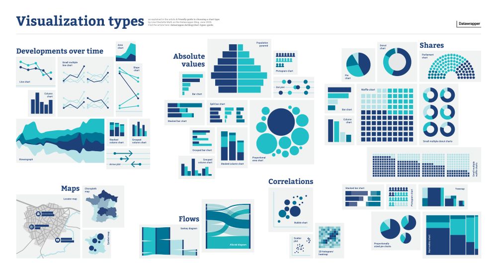
📊 There are *so* many chart types out there. Which one should you use for what kind of data and goal?
I tried to answer the question in a new blog post (and poster!): www.datawrapper.de/blog/chart-t...
I tried to answer the question in a new blog post (and poster!): www.datawrapper.de/blog/chart-t...
June 17, 2025 at 6:36 PM
Is there nothing new in 📊 dataviz to talk about?
Why is the same information endlessly rehashed? Career reasons? (I.e., to generate leads, pad résumés, boost personal brands?) Something else?
Are we actually reaching new audiences?
(Not a criticism of this post/person in particular.)
Why is the same information endlessly rehashed? Career reasons? (I.e., to generate leads, pad résumés, boost personal brands?) Something else?
Are we actually reaching new audiences?
(Not a criticism of this post/person in particular.)
Dataviz 📊 freelancers/consultants: What proportion of your time is dedicated to churning out buzzword-laden LinkedIn posts and newsletter emails? 90%? 95%?
June 17, 2025 at 3:27 PM
Dataviz 📊 freelancers/consultants: What proportion of your time is dedicated to churning out buzzword-laden LinkedIn posts and newsletter emails? 90%? 95%?
Seems like a case for syncing scales across facets. 📊


June 14, 2025 at 6:45 PM
Seems like a case for syncing scales across facets. 📊
Calling all the data analysis and visualization done prior to 2022 "limited insights and manual analysis" because it doesn't harness the power of the slop generators is obscene.
This stuff can't go the way of "blockchain" soon enough.
This stuff can't go the way of "blockchain" soon enough.

📊 AI is transforming data viz, moving from simply plotting "what" to telling the complete "why."
Daria Voronova's latest explains how this shift turns static charts into dynamic arguments, not just displaying data but helping uncover the reasons behind it.
nightingaledvs.com/the-shape-of...
Daria Voronova's latest explains how this shift turns static charts into dynamic arguments, not just displaying data but helping uncover the reasons behind it.
nightingaledvs.com/the-shape-of...

The Shape of Why, Nightingale
From descriptive to prescriptive: How AI in data visualization is evolving from plotting the “What” to telling the “Why”.
nightingaledvs.com
June 9, 2025 at 8:36 PM
Calling all the data analysis and visualization done prior to 2022 "limited insights and manual analysis" because it doesn't harness the power of the slop generators is obscene.
This stuff can't go the way of "blockchain" soon enough.
This stuff can't go the way of "blockchain" soon enough.
Just please don't mess with my scrollbar!

I think the thing I'm most excited to see over the next ~10 years of #dataviz is web-based content that interweaves long-form text and modular interactives.
Not as heavy as scrollytelling and not as aimless as a dashboard, but something in between.
This is what I was going for with the QR project!
Not as heavy as scrollytelling and not as aimless as a dashboard, but something in between.
This is what I was going for with the QR project!
June 6, 2025 at 1:21 PM
Just please don't mess with my scrollbar!
Reposted by Jesse Onland
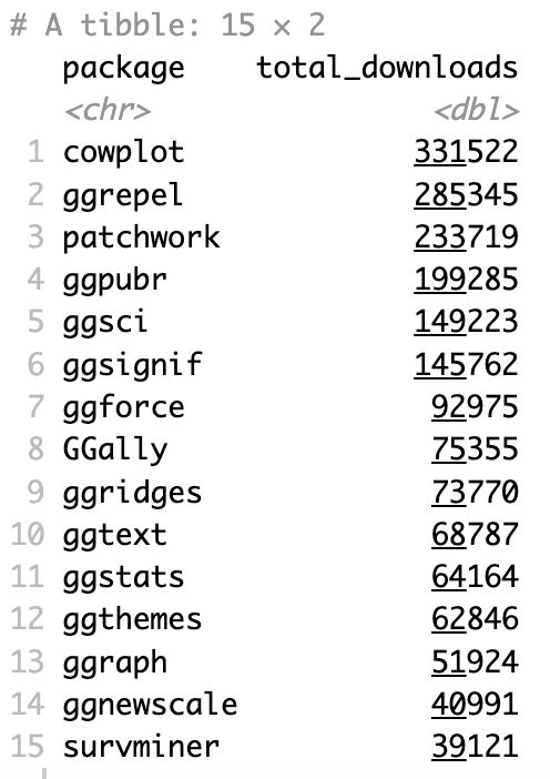
Top 15 ggplot2 extensions, by downloads during the last month.
Some surprises here, at least for me.
#rstats
Code: gist.github.com/carl...
Some surprises here, at least for me.
#rstats
Code: gist.github.com/carl...
June 3, 2025 at 6:59 PM
Top 15 ggplot2 extensions, by downloads during the last month.
Some surprises here, at least for me.
#rstats
Code: gist.github.com/carl...
Some surprises here, at least for me.
#rstats
Code: gist.github.com/carl...
Reposted by Jesse Onland

Lollipop charts are a very elegant alternative to bar charts. 📊

Some completely new charts in this edition, including this nice double-paneled lollipop chart!
8/12
8/12

June 3, 2025 at 10:36 AM
Lollipop charts are a very elegant alternative to bar charts. 📊
Andrew Gelman uses this example in a post about counteracting perceptual distortion in dataviz 📊. It compromises on ease of comparisons to maintain a visual metaphor.
I want to see how a 100% stacked bar graph would look, but sadly getting the chart data from the code isn't straightforward.
I want to see how a 100% stacked bar graph would look, but sadly getting the chart data from the code isn't straightforward.
May 31, 2025 at 12:09 AM
Andrew Gelman uses this example in a post about counteracting perceptual distortion in dataviz 📊. It compromises on ease of comparisons to maintain a visual metaphor.
I want to see how a 100% stacked bar graph would look, but sadly getting the chart data from the code isn't straightforward.
I want to see how a 100% stacked bar graph would look, but sadly getting the chart data from the code isn't straightforward.
Reposted by Jesse Onland

The story you likely *didn’t* know about John Snow’s cholera map.
www.maps.com/snow-mistake...
“Maps inform, inspire, and ignite interest in a way that is unlike any other media.”
By @jscarto.bsky.social
📊🗺️
www.maps.com/snow-mistake...
“Maps inform, inspire, and ignite interest in a way that is unlike any other media.”
By @jscarto.bsky.social
📊🗺️

May 27, 2025 at 5:57 PM
The story you likely *didn’t* know about John Snow’s cholera map.
www.maps.com/snow-mistake...
“Maps inform, inspire, and ignite interest in a way that is unlike any other media.”
By @jscarto.bsky.social
📊🗺️
www.maps.com/snow-mistake...
“Maps inform, inspire, and ignite interest in a way that is unlike any other media.”
By @jscarto.bsky.social
📊🗺️