Posts
Media
Videos
Starter Packs
Reposted by Jonny Dawe
Reposted by Jonny Dawe
Reposted by Jonny Dawe
Reposted by Jonny Dawe

Reposted by Jonny Dawe

Reposted by Jonny Dawe
Reposted by Jonny Dawe
Jonny Dawe
@jonnydawe.github.io
· Jul 3
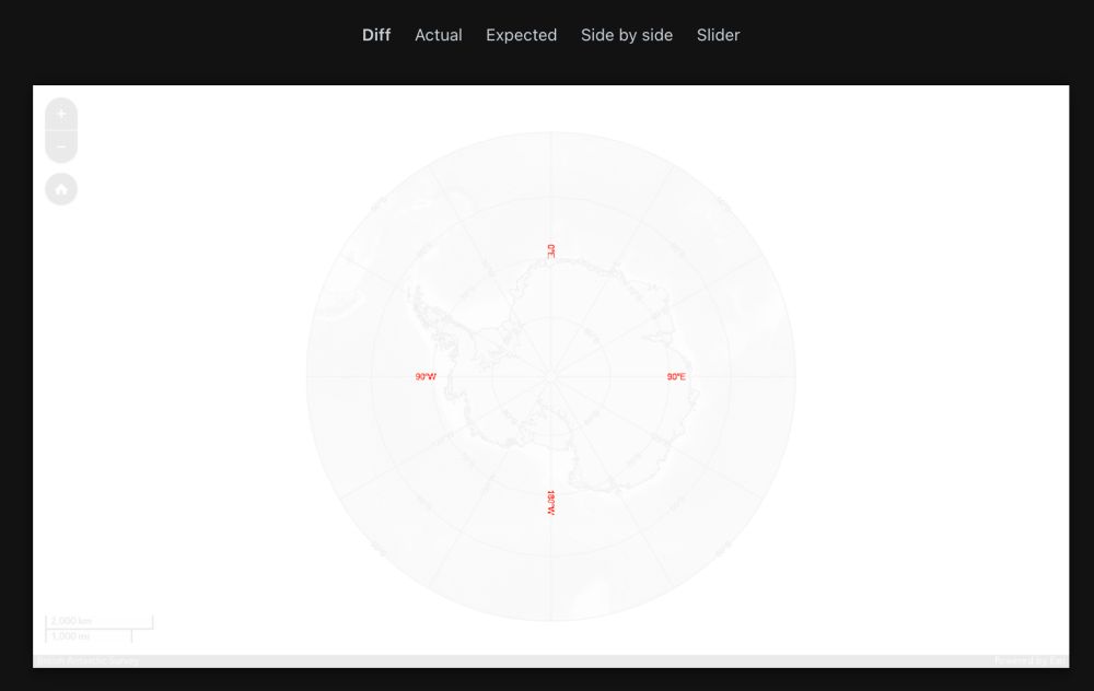
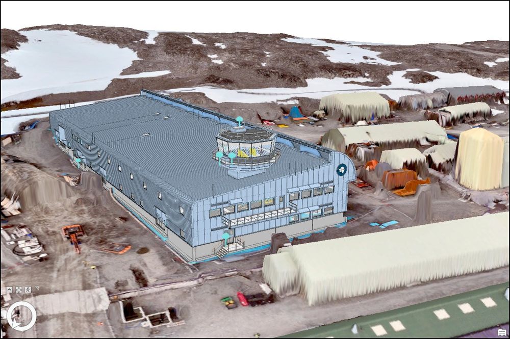
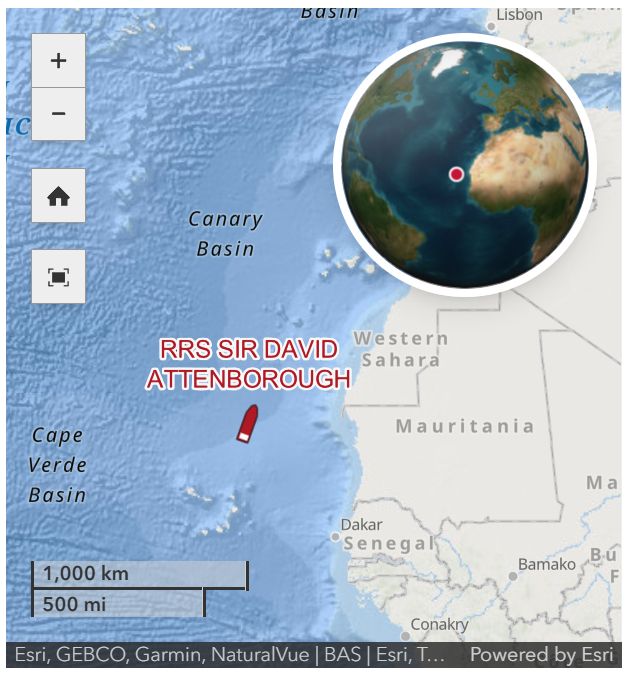
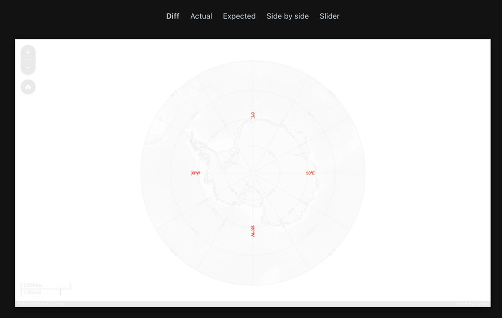
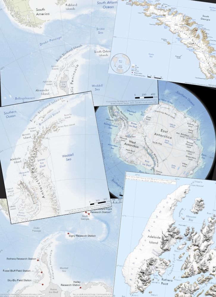
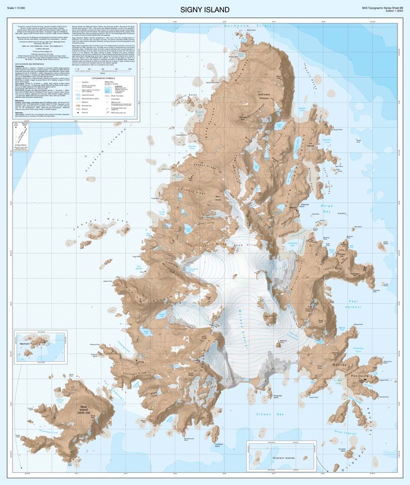
Polar Labelling changes/bug in 4.33 release?
Our end-to-end testing has picked up an apparent labelling issue in the latest release. We have some logic to create a client side graticule layer within our application which can work on any projecti...
community.esri.com
Jonny Dawe
@jonnydawe.github.io
· Jun 25
Reposted by Jonny Dawe
Jonny Dawe
@jonnydawe.github.io
· Jun 24
Reposted by Jonny Dawe
Reposted by Jonny Dawe
Reposted by Jonny Dawe

Reposted by Jonny Dawe
Reposted by Jonny Dawe


Reposted by Jonny Dawe


Reposted by Jonny Dawe