VizChitra
@vizchitra.bsky.social
43 followers 6 following 110 posts
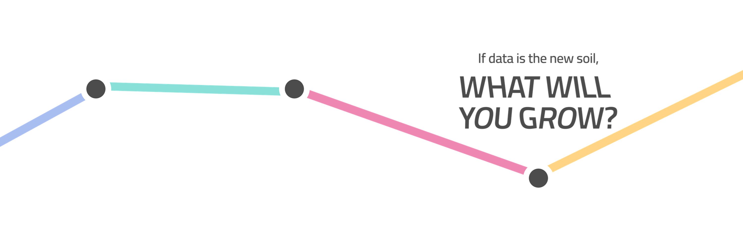
A space to connect and create with data. 
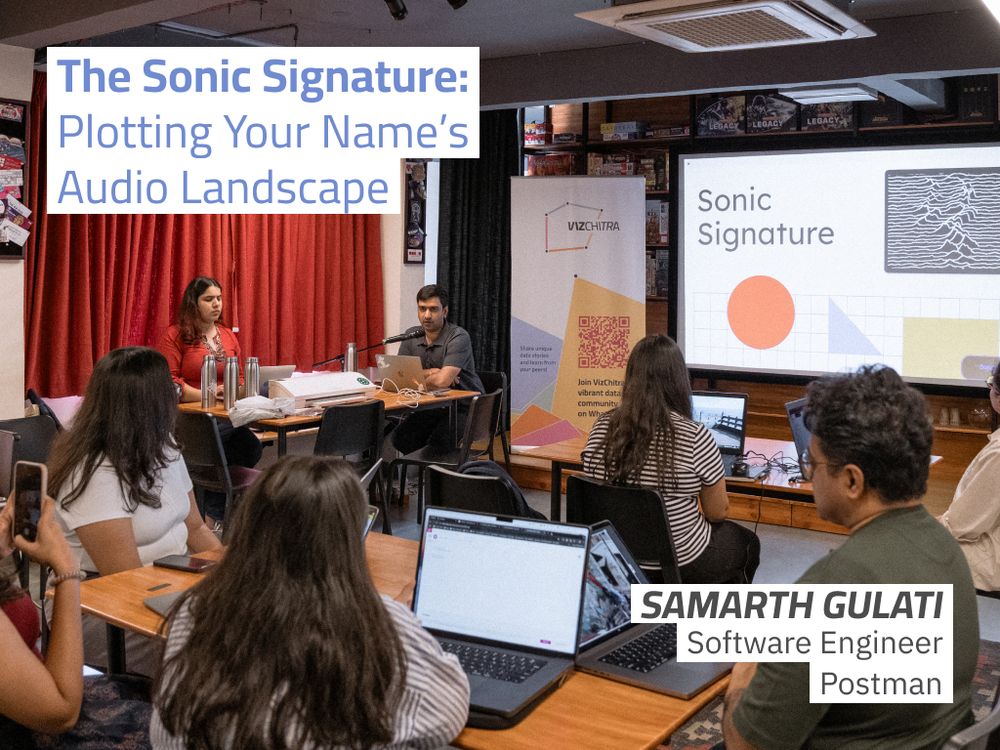
🎉 India’s first data viz conference | 📍 June 27-28 in Bengaluru | 🐣 Early bird tickets are live Get your tickets here: https://hasgeek.com/VizChitra/2025/#tickets
Posts Media Videos Starter Packs
vizchitra.bsky.social
What started as a chat over gobhi ke parathe has grown into VizChitra, India’s first community-run data visualization conference📈🎉

Here’s a peek at #VizChitra2025 in action👀 — the hands, minds & stories that made it all come alive 💡📊
VizChitra 2025 Highlights | India's first community-run Data Visualisation Conference
YouTube video by VizChitra
www.youtube.com
vizchitra.bsky.social
📈 “Investors often struggle to access the right info to make financial decisions.” Rahul Beniwal & Neel Lakhwani shared Groww Stories: 1,000+ accessible, engaging stories for first-time investors, built in 8 months with a flexible design system.
Watch: www.youtube.com/watch?v=AGTy...
vizchitra.bsky.social
🧬 “ATCG means Anomalies, Trajectories, Correlations & Geographies”. @saketkc.bsky.social took us on a chart quest to understand seasonal patterns of births across India, debunking many common misconceptions and showed us how it all comes down to the weather!
Watch: www.youtube.com/watch?v=VqFN...
vizchitra.bsky.social
🖥️ "UX matters when your chart is for someone else." Vikram Nayak discussed the USER framework: Understand, Select, Enhance, Relate, and its application in product thinking to reduce clutter and even rethink chart choices.
Watch: www.youtube.com/watch?v=v6u4...
vizchitra.bsky.social
📚 “Qualitative data reveals blind spots that metrics miss”. Yashna Jhamb shared a framework for structuring unstructured data: listening with intent, templating, using hints and nudges in open-ended questions and robust tagging.
Watch: www.youtube.com/watch?v=t-dm...
vizchitra.bsky.social
🎧 "When a graph can talk, more people listen." Sabhyata Jain explored how AI and screen readers can translate patterns into sound, making dataviz more accessible, and why designing for outliers means designing for everyone.
Listen here: www.youtube.com/watch?v=MmSd...
vizchitra.bsky.social
🛠️ "Side projects? Do them!", Aman Bhargava shared why his tinkering formula of small experiments, messy starts, a few tools, collaborations and daily practice beats waiting around for that one big idea.
Catch his talk here: www.youtube.com/watch?v=F4Hr...
vizchitra.bsky.social
⚡️Lightning Talks at #VizChitra2025 packed a punch: accessibility, chart design, health genomes, qualitative data, financial transparency and the tricky joy of tinkering.
vizchitra.bsky.social
🧠 In biopharma, data is complex & critical. Aditeya Pandey from @EliLillyandCo showed how simple visuals empower teams with clarity, trust & foresight in an industry where the stakes are highest.

Watch: www.youtube.com/watch?v=AUrJ...
vizchitra.bsky.social
🏢 Driving DataViz in an Enterprise is hard! In “Bringing Order to Chaos” @18Hardik shows how to use dataviz as a UX tool to get users to identify patterns, relationships and make meaning across the layered enterprise systems.

Watch: www.youtube.com/watch?v=3dZA...
vizchitra.bsky.social
📰@vrsrini, Deputy National Editor, @the_hindu, in his talk “Data Journalism and Visualisation at a time of Print’s Decline”, shared how their near-daily Data Point column shows that data and context are print’s new superpowers.

Watch: youtu.be/lNMBq8_zl_M?...
vizchitra.bsky.social
⭕What happens when data moves. And can it move you back? In Data Visceralization: Moving Data, Spinning Stories, Aditi Bhat used hula hoops & poi to show how embodiment opens new ways of telling data stories, with a climate stripes performance!

Watch: www.youtube.com/watch?v=6jTH...
vizchitra.bsky.social
🧩 Good charts don’t just inform, they guide the eye. In “The Eyes Have It”, @Da_Pacific unpacked how perception science shapes what we notice first in a chart, and how small design tweaks can bring big gains on clarity!

Watch: www.youtube.com/watch?v=ngjk...
vizchitra.bsky.social
🎤 Standard Talks at #VizChitra2025

From how we see charts to how we feel stories, and even how newsrooms and firms adapt to visualising data, our standard talks covered it all. Catch the full lineup and links here.👇
vizchitra.bsky.social
📉 You Had One Job: Chart Edition by Anushka Gokhale
and Rutu Tank from @parallelhq.bsky.social showcased the best of the worst, taking us to ill-charted territories to see plot-holes, legend-ary fails, charts that could have been axe-d!
vizchitra.bsky.social
🔍 How Well Do You Know India? by Pragnya from
@dataforindia.bsky.social tested what we think we know about how India moves, learns, eats, earns, and spends.
vizchitra.bsky.social
Three of our alt-sessions also engaged audiences!
🌀Data Trail by Prakriti Bakshi from The Secretariat
mapped the day in small acts: draw the favourite chart type of the 1st person you meet, tally your sessions, a squiggle for every cool moment, and log each glass of water
vizchitra.bsky.social
📍Dot Plot by Simleen Kaur & @rasagy.bsky.social became a living board of journeys and moods, where each dot marked how far one travelled to attend the conference, and how the day felt.
vizchitra.bsky.social
💬 Chain of Nice Things by Samhita Chilukuri invited small gestures — a reminder, a note, a quote, a wish — and grew into a weaving thread of kindness, one message at a time.
vizchitra.bsky.social
Participatory viz stations at #VizChitra2025 invited everyone to leave a mark!

🖐️Hands of VizChitra by Aditi Bhat turned palms into personal data maps, with each finger filled with little life details.
vizchitra.bsky.social
The Sonic Signature by @samarthishere.bsky.social turned names into sound and sound into Joy Division–inspired visuals, sending everyone home with a personal data artefact!
vizchitra.bsky.social
Democratising Data with Arundathi Rajan revealed how simple, everyday things like toffee wrappers and traffic jams can become data stories, without the need of complex tools.
vizchitra.bsky.social
Chitra-Lekha by Urban Emissions asked: what does air look like? Participants visualised pollution data to trace the city’s invisible patterns.
vizchitra.bsky.social
Let’s Get Mapping with Pulaha Roy used QGIS to wrangle spatial data and build striking maps. Vectors, rasters, projections, packed with plenty of wow moments!