

Kevin Wee 黃克文
@kevinwee.bsky.social
200 followers
170 following
59 posts
Tableau Visionary, Public Ambassador, & Speaker | Chicago-based DataViz Practioner | PhD in SciViz Evaluation | Lead BI Analyst at Discover FinServ | Find me: https://linktr.ee/kevinwee90
Posts
Media
Videos
Starter Packs


Reposted by Kevin Wee 黃克文

Kevin Wee 黃克文
@kevinwee.bsky.social
· Aug 3
Reposted by Kevin Wee 黃克文


Kevin Wee 黃克文
@kevinwee.bsky.social
· May 28
Reposted by Kevin Wee 黃克文


Reposted by Kevin Wee 黃克文


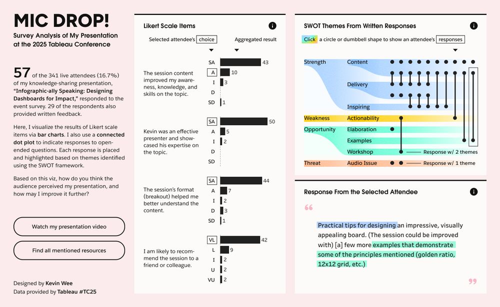
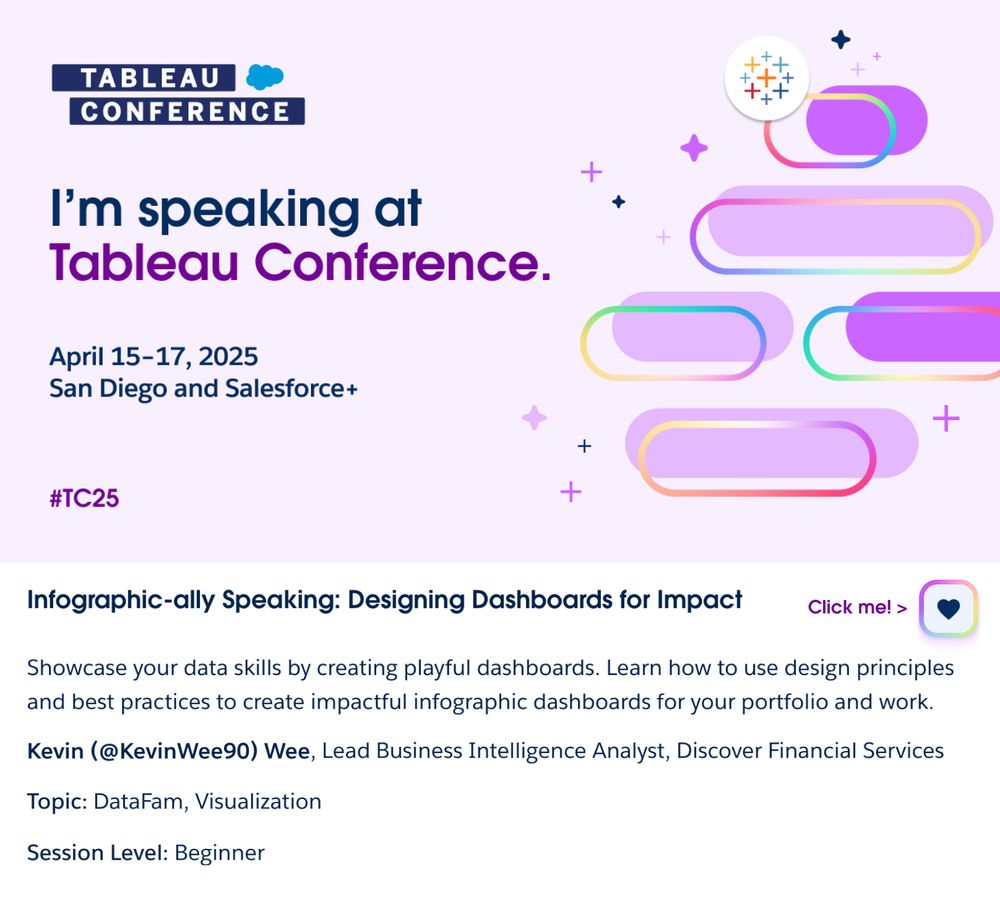
Kevin Wee 黃克文
@kevinwee.bsky.social
· Apr 25
Kevin Wee 黃克文
@kevinwee.bsky.social
· Apr 25
Reposted by Kevin Wee 黃克文


Kevin Wee 黃克文
@kevinwee.bsky.social
· Apr 19

Kevin Wee 黃克文
@kevinwee.bsky.social
· Apr 15
Kevin Wee 黃克文
@kevinwee.bsky.social
· Apr 14

Reposted by Kevin Wee 黃克文
Kevin Wee 黃克文
@kevinwee.bsky.social
· Apr 14
Kevin Wee 黃克文
@kevinwee.bsky.social
· Apr 13

Kevin Wee 黃克文
@kevinwee.bsky.social
· Apr 10