Larissa Lachmann
@larissalachmann.bsky.social
110 followers 280 following 36 posts
Information Design | Infographics | Sustainability and Science Communication
Posts Media Videos Starter Packs
larissalachmann.bsky.social
Here’s one way to clarify your figures using contrast and font size. 👇 What would you like to improve in your next chart?

#sciviz #infodesign #scicomm #designprinciples
larissalachmann.bsky.social
In science, we often assume the numbers will speak for themselves – but it’s a clear structure that makes them truly understandable.
larissalachmann.bsky.social
You’ve got the data. You’ve got the chart.
But people still don’t understand your results?
larissalachmann.bsky.social
With a background in Geography (B.Sc.) and Sustainability Science (M.Sc.), simultaneously working six years in research-related contexts, and now three years as a designer — I know both worlds.

And I love building the bridge between them.
larissalachmann.bsky.social
Visual Science Communication connects science with design – from one infographic to a whole project identity. Bridging both worlds is my strength. Let’s make your research visible.
Smiling woman in a red sweater sits in front of a blue background. Text on the image reads: “GET YOUR RESEARCH SEEN. HOW I COMBINE SCIENCE AND DESIGN.”
larissalachmann.bsky.social
Nice - thank you for finding it! :)
larissalachmann.bsky.social
Thank you @lasseharkort.bsky.social for researching and compiling the data on this topic!
larissalachmann.bsky.social
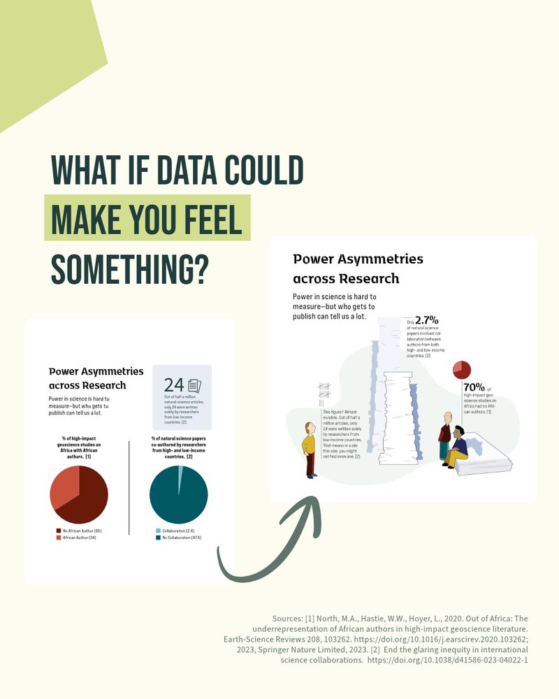
📚 Out of half a million natural-science articles, only 24 were written solely by researchers from low-income countries.https://doi.org/10.1038/d41586-023-04022-1

🌍 Over 70% of published geoscience articles on Africa included no African authors. doi.org/10.1016/j.ea...
larissalachmann.bsky.social
There’s more than one way to show data. And sometimes, we need formats that don’t just inform — but move us.
👉 Which version would you use? How does it make you feel?
larissalachmann.bsky.social
Most scientific figures aim to be clear.
But what if they also aimed to be compelling?

I love clean, well-structured data visuals — often, they’re exactly what’s needed.

But when data is about people — shouldn’t we also show them? #DataVisualization #SciComm @humboldteolab.bsky.social
larissalachmann.bsky.social
Outreach can feel overwhelming: too short = oversimplified, too long = confusing, visuals = time sink, social media = full-time job. But with a solid plan & support, it gets easier, more fun—and less time-consuming. Curious? Let’s talk. #scicomm #sciart #infographics
A smiling woman sits cross-legged on a circular concrete platform in a forest, holding a notebook and pen. She wears a red jacket, blue scarf, and jeans. The text on the image reads: 'Outreach doesn’t have to be exhausting.'
larissalachmann.bsky.social
Interesting connection! 🤯
larissalachmann.bsky.social
Important science, matched with astonishing science art by Alex Boersma!
larissalachmann.bsky.social
This is what a conceptual figure should look like: accurate yet visually inviting. This way I understand what they did, was motivated to read the article and will look out for the next publication. thanks for sharing 💚 #scicomm
samillingworth.com
🌳 Tropical forests struggle to keep up with climate change

Tree species in the American tropics are not adapting fast enough to match shifting climate conditions.

This mismatch may make forests more vulnerable in the future

🔗 www.science.org/doi/10.1126/...

#SciComm 🧪 #ClimateChange #Forests
Tropical forests in the Americas are changing too slowly to track climate change
Understanding the capacity of forests to adapt to climate change is of pivotal importance for conservation science, yet this is still widely unknown. This knowledge gap is particularly acute in high-b...
www.science.org
larissalachmann.bsky.social
Things aren’t fine. A day on the water: beavers build, kingfishers hunt. Idyllic? Yet, environmental issues are treated as “nice-to-have.”
🔥 Fear alone won’t spark change - it leads to paralysis.
📈 Visualisation matters. Let’s get clearer, braver, better.
#scicomm #sciencecommunication #infographic
 A woman wearing sunglasses, a red fleece jacket, and black pants stands smiling on a grassy riverbank. She has her hands in her pockets and is wearing hiking boots. Behind her, a calm river reflects the clear blue sky and tall, leafless trees. The surrounding landscape is a mix of dry grass, reeds, and distant forest.
 A vibrant kingfisher with blue and orange plumage perches on a thin branch amid a tangle of dry grass and twigs. The bird's sharp beak points forward, and its small claws grip the branch. The background consists of dried reeds and vegetation, blending earthy tones with the kingfisher’s striking colors.
larissalachmann.bsky.social
Important and well prepared in a nice infographic! 👏
larissalachmann.bsky.social
You spend years on research - don’t let your findings get lost in complex charts or hidden reports. A well-designed #infographic can be used across formats: posters, social media, presentations, websites - saving time + increasing impact. #scicomm

Need visuals for your research group? Let’s talk!
A visual showing how one information design can be adapted for multiple formats: a poster, a website, and social media posts. The title reads "One Information Design, Three Use Cases". The poster features a scientific infographic about neon fish, the website shows a similar theme on a laptop and phone screen, and social media graphics are displayed as a stack of images.
Reposted by Larissa Lachmann
rmslogan.bsky.social
"By presenting both messages effectively—the value of scientific curiosity and the impact of practical applications—we will strengthen public support for the long and winding road that is scientific discovery." ❤️❤️
#SciComm
rebeccasky.bsky.social
Delicate, on-target illustration by Sunnu Rebecca Choi for today's essay: How to communicate the value of curiosity-driven research. The burden of proof is on researchers to explain. By Anthony Zador for @thetransmitter.bsky.social www.thetransmitter.org/outreach/how... #sciart
How to communicate the value of curiosity-driven research
The burden of proof is on us, as researchers, to explain why what we do is valuable to society.
www.thetransmitter.org
larissalachmann.bsky.social
Manchmal kann man eben doch noch eine Einigung finden! #naturschutz #COP16 #biodiverstiy
larissalachmann.bsky.social
🎨 Need help choosing colors for scientific visuals? This tool ensures your graphics are not only beautiful but also colorblind-friendly! 📊 Check it out: personal.sron.nl/~pault/#sec:...
#SciComm #DataViz #ColorBlindness @lasseharkort.bsky.social
The image is an informational graphic with the title: "Struggeling with color choices? Make your science accessible" The text is presented in a clean, modern font, with the phrase "Helpful Resource" highlighted in a light green box, emphasizing accessibility in scientific visuals. The background is a light beige color with abstract geometric shapes in muted red and light blue scattered around. In the lower right, there is a circular diagram composed of segmented parts, some of which are hatched, connected to smaller geometric shapes, including a yellow pentagon and another pentagon with a question mark inside, suggesting inquiry or guidance. The design is minimalist and visually appealing, aimed at guiding color choices for accessible scientific graphics.