Starfleet Design 🖍🖖
@starfleetdesign.bsky.social
5.4K followers 1K following 3.6K posts
Fan of colourful Star Trek and sleek starships • designer • #Blender3D • fonts! • AuDHD • typos • humanist • he/him • no commissions • opinions are mine not Starfleet’s • #StarfleetFinds • #WIP https://artstation.com/starfleetdesign
Posts Media Videos Starter Packs
Pinned
starfleetdesign.bsky.social
#StarTrek Fonts: The Thread

This thread is going to cover the official typefaces used for on-screen titles and marketing materials etc. Not in-universe graphics, alien scripts or any of that.

Feedback and corrections welcome! Please check ALT text for additional context. 🧵 [001/???]
FONTS! [the word rendered using different iconic Star Trek fonts]
starfleetdesign.bsky.social
That's a brilliant idea.

It'll probably happen, even if not for Sky Captain 2. Though we are rapidly losing a lot of that institutional knowledge. And if they want to shoot and edit on film too, that's going to be a LOT more expensive than it ever used to be.
starfleetdesign.bsky.social
For clarification, the official Psygnosis logos that I found on box art, screenshots, etc, either had the owl ball element by the side, or omitted it. This third version (pic #5) seems to be fan art by pixel artist Philippe Lesire.

I recreated it anyway because I liked it.
Four official (I assume) pixel art versions of the Psygnosis logo from opening title cards. 

The fifth is a higher resolution version that has the name Philippe Lesire credited. (I added the large credit, but the original signature is visible under the '…SIS' in a small pixel font.) It puts the owl ball motif inside the ring behind the full owl.
Reposted by Starfleet Design 🖍🖖
starfleetdesign.bsky.social
The Psygnosis logo was designed by fantasy and SF artist Roger Dean, who I learned also designed the Tetris logo (and many others).

This version with the owl face in the background may have been a fan composition, I'm not sure. I didn't see it on any official materials.
Vector recreation of the Psygnosis logo, in pinky purple hues. Close-up detail of my Psygnosis logo.
starfleetdesign.bsky.social
Leto has the distinction of being actually repulsive to me. The others I can happily take or leave.
Reposted by Starfleet Design 🖍🖖
castpixel.bsky.social
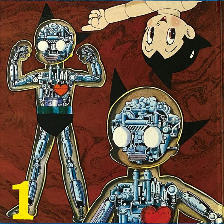
The unlicensed Astro Boy I'm designing is moving along. I have no idea what I'm doing in this space or whether anyone would want to buy it. If you have advice, I'm all ears!

I just know I am compelled to make it, and keep it as close to Tezuka's original lineart as possible. So much research!
Astro 3D sculpt, and blueprint of what's in him, based on all the artwork Osamu Tezuka has of Astro Boy dissected or X-Rayed (that's 6 drawings!) cover for the Kappa Comics De Luxe Astro Boy, Issue 1. Original Osamu Tezuka view of Astro's insides
starfleetdesign.bsky.social
Funnily enough, I saw that while I was collecting reference images and had the same thought!
Reposted by Starfleet Design 🖍🖖
thatsgoodweb.bsky.social
Oscar Chichoni, cover art for Starship Titanic, 1997
starfleetdesign.bsky.social
And this is a little collage of some of the key reference material I used.

I still have a few more bits to do, but I wanted to post this today anyway. I'll link to the completed project on ArtStation later.
A collage of Psygnosis reference material, like packaging, screenshots, business cards etc.
starfleetdesign.bsky.social
A few other variants and styles I threw together…
Vector recreation of the Psygnosis logo as seen on some of their boxes, I believe. The individual game art was printed on an outer sleeve. Recreation of a Commodore 64 cassette for the Psygnosis game 'Barbarian'. Cassette is vector art too (with some raster textures). Two mono versions of the Psygnosis logo.
starfleetdesign.bsky.social
The Psygnosis logo was designed by fantasy and SF artist Roger Dean, who I learned also designed the Tetris logo (and many others).

This version with the owl face in the background may have been a fan composition, I'm not sure. I didn't see it on any official materials.
Vector recreation of the Psygnosis logo, in pinky purple hues. Close-up detail of my Psygnosis logo.
starfleetdesign.bsky.social
Vector recreation of the iconic Psygnosis logo.

Psygnosis were a video game developer and publisher from '84 to '99, perhaps most famous for Lemmings and WipeOut. At least to me. I was also fond of a mech shooter called Walker. [🧵]
Vector recreation of the Psygnosis logo in Matrix green.
starfleetdesign.bsky.social
You should try some slow-motion shots! I did this with some of my local crows a while back. 😄
starfleetdesign.bsky.social
Oh wow, I watched his videos for a long time! I'll have to check out how his journey ended.
starfleetdesign.bsky.social
Oh, I have a couple of these. The "Narcissus" and "Millennium Falcon" ones. Don't think I ever saw that packaging before tho.
Reposted by Starfleet Design 🖍🖖
starfleetdesign.bsky.social
Current #WIP logo recreation. Plus a bonus tutorial detailing my process…
Screenshot of Affinity Designer showing an owl detail in a famous logo from an old video game developer and publisher. Work in progress. The 'How to draw an owl' meme:

1. Draw some circles
2. Draw the rest of the fucking owl
Reposted by Starfleet Design 🖍🖖
starfleetdesign.bsky.social
☝️ Vector recreations of the Flash Gordon logo from the 1980 film, plus a few others.

I used textures quite liberally, but I still went a bit overboard making the vinyl record and CD case in Affinity Designer. 😅 [🧵]
The Flash Gordon logo as it appeared on the Queen soundtrack vinyl and CD, with its iconic yellow backdrop. Honestly, I'm more of a Queen fan than I am a Flash Gordon fan, though I do have a fondness for the 1980 film. Detail of the first pic. Don't you hate it when the labels won't peel off? Vector outlines of the compact disc case, screenshot from within Affinity Designer. I made layers for the back, inner tray, front, etc, all to simulate the depth of the plastic. Also, note the staples! Vector outlines of the vinyl LP and its sticker, screenshot from within Affinity Designer. And yes, the track is a spiral! Lighting was simulated using gradients, etc. IIRC, there was only one texture used for the fine scratches.
Reposted by Starfleet Design 🖍🖖
andydpurromann.bsky.social
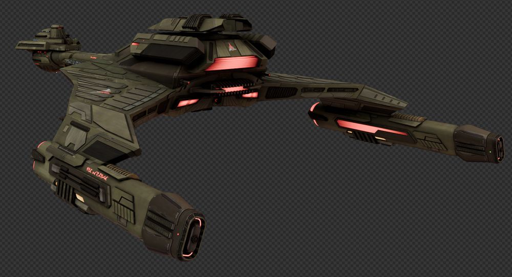
Revising the K'T'Inga Battlecruiser refit to something more faithful to the original game asset, stripping the disco inspired structures that made it look more regal and overhauled some areas and redone the Nacelles!

Also dulled the colour of the hull

#StarTrekOnline #Blender3D #WIP
Reposted by Starfleet Design 🖍🖖
joeralat.bsky.social
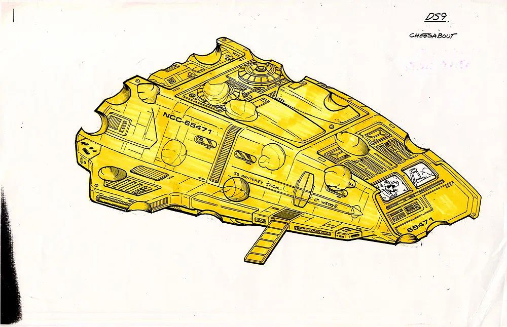
This production art is a spoof of the runnabout shuttle used in Star Trek: Deep Space Nine and features a small mouse piloting a ship made from a piece of cheese.
starfleetdesign.bsky.social
Sternbach? From that Spaceflight Chronology book?
Reposted by Starfleet Design 🖍🖖
scifiart.bsky.social
Sci-fi / horror film & TV and futurist magazines were the life blood of a kid throughout the 1970s, 80s and 90s
starfleetdesign.bsky.social
Thank you, thank you. Should be posting the final version(s) before the weekend.