


Brent Dykes
@analyticshero.bsky.social
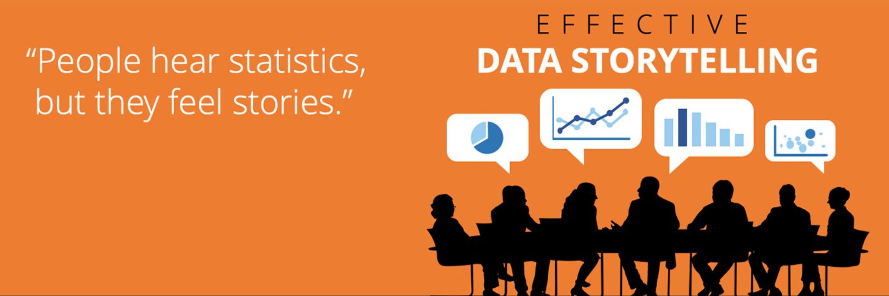
Author of Effective Data Storytelling
Chief Data Storyteller / Founder at AnalyticsHero, LLC
Chief Data Storyteller / Founder at AnalyticsHero, LLC
Don't let those default "extras" interfere with your data visualizations by adding unwanted noise.
www.linkedin.com/posts/brentd...
www.linkedin.com/posts/brentd...

As I review client presentations, I’m constantly reminded how often charts are burdened with unnecessary “extras.”
Borders, gridlines, axis lines, tick marks, etc.
These elements may seem harmless,…...
As I review client presentations, I’m constantly reminded how often charts are burdened with unnecessary “extras.”
Borders, gridlines, axis lines, tick marks, etc.
These elements may seem harmless, ...
www.linkedin.com
November 12, 2025 at 4:21 PM
Don't let those default "extras" interfere with your data visualizations by adding unwanted noise.
www.linkedin.com/posts/brentd...
www.linkedin.com/posts/brentd...


Sorry, I disagree that you should "make the audience the hero of your story."
www.linkedin.com/posts/brentd...
www.linkedin.com/posts/brentd...

I have a bone to pick.
I’m sure some of you won’t agree with me.
You’ve probably heard this advice before:
👉 “Make your audience the hero.”
It sounds empowering and audience-centered—but it… | Bren...
I have a bone to pick.
I’m sure some of you won’t agree with me.
You’ve probably heard this advice before:
👉 “Make your audience the hero.”
It sounds empowering and audience-centered—but it actuall...
www.linkedin.com
October 16, 2025 at 5:16 PM
Sorry, I disagree that you should "make the audience the hero of your story."
www.linkedin.com/posts/brentd...
www.linkedin.com/posts/brentd...


Don't limit the number of slides for presentations. Instead, limit the time for the presentations.
www.linkedin.com/posts/brentd...
www.linkedin.com/posts/brentd...

Executives often limit the number of slides for a presentation. The goal is fair—keep the content concise and respect their limited time.
But limiting slides usually backfires. Analysts cram too… | B...
Executives often limit the number of slides for a presentation. The goal is fair—keep the content concise and respect their limited time.
But limiting slides usually backfires. Analysts cram too much...
www.linkedin.com
September 25, 2025 at 5:25 PM
Don't limit the number of slides for presentations. Instead, limit the time for the presentations.
www.linkedin.com/posts/brentd...
www.linkedin.com/posts/brentd...


Beware of the Data Meddleman! Don't let them interfere with your data success.
www.linkedin.com/posts/brentd...
www.linkedin.com/posts/brentd...

A while ago, I chatted with an analyst who was frustrated. Her business team refused to let her meet directly with executives. All she got was vague requirements for an executive dashboard.
She… | B...
A while ago, I chatted with an analyst who was frustrated. Her business team refused to let her meet directly with executives. All she got was vague requirements for an executive dashboard.
She went...
www.linkedin.com
September 16, 2025 at 4:23 PM
Beware of the Data Meddleman! Don't let them interfere with your data success.
www.linkedin.com/posts/brentd...
www.linkedin.com/posts/brentd...
Leaping to judgment is always a problem. Data storytelling is about slowing down, resisting shortcuts (not jumping to conclusions), and making better decisions. One statistic is just a clue—you need context and deeper analysis to see and understand the full picture.
www.linkedin.com/posts/brentd...
www.linkedin.com/posts/brentd...

Too often, people leap to judgment with data.
They see something in the numbers, make a snap judgment, and quickly form a supporting narrative—frequently, the wrong one or one they later have to… | B...
Too often, people leap to judgment with data.
They see something in the numbers, make a snap judgment, and quickly form a supporting narrative—frequently, the wrong one or one they later have to just...
www.linkedin.com
September 12, 2025 at 3:57 PM
Leaping to judgment is always a problem. Data storytelling is about slowing down, resisting shortcuts (not jumping to conclusions), and making better decisions. One statistic is just a clue—you need context and deeper analysis to see and understand the full picture.
www.linkedin.com/posts/brentd...
www.linkedin.com/posts/brentd...
Annotations are an integral part of data storytelling. However, people often confuse them with commentary, which serves a different purpose. In this post, I review three types of annotations and contrast them with commentary.
www.linkedin.com/posts/brentd...
www.linkedin.com/posts/brentd...

September 10, 2025 at 4:13 PM
Annotations are an integral part of data storytelling. However, people often confuse them with commentary, which serves a different purpose. In this post, I review three types of annotations and contrast them with commentary.
www.linkedin.com/posts/brentd...
www.linkedin.com/posts/brentd...

If you're sharing insights, you'll definitely run into cognitive dissonance. Data storytelling is your secret weapon for helping audiences to overcome it.
www.linkedin.com/posts/brentd...
www.linkedin.com/posts/brentd...

If you’ve read my book or attended one of my workshops, you know I’m fascinated by the psychology behind data communication and decision-making.
For example, when your data challenges what people… | ...
If you’ve read my book or attended one of my workshops, you know I’m fascinated by the psychology behind data communication and decision-making.
For example, when your data challenges what people bel...
www.linkedin.com
September 4, 2025 at 5:25 PM
If you're sharing insights, you'll definitely run into cognitive dissonance. Data storytelling is your secret weapon for helping audiences to overcome it.
www.linkedin.com/posts/brentd...
www.linkedin.com/posts/brentd...
Have you tried using the jitter effect? In some situations, it can be helpful to spread out data so patterns are easier to see.
www.linkedin.com/posts/brentd...
www.linkedin.com/posts/brentd...

Not every visualization challenge requires switching to an entirely different chart type. Sometimes, a small adjustment can have a big impact.
When data points stack directly on top of each other… | ...
Not every visualization challenge requires switching to an entirely different chart type. Sometimes, a small adjustment can have a big impact.
When data points stack directly on top of each other, yo...
www.linkedin.com
September 2, 2025 at 4:26 PM
Have you tried using the jitter effect? In some situations, it can be helpful to spread out data so patterns are easier to see.
www.linkedin.com/posts/brentd...
www.linkedin.com/posts/brentd...
"Shooting the messenger" ruins your data culture
www.linkedin.com/posts/brentd...
www.linkedin.com/posts/brentd...

Most organizations talk about being more “data-driven,” but one destructive leadership behavior quietly undermines that goal: shooting the messenger.
When analysts or managers are punished for… | Bre...
Most organizations talk about being more “data-driven,” but one destructive leadership behavior quietly undermines that goal: shooting the messenger.
When analysts or managers are punished for sharin...
www.linkedin.com
August 26, 2025 at 5:36 PM
"Shooting the messenger" ruins your data culture
www.linkedin.com/posts/brentd...
www.linkedin.com/posts/brentd...
In #datastorytelling, narrative isn't just good for your audience, it's good for you as the presenter.
www.linkedin.com/posts/brentd...
www.linkedin.com/posts/brentd...

Recently, I was discussing the benefits of data storytelling with a client. Most people see narrative as something that benefits the audience.
It makes your data communications:
✅ 𝐄𝐧𝐠𝐚𝐠𝐢𝐧𝐠… | Brent ...
Recently, I was discussing the benefits of data storytelling with a client. Most people see narrative as something that benefits the audience.
It makes your data communications:
✅ 𝐄𝐧𝐠𝐚𝐠𝐢𝐧𝐠 – capture...
www.linkedin.com
August 21, 2025 at 5:38 PM
In #datastorytelling, narrative isn't just good for your audience, it's good for you as the presenter.
www.linkedin.com/posts/brentd...
www.linkedin.com/posts/brentd...
How do you use color in your #datastorytelling? Here are five ways to take advantage of color in your data stories.
www.linkedin.com/posts/brentd...
www.linkedin.com/posts/brentd...

In my data storytelling workshops, I often say color is one of the most powerful tools in your visual storytelling toolbox. | Brent Dykes
In my data storytelling workshops, I often say color is one of the most powerful tools in your visual storytelling toolbox.
Here are five key ways color can enhance your data stories:
1️⃣ 𝐇𝐢𝐠𝐡𝐥𝐢𝐠𝐡𝐭𝐢...
www.linkedin.com
August 20, 2025 at 4:34 PM
How do you use color in your #datastorytelling? Here are five ways to take advantage of color in your data stories.
www.linkedin.com/posts/brentd...
www.linkedin.com/posts/brentd...
Color highlighting is essential in #datastorytelling. There are two approaches with different trade-offs.
www.linkedin.com/posts/brentd...
www.linkedin.com/posts/brentd...

In data storytelling, color highlighting is a powerful way to guide your audience’s focus. | Brent Dykes
In data storytelling, color highlighting is a powerful way to guide your audience’s focus.
Many people are familiar with pairing a bold color with grayscale for the background values.
Another highli...
www.linkedin.com
August 12, 2025 at 4:27 PM
Color highlighting is essential in #datastorytelling. There are two approaches with different trade-offs.
www.linkedin.com/posts/brentd...
www.linkedin.com/posts/brentd...
Here's my breakdown of a data chart from last Thursday's White House presentation with economist Stephen Moore and President Trump. It was the only one based on publicly available data.
www.linkedin.com/posts/brentd...
www.linkedin.com/posts/brentd...

Up for a simple “critical thinking with data” exercise? | Brent Dykes
Up for a simple “critical thinking with data” exercise?
Last Thursday, economist Stephen Moore presented charts alongside President Trump at the White House. One chart, showing how the BLS (Bureau of...
www.linkedin.com
August 11, 2025 at 3:30 PM
Here's my breakdown of a data chart from last Thursday's White House presentation with economist Stephen Moore and President Trump. It was the only one based on publicly available data.
www.linkedin.com/posts/brentd...
www.linkedin.com/posts/brentd...
I'm getting tired of the "humans process visual information 60,000 times faster than text" myth. It doesn't want to go away or die.
www.linkedin.com/posts/brentd...
www.linkedin.com/posts/brentd...

Recently, I was excited to read a new report on data storytelling from a data visualization vendor. | Brent Dykes
Recently, I was excited to read a new report on data storytelling from a data visualization vendor. But halfway through, I came across the tired old myth:
“The human brain processes visuals 60,000 ti...
www.linkedin.com
August 7, 2025 at 4:22 PM
I'm getting tired of the "humans process visual information 60,000 times faster than text" myth. It doesn't want to go away or die.
www.linkedin.com/posts/brentd...
www.linkedin.com/posts/brentd...
I'm not a fan of radar or spider charts because the axis sequence changes the shape of these charts. For me, that makes them problematic and less reliable.
www.linkedin.com/posts/brentd...
www.linkedin.com/posts/brentd...

In my data career, I’ve rarely used radar or spider charts. | Brent Dykes
In my data career, I’ve rarely used radar or spider charts.
They can make your data look novel or dramatic—until you realize the shape is just a side effect of the axis order. Once I understood that,...
www.linkedin.com
July 30, 2025 at 4:26 PM
I'm not a fan of radar or spider charts because the axis sequence changes the shape of these charts. For me, that makes them problematic and less reliable.
www.linkedin.com/posts/brentd...
www.linkedin.com/posts/brentd...
Analytics can't stop at "What". We must include "So What" and "Now What."
www.linkedin.com/posts/brentd...
www.linkedin.com/posts/brentd...

Analytics teams spend weeks perfecting their reports and dashboards only to hear: “This is interesting, but what should we actually do?” | Brent Dykes
Analytics teams spend weeks perfecting their reports and dashboards only to hear: “This is interesting, but what should we actually do?”
Recently, a marketing professor DM’ed me about his students st...
www.linkedin.com
July 24, 2025 at 6:42 PM
Analytics can't stop at "What". We must include "So What" and "Now What."
www.linkedin.com/posts/brentd...
www.linkedin.com/posts/brentd...