


AnyChart
@anychart.bsky.social
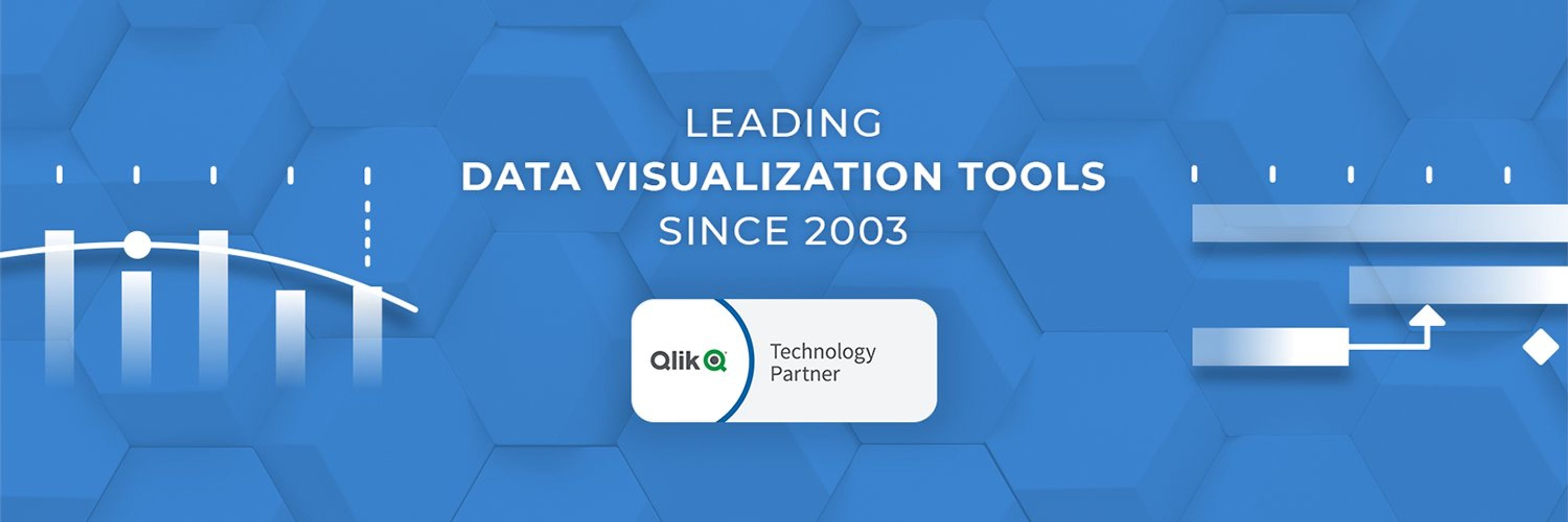
Cross-platform data visualization solutions • www.anychart.com
JavaScript library for interactive charts, maps, and dashboards • Qlik Sense extensions for visual analytics • And more to turn data into insight 📈
JavaScript library for interactive charts, maps, and dashboards • Qlik Sense extensions for visual analytics • And more to turn data into insight 📈
Pinned
AnyChart
@anychart.bsky.social
· Sep 2
Hello Bluesky! AnyChart is here 👋
We create solutions for interactive data visualization and analytics, designed to help data speak clearly in every setting.
Here you can expect:
📢 Updates
💡 Tips & tutorials
📊 Visual inspiration
Excited for the connections and conversations ahead 🎈
We create solutions for interactive data visualization and analytics, designed to help data speak clearly in every setting.
Here you can expect:
📢 Updates
💡 Tips & tutorials
📊 Visual inspiration
Excited for the connections and conversations ahead 🎈
Still exporting to Excel just to update a template?
💡 There is a better way in Qlik:
Import your #Excel template into #Qlik Sense.
✅ Keeps layout, formulas, charts
✅ Syncs with live Qlik data
✅ Work stays in the app, no version drift
See our tutorial: qlik.anychart.com/news/import-...
💡 There is a better way in Qlik:
Import your #Excel template into #Qlik Sense.
✅ Keeps layout, formulas, charts
✅ Syncs with live Qlik data
✅ Work stays in the app, no version drift
See our tutorial: qlik.anychart.com/news/import-...
February 12, 2026 at 2:42 PM
Still exporting to Excel just to update a template?
💡 There is a better way in Qlik:
Import your #Excel template into #Qlik Sense.
✅ Keeps layout, formulas, charts
✅ Syncs with live Qlik data
✅ Work stays in the app, no version drift
See our tutorial: qlik.anychart.com/news/import-...
💡 There is a better way in Qlik:
Import your #Excel template into #Qlik Sense.
✅ Keeps layout, formulas, charts
✅ Syncs with live Qlik data
✅ Work stays in the app, no version drift
See our tutorial: qlik.anychart.com/news/import-...
Charts & maps should not just support the text.
In good visual data storytelling, they do the explaining.
New DataViz Weekly is live with fresh examples:
🔸 Neglected diseases
🔸 Health insurance subsidies
🔸 ICE transfers
🔸 Tariff promises vs math
Check it out on our blog.
In good visual data storytelling, they do the explaining.
New DataViz Weekly is live with fresh examples:
🔸 Neglected diseases
🔸 Health insurance subsidies
🔸 ICE transfers
🔸 Tariff promises vs math
Check it out on our blog.

February 10, 2026 at 1:28 PM
Charts & maps should not just support the text.
In good visual data storytelling, they do the explaining.
New DataViz Weekly is live with fresh examples:
🔸 Neglected diseases
🔸 Health insurance subsidies
🔸 ICE transfers
🔸 Tariff promises vs math
Check it out on our blog.
In good visual data storytelling, they do the explaining.
New DataViz Weekly is live with fresh examples:
🔸 Neglected diseases
🔸 Health insurance subsidies
🔸 ICE transfers
🔸 Tariff promises vs math
Check it out on our blog.
Data visuals don't have to be complicated to work.
📊 Clear structure does a lot of the heavy lifting.
New #DataViz Weekly is live with fresh examples:
๏ Measles cases rise
๏ Population shifts
๏ Science cutbacks
๏ Food deserts
See the new edition on our blog:
www.anychart.com/blog/2026/01...
📊 Clear structure does a lot of the heavy lifting.
New #DataViz Weekly is live with fresh examples:
๏ Measles cases rise
๏ Population shifts
๏ Science cutbacks
๏ Food deserts
See the new edition on our blog:
www.anychart.com/blog/2026/01...

February 2, 2026 at 11:47 AM
Data visuals don't have to be complicated to work.
📊 Clear structure does a lot of the heavy lifting.
New #DataViz Weekly is live with fresh examples:
๏ Measles cases rise
๏ Population shifts
๏ Science cutbacks
๏ Food deserts
See the new edition on our blog:
www.anychart.com/blog/2026/01...
📊 Clear structure does a lot of the heavy lifting.
New #DataViz Weekly is live with fresh examples:
๏ Measles cases rise
๏ Population shifts
๏ Science cutbacks
๏ Food deserts
See the new edition on our blog:
www.anychart.com/blog/2026/01...
Reposted by AnyChart
Excel is still a daily tool for analysis.
Qlik Sense is built for governed analytics.
📝 We published a comprehensive guide to using both, and when each approach makes sense:
→ Exports & imports
→ Automation
→ Live connections
→ Embedded spreadsheets
Read it on our blog.
Qlik Sense is built for governed analytics.
📝 We published a comprehensive guide to using both, and when each approach makes sense:
→ Exports & imports
→ Automation
→ Live connections
→ Embedded spreadsheets
Read it on our blog.

January 26, 2026 at 1:29 PM
Excel is still a daily tool for analysis.
Qlik Sense is built for governed analytics.
📝 We published a comprehensive guide to using both, and when each approach makes sense:
→ Exports & imports
→ Automation
→ Live connections
→ Embedded spreadsheets
Read it on our blog.
Qlik Sense is built for governed analytics.
📝 We published a comprehensive guide to using both, and when each approach makes sense:
→ Exports & imports
→ Automation
→ Live connections
→ Embedded spreadsheets
Read it on our blog.
Visualizing data helps stories land faster 🎯
New #DataViz Weekly is live with new examples of visual #storytelling in action:
⭐️ 2025 heat in the global warming trend
⭐️ Circular AI deals
⭐️ Births versus deaths across France
⭐️ 2025 in Reuters graphics
Check it out on our blog.
New #DataViz Weekly is live with new examples of visual #storytelling in action:
⭐️ 2025 heat in the global warming trend
⭐️ Circular AI deals
⭐️ Births versus deaths across France
⭐️ 2025 in Reuters graphics
Check it out on our blog.

January 26, 2026 at 9:00 PM
Visualizing data helps stories land faster 🎯
New #DataViz Weekly is live with new examples of visual #storytelling in action:
⭐️ 2025 heat in the global warming trend
⭐️ Circular AI deals
⭐️ Births versus deaths across France
⭐️ 2025 in Reuters graphics
Check it out on our blog.
New #DataViz Weekly is live with new examples of visual #storytelling in action:
⭐️ 2025 heat in the global warming trend
⭐️ Circular AI deals
⭐️ Births versus deaths across France
⭐️ 2025 in Reuters graphics
Check it out on our blog.
Excel is still a daily tool for analysis.
Qlik Sense is built for governed analytics.
📝 We published a comprehensive guide to using both, and when each approach makes sense:
→ Exports & imports
→ Automation
→ Live connections
→ Embedded spreadsheets
Read it on our blog.
Qlik Sense is built for governed analytics.
📝 We published a comprehensive guide to using both, and when each approach makes sense:
→ Exports & imports
→ Automation
→ Live connections
→ Embedded spreadsheets
Read it on our blog.
January 26, 2026 at 1:29 PM
Excel is still a daily tool for analysis.
Qlik Sense is built for governed analytics.
📝 We published a comprehensive guide to using both, and when each approach makes sense:
→ Exports & imports
→ Automation
→ Live connections
→ Embedded spreadsheets
Read it on our blog.
Qlik Sense is built for governed analytics.
📝 We published a comprehensive guide to using both, and when each approach makes sense:
→ Exports & imports
→ Automation
→ Live connections
→ Embedded spreadsheets
Read it on our blog.
#DataViz Weekly is back 📈 Sharing some standout data visualization work we've come across lately.
Four new data viz picks worth checking out:
📌 Bollywood genre shift
📌 DHS presence in Minnesota
📌 Traffic noise in Singapore homes
📌 Trump deal connections
Full roundup on our blog.
Four new data viz picks worth checking out:
📌 Bollywood genre shift
📌 DHS presence in Minnesota
📌 Traffic noise in Singapore homes
📌 Trump deal connections
Full roundup on our blog.

January 20, 2026 at 12:58 PM
#DataViz Weekly is back 📈 Sharing some standout data visualization work we've come across lately.
Four new data viz picks worth checking out:
📌 Bollywood genre shift
📌 DHS presence in Minnesota
📌 Traffic noise in Singapore homes
📌 Trump deal connections
Full roundup on our blog.
Four new data viz picks worth checking out:
📌 Bollywood genre shift
📌 DHS presence in Minnesota
📌 Traffic noise in Singapore homes
📌 Trump deal connections
Full roundup on our blog.
Reposted by AnyChart
The best data visualizations of 2025.
In one roundup 📊🏆
We published a special DataViz Weekly edition that brings together best-of-year picks and year-in-graphics collections, with direct links to every featured project.
Check it out: www.anychart.com/blog/2026/01...
In one roundup 📊🏆
We published a special DataViz Weekly edition that brings together best-of-year picks and year-in-graphics collections, with direct links to every featured project.
Check it out: www.anychart.com/blog/2026/01...

January 13, 2026 at 3:54 PM
The best data visualizations of 2025.
In one roundup 📊🏆
We published a special DataViz Weekly edition that brings together best-of-year picks and year-in-graphics collections, with direct links to every featured project.
Check it out: www.anychart.com/blog/2026/01...
In one roundup 📊🏆
We published a special DataViz Weekly edition that brings together best-of-year picks and year-in-graphics collections, with direct links to every featured project.
Check it out: www.anychart.com/blog/2026/01...
January 13, 2026 at 3:54 PM
The best data visualizations of 2025.
In one roundup 📊🏆
We published a special DataViz Weekly edition that brings together best-of-year picks and year-in-graphics collections, with direct links to every featured project.
Check it out: www.anychart.com/blog/2026/01...
In one roundup 📊🏆
We published a special DataViz Weekly edition that brings together best-of-year picks and year-in-graphics collections, with direct links to every featured project.
Check it out: www.anychart.com/blog/2026/01...
Happy Holidays! 🎄
This sweater is a nod to our top release this year:
🌟 Spreadsheets for Qlik Sense
BI tools like Qlik evolve, but Excel stays in the last mile, triggering the export loop. Our extension keeps familiar spreadsheet work inside Qlik apps.
Thanks for a great 2025!
This sweater is a nod to our top release this year:
🌟 Spreadsheets for Qlik Sense
BI tools like Qlik evolve, but Excel stays in the last mile, triggering the export loop. Our extension keeps familiar spreadsheet work inside Qlik apps.
Thanks for a great 2025!

December 24, 2025 at 12:18 PM
Happy Holidays! 🎄
This sweater is a nod to our top release this year:
🌟 Spreadsheets for Qlik Sense
BI tools like Qlik evolve, but Excel stays in the last mile, triggering the export loop. Our extension keeps familiar spreadsheet work inside Qlik apps.
Thanks for a great 2025!
This sweater is a nod to our top release this year:
🌟 Spreadsheets for Qlik Sense
BI tools like Qlik evolve, but Excel stays in the last mile, triggering the export loop. Our extension keeps familiar spreadsheet work inside Qlik apps.
Thanks for a great 2025!
Reposted by AnyChart
Your Qlik apps keep getting smarter.
But users still ask for Excel.
Export → edit → share → bring back 🔁
Now you can keep Excel-style spreadsheet work in-app: cell editing, formulas, multi-sheet, charts, and more. Connected to live Qlik data.
📽️ New tutorial on our blog.
But users still ask for Excel.
Export → edit → share → bring back 🔁
Now you can keep Excel-style spreadsheet work in-app: cell editing, formulas, multi-sheet, charts, and more. Connected to live Qlik data.
📽️ New tutorial on our blog.
December 22, 2025 at 9:37 AM
Your Qlik apps keep getting smarter.
But users still ask for Excel.
Export → edit → share → bring back 🔁
Now you can keep Excel-style spreadsheet work in-app: cell editing, formulas, multi-sheet, charts, and more. Connected to live Qlik data.
📽️ New tutorial on our blog.
But users still ask for Excel.
Export → edit → share → bring back 🔁
Now you can keep Excel-style spreadsheet work in-app: cell editing, formulas, multi-sheet, charts, and more. Connected to live Qlik data.
📽️ New tutorial on our blog.
Love good charts & maps? 👀
#DataViz Weekly is back with new data viz picks worth a look:
> Time with others @flowingdata.com
> NYC parking lots housing potential @tdubolyou.bsky.social
> China's rise in trade @ourworldindata.org
> AI questions beyond tech earnings @bloomberg.com
See it on our blog.
#DataViz Weekly is back with new data viz picks worth a look:
> Time with others @flowingdata.com
> NYC parking lots housing potential @tdubolyou.bsky.social
> China's rise in trade @ourworldindata.org
> AI questions beyond tech earnings @bloomberg.com
See it on our blog.

December 22, 2025 at 12:32 PM
Love good charts & maps? 👀
#DataViz Weekly is back with new data viz picks worth a look:
> Time with others @flowingdata.com
> NYC parking lots housing potential @tdubolyou.bsky.social
> China's rise in trade @ourworldindata.org
> AI questions beyond tech earnings @bloomberg.com
See it on our blog.
#DataViz Weekly is back with new data viz picks worth a look:
> Time with others @flowingdata.com
> NYC parking lots housing potential @tdubolyou.bsky.social
> China's rise in trade @ourworldindata.org
> AI questions beyond tech earnings @bloomberg.com
See it on our blog.
Your Qlik apps keep getting smarter.
But users still ask for Excel.
Export → edit → share → bring back 🔁
Now you can keep Excel-style spreadsheet work in-app: cell editing, formulas, multi-sheet, charts, and more. Connected to live Qlik data.
📽️ New tutorial on our blog.
But users still ask for Excel.
Export → edit → share → bring back 🔁
Now you can keep Excel-style spreadsheet work in-app: cell editing, formulas, multi-sheet, charts, and more. Connected to live Qlik data.
📽️ New tutorial on our blog.
December 22, 2025 at 9:37 AM
Your Qlik apps keep getting smarter.
But users still ask for Excel.
Export → edit → share → bring back 🔁
Now you can keep Excel-style spreadsheet work in-app: cell editing, formulas, multi-sheet, charts, and more. Connected to live Qlik data.
📽️ New tutorial on our blog.
But users still ask for Excel.
Export → edit → share → bring back 🔁
Now you can keep Excel-style spreadsheet work in-app: cell editing, formulas, multi-sheet, charts, and more. Connected to live Qlik data.
📽️ New tutorial on our blog.
Visuals let data speak 📈
New DataViz Weekly is out, highlighting projects that stood out to us last week. Great new examples of data visualization in action ↴
🔸 Defense at record highs
🔸 Climate-driven insurance surge
🔸 Star Wars galaxy map
🔸 Sizes of life
www.anychart.com/blog/2025/12...
New DataViz Weekly is out, highlighting projects that stood out to us last week. Great new examples of data visualization in action ↴
🔸 Defense at record highs
🔸 Climate-driven insurance surge
🔸 Star Wars galaxy map
🔸 Sizes of life
www.anychart.com/blog/2025/12...

December 16, 2025 at 5:29 PM
Visuals let data speak 📈
New DataViz Weekly is out, highlighting projects that stood out to us last week. Great new examples of data visualization in action ↴
🔸 Defense at record highs
🔸 Climate-driven insurance surge
🔸 Star Wars galaxy map
🔸 Sizes of life
www.anychart.com/blog/2025/12...
New DataViz Weekly is out, highlighting projects that stood out to us last week. Great new examples of data visualization in action ↴
🔸 Defense at record highs
🔸 Climate-driven insurance surge
🔸 Star Wars galaxy map
🔸 Sizes of life
www.anychart.com/blog/2025/12...
Some data visuals instantly pull you in 👀
New examples in #DataVizWeekly ⤵️
The final November edition spotlights the following projects worth a look:
✳️ Trans news coverage
✳️ Ideal political party
✳️ Epstein emails
✳️ Fiscal inequality
#dataviz #datavisualization
New examples in #DataVizWeekly ⤵️
The final November edition spotlights the following projects worth a look:
✳️ Trans news coverage
✳️ Ideal political party
✳️ Epstein emails
✳️ Fiscal inequality
#dataviz #datavisualization

December 1, 2025 at 12:18 PM
Some data visuals instantly pull you in 👀
New examples in #DataVizWeekly ⤵️
The final November edition spotlights the following projects worth a look:
✳️ Trans news coverage
✳️ Ideal political party
✳️ Epstein emails
✳️ Fiscal inequality
#dataviz #datavisualization
New examples in #DataVizWeekly ⤵️
The final November edition spotlights the following projects worth a look:
✳️ Trans news coverage
✳️ Ideal political party
✳️ Epstein emails
✳️ Fiscal inequality
#dataviz #datavisualization
Reposted by AnyChart
AI-assisted data visualization just got better ⚡ Claude + Context7 MCP now pulls live AnyChart docs right into your workflow. A clean little update that makes JavaScript chart development way smoother 📈 Faster, safer, no outdated API calls.

November 26, 2025 at 4:04 PM
AI-assisted data visualization just got better ⚡ Claude + Context7 MCP now pulls live AnyChart docs right into your workflow. A clean little update that makes JavaScript chart development way smoother 📈 Faster, safer, no outdated API calls.
AI-assisted data visualization just got better ⚡ Claude + Context7 MCP now pulls live AnyChart docs right into your workflow. A clean little update that makes JavaScript chart development way smoother 📈 Faster, safer, no outdated API calls.
November 26, 2025 at 4:04 PM
AI-assisted data visualization just got better ⚡ Claude + Context7 MCP now pulls live AnyChart docs right into your workflow. A clean little update that makes JavaScript chart development way smoother 📈 Faster, safer, no outdated API calls.
Visualizing data makes it easier to navigate.
How does that work in practice?
See 4 great new examples in the latest edition of DataViz Weekly 👇
📍 Neuroscience research topics
📍 Walking & cycling globally
📍 Billionaire migration
📍 Politics for new X users
#DataViz #DataAnalysis #DataVisualization
How does that work in practice?
See 4 great new examples in the latest edition of DataViz Weekly 👇
📍 Neuroscience research topics
📍 Walking & cycling globally
📍 Billionaire migration
📍 Politics for new X users
#DataViz #DataAnalysis #DataVisualization

Fresh Data Visualizations Worth a Look — DataViz Weekly
DataViz Weekly highlights new visualizations on neuroscience trends, walking & cycling patterns, billionaire migration, and political content on X.
anychart.com
November 25, 2025 at 10:39 AM
Visualizing data makes it easier to navigate.
How does that work in practice?
See 4 great new examples in the latest edition of DataViz Weekly 👇
📍 Neuroscience research topics
📍 Walking & cycling globally
📍 Billionaire migration
📍 Politics for new X users
#DataViz #DataAnalysis #DataVisualization
How does that work in practice?
See 4 great new examples in the latest edition of DataViz Weekly 👇
📍 Neuroscience research topics
📍 Walking & cycling globally
📍 Billionaire migration
📍 Politics for new X users
#DataViz #DataAnalysis #DataVisualization
The right JavaScript Gantt chart library can save weeks of development.
A new deep dive reviews six top options across features, integration, and real-world fit.
🧩 Which one stands out for you?
👉 www.anychart.com/blog/2025/11...
#ProjectManagement #DataVisualization #JavaScriptCharts
A new deep dive reviews six top options across features, integration, and real-world fit.
🧩 Which one stands out for you?
👉 www.anychart.com/blog/2025/11...
#ProjectManagement #DataVisualization #JavaScriptCharts

November 6, 2025 at 8:11 AM
The right JavaScript Gantt chart library can save weeks of development.
A new deep dive reviews six top options across features, integration, and real-world fit.
🧩 Which one stands out for you?
👉 www.anychart.com/blog/2025/11...
#ProjectManagement #DataVisualization #JavaScriptCharts
A new deep dive reviews six top options across features, integration, and real-world fit.
🧩 Which one stands out for you?
👉 www.anychart.com/blog/2025/11...
#ProjectManagement #DataVisualization #JavaScriptCharts
Gathered some compelling new data visualization examples 👇
The latest #DataVizWeekly features:
📍 EU solar grid pressure @bloomberg.com
📍 China vs U.S. in trade @folha.com
📍 Sleepless Ukraine @texty.org
📍 Cats' laziness 🐈 @lisahornung.bsky.social
www.anychart.com/blog/2025/10...
#DataVisualization
The latest #DataVizWeekly features:
📍 EU solar grid pressure @bloomberg.com
📍 China vs U.S. in trade @folha.com
📍 Sleepless Ukraine @texty.org
📍 Cats' laziness 🐈 @lisahornung.bsky.social
www.anychart.com/blog/2025/10...
#DataVisualization


November 4, 2025 at 11:06 AM
Gathered some compelling new data visualization examples 👇
The latest #DataVizWeekly features:
📍 EU solar grid pressure @bloomberg.com
📍 China vs U.S. in trade @folha.com
📍 Sleepless Ukraine @texty.org
📍 Cats' laziness 🐈 @lisahornung.bsky.social
www.anychart.com/blog/2025/10...
#DataVisualization
The latest #DataVizWeekly features:
📍 EU solar grid pressure @bloomberg.com
📍 China vs U.S. in trade @folha.com
📍 Sleepless Ukraine @texty.org
📍 Cats' laziness 🐈 @lisahornung.bsky.social
www.anychart.com/blog/2025/10...
#DataVisualization
How to make complex data easy to grasp?
Visualization helps bring meaning into view 📈
#DataViz Weekly shows how it works.
Latest examples 👇
- AI industry links @tijd.be
- U.S. funding halt @nytimes.com
- TikTok watch-time @washingtonpost.com
- Global sea temps @gary.oberbrunner.com
Visualization helps bring meaning into view 📈
#DataViz Weekly shows how it works.
Latest examples 👇
- AI industry links @tijd.be
- U.S. funding halt @nytimes.com
- TikTok watch-time @washingtonpost.com
- Global sea temps @gary.oberbrunner.com

How Visualization Reveals Meaning in Data — DataViz Weekly
Discover how visualization reveals meaning in data, with new examples from De Tijd, NYT, The Post, and Gary Oberbrunner.
www.anychart.com
October 29, 2025 at 11:46 AM
How to make complex data easy to grasp?
Visualization helps bring meaning into view 📈
#DataViz Weekly shows how it works.
Latest examples 👇
- AI industry links @tijd.be
- U.S. funding halt @nytimes.com
- TikTok watch-time @washingtonpost.com
- Global sea temps @gary.oberbrunner.com
Visualization helps bring meaning into view 📈
#DataViz Weekly shows how it works.
Latest examples 👇
- AI industry links @tijd.be
- U.S. funding halt @nytimes.com
- TikTok watch-time @washingtonpost.com
- Global sea temps @gary.oberbrunner.com
See how visualization brings data to life ✨
#DataVizWeekly spotlights four compelling new projects:
🕊️ Bird migration & climate
💵 U.S. living costs
⚡ AI & electricity prices
🏙️ Urban patterns in Europe
👉 www.anychart.com/blog/2025/10...
#DataVisualization #DataAnalytics #DataViz
#DataVizWeekly spotlights four compelling new projects:
🕊️ Bird migration & climate
💵 U.S. living costs
⚡ AI & electricity prices
🏙️ Urban patterns in Europe
👉 www.anychart.com/blog/2025/10...
#DataVisualization #DataAnalytics #DataViz

October 21, 2025 at 11:04 AM
See how visualization brings data to life ✨
#DataVizWeekly spotlights four compelling new projects:
🕊️ Bird migration & climate
💵 U.S. living costs
⚡ AI & electricity prices
🏙️ Urban patterns in Europe
👉 www.anychart.com/blog/2025/10...
#DataVisualization #DataAnalytics #DataViz
#DataVizWeekly spotlights four compelling new projects:
🕊️ Bird migration & climate
💵 U.S. living costs
⚡ AI & electricity prices
🏙️ Urban patterns in Europe
👉 www.anychart.com/blog/2025/10...
#DataVisualization #DataAnalytics #DataViz
Raw data rarely speaks clearly. Visuals give it a voice 📊
The latest #DataViz Weekly shows great new examples:
• Causes of death in reality vs. media / @ourworldindata.org
• EU healthcare priorities / @nadiehbremer.com
• U.S. school redistricting / @newamerica.org
• Religion & marriage in Australia
The latest #DataViz Weekly shows great new examples:
• Causes of death in reality vs. media / @ourworldindata.org
• EU healthcare priorities / @nadiehbremer.com
• U.S. school redistricting / @newamerica.org
• Religion & marriage in Australia

Great New Visuals Letting Data Speak — DataViz Weekly
Discover new examples of how visuals make data speak. Featuring works from Our World in Data, European Data Portal, New America, and ABC News.
www.anychart.com
October 13, 2025 at 12:04 PM
Raw data rarely speaks clearly. Visuals give it a voice 📊
The latest #DataViz Weekly shows great new examples:
• Causes of death in reality vs. media / @ourworldindata.org
• EU healthcare priorities / @nadiehbremer.com
• U.S. school redistricting / @newamerica.org
• Religion & marriage in Australia
The latest #DataViz Weekly shows great new examples:
• Causes of death in reality vs. media / @ourworldindata.org
• EU healthcare priorities / @nadiehbremer.com
• U.S. school redistricting / @newamerica.org
• Religion & marriage in Australia
When data needs to be explored or explained, visualization helps 📈📉
New #DataViz Weekly shows how it works in practice:
🔸 U.S. funding and #shutdown
🔸 #H1BVisa workers at U.S. research institutions
🔸 #USAID medical supply disruptions
🔸 Daytime air alerts in #Kyiv
www.anychart.com/blog/2025/10...
New #DataViz Weekly shows how it works in practice:
🔸 U.S. funding and #shutdown
🔸 #H1BVisa workers at U.S. research institutions
🔸 #USAID medical supply disruptions
🔸 Daytime air alerts in #Kyiv
www.anychart.com/blog/2025/10...

October 6, 2025 at 2:58 PM
Reposted by AnyChart
Bring #Excel templates to life inside #Qlik Sense 📄📥
The Spreadsheets extension enables import of templates as is, linking them to live Qlik data, using formulas 🟰, and keeping everything interactive & editable just like in Excel:
📽️ www.youtube.com/watch?v=RmR-...
#BI #DataAnalytics #Dashboard
The Spreadsheets extension enables import of templates as is, linking them to live Qlik data, using formulas 🟰, and keeping everything interactive & editable just like in Excel:
📽️ www.youtube.com/watch?v=RmR-...
#BI #DataAnalytics #Dashboard
September 16, 2025 at 9:28 AM
Bring #Excel templates to life inside #Qlik Sense 📄📥
The Spreadsheets extension enables import of templates as is, linking them to live Qlik data, using formulas 🟰, and keeping everything interactive & editable just like in Excel:
📽️ www.youtube.com/watch?v=RmR-...
#BI #DataAnalytics #Dashboard
The Spreadsheets extension enables import of templates as is, linking them to live Qlik data, using formulas 🟰, and keeping everything interactive & editable just like in Excel:
📽️ www.youtube.com/watch?v=RmR-...
#BI #DataAnalytics #Dashboard