


Steve Wexler
@datarevelations.com
Professional chart looker-atter. Author of "The Big Picture" and co-author of "The Big Book of Dashboards." James Jamerson disciple.
If you are into data and music (and especially Broadway musicals) THIS IS FOR YOU!
Join me and the stellar team I've been working with for a 20-minute Livestream on January 6 at 11 AM EST.
Women+ Conduct on Broadway Data Visualization Contest.
www.eventbrite.com/e/women-cond...
Join me and the stellar team I've been working with for a 20-minute Livestream on January 6 at 11 AM EST.
Women+ Conduct on Broadway Data Visualization Contest.
www.eventbrite.com/e/women-cond...

January 5, 2026 at 4:39 PM
If you are into data and music (and especially Broadway musicals) THIS IS FOR YOU!
Join me and the stellar team I've been working with for a 20-minute Livestream on January 6 at 11 AM EST.
Women+ Conduct on Broadway Data Visualization Contest.
www.eventbrite.com/e/women-cond...
Join me and the stellar team I've been working with for a 20-minute Livestream on January 6 at 11 AM EST.
Women+ Conduct on Broadway Data Visualization Contest.
www.eventbrite.com/e/women-cond...
HOW COOL IS THIS TABLE?!
The table on the left shows my results for the first three tournaments I've played in Learned League. The green highlights are lightly-rendered bars.
I drew the bars in the table on the right in case you don't see them on the left.
Great way to augment a table.
The table on the left shows my results for the first three tournaments I've played in Learned League. The green highlights are lightly-rendered bars.
I drew the bars in the table on the right in case you don't see them on the left.
Great way to augment a table.

December 19, 2025 at 4:39 PM
HOW COOL IS THIS TABLE?!
The table on the left shows my results for the first three tournaments I've played in Learned League. The green highlights are lightly-rendered bars.
I drew the bars in the table on the right in case you don't see them on the left.
Great way to augment a table.
The table on the left shows my results for the first three tournaments I've played in Learned League. The green highlights are lightly-rendered bars.
I drew the bars in the table on the right in case you don't see them on the left.
Great way to augment a table.
Folks, here's a link to my newsletter where I express my exasperation with LinkedIn.
Maybe we can get a critical mass of data viz people to agree to put in real effort to make BlueSky social work.
mailchi.mp/b0a153ba5843...
Maybe we can get a critical mass of data viz people to agree to put in real effort to make BlueSky social work.
mailchi.mp/b0a153ba5843...
I'm exasperated with LinkedIn. How about you?
mailchi.mp
December 17, 2025 at 5:18 PM
Folks, here's a link to my newsletter where I express my exasperation with LinkedIn.
Maybe we can get a critical mass of data viz people to agree to put in real effort to make BlueSky social work.
mailchi.mp/b0a153ba5843...
Maybe we can get a critical mass of data viz people to agree to put in real effort to make BlueSky social work.
mailchi.mp/b0a153ba5843...
Women+ Conduct on Broadway Data Visualization Contest
I've been working for the past few months with some great collaborators to bring this contest into fruition.
Learn more: forms.gle/xwPYxFehjfmT...
I've been working for the past few months with some great collaborators to bring this contest into fruition.
Learn more: forms.gle/xwPYxFehjfmT...

Women+ Conduct on Broadway Data Visualization Contest
Broadway has a rich history of music and artistry, but until recently, little attention has been given to the representation of female and nonbinary conductors, music directors, and music supervisors ...
forms.gle
December 10, 2025 at 6:19 PM
Women+ Conduct on Broadway Data Visualization Contest
I've been working for the past few months with some great collaborators to bring this contest into fruition.
Learn more: forms.gle/xwPYxFehjfmT...
I've been working for the past few months with some great collaborators to bring this contest into fruition.
Learn more: forms.gle/xwPYxFehjfmT...
You can now get LIFETIME access to my *updated* Visualizing Survey Data Using Tableau On-Demand course.
Learn more at bigpic.me/course
#surveydata
Learn more at bigpic.me/course
#surveydata
December 4, 2025 at 6:31 PM
You can now get LIFETIME access to my *updated* Visualizing Survey Data Using Tableau On-Demand course.
Learn more at bigpic.me/course
#surveydata
Learn more at bigpic.me/course
#surveydata
Come join me, @abmakulec.bsky.social, @acotgreave.bsky.social, and Jeffrey Shaffer as we explore some of the highlights (and lowlights) of data visualization in 2025.
Like the BBC News, our goal is to inform, educate, and entertain.
(But without any scandals).
buytickets.at/datarevelati...
Like the BBC News, our goal is to inform, educate, and entertain.
(But without any scandals).
buytickets.at/datarevelati...

December 4, 2025 at 6:25 PM
Come join me, @abmakulec.bsky.social, @acotgreave.bsky.social, and Jeffrey Shaffer as we explore some of the highlights (and lowlights) of data visualization in 2025.
Like the BBC News, our goal is to inform, educate, and entertain.
(But without any scandals).
buytickets.at/datarevelati...
Like the BBC News, our goal is to inform, educate, and entertain.
(But without any scandals).
buytickets.at/datarevelati...
If you are into music and data (or music and history, or music and anthropology, or music and politics) this edition of Chart Chat is for you!
We'll be talking with musician, author, and fellow data nerd Chris Dalla Riva about his new book, "Uncharted Territory."
buytickets.at/datarevelati...
We'll be talking with musician, author, and fellow data nerd Chris Dalla Riva about his new book, "Uncharted Territory."
buytickets.at/datarevelati...

November 12, 2025 at 5:35 PM
If you are into music and data (or music and history, or music and anthropology, or music and politics) this edition of Chart Chat is for you!
We'll be talking with musician, author, and fellow data nerd Chris Dalla Riva about his new book, "Uncharted Territory."
buytickets.at/datarevelati...
We'll be talking with musician, author, and fellow data nerd Chris Dalla Riva about his new book, "Uncharted Territory."
buytickets.at/datarevelati...
Monday bass delights.
Live recording of Stevie Wonder performing "For Once In My Life." KILLER bass playing from then 18-year-old Michael Henderson. Apparently, Miles Davis caught one of the shows and told Wonder "I'm stealing your bass player."
stevewexlertopshelf.wordpress.com/2014/09/01/f...
Live recording of Stevie Wonder performing "For Once In My Life." KILLER bass playing from then 18-year-old Michael Henderson. Apparently, Miles Davis caught one of the shows and told Wonder "I'm stealing your bass player."
stevewexlertopshelf.wordpress.com/2014/09/01/f...

For Once in My Life — An Appreciation of Michael Henderson
I think I own everything that Stevie Wonder has recorded and released, going back to the early 1960s. On a recent plane ride to Omaha with my iPhone in shuffle mode I stumbled across a live record…
stevewexlertopshelf.wordpress.com
September 29, 2025 at 6:02 PM
Monday bass delights.
Live recording of Stevie Wonder performing "For Once In My Life." KILLER bass playing from then 18-year-old Michael Henderson. Apparently, Miles Davis caught one of the shows and told Wonder "I'm stealing your bass player."
stevewexlertopshelf.wordpress.com/2014/09/01/f...
Live recording of Stevie Wonder performing "For Once In My Life." KILLER bass playing from then 18-year-old Michael Henderson. Apparently, Miles Davis caught one of the shows and told Wonder "I'm stealing your bass player."
stevewexlertopshelf.wordpress.com/2014/09/01/f...
Monday Bass Delight.
"What's The Buzz" from Jesus Christ Superstar. Alan Spenner (Joe Cocker) on bass. A veritable clinic on I to IV.
So inventive and so in-the-pocket. Great tone, too.
youtu.be/0X4h9TEwPRY?...
"What's The Buzz" from Jesus Christ Superstar. Alan Spenner (Joe Cocker) on bass. A veritable clinic on I to IV.
So inventive and so in-the-pocket. Great tone, too.
youtu.be/0X4h9TEwPRY?...

What's The Buzz / Strange Thing Mystifying
YouTube video by Yvonne Elliman - Topic
youtu.be
September 8, 2025 at 2:21 PM
Monday Bass Delight.
"What's The Buzz" from Jesus Christ Superstar. Alan Spenner (Joe Cocker) on bass. A veritable clinic on I to IV.
So inventive and so in-the-pocket. Great tone, too.
youtu.be/0X4h9TEwPRY?...
"What's The Buzz" from Jesus Christ Superstar. Alan Spenner (Joe Cocker) on bass. A veritable clinic on I to IV.
So inventive and so in-the-pocket. Great tone, too.
youtu.be/0X4h9TEwPRY?...
How does Andy Borowitz come up with this stuff, day after day?
Brilliant.
www.borowitzreport.com/p/trump-taps...
Brilliant.
www.borowitzreport.com/p/trump-taps...

Trump Taps George Santos to Head Dept. Of Labor Statistics
Beltway insiders are calling it one of the most stunning political comebacks in American history.
www.borowitzreport.com
August 4, 2025 at 6:05 PM
How does Andy Borowitz come up with this stuff, day after day?
Brilliant.
www.borowitzreport.com/p/trump-taps...
Brilliant.
www.borowitzreport.com/p/trump-taps...
Hey dashboard designers:
This may be controversial, but I think a dashboard is a terrible place to *tell* a data story.
But a good dashboard can be an indispensable tool for helping you and your organization *find* data stories worth telling.
Learn more at buytickets.at/datarevelati...
This may be controversial, but I think a dashboard is a terrible place to *tell* a data story.
But a good dashboard can be an indispensable tool for helping you and your organization *find* data stories worth telling.
Learn more at buytickets.at/datarevelati...
April 23, 2025 at 8:01 AM
Hey dashboard designers:
This may be controversial, but I think a dashboard is a terrible place to *tell* a data story.
But a good dashboard can be an indispensable tool for helping you and your organization *find* data stories worth telling.
Learn more at buytickets.at/datarevelati...
This may be controversial, but I think a dashboard is a terrible place to *tell* a data story.
But a good dashboard can be an indispensable tool for helping you and your organization *find* data stories worth telling.
Learn more at buytickets.at/datarevelati...
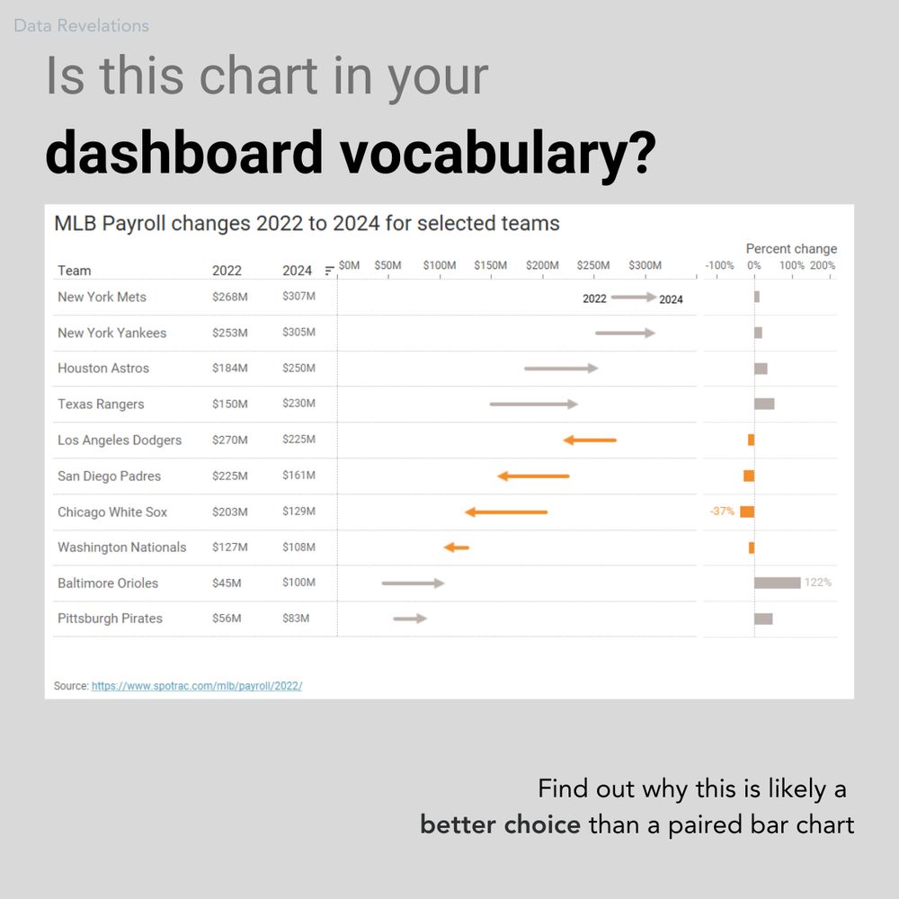
Hey, dashboard designers:
Is this chart in your chart vocabulary?
It's one of my favorite ways to show "now vs. then" along with percent change.
We'll examine this chart--and dozens--more in my upcoming dashboard design workshop May 27 and 29.
Learn more at buytickets.at/datarevelati...
Is this chart in your chart vocabulary?
It's one of my favorite ways to show "now vs. then" along with percent change.
We'll examine this chart--and dozens--more in my upcoming dashboard design workshop May 27 and 29.
Learn more at buytickets.at/datarevelati...
April 22, 2025 at 6:16 PM
Hey, dashboard designers:
Is this chart in your chart vocabulary?
It's one of my favorite ways to show "now vs. then" along with percent change.
We'll examine this chart--and dozens--more in my upcoming dashboard design workshop May 27 and 29.
Learn more at buytickets.at/datarevelati...
Is this chart in your chart vocabulary?
It's one of my favorite ways to show "now vs. then" along with percent change.
We'll examine this chart--and dozens--more in my upcoming dashboard design workshop May 27 and 29.
Learn more at buytickets.at/datarevelati...
FAVOR:
Please take this one-question survey. If my theory is correct, we'll have some interesting data to visualize.
www.surveymonkey.com/r/8BLVDW9
Please take this one-question survey. If my theory is correct, we'll have some interesting data to visualize.
www.surveymonkey.com/r/8BLVDW9
What do you think of anchovies?
Take this survey powered by surveymonkey.com. Create your own surveys for free.
www.surveymonkey.com
April 9, 2025 at 3:17 PM
FAVOR:
Please take this one-question survey. If my theory is correct, we'll have some interesting data to visualize.
www.surveymonkey.com/r/8BLVDW9
Please take this one-question survey. If my theory is correct, we'll have some interesting data to visualize.
www.surveymonkey.com/r/8BLVDW9
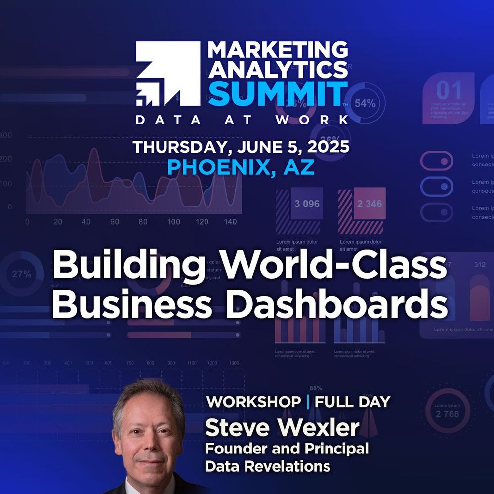
Not one but TWO dashboard design workshops coming up soon!
May 27 and 29 -- Online (two half-days).
June 5 -- In person as part of the Marketing Analytics Summit on Phoenix.
May: buytickets.at/datarevelati...
June: marketinganalyticssummit.com/workshop/bui...
May 27 and 29 -- Online (two half-days).
June 5 -- In person as part of the Marketing Analytics Summit on Phoenix.
May: buytickets.at/datarevelati...
June: marketinganalyticssummit.com/workshop/bui...
March 25, 2025 at 4:22 PM
Not one but TWO dashboard design workshops coming up soon!
May 27 and 29 -- Online (two half-days).
June 5 -- In person as part of the Marketing Analytics Summit on Phoenix.
May: buytickets.at/datarevelati...
June: marketinganalyticssummit.com/workshop/bui...
May 27 and 29 -- Online (two half-days).
June 5 -- In person as part of the Marketing Analytics Summit on Phoenix.
May: buytickets.at/datarevelati...
June: marketinganalyticssummit.com/workshop/bui...
I'm delighted that I will be presenting twice at the upcoming Tableau Conference.
1) **Visualizing Survey Data with Tableau** After a multi-year hiatus I'll be sharing what's new, what's stood the test of time, and what you absolutely need to know in order to excel in your survey data efforts.
1) **Visualizing Survey Data with Tableau** After a multi-year hiatus I'll be sharing what's new, what's stood the test of time, and what you absolutely need to know in order to excel in your survey data efforts.
March 17, 2025 at 3:57 PM
I'm delighted that I will be presenting twice at the upcoming Tableau Conference.
1) **Visualizing Survey Data with Tableau** After a multi-year hiatus I'll be sharing what's new, what's stood the test of time, and what you absolutely need to know in order to excel in your survey data efforts.
1) **Visualizing Survey Data with Tableau** After a multi-year hiatus I'll be sharing what's new, what's stood the test of time, and what you absolutely need to know in order to excel in your survey data efforts.
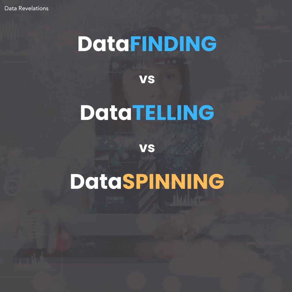
I'm agonizing over an essay I'm writing about storyFINDING vs. StoryTELLING vs StorySPINNING. I'm in the "it's easier to research than to write" phase. I came across this terrific post (and viewpoint) from @visualisingdata.com. See visualisingdata.com/2015/02/visu...
Is it the visualisation or the data we like? - Data Viz Excellence, Everywhere
I'm musing about this visualisation work that has received a lot of love and attention on blogs and social media over the past few days. Created by the excellent people in the Wall Street Journal grap...
visualisingdata.com
January 27, 2025 at 6:14 PM
I'm agonizing over an essay I'm writing about storyFINDING vs. StoryTELLING vs StorySPINNING. I'm in the "it's easier to research than to write" phase. I came across this terrific post (and viewpoint) from @visualisingdata.com. See visualisingdata.com/2015/02/visu...
I'm a big fan of @borowitzreport.bsky.social. He's a brilliant satirist.
This article pushed me past the tipping point. I encourage to you to read it and share with friends.
www.borowitzreport.com/p/time-to-un...
This article pushed me past the tipping point. I encourage to you to read it and share with friends.
www.borowitzreport.com/p/time-to-un...

My War with Facebook
Now it’s personal.
www.borowitzreport.com
January 27, 2025 at 1:21 AM
I'm a big fan of @borowitzreport.bsky.social. He's a brilliant satirist.
This article pushed me past the tipping point. I encourage to you to read it and share with friends.
www.borowitzreport.com/p/time-to-un...
This article pushed me past the tipping point. I encourage to you to read it and share with friends.
www.borowitzreport.com/p/time-to-un...
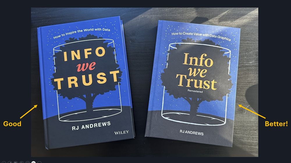
@infowetrust.com I'm grateful for the good you bring into the world.
And now with the updated and remastered version, you've brought some "better" into the world.
I encourage people to visit infowetrust.com
And now with the updated and remastered version, you've brought some "better" into the world.
I encourage people to visit infowetrust.com
January 22, 2025 at 10:26 PM
@infowetrust.com I'm grateful for the good you bring into the world.
And now with the updated and remastered version, you've brought some "better" into the world.
I encourage people to visit infowetrust.com
And now with the updated and remastered version, you've brought some "better" into the world.
I encourage people to visit infowetrust.com
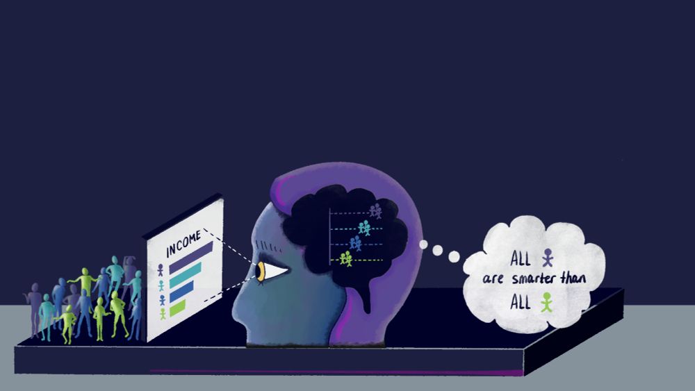
This just nails it.


January 19, 2025 at 6:42 PM
This just nails it.
In working with @abmakulec.bsky.social, Jeffrey Shaffer, and @acotgreave.bsky.social on our new book, I got to revisit this article from @elibryan.bsky.social .
He is seriously bad-ass.
Make sure to check out his other pieces for DVS Nightingale.
nightingaledvs.com/unfair-compa...
He is seriously bad-ass.
Make sure to check out his other pieces for DVS Nightingale.
nightingaledvs.com/unfair-compa...
Unfair Comparisons: How Visualizing Social Inequality Can Make It Worse - Nightingale
Our new research shows how popular chart choices can trigger unconscious social biases and reinforce systemic racism.
nightingaledvs.com
January 15, 2025 at 4:29 PM
In working with @abmakulec.bsky.social, Jeffrey Shaffer, and @acotgreave.bsky.social on our new book, I got to revisit this article from @elibryan.bsky.social .
He is seriously bad-ass.
Make sure to check out his other pieces for DVS Nightingale.
nightingaledvs.com/unfair-compa...
He is seriously bad-ass.
Make sure to check out his other pieces for DVS Nightingale.
nightingaledvs.com/unfair-compa...
We need your help!
Please take this two-question survey about whether you think most dashboards fail. I'm working with Jeff Shaffer, @acotgreave.bsky.social and @abmakulec.bsky.social and with just a few more responses we'll be able to narrow the margin of error.
www.surveymonkey.com/r/K6YGR6Z
Please take this two-question survey about whether you think most dashboards fail. I'm working with Jeff Shaffer, @acotgreave.bsky.social and @abmakulec.bsky.social and with just a few more responses we'll be able to narrow the margin of error.
www.surveymonkey.com/r/K6YGR6Z
Your Thoughts About Dashboards
Take this survey powered by surveymonkey.com. Create your own surveys for free.
www.surveymonkey.com
January 12, 2025 at 8:40 PM
We need your help!
Please take this two-question survey about whether you think most dashboards fail. I'm working with Jeff Shaffer, @acotgreave.bsky.social and @abmakulec.bsky.social and with just a few more responses we'll be able to narrow the margin of error.
www.surveymonkey.com/r/K6YGR6Z
Please take this two-question survey about whether you think most dashboards fail. I'm working with Jeff Shaffer, @acotgreave.bsky.social and @abmakulec.bsky.social and with just a few more responses we'll be able to narrow the margin of error.
www.surveymonkey.com/r/K6YGR6Z
I have no idea how Amazon's algorithm works, but the price for The Big Book of Dashboards is the lowest it's ever been (at least in the US.) www.amazon.com/dp/1119282713 @acotgreave.bsky.social
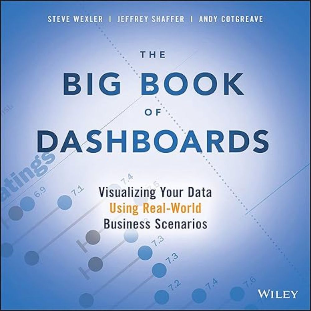
The Big Book of Dashboards: Visualizing Your Data Using Real-World Business Scenarios
The Big Book of Dashboards: Visualizing Your Data Using Real-World Business Scenarios: 9781119282716: Business Communication Books @ Amazon.com
www.amazon.com
January 10, 2025 at 6:52 PM
I have no idea how Amazon's algorithm works, but the price for The Big Book of Dashboards is the lowest it's ever been (at least in the US.) www.amazon.com/dp/1119282713 @acotgreave.bsky.social
If I only had 20 seconds to advise someone about color use in data visualization, it would be this. www.linkedin.com/pulse/haiku-...
@abmakulec.bsky.social @acotgreave.bsky.social
@abmakulec.bsky.social @acotgreave.bsky.social

A Haiku about color in data visualization
I think the number one infraction in data visualization is the misuse of color. If I were pressed for time and had to distill my recommendations on color into a Haiku, it would be this: Make everythin...
www.linkedin.com
January 8, 2025 at 3:25 PM
If I only had 20 seconds to advise someone about color use in data visualization, it would be this. www.linkedin.com/pulse/haiku-...
@abmakulec.bsky.social @acotgreave.bsky.social
@abmakulec.bsky.social @acotgreave.bsky.social
How often does a CHART play a pivotal role in a TV show?
This one from the Hulu mini-series "Dopesick" sure did.
We'll explore this and nine other charts from TV shows in our upcoming Chart Chat on December 12.
https://buff.ly/4irpEtP
This one from the Hulu mini-series "Dopesick" sure did.
We'll explore this and nine other charts from TV shows in our upcoming Chart Chat on December 12.
https://buff.ly/4irpEtP

December 10, 2024 at 2:15 PM
How often does a CHART play a pivotal role in a TV show?
This one from the Hulu mini-series "Dopesick" sure did.
We'll explore this and nine other charts from TV shows in our upcoming Chart Chat on December 12.
https://buff.ly/4irpEtP
This one from the Hulu mini-series "Dopesick" sure did.
We'll explore this and nine other charts from TV shows in our upcoming Chart Chat on December 12.
https://buff.ly/4irpEtP
Is this one of the best charts EVER shown on TV?
It's the infamous "pie chart of my favorite bars" from "How I Met Your Mother."
We'll look at this, and nine other delights in our upcoming Chart Chat Livestream on December 12. Join us!
https://buff.ly/4irpEtP
It's the infamous "pie chart of my favorite bars" from "How I Met Your Mother."
We'll look at this, and nine other delights in our upcoming Chart Chat Livestream on December 12. Join us!
https://buff.ly/4irpEtP

December 9, 2024 at 11:38 AM
Is this one of the best charts EVER shown on TV?
It's the infamous "pie chart of my favorite bars" from "How I Met Your Mother."
We'll look at this, and nine other delights in our upcoming Chart Chat Livestream on December 12. Join us!
https://buff.ly/4irpEtP
It's the infamous "pie chart of my favorite bars" from "How I Met Your Mother."
We'll look at this, and nine other delights in our upcoming Chart Chat Livestream on December 12. Join us!
https://buff.ly/4irpEtP