


Herzberg Design Co
@herzberg.bsky.social
The Type Foundry & Design Studio of Matthijs Herzberg.
Designed a book cover.


November 27, 2025 at 5:18 PM
Designed a book cover.
Reposted by Herzberg Design Co
Our final batch of 100 Tens features contributions from this brilliant bundle of designers:
Lucas Sharp
Matthijs Herzberg @herzberg.bsky.social
Nolan Pelletier @nolanpelletier.bsky.social
Craig Frazier
Oded Ezer
Christoph Niemann @christophniemann.bsky.social
Petra Dočekalová
Susan Kare…
Lucas Sharp
Matthijs Herzberg @herzberg.bsky.social
Nolan Pelletier @nolanpelletier.bsky.social
Craig Frazier
Oded Ezer
Christoph Niemann @christophniemann.bsky.social
Petra Dočekalová
Susan Kare…
October 28, 2025 at 5:44 AM
Our final batch of 100 Tens features contributions from this brilliant bundle of designers:
Lucas Sharp
Matthijs Herzberg @herzberg.bsky.social
Nolan Pelletier @nolanpelletier.bsky.social
Craig Frazier
Oded Ezer
Christoph Niemann @christophniemann.bsky.social
Petra Dočekalová
Susan Kare…
Lucas Sharp
Matthijs Herzberg @herzberg.bsky.social
Nolan Pelletier @nolanpelletier.bsky.social
Craig Frazier
Oded Ezer
Christoph Niemann @christophniemann.bsky.social
Petra Dočekalová
Susan Kare…
Here’s every typeface that I’m currently working on (to some degree or another). Hopeful that they’ll all see the finish line before I start drawing 2 dozen new ones. Which one are you most excited about?


October 7, 2025 at 6:13 PM
Here’s every typeface that I’m currently working on (to some degree or another). Hopeful that they’ll all see the finish line before I start drawing 2 dozen new ones. Which one are you most excited about?
The most minimalist “1” I could manage drawing, in honor of @letterformarchive.org’s 10th anniversary. I think that everyone in the typosphere has, at some point or another, benefitted from the Archive and its tireless efforts to preserve, showcase, and honor the mighty letterform.


October 6, 2025 at 5:39 PM
The most minimalist “1” I could manage drawing, in honor of @letterformarchive.org’s 10th anniversary. I think that everyone in the typosphere has, at some point or another, benefitted from the Archive and its tireless efforts to preserve, showcase, and honor the mighty letterform.
In use: Ubique, the new & custom house typeface for Foreign Affairs magazine. Here it is seeing the light of day for the first time in the July/August issue. #typedesign #caslon


August 29, 2025 at 3:41 PM
In use: Ubique, the new & custom house typeface for Foreign Affairs magazine. Here it is seeing the light of day for the first time in the July/August issue. #typedesign #caslon
Font WIP: Better Böcklin (better name yet to be workshopped).


August 27, 2025 at 4:34 PM
Font WIP: Better Böcklin (better name yet to be workshopped).
Wordmark redesign for Lore.


August 19, 2025 at 2:18 PM
Wordmark redesign for Lore.
Crisp italics, drawn in procreate.

July 23, 2025 at 4:14 PM
Crisp italics, drawn in procreate.
Lettering in 3 weights.


July 13, 2025 at 5:21 PM
Lettering in 3 weights.
“When in doubt, use Caslon”
Ubique is the new house typeface for Foreign Affairs Magazine, used in print and on their website for everything from headlines to paragraphs to footnotes.
Ubique is the new house typeface for Foreign Affairs Magazine, used in print and on their website for everything from headlines to paragraphs to footnotes.


July 8, 2025 at 5:36 PM
“When in doubt, use Caslon”
Ubique is the new house typeface for Foreign Affairs Magazine, used in print and on their website for everything from headlines to paragraphs to footnotes.
Ubique is the new house typeface for Foreign Affairs Magazine, used in print and on their website for everything from headlines to paragraphs to footnotes.
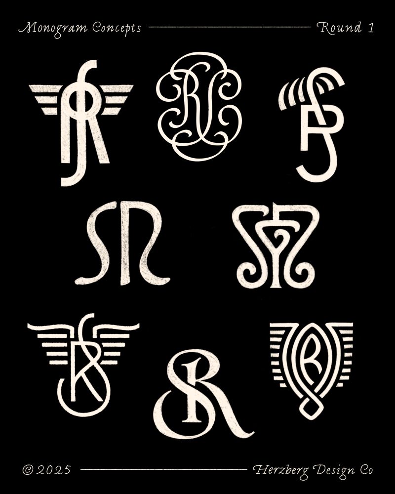
Two rounds of RS/RGS monograms + the final thing.


May 18, 2025 at 3:45 PM
Two rounds of RS/RGS monograms + the final thing.
I drew this handy guide for folks who, like me, keep forgetting the order of the alphabet

May 13, 2025 at 4:03 PM
I drew this handy guide for folks who, like me, keep forgetting the order of the alphabet
Goofballs shall inherit the earth!

May 6, 2025 at 3:31 PM
Goofballs shall inherit the earth!
“Drew an uppercase to this psychedelic blackletter” hmmm that’s not gonna take off.
“It’s the way I drew an uppercase to this psychedelic blackletter for me”
“It’s the way I drew an uppercase to this psychedelic blackletter for me”


May 5, 2025 at 3:27 PM
“Drew an uppercase to this psychedelic blackletter” hmmm that’s not gonna take off.
“It’s the way I drew an uppercase to this psychedelic blackletter for me”
“It’s the way I drew an uppercase to this psychedelic blackletter for me”
Southern Gothic, WIP blackletter with Width and Weight axes.


April 16, 2025 at 3:02 PM
Southern Gothic, WIP blackletter with Width and Weight axes.
Obviously the most pressing and urgent part of the website redesign I’m grinding on: drawing a 404 page.

March 29, 2025 at 7:31 PM
Obviously the most pressing and urgent part of the website redesign I’m grinding on: drawing a 404 page.
Mardi Gras rain break

March 7, 2025 at 7:46 PM
Mardi Gras rain break
A slide from tomorrow’s presentation on earning a living drawing shapes: last year’s shape-drawing income distribution.

February 19, 2025 at 1:10 AM
A slide from tomorrow’s presentation on earning a living drawing shapes: last year’s shape-drawing income distribution.
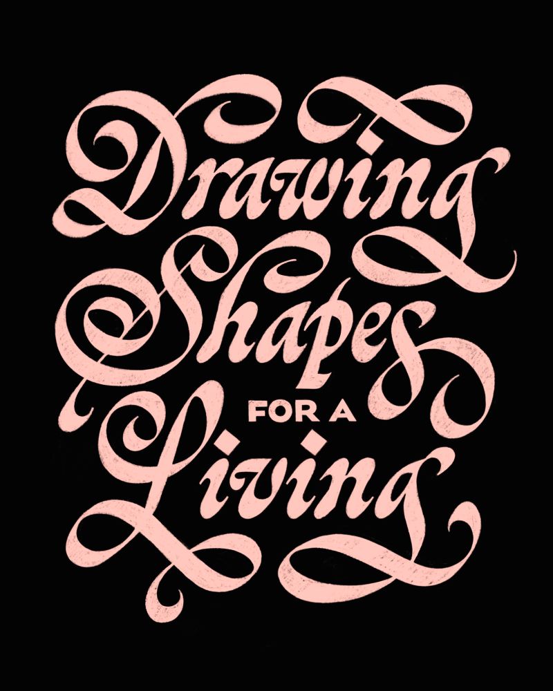
I’m presenting a lecture about my work and career as a shape-drawer at Loyola university here in New Orleans. Free entry, all are welcome. Nunemaker Auditorium, Wednesday February 19, 2025 from 4:55-6:10. See ya there!
February 13, 2025 at 4:29 PM
I’m presenting a lecture about my work and career as a shape-drawer at Loyola university here in New Orleans. Free entry, all are welcome. Nunemaker Auditorium, Wednesday February 19, 2025 from 4:55-6:10. See ya there!
Oops! All ornament

January 19, 2025 at 5:57 PM
Oops! All ornament
Last day of my last sale ever. Get it while you can. Herzbergdesign.com/fonts


December 2, 2024 at 2:59 PM
Last day of my last sale ever. Get it while you can. Herzbergdesign.com/fonts
30 percent off all my fonts on herzberg design dot com, applied automatically.
This is the last time I’m doing a black Friday sale, or any sale for that matter, so have at it!
This is the last time I’m doing a black Friday sale, or any sale for that matter, so have at it!

November 29, 2024 at 3:13 PM
30 percent off all my fonts on herzberg design dot com, applied automatically.
This is the last time I’m doing a black Friday sale, or any sale for that matter, so have at it!
This is the last time I’m doing a black Friday sale, or any sale for that matter, so have at it!
Reposted by Herzberg Design Co
Here’s 16 European towns, letter’ed by hand in Procreate in various Art Nouveau inspired styles. Goal here was not to imitate any existing lettering work from the period, but instead find new forms that still fit the style.


September 2, 2023 at 3:39 PM
Here’s 16 European towns, letter’ed by hand in Procreate in various Art Nouveau inspired styles. Goal here was not to imitate any existing lettering work from the period, but instead find new forms that still fit the style.
White on black just looks better. Miscellaneous lettering pieces from the archive, all drawn in Procreate.


November 25, 2024 at 9:31 PM
White on black just looks better. Miscellaneous lettering pieces from the archive, all drawn in Procreate.
KD & AZ monogram sketches


November 22, 2024 at 5:19 AM
KD & AZ monogram sketches