


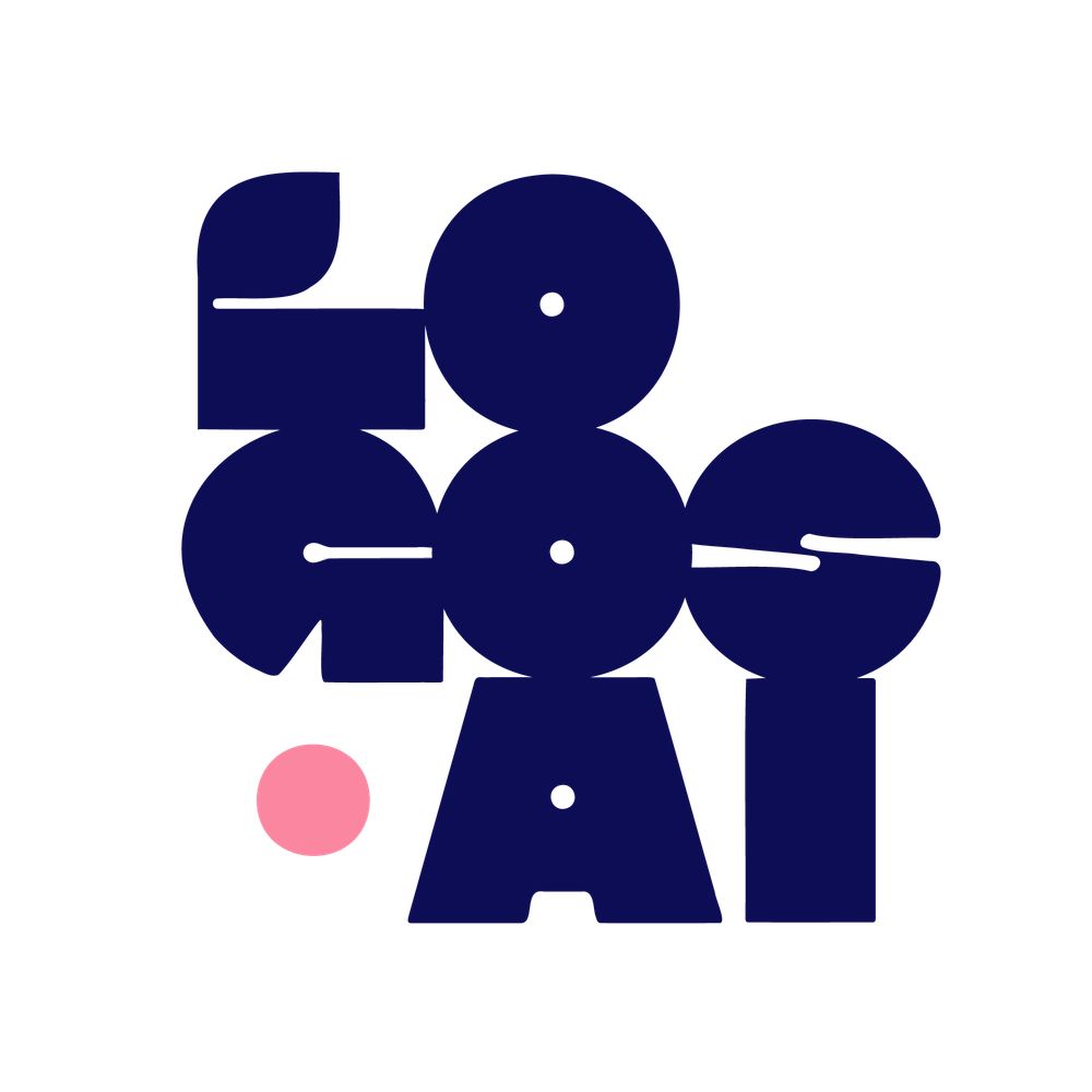
Branding for @passworldbibun 🗝️
They turned the 'b' into a keyhole to symbolize the shift from the rush of the world to a quiet inner pause. Design that feels like a deep breath.
Work by @ssmen.k @rohseeee @bobu.office
#graphicdesign #branding #typography #identity
They turned the 'b' into a keyhole to symbolize the shift from the rush of the world to a quiet inner pause. Design that feels like a deep breath.
Work by @ssmen.k @rohseeee @bobu.office
#graphicdesign #branding #typography #identity


February 10, 2026 at 1:18 PM
Branding for @passworldbibun 🗝️
They turned the 'b' into a keyhole to symbolize the shift from the rush of the world to a quiet inner pause. Design that feels like a deep breath.
Work by @ssmen.k @rohseeee @bobu.office
#graphicdesign #branding #typography #identity
They turned the 'b' into a keyhole to symbolize the shift from the rush of the world to a quiet inner pause. Design that feels like a deep breath.
Work by @ssmen.k @rohseeee @bobu.office
#graphicdesign #branding #typography #identity
Design meets neuroscience. CFC collaborated with Shinhan Life Care to launch Solache. Backed by KAIST cognitive research, we’ve created a biophilic identity and custom typography optimized for senior visual perception. Dignity through data.
@charryjeon #SeniorCare #Design
@charryjeon #SeniorCare #Design


February 10, 2026 at 9:32 AM
Design meets neuroscience. CFC collaborated with Shinhan Life Care to launch Solache. Backed by KAIST cognitive research, we’ve created a biophilic identity and custom typography optimized for senior visual perception. Dignity through data.
@charryjeon #SeniorCare #Design
@charryjeon #SeniorCare #Design
Brand work for @cokelanepizza. @sarahmoloneydesign
traded the expected for the edgy with a croc mascot that’s as confident as the food. Fun, gritty, and seriously bold branding for a serious slice.
📷 @cokelanepizza Design by @sarahmoloneydesign
#Branding #LogoDesign #Pizza
traded the expected for the edgy with a croc mascot that’s as confident as the food. Fun, gritty, and seriously bold branding for a serious slice.
📷 @cokelanepizza Design by @sarahmoloneydesign
#Branding #LogoDesign #Pizza


February 10, 2026 at 6:34 AM
Brand work for @cokelanepizza. @sarahmoloneydesign
traded the expected for the edgy with a croc mascot that’s as confident as the food. Fun, gritty, and seriously bold branding for a serious slice.
📷 @cokelanepizza Design by @sarahmoloneydesign
#Branding #LogoDesign #Pizza
traded the expected for the edgy with a croc mascot that’s as confident as the food. Fun, gritty, and seriously bold branding for a serious slice.
📷 @cokelanepizza Design by @sarahmoloneydesign
#Branding #LogoDesign #Pizza
Visualizing the "Scream." ⚡️
The identity for @gr1t0 by @manu_arza_ @jajajajaime @untipoconh and team is a pure transgression. Vertical type, sonic waves, and a DIY soul for the next era of fashion film.
Turn the volume up at gritofilms.com
#GraphicDesign #FashionContent #Typography #DIY
The identity for @gr1t0 by @manu_arza_ @jajajajaime @untipoconh and team is a pure transgression. Vertical type, sonic waves, and a DIY soul for the next era of fashion film.
Turn the volume up at gritofilms.com
#GraphicDesign #FashionContent #Typography #DIY


February 9, 2026 at 1:20 PM
Visualizing the "Scream." ⚡️
The identity for @gr1t0 by @manu_arza_ @jajajajaime @untipoconh and team is a pure transgression. Vertical type, sonic waves, and a DIY soul for the next era of fashion film.
Turn the volume up at gritofilms.com
#GraphicDesign #FashionContent #Typography #DIY
The identity for @gr1t0 by @manu_arza_ @jajajajaime @untipoconh and team is a pure transgression. Vertical type, sonic waves, and a DIY soul for the next era of fashion film.
Turn the volume up at gritofilms.com
#GraphicDesign #FashionContent #Typography #DIY
Design shouldn't just look good. It should move you. ☕️
For @coffee_keeep_on, @sampleanimal created a sharp, minimalist system where the roastery craft meets architectural intent. It’s not just a cafe. It’s a momentum shift.
#Branding #Design #CoffeeCulture #Typography
For @coffee_keeep_on, @sampleanimal created a sharp, minimalist system where the roastery craft meets architectural intent. It’s not just a cafe. It’s a momentum shift.
#Branding #Design #CoffeeCulture #Typography


February 9, 2026 at 7:25 AM
Design shouldn't just look good. It should move you. ☕️
For @coffee_keeep_on, @sampleanimal created a sharp, minimalist system where the roastery craft meets architectural intent. It’s not just a cafe. It’s a momentum shift.
#Branding #Design #CoffeeCulture #Typography
For @coffee_keeep_on, @sampleanimal created a sharp, minimalist system where the roastery craft meets architectural intent. It’s not just a cafe. It’s a momentum shift.
#Branding #Design #CoffeeCulture #Typography
How do you grow up without losing your soul? 🇫🇷
For @delajoie.editions, @odds.studio traded "pop energy" for "heritage weight." Inspired by mid-century Paris & Monet’s gardens, the new identity is a dialogue between 1940s craft and 2026 minimalism. A true evolution.
#Design #Branding
For @delajoie.editions, @odds.studio traded "pop energy" for "heritage weight." Inspired by mid-century Paris & Monet’s gardens, the new identity is a dialogue between 1940s craft and 2026 minimalism. A true evolution.
#Design #Branding


February 8, 2026 at 1:20 PM
@churroschurroses is proof that branding can turn a local shop into a lifestyle icon. Using Neue Montreal Ultra Squeezed and a chocolate-stained mascot, @wearepixelarte built an identity for the modern street-food era.
#HospitalityDesign #Branding
#HospitalityDesign #Branding


February 7, 2026 at 6:40 AM
@churroschurroses is proof that branding can turn a local shop into a lifestyle icon. Using Neue Montreal Ultra Squeezed and a chocolate-stained mascot, @wearepixelarte built an identity for the modern street-food era.
#HospitalityDesign #Branding
#HospitalityDesign #Branding
Rebranding @cadmus_io: Bridging the gap between EdTech and the prestige of global universities. 🎓
We traded SaaS clichés for Renaissance-inspired tones and a refined, kinetic quill logo. Sophisticated, holistic, and built for the modern academic.
Uplifting Assessment.
#Design
We traded SaaS clichés for Renaissance-inspired tones and a refined, kinetic quill logo. Sophisticated, holistic, and built for the modern academic.
Uplifting Assessment.
#Design


February 6, 2026 at 5:50 AM
Rebranding @cadmus_io: Bridging the gap between EdTech and the prestige of global universities. 🎓
We traded SaaS clichés for Renaissance-inspired tones and a refined, kinetic quill logo. Sophisticated, holistic, and built for the modern academic.
Uplifting Assessment.
#Design
We traded SaaS clichés for Renaissance-inspired tones and a refined, kinetic quill logo. Sophisticated, holistic, and built for the modern academic.
Uplifting Assessment.
#Design
Les Tchéroux: From a 1980s windsurfing club to a floating canteen. ⛱️
@studio_la_folie bypassed the "polished" look for raw flash photography and imperfect lines. A visual identity that’s alive, generous, and functional across menus and merch.
Design that feels like a core memory.
@studio_la_folie bypassed the "polished" look for raw flash photography and imperfect lines. A visual identity that’s alive, generous, and functional across menus and merch.
Design that feels like a core memory.


February 5, 2026 at 1:19 PM
Les Tchéroux: From a 1980s windsurfing club to a floating canteen. ⛱️
@studio_la_folie bypassed the "polished" look for raw flash photography and imperfect lines. A visual identity that’s alive, generous, and functional across menus and merch.
Design that feels like a core memory.
@studio_la_folie bypassed the "polished" look for raw flash photography and imperfect lines. A visual identity that’s alive, generous, and functional across menus and merch.
Design that feels like a core memory.
Your legacy brand is why you’re losing to agile startups.
@konpo.studio evolved ComPsych (130M+ users) by solving the Friction vs. Perfection paradox: moving from "static giant" to "digital authority."
Authority is felt through the absence of friction.
@konpo.studio evolved ComPsych (130M+ users) by solving the Friction vs. Perfection paradox: moving from "static giant" to "digital authority."
Authority is felt through the absence of friction.


February 4, 2026 at 1:20 PM
Your legacy brand is why you’re losing to agile startups.
@konpo.studio evolved ComPsych (130M+ users) by solving the Friction vs. Perfection paradox: moving from "static giant" to "digital authority."
Authority is felt through the absence of friction.
@konpo.studio evolved ComPsych (130M+ users) by solving the Friction vs. Perfection paradox: moving from "static giant" to "digital authority."
Authority is felt through the absence of friction.
Dairy is entering its High-Design era. 🧈✨ @regularpractice just leveled up @allthingsdairy__ from butter specialists to a full Brand World. No boring labels—just bold art by Eliza Robinson. Is cottage cheese officially cool now?
Save for 2026 inspo. 📂
#branding #packaging
Save for 2026 inspo. 📂
#branding #packaging


February 4, 2026 at 6:54 AM
Dairy is entering its High-Design era. 🧈✨ @regularpractice just leveled up @allthingsdairy__ from butter specialists to a full Brand World. No boring labels—just bold art by Eliza Robinson. Is cottage cheese officially cool now?
Save for 2026 inspo. 📂
#branding #packaging
Save for 2026 inspo. 📂
#branding #packaging
@unpeel.design created the conceptual body-care identity for Melabody, a brand designed specifically for melanin-rich skin.


February 3, 2026 at 2:13 PM
@unpeel.design created the conceptual body-care identity for Melabody, a brand designed specifically for melanin-rich skin.
Notice how @studio_drill and @danielevalluzzi approached Humo Maya. They didn't try to polish the street - they bottled the friction. Most brands fail because they’re too clean. They remove the "dirt" that actually holds the flavor, perfection is boring; authenticity is messy.


February 3, 2026 at 7:01 AM
Notice how @studio_drill and @danielevalluzzi approached Humo Maya. They didn't try to polish the street - they bottled the friction. Most brands fail because they’re too clean. They remove the "dirt" that actually holds the flavor, perfection is boring; authenticity is messy.
Stop building "accessible" brands; start building worlds. 🏛️
For La Cave D’Enfer, @guasca.studio traded flat design for a medieval guardian. A three-headed hound guarding the ritual of Jura wine & specialty coffee.
Guard your culture. 🍷🐕🦺
#Branding #WineCulture #France
For La Cave D’Enfer, @guasca.studio traded flat design for a medieval guardian. A three-headed hound guarding the ritual of Jura wine & specialty coffee.
Guard your culture. 🍷🐕🦺
#Branding #WineCulture #France


February 2, 2026 at 9:17 PM
Stop building "accessible" brands; start building worlds. 🏛️
For La Cave D’Enfer, @guasca.studio traded flat design for a medieval guardian. A three-headed hound guarding the ritual of Jura wine & specialty coffee.
Guard your culture. 🍷🐕🦺
#Branding #WineCulture #France
For La Cave D’Enfer, @guasca.studio traded flat design for a medieval guardian. A three-headed hound guarding the ritual of Jura wine & specialty coffee.
Guard your culture. 🍷🐕🦺
#Branding #WineCulture #France
By operating the space directly, @xyz.studio.ofcl turned "user feedback" into "visual language." They refined the symbol and wordmark to reflect the weight of stone and the glow of orange.
It’s not just a stay; it’s a cohesive ecosystem where the digital app feels exactly like the physical room.
It’s not just a stay; it’s a cohesive ecosystem where the digital app feels exactly like the physical room.


February 2, 2026 at 1:36 PM
By operating the space directly, @xyz.studio.ofcl turned "user feedback" into "visual language." They refined the symbol and wordmark to reflect the weight of stone and the glow of orange.
It’s not just a stay; it’s a cohesive ecosystem where the digital app feels exactly like the physical room.
It’s not just a stay; it’s a cohesive ecosystem where the digital app feels exactly like the physical room.
Is your brand a flat JPEG in a 4D world?
If you aren't designing for sensation, you’re just making noise. @smlxl.company builts liminal spaces, not layouts.
Depth: Use "Fictional Liminality"
Sensation: Design like a sonic landscape
Evolution: Move from 2D to multi-room
#Design #Spatial
If you aren't designing for sensation, you’re just making noise. @smlxl.company builts liminal spaces, not layouts.
Depth: Use "Fictional Liminality"
Sensation: Design like a sonic landscape
Evolution: Move from 2D to multi-room
#Design #Spatial
February 1, 2026 at 1:19 PM
Stop chasing immediate results. The brand for @rafajunkers, created by @essentis.studio, proves that aesthetics require planning and ethics. This visual identity prioritizes technical rigour and patient authenticity over hollow promises. Real design builds real trust.


February 1, 2026 at 7:27 AM
Stop chasing immediate results. The brand for @rafajunkers, created by @essentis.studio, proves that aesthetics require planning and ethics. This visual identity prioritizes technical rigour and patient authenticity over hollow promises. Real design builds real trust.
Some illustrations and creative process to go with their
Identity and celebrating their 25 years! by @cucaberenguer
Identity and celebrating their 25 years! by @cucaberenguer


January 31, 2026 at 8:30 PM
Some illustrations and creative process to go with their
Identity and celebrating their 25 years! by @cucaberenguer
Identity and celebrating their 25 years! by @cucaberenguer
Visual identity works best when it feels human. @gretelnyc built a brand for @finersounds that uses awkward lines to create warmth. Partners David Azzoni and Shota Iyobe prove that audio goods can be accessible and high-end at once.
Visit them at Ace Hotel Brooklyn.
Visit them at Ace Hotel Brooklyn.


January 31, 2026 at 7:28 AM
Visual identity works best when it feels human. @gretelnyc built a brand for @finersounds that uses awkward lines to create warmth. Partners David Azzoni and Shota Iyobe prove that audio goods can be accessible and high-end at once.
Visit them at Ace Hotel Brooklyn.
Visit them at Ace Hotel Brooklyn.
Visual identity must match product quality. @onyagency rebuilt the Gvalt brand platform to support global growth. By refining the brand architecture and typography, they created a system as sharp as the label's tailoring.


January 30, 2026 at 1:58 PM
Visual identity must match product quality. @onyagency rebuilt the Gvalt brand platform to support global growth. By refining the brand architecture and typography, they created a system as sharp as the label's tailoring.
@within.design.studio and HealthClub create a wellness brand based on the balance and momentum of real life.
In a world where keeping up is hard enough. HealthClub wanted a brand built around restraint, clarity and balance. Spanning positioning, brand identity, art direction and packaging.
In a world where keeping up is hard enough. HealthClub wanted a brand built around restraint, clarity and balance. Spanning positioning, brand identity, art direction and packaging.


January 29, 2026 at 2:34 PM
@within.design.studio and HealthClub create a wellness brand based on the balance and momentum of real life.
In a world where keeping up is hard enough. HealthClub wanted a brand built around restraint, clarity and balance. Spanning positioning, brand identity, art direction and packaging.
In a world where keeping up is hard enough. HealthClub wanted a brand built around restraint, clarity and balance. Spanning positioning, brand identity, art direction and packaging.
@thelabsaigon used real tomato sauce to brand Moa Moa Pasta Club. The visual identity by Giang Ho and Thinh Tran rejects boring tropes for bold woodtype and flour-dusted textures. Authentic, messy, and brilliant.


January 29, 2026 at 7:29 AM
@thelabsaigon used real tomato sauce to brand Moa Moa Pasta Club. The visual identity by Giang Ho and Thinh Tran rejects boring tropes for bold woodtype and flour-dusted textures. Authentic, messy, and brilliant.
Civic branding is usually boring. @SaintUrbain changed that for West Village Partnership. They built a visual identity and brand architecture rooted in community action. It turns a historic district into a shared experience. Bold, human, and functional.


January 28, 2026 at 2:13 PM
Civic branding is usually boring. @SaintUrbain changed that for West Village Partnership. They built a visual identity and brand architecture rooted in community action. It turns a historic district into a shared experience. Bold, human, and functional.
Stop using generic legal symbols.
@eiga_design built Rawen Legal a visual identity based on foresight and calm. A brand narrative that replaces clichés with actual perspective.
@eiga_design built Rawen Legal a visual identity based on foresight and calm. A brand narrative that replaces clichés with actual perspective.


January 28, 2026 at 7:27 AM
Stop using generic legal symbols.
@eiga_design built Rawen Legal a visual identity based on foresight and calm. A brand narrative that replaces clichés with actual perspective.
@eiga_design built Rawen Legal a visual identity based on foresight and calm. A brand narrative that replaces clichés with actual perspective.