


Minsheeee
@minsheeee.bsky.social
Design Tip: The Rule of Thirds
Balance is beautiful. ✨
- Divide your canvas into a 3x3 grid.
- Place key elements along the lines or intersections.
Creates visual harmony and draws the eye naturally.
🎨 #DesignTips #UXUI
Balance is beautiful. ✨
- Divide your canvas into a 3x3 grid.
- Place key elements along the lines or intersections.
Creates visual harmony and draws the eye naturally.
🎨 #DesignTips #UXUI
March 7, 2025 at 8:34 AM
Design Tip: The Rule of Thirds
Balance is beautiful. ✨
- Divide your canvas into a 3x3 grid.
- Place key elements along the lines or intersections.
Creates visual harmony and draws the eye naturally.
🎨 #DesignTips #UXUI
Balance is beautiful. ✨
- Divide your canvas into a 3x3 grid.
- Place key elements along the lines or intersections.
Creates visual harmony and draws the eye naturally.
🎨 #DesignTips #UXUI
The F-Pattern
Eyes don’t read—they scan. 👀
- Users typically read in an F-shaped pattern (top to bottom, left to right).
- Place key info at the top and left.
- Use headings, bullet points, and visuals to break up text.
Design for how people *actually* consume content. #UXDesign #DesignTips
Eyes don’t read—they scan. 👀
- Users typically read in an F-shaped pattern (top to bottom, left to right).
- Place key info at the top and left.
- Use headings, bullet points, and visuals to break up text.
Design for how people *actually* consume content. #UXDesign #DesignTips
March 5, 2025 at 8:08 AM
The F-Pattern
Eyes don’t read—they scan. 👀
- Users typically read in an F-shaped pattern (top to bottom, left to right).
- Place key info at the top and left.
- Use headings, bullet points, and visuals to break up text.
Design for how people *actually* consume content. #UXDesign #DesignTips
Eyes don’t read—they scan. 👀
- Users typically read in an F-shaped pattern (top to bottom, left to right).
- Place key info at the top and left.
- Use headings, bullet points, and visuals to break up text.
Design for how people *actually* consume content. #UXDesign #DesignTips
Design Tip : Hierarchy is Key
Guide your users with clear visual hierarchy. 🔑
- Size = importance (bigger elements grab attention first).
- Contrast = focus (use color and weight to differentiate).
- Alignment = order (keep it clean and organized).
What’s your hierarchy hack? Share below!
Guide your users with clear visual hierarchy. 🔑
- Size = importance (bigger elements grab attention first).
- Contrast = focus (use color and weight to differentiate).
- Alignment = order (keep it clean and organized).
What’s your hierarchy hack? Share below!
March 4, 2025 at 8:32 AM
Design Tip : Hierarchy is Key
Guide your users with clear visual hierarchy. 🔑
- Size = importance (bigger elements grab attention first).
- Contrast = focus (use color and weight to differentiate).
- Alignment = order (keep it clean and organized).
What’s your hierarchy hack? Share below!
Guide your users with clear visual hierarchy. 🔑
- Size = importance (bigger elements grab attention first).
- Contrast = focus (use color and weight to differentiate).
- Alignment = order (keep it clean and organized).
What’s your hierarchy hack? Share below!
Design Tips Day 5:
Whitespace isn’t empty—it’s essential.
- Improves readability and focus.
- Creates a sense of elegance and simplicity.
- Guides users through your design.
Remember: Less clutter = more impact. What’s your favorite example of great whitespace usage? 👇
#DesignTips #UXDesign
Whitespace isn’t empty—it’s essential.
- Improves readability and focus.
- Creates a sense of elegance and simplicity.
- Guides users through your design.
Remember: Less clutter = more impact. What’s your favorite example of great whitespace usage? 👇
#DesignTips #UXDesign
February 25, 2025 at 10:25 AM
Design Tips Day 5:
Whitespace isn’t empty—it’s essential.
- Improves readability and focus.
- Creates a sense of elegance and simplicity.
- Guides users through your design.
Remember: Less clutter = more impact. What’s your favorite example of great whitespace usage? 👇
#DesignTips #UXDesign
Whitespace isn’t empty—it’s essential.
- Improves readability and focus.
- Creates a sense of elegance and simplicity.
- Guides users through your design.
Remember: Less clutter = more impact. What’s your favorite example of great whitespace usage? 👇
#DesignTips #UXDesign
Design Tips Day 4:
Ever clicked a button and had no idea if it worked?
That’s Feedback ghosting you.
Good design gives you a clear response—like a color change, animation, or sound.
Bad design leaves you clicking repeatedly, wondering if the universe hates you. 🖱️👻 #UXDesign #DesignFeedback
Ever clicked a button and had no idea if it worked?
That’s Feedback ghosting you.
Good design gives you a clear response—like a color change, animation, or sound.
Bad design leaves you clicking repeatedly, wondering if the universe hates you. 🖱️👻 #UXDesign #DesignFeedback
February 16, 2025 at 6:31 PM
Design Tips Day 4:
Ever clicked a button and had no idea if it worked?
That’s Feedback ghosting you.
Good design gives you a clear response—like a color change, animation, or sound.
Bad design leaves you clicking repeatedly, wondering if the universe hates you. 🖱️👻 #UXDesign #DesignFeedback
Ever clicked a button and had no idea if it worked?
That’s Feedback ghosting you.
Good design gives you a clear response—like a color change, animation, or sound.
Bad design leaves you clicking repeatedly, wondering if the universe hates you. 🖱️👻 #UXDesign #DesignFeedback
Day 3 of Design Tips:
Ever used a door where you couldn’t tell if you should push, pull, or slide?
That’s Affordance failing you.
Good design whispers,
'Hey, dummy, this is how I work.'
Bad design just leaves you awkwardly yanking on a handle. 🚪🤦♂️
#UXDesign #Affordance
Ever used a door where you couldn’t tell if you should push, pull, or slide?
That’s Affordance failing you.
Good design whispers,
'Hey, dummy, this is how I work.'
Bad design just leaves you awkwardly yanking on a handle. 🚪🤦♂️
#UXDesign #Affordance
February 15, 2025 at 12:22 PM
Day 3 of Design Tips:
Ever used a door where you couldn’t tell if you should push, pull, or slide?
That’s Affordance failing you.
Good design whispers,
'Hey, dummy, this is how I work.'
Bad design just leaves you awkwardly yanking on a handle. 🚪🤦♂️
#UXDesign #Affordance
Ever used a door where you couldn’t tell if you should push, pull, or slide?
That’s Affordance failing you.
Good design whispers,
'Hey, dummy, this is how I work.'
Bad design just leaves you awkwardly yanking on a handle. 🚪🤦♂️
#UXDesign #Affordance
Day 2 of Design Tips:
Ever tried to read a website where everything is bold, flashing, and screaming for attention? That's Visual Hierarchy. If everything’s important, nothing is. Your eyes need a roadmap, not a tornado. 🌪️👀
#DesignTips #VisualHierarchy
Ever tried to read a website where everything is bold, flashing, and screaming for attention? That's Visual Hierarchy. If everything’s important, nothing is. Your eyes need a roadmap, not a tornado. 🌪️👀
#DesignTips #VisualHierarchy
February 14, 2025 at 7:53 AM
Day 2 of Design Tips:
Ever tried to read a website where everything is bold, flashing, and screaming for attention? That's Visual Hierarchy. If everything’s important, nothing is. Your eyes need a roadmap, not a tornado. 🌪️👀
#DesignTips #VisualHierarchy
Ever tried to read a website where everything is bold, flashing, and screaming for attention? That's Visual Hierarchy. If everything’s important, nothing is. Your eyes need a roadmap, not a tornado. 🌪️👀
#DesignTips #VisualHierarchy
Going to start sharing my ux knowledge in everyday terms.
Day 1: Ever stood in a coffee shop staring at 12 different latte options, wondering if you’re a caramel or vanilla person today?
That’s Hick’s Law: more choices = more time spent in making choices☕🤔
#UX #DesignThinking
Day 1: Ever stood in a coffee shop staring at 12 different latte options, wondering if you’re a caramel or vanilla person today?
That’s Hick’s Law: more choices = more time spent in making choices☕🤔
#UX #DesignThinking
February 12, 2025 at 11:56 PM
Going to start sharing my ux knowledge in everyday terms.
Day 1: Ever stood in a coffee shop staring at 12 different latte options, wondering if you’re a caramel or vanilla person today?
That’s Hick’s Law: more choices = more time spent in making choices☕🤔
#UX #DesignThinking
Day 1: Ever stood in a coffee shop staring at 12 different latte options, wondering if you’re a caramel or vanilla person today?
That’s Hick’s Law: more choices = more time spent in making choices☕🤔
#UX #DesignThinking
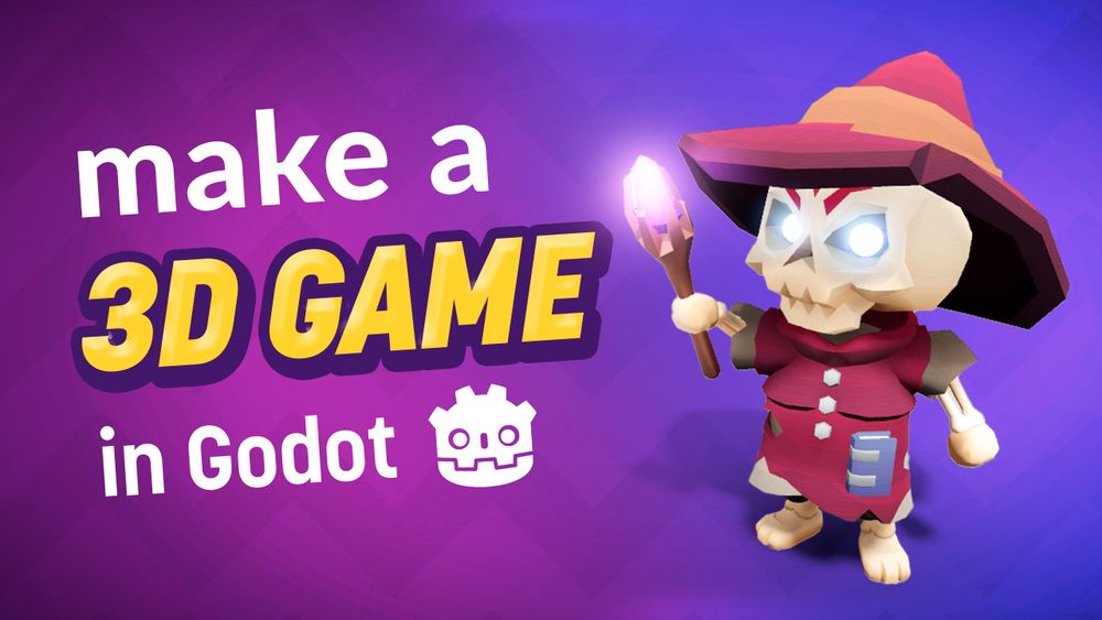
If you’ve never used godot this is a very good resource to get an intro to Godot 3D

Finally it's here... How to make 3D Games in Godot! 🌟 youtu.be/ke5KpqcoiIU #GodotEngine
February 11, 2025 at 9:58 PM
If you’ve never used godot this is a very good resource to get an intro to Godot 3D
Thinking of starting some freelance UX/UI work. Want me to look at your website and re-design for free?
February 11, 2025 at 8:47 PM
Thinking of starting some freelance UX/UI work. Want me to look at your website and re-design for free?