


Molinnaire
@molinnaire.bsky.social
Mid to Low Fantasy artist with a lot of ideas. 27 years old.
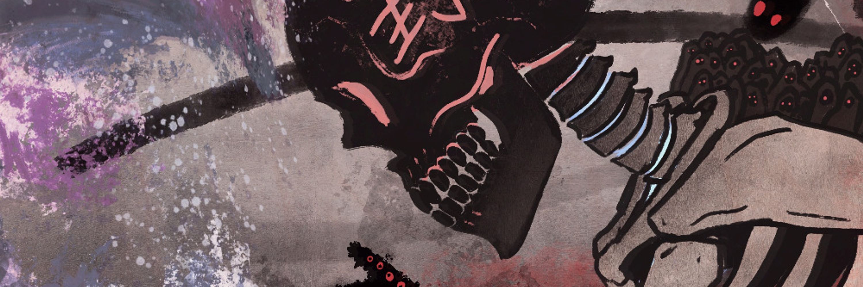
ANTIMO NANCY RAGNO - THE SPIDER
Shifty troublemaker with an arrogance to match the devil's own. They're a techie like Robin.
They steal and sabotage, then leave cryptic signatures so they know who it was. They love their little spider calling card.
They like being anon, see?
//
#art #alt #twink
Shifty troublemaker with an arrogance to match the devil's own. They're a techie like Robin.
They steal and sabotage, then leave cryptic signatures so they know who it was. They love their little spider calling card.
They like being anon, see?
//
#art #alt #twink


February 4, 2026 at 9:22 PM
SELLEN MCKENNA - THE WITCH
Member of a coven by birth and an interesting figure in her own right.
As luck would have it, she'd meet him again at the same place.
Was it luck? Pre-ordained?
...Something within her eyes says it could be the last time.
'Fore it's over
//
#art #witch #illustration
Member of a coven by birth and an interesting figure in her own right.
As luck would have it, she'd meet him again at the same place.
Was it luck? Pre-ordained?
...Something within her eyes says it could be the last time.
'Fore it's over
//
#art #witch #illustration


February 1, 2026 at 7:28 PM
SELLEN MCKENNA - THE WITCH
Member of a coven by birth and an interesting figure in her own right.
As luck would have it, she'd meet him again at the same place.
Was it luck? Pre-ordained?
...Something within her eyes says it could be the last time.
'Fore it's over
//
#art #witch #illustration
Member of a coven by birth and an interesting figure in her own right.
As luck would have it, she'd meet him again at the same place.
Was it luck? Pre-ordained?
...Something within her eyes says it could be the last time.
'Fore it's over
//
#art #witch #illustration
THE PROTÉGÉ
"I-I don't panic! The Offensive is just very specific and requires a certain set of steps to conjure...!"
Eloise doubts herself a lot. Her brilliance is a double edged sword. What's an ocean but an infinite pit to those aware of the depths?
//
#fantasyart #art #goth #characterdesign
"I-I don't panic! The Offensive is just very specific and requires a certain set of steps to conjure...!"
Eloise doubts herself a lot. Her brilliance is a double edged sword. What's an ocean but an infinite pit to those aware of the depths?
//
#fantasyart #art #goth #characterdesign


January 28, 2026 at 10:03 PM
THE PROTÉGÉ
"I-I don't panic! The Offensive is just very specific and requires a certain set of steps to conjure...!"
Eloise doubts herself a lot. Her brilliance is a double edged sword. What's an ocean but an infinite pit to those aware of the depths?
//
#fantasyart #art #goth #characterdesign
"I-I don't panic! The Offensive is just very specific and requires a certain set of steps to conjure...!"
Eloise doubts herself a lot. Her brilliance is a double edged sword. What's an ocean but an infinite pit to those aware of the depths?
//
#fantasyart #art #goth #characterdesign
THE DARKHAND
"Yeah... Almost got expelled for this. Still wanna know what the Observer can do?"
Ludwig Plümacher, one of the two Nightrovers under High Professor Luneste's command.
Considered a danger, but mostly just antisocial.
//
#digitalart #fantasyart #art #illustration #characterdesign
"Yeah... Almost got expelled for this. Still wanna know what the Observer can do?"
Ludwig Plümacher, one of the two Nightrovers under High Professor Luneste's command.
Considered a danger, but mostly just antisocial.
//
#digitalart #fantasyart #art #illustration #characterdesign


January 23, 2026 at 10:32 PM
THE DARKHAND
"Yeah... Almost got expelled for this. Still wanna know what the Observer can do?"
Ludwig Plümacher, one of the two Nightrovers under High Professor Luneste's command.
Considered a danger, but mostly just antisocial.
//
#digitalart #fantasyart #art #illustration #characterdesign
"Yeah... Almost got expelled for this. Still wanna know what the Observer can do?"
Ludwig Plümacher, one of the two Nightrovers under High Professor Luneste's command.
Considered a danger, but mostly just antisocial.
//
#digitalart #fantasyart #art #illustration #characterdesign
THE GIRL WITH DEAD EYES
"Some say a mortician is a voice for the dead, but for me, that may be a bit more literal..."
Lily, truly her father's daughter as they both see the dead.
However, neither can do anything about it.
//
#digitalart #fantasyart #Steampunk #illustration #art #dress #horror
"Some say a mortician is a voice for the dead, but for me, that may be a bit more literal..."
Lily, truly her father's daughter as they both see the dead.
However, neither can do anything about it.
//
#digitalart #fantasyart #Steampunk #illustration #art #dress #horror


January 18, 2026 at 9:44 PM
THE GIRL WITH DEAD EYES
"Some say a mortician is a voice for the dead, but for me, that may be a bit more literal..."
Lily, truly her father's daughter as they both see the dead.
However, neither can do anything about it.
//
#digitalart #fantasyart #Steampunk #illustration #art #dress #horror
"Some say a mortician is a voice for the dead, but for me, that may be a bit more literal..."
Lily, truly her father's daughter as they both see the dead.
However, neither can do anything about it.
//
#digitalart #fantasyart #Steampunk #illustration #art #dress #horror
THE CRIMSON VEIL
"That's your plan...? Fine, let's go. ...Of course I'm fine with it. It's not my job to debate your bad ideas, Pho--it's to make sure you survive them."
A Christmas Present I made for a dear friend.
//
#fantasyart #digitalart #charactersheet #art
"That's your plan...? Fine, let's go. ...Of course I'm fine with it. It's not my job to debate your bad ideas, Pho--it's to make sure you survive them."
A Christmas Present I made for a dear friend.
//
#fantasyart #digitalart #charactersheet #art


January 8, 2026 at 9:00 PM
THE CRIMSON VEIL
"That's your plan...? Fine, let's go. ...Of course I'm fine with it. It's not my job to debate your bad ideas, Pho--it's to make sure you survive them."
A Christmas Present I made for a dear friend.
//
#fantasyart #digitalart #charactersheet #art
"That's your plan...? Fine, let's go. ...Of course I'm fine with it. It's not my job to debate your bad ideas, Pho--it's to make sure you survive them."
A Christmas Present I made for a dear friend.
//
#fantasyart #digitalart #charactersheet #art
THE OUTSIDER
“Imagine crawling through hell, never knowing if you’ll see tomorrow, only to discover that the rest of the world was at peace—none the wiser. I won’t let the fallen be forgotten; they deserved to see this, more than I.”
- Mathilda Blair
//
#art #digitalart #fantasy
“Imagine crawling through hell, never knowing if you’ll see tomorrow, only to discover that the rest of the world was at peace—none the wiser. I won’t let the fallen be forgotten; they deserved to see this, more than I.”
- Mathilda Blair
//
#art #digitalart #fantasy


January 4, 2026 at 11:03 PM
THE OUTSIDER
“Imagine crawling through hell, never knowing if you’ll see tomorrow, only to discover that the rest of the world was at peace—none the wiser. I won’t let the fallen be forgotten; they deserved to see this, more than I.”
- Mathilda Blair
//
#art #digitalart #fantasy
“Imagine crawling through hell, never knowing if you’ll see tomorrow, only to discover that the rest of the world was at peace—none the wiser. I won’t let the fallen be forgotten; they deserved to see this, more than I.”
- Mathilda Blair
//
#art #digitalart #fantasy
THE TORCHBEARER
"Spirits old and new gather around this spot, and it is my sworn oath to keep them at peace."
Hagiwara Lian, adventurer and errand girl. Her personality does not reflect it, but she is passionate, kindhearted, and patient, even if she can come across as aloof.
//
#digitalart #art
"Spirits old and new gather around this spot, and it is my sworn oath to keep them at peace."
Hagiwara Lian, adventurer and errand girl. Her personality does not reflect it, but she is passionate, kindhearted, and patient, even if she can come across as aloof.
//
#digitalart #art


December 22, 2025 at 8:57 PM
THE TORCHBEARER
"Spirits old and new gather around this spot, and it is my sworn oath to keep them at peace."
Hagiwara Lian, adventurer and errand girl. Her personality does not reflect it, but she is passionate, kindhearted, and patient, even if she can come across as aloof.
//
#digitalart #art
"Spirits old and new gather around this spot, and it is my sworn oath to keep them at peace."
Hagiwara Lian, adventurer and errand girl. Her personality does not reflect it, but she is passionate, kindhearted, and patient, even if she can come across as aloof.
//
#digitalart #art
ONI 鬼
Haruna Hantaa, the Oni.
She is a person of tradition who does not like the thought of being cybernetically enhanced, but she acts the part of a vigilante wielding her family's heirloom sword.
A commission, for her.
//
#digitalart #art #characterdesign #Commission #cyberpunk #scifiart
Haruna Hantaa, the Oni.
She is a person of tradition who does not like the thought of being cybernetically enhanced, but she acts the part of a vigilante wielding her family's heirloom sword.
A commission, for her.
//
#digitalart #art #characterdesign #Commission #cyberpunk #scifiart


December 16, 2025 at 11:54 PM
ONI 鬼
Haruna Hantaa, the Oni.
She is a person of tradition who does not like the thought of being cybernetically enhanced, but she acts the part of a vigilante wielding her family's heirloom sword.
A commission, for her.
//
#digitalart #art #characterdesign #Commission #cyberpunk #scifiart
Haruna Hantaa, the Oni.
She is a person of tradition who does not like the thought of being cybernetically enhanced, but she acts the part of a vigilante wielding her family's heirloom sword.
A commission, for her.
//
#digitalart #art #characterdesign #Commission #cyberpunk #scifiart
PLETHORA OF CYBERWARE
Juliet Levine, better known as Jules. A Mox with some moxxie.
A commission for a friend.
//
#digitalart #Cyberpunk2077 #characterdesign #art #scifiart #catgirl #OC #conceptart
Juliet Levine, better known as Jules. A Mox with some moxxie.
A commission for a friend.
//
#digitalart #Cyberpunk2077 #characterdesign #art #scifiart #catgirl #OC #conceptart


December 7, 2025 at 6:11 PM
PLETHORA OF CYBERWARE
Juliet Levine, better known as Jules. A Mox with some moxxie.
A commission for a friend.
//
#digitalart #Cyberpunk2077 #characterdesign #art #scifiart #catgirl #OC #conceptart
Juliet Levine, better known as Jules. A Mox with some moxxie.
A commission for a friend.
//
#digitalart #Cyberpunk2077 #characterdesign #art #scifiart #catgirl #OC #conceptart
THE HACKER
"I mean, I expected better. Not gonna complain though."
Robin Zachary Faust, IT specialist for the Goethe Devils. Thanks to his dry wit, gloomy charm, and know-how, he earned himself a place amongst the Devils.
//
#digitalart #art #emo #characterdesign #drawing
"I mean, I expected better. Not gonna complain though."
Robin Zachary Faust, IT specialist for the Goethe Devils. Thanks to his dry wit, gloomy charm, and know-how, he earned himself a place amongst the Devils.
//
#digitalart #art #emo #characterdesign #drawing


December 2, 2025 at 8:44 PM
THE HACKER
"I mean, I expected better. Not gonna complain though."
Robin Zachary Faust, IT specialist for the Goethe Devils. Thanks to his dry wit, gloomy charm, and know-how, he earned himself a place amongst the Devils.
//
#digitalart #art #emo #characterdesign #drawing
"I mean, I expected better. Not gonna complain though."
Robin Zachary Faust, IT specialist for the Goethe Devils. Thanks to his dry wit, gloomy charm, and know-how, he earned himself a place amongst the Devils.
//
#digitalart #art #emo #characterdesign #drawing
THE HERO
"I-I chose to be a knight! And that is what's important. I-I made a choice."
- Lady Sigrid Wym
//
#digitalart #fantasyart #portrait #KnightArt #magic #characterdesign #painting
"I-I chose to be a knight! And that is what's important. I-I made a choice."
- Lady Sigrid Wym
//
#digitalart #fantasyart #portrait #KnightArt #magic #characterdesign #painting


November 26, 2025 at 7:40 PM
THE HERO
"I-I chose to be a knight! And that is what's important. I-I made a choice."
- Lady Sigrid Wym
//
#digitalart #fantasyart #portrait #KnightArt #magic #characterdesign #painting
"I-I chose to be a knight! And that is what's important. I-I made a choice."
- Lady Sigrid Wym
//
#digitalart #fantasyart #portrait #KnightArt #magic #characterdesign #painting
THE GLOAM
"Nothing matters. And that is great."
- Frigg Alberich Plümacher
//
#digitalart #fantasy #portrait #art #painting #characterdesign #conceptart
"Nothing matters. And that is great."
- Frigg Alberich Plümacher
//
#digitalart #fantasy #portrait #art #painting #characterdesign #conceptart


November 23, 2025 at 6:25 PM
THE GLOAM
"Nothing matters. And that is great."
- Frigg Alberich Plümacher
//
#digitalart #fantasy #portrait #art #painting #characterdesign #conceptart
"Nothing matters. And that is great."
- Frigg Alberich Plümacher
//
#digitalart #fantasy #portrait #art #painting #characterdesign #conceptart
Show me how you draw armor! If you'd like.


November 20, 2025 at 8:14 PM
Show me how you draw armor! If you'd like.
THE STARCALLER
"Milords, miladies; there is no path surer than picking a star that sings to you, and following its light."
- Osric Finnegan
//
#digitalart #art #fantasyart #illustration #portrait
"Milords, miladies; there is no path surer than picking a star that sings to you, and following its light."
- Osric Finnegan
//
#digitalart #art #fantasyart #illustration #portrait


November 20, 2025 at 7:53 PM
THE STARCALLER
"Milords, miladies; there is no path surer than picking a star that sings to you, and following its light."
- Osric Finnegan
//
#digitalart #art #fantasyart #illustration #portrait
"Milords, miladies; there is no path surer than picking a star that sings to you, and following its light."
- Osric Finnegan
//
#digitalart #art #fantasyart #illustration #portrait
THE SPY
"Don't be afraid to dirty up the halo; so says the devilish little elephant in the room."
- Seichi von Tiefhölle
//
#digitalart #fantasyart #demon #girl #art #cute
"Don't be afraid to dirty up the halo; so says the devilish little elephant in the room."
- Seichi von Tiefhölle
//
#digitalart #fantasyart #demon #girl #art #cute


November 16, 2025 at 8:54 PM
THE SPY
"Don't be afraid to dirty up the halo; so says the devilish little elephant in the room."
- Seichi von Tiefhölle
//
#digitalart #fantasyart #demon #girl #art #cute
"Don't be afraid to dirty up the halo; so says the devilish little elephant in the room."
- Seichi von Tiefhölle
//
#digitalart #fantasyart #demon #girl #art #cute
THE CRITIC
"It is truly impossible to have a correct perspective; just the most agreed upon."
- Heo Soo-Hyun
//
#digitalart #portrait #fantasyart #drawing #illustration
"It is truly impossible to have a correct perspective; just the most agreed upon."
- Heo Soo-Hyun
//
#digitalart #portrait #fantasyart #drawing #illustration


November 13, 2025 at 12:03 AM
THE CRITIC
"It is truly impossible to have a correct perspective; just the most agreed upon."
- Heo Soo-Hyun
//
#digitalart #portrait #fantasyart #drawing #illustration
"It is truly impossible to have a correct perspective; just the most agreed upon."
- Heo Soo-Hyun
//
#digitalart #portrait #fantasyart #drawing #illustration
THE PRODIGY
"Brilliant, I'd say; and surprisingly light. Oh, so is my sword."
- Alicia Edward Krause III Bellerose von Elysium
//
#digitalart #portrait #characterdesign #illustration #art #paiting #drawing
"Brilliant, I'd say; and surprisingly light. Oh, so is my sword."
- Alicia Edward Krause III Bellerose von Elysium
//
#digitalart #portrait #characterdesign #illustration #art #paiting #drawing


November 4, 2025 at 11:05 PM
THE PRODIGY
"Brilliant, I'd say; and surprisingly light. Oh, so is my sword."
- Alicia Edward Krause III Bellerose von Elysium
//
#digitalart #portrait #characterdesign #illustration #art #paiting #drawing
"Brilliant, I'd say; and surprisingly light. Oh, so is my sword."
- Alicia Edward Krause III Bellerose von Elysium
//
#digitalart #portrait #characterdesign #illustration #art #paiting #drawing
FROM THE METEORHALL
The scion of the Meteorhall, a title as decorative as the stones which are mined from this night-time paradise.
The home of sorcery, in a way.
And all the stars rain down, for man to know the wonders of the cosmos
//
#digitalart #drawing #art #characterdesign
The scion of the Meteorhall, a title as decorative as the stones which are mined from this night-time paradise.
The home of sorcery, in a way.
And all the stars rain down, for man to know the wonders of the cosmos
//
#digitalart #drawing #art #characterdesign


October 29, 2025 at 9:47 PM
FROM THE METEORHALL
The scion of the Meteorhall, a title as decorative as the stones which are mined from this night-time paradise.
The home of sorcery, in a way.
And all the stars rain down, for man to know the wonders of the cosmos
//
#digitalart #drawing #art #characterdesign
The scion of the Meteorhall, a title as decorative as the stones which are mined from this night-time paradise.
The home of sorcery, in a way.
And all the stars rain down, for man to know the wonders of the cosmos
//
#digitalart #drawing #art #characterdesign
DRAGONSLAYERS - THE SPELLSWORD
Alicia Bellerose, the prodigy of the Academy. Though she bears quite the burden to match her father's success, she wants to do so on her own terms - and has to.
The difference between genius and insanity is results.
//
#digitalart #sketch #art #oc #characterdesign
Alicia Bellerose, the prodigy of the Academy. Though she bears quite the burden to match her father's success, she wants to do so on her own terms - and has to.
The difference between genius and insanity is results.
//
#digitalart #sketch #art #oc #characterdesign


October 26, 2025 at 5:07 PM
DRAGONSLAYERS - THE SPELLSWORD
Alicia Bellerose, the prodigy of the Academy. Though she bears quite the burden to match her father's success, she wants to do so on her own terms - and has to.
The difference between genius and insanity is results.
//
#digitalart #sketch #art #oc #characterdesign
Alicia Bellerose, the prodigy of the Academy. Though she bears quite the burden to match her father's success, she wants to do so on her own terms - and has to.
The difference between genius and insanity is results.
//
#digitalart #sketch #art #oc #characterdesign
DRAGONSLAYERS - THE WIZARD
Frigg Plümacher, underachiever of the Solvognish Academy. Her family life remains rather mysterious. Considered a weird girl. Given her inclinations, little surprise she wields Dark.
Perhaps she prefers it this way.
//
#digitalart #art #fantasy #sketch
Frigg Plümacher, underachiever of the Solvognish Academy. Her family life remains rather mysterious. Considered a weird girl. Given her inclinations, little surprise she wields Dark.
Perhaps she prefers it this way.
//
#digitalart #art #fantasy #sketch


October 19, 2025 at 11:29 PM
DRAGONSLAYERS - THE WIZARD
Frigg Plümacher, underachiever of the Solvognish Academy. Her family life remains rather mysterious. Considered a weird girl. Given her inclinations, little surprise she wields Dark.
Perhaps she prefers it this way.
//
#digitalart #art #fantasy #sketch
Frigg Plümacher, underachiever of the Solvognish Academy. Her family life remains rather mysterious. Considered a weird girl. Given her inclinations, little surprise she wields Dark.
Perhaps she prefers it this way.
//
#digitalart #art #fantasy #sketch
DRAGONSLAYERS - THE KNIGHT
Lady Sigrid Wym, aspiring knight who has been sent to the Solvognish Academy.
She is a passionate warrior who wants to dedicate her life to being a hero like in the bardic tales.
Chivalry is not dead, just anxious.
//
#digitalart #fantasy #sketch #art #characterdesign
Lady Sigrid Wym, aspiring knight who has been sent to the Solvognish Academy.
She is a passionate warrior who wants to dedicate her life to being a hero like in the bardic tales.
Chivalry is not dead, just anxious.
//
#digitalart #fantasy #sketch #art #characterdesign


October 15, 2025 at 7:38 PM
DRAGONSLAYERS - THE KNIGHT
Lady Sigrid Wym, aspiring knight who has been sent to the Solvognish Academy.
She is a passionate warrior who wants to dedicate her life to being a hero like in the bardic tales.
Chivalry is not dead, just anxious.
//
#digitalart #fantasy #sketch #art #characterdesign
Lady Sigrid Wym, aspiring knight who has been sent to the Solvognish Academy.
She is a passionate warrior who wants to dedicate her life to being a hero like in the bardic tales.
Chivalry is not dead, just anxious.
//
#digitalart #fantasy #sketch #art #characterdesign
DRAGONSLAYERS - THE ROGUE
Seichi von Tiefhölle, a name sometimes echoed in lore.
She is an enigmatic traveler from a far off land, finding herself in Solvognen on a mission. What this mission is, only she knows
The devil is in the details with her
//
#art #sketch #characterdesign #digitalart
Seichi von Tiefhölle, a name sometimes echoed in lore.
She is an enigmatic traveler from a far off land, finding herself in Solvognen on a mission. What this mission is, only she knows
The devil is in the details with her
//
#art #sketch #characterdesign #digitalart


October 10, 2025 at 11:02 PM
DRAGONSLAYERS - THE ROGUE
Seichi von Tiefhölle, a name sometimes echoed in lore.
She is an enigmatic traveler from a far off land, finding herself in Solvognen on a mission. What this mission is, only she knows
The devil is in the details with her
//
#art #sketch #characterdesign #digitalart
Seichi von Tiefhölle, a name sometimes echoed in lore.
She is an enigmatic traveler from a far off land, finding herself in Solvognen on a mission. What this mission is, only she knows
The devil is in the details with her
//
#art #sketch #characterdesign #digitalart
DAWN-LIGHT-ON-HER-THREADS
Orsina, an Anadi who prefers to keep to the shadows. Often labels herself as a "Trash Witch," due to her tatters.
If one looks closely, they can see tiny seams on her skin - remnants of an imperfect guise.
For @bibliophileemi.bsky.social !
//
#digitalart #art #ttrpg
Orsina, an Anadi who prefers to keep to the shadows. Often labels herself as a "Trash Witch," due to her tatters.
If one looks closely, they can see tiny seams on her skin - remnants of an imperfect guise.
For @bibliophileemi.bsky.social !
//
#digitalart #art #ttrpg


October 4, 2025 at 10:16 PM
DAWN-LIGHT-ON-HER-THREADS
Orsina, an Anadi who prefers to keep to the shadows. Often labels herself as a "Trash Witch," due to her tatters.
If one looks closely, they can see tiny seams on her skin - remnants of an imperfect guise.
For @bibliophileemi.bsky.social !
//
#digitalart #art #ttrpg
Orsina, an Anadi who prefers to keep to the shadows. Often labels herself as a "Trash Witch," due to her tatters.
If one looks closely, they can see tiny seams on her skin - remnants of an imperfect guise.
For @bibliophileemi.bsky.social !
//
#digitalart #art #ttrpg
JUNO, VERSED IN THE OCCULT
Your every choice. Your every thought. Your every move - all preordained for you to become a vessel for He who will call down the new world.
But... What if you grow to love your monster?
Can you bring yourself to kill your only child?
//
#digitalart #art #dark #ritual
Your every choice. Your every thought. Your every move - all preordained for you to become a vessel for He who will call down the new world.
But... What if you grow to love your monster?
Can you bring yourself to kill your only child?
//
#digitalart #art #dark #ritual


September 29, 2025 at 8:16 PM
JUNO, VERSED IN THE OCCULT
Your every choice. Your every thought. Your every move - all preordained for you to become a vessel for He who will call down the new world.
But... What if you grow to love your monster?
Can you bring yourself to kill your only child?
//
#digitalart #art #dark #ritual
Your every choice. Your every thought. Your every move - all preordained for you to become a vessel for He who will call down the new world.
But... What if you grow to love your monster?
Can you bring yourself to kill your only child?
//
#digitalart #art #dark #ritual