


Shari07
@parnshari07.bsky.social
ป่านศรีคนเดิม เพิ่มเติมคือไม่แยกแอค
🇹🇭🇺🇸(Fan)artist / freelance / teacher
Find me more : shari07.carrd.co
[Original] Chaser : http://bit.ly/3eA9ptQ
My belove : X (clamp)/ 封神 supremacy !
Artworks : #ShariStorage
Do not repost my art without credits
🇹🇭🇺🇸(Fan)artist / freelance / teacher
Find me more : shari07.carrd.co
[Original] Chaser : http://bit.ly/3eA9ptQ
My belove : X (clamp)/ 封神 supremacy !
Artworks : #ShariStorage
Do not repost my art without credits
Pinned
Shari07
@parnshari07.bsky.social
· Oct 21


🔹ป่านศรี/Shari07🔹
EN below
งานสอนภาษาเป็นหลัก งานวาดเป็นรองค่ะ❤️ (เปิด CMS/วาดออริ)
ด้อมหลักเป็น X (clamp) งานออริคือ Chaser -เกมล่าพระเจ้า- แท็กงานคือ #ShariStorage
Hi, it's Shari07
Mutuals from Clampdom may know as "Shari" --- idoit who loves X and FuuKam. Feel free to follow me here for clamp/X rants as ever🥰!
EN below
งานสอนภาษาเป็นหลัก งานวาดเป็นรองค่ะ❤️ (เปิด CMS/วาดออริ)
ด้อมหลักเป็น X (clamp) งานออริคือ Chaser -เกมล่าพระเจ้า- แท็กงานคือ #ShariStorage
Hi, it's Shari07
Mutuals from Clampdom may know as "Shari" --- idoit who loves X and FuuKam. Feel free to follow me here for clamp/X rants as ever🥰!
I need to ask Nokoru how he treats them....
(let's see Kamui's bed, Subaru's, and Sorata's...)
(let's see Kamui's bed, Subaru's, and Sorata's...)


November 25, 2025 at 2:06 PM
I need to ask Nokoru how he treats them....
(let's see Kamui's bed, Subaru's, and Sorata's...)
(let's see Kamui's bed, Subaru's, and Sorata's...)
Ok.... Listen to me...
If Angelic Layer is the next series
.. i don't think it'll keep Mokona-sensei that busy....
I still bet on they doing another work...(🤣)
If Angelic Layer is the next series
.. i don't think it'll keep Mokona-sensei that busy....
I still bet on they doing another work...(🤣)
November 18, 2025 at 6:50 AM
Ok.... Listen to me...
If Angelic Layer is the next series
.. i don't think it'll keep Mokona-sensei that busy....
I still bet on they doing another work...(🤣)
If Angelic Layer is the next series
.. i don't think it'll keep Mokona-sensei that busy....
I still bet on they doing another work...(🤣)
Speaking of which
... Tokyo Babylon is the one that hasn't been on LINE wallpaper, right?
(I don't count TRC!Seishirou for TB)
... Tokyo Babylon is the one that hasn't been on LINE wallpaper, right?
(I don't count TRC!Seishirou for TB)
November 18, 2025 at 6:49 AM
Speaking of which
... Tokyo Babylon is the one that hasn't been on LINE wallpaper, right?
(I don't count TRC!Seishirou for TB)
... Tokyo Babylon is the one that hasn't been on LINE wallpaper, right?
(I don't count TRC!Seishirou for TB)
It seems both Kodansha and Kadokawa keeps their "longest series" for the last card...
So i wonder what the meaning of throwing X so early...
So i wonder what the meaning of throwing X so early...
November 18, 2025 at 6:49 AM
It seems both Kodansha and Kadokawa keeps their "longest series" for the last card...
So i wonder what the meaning of throwing X so early...
So i wonder what the meaning of throwing X so early...
First!! Starting with BD/DVD----😂
November 4, 2025 at 2:50 AM
First!! Starting with BD/DVD----😂
Young ace!!! Come on!!! (😂)
They haven't updated furokus in next issue yet...
They haven't updated furokus in next issue yet...
November 4, 2025 at 2:48 AM
Young ace!!! Come on!!! (😂)
They haven't updated furokus in next issue yet...
They haven't updated furokus in next issue yet...
The new holic chapter is very surprising....
i mean... the number of pages....
😂
i mean... the number of pages....
😂
November 3, 2025 at 3:23 PM
The new holic chapter is very surprising....
i mean... the number of pages....
😂
i mean... the number of pages....
😂
Young Ace killed another title....
come onnnnnnnnnnnnn
come onnnnnnnnnnnnn
November 3, 2025 at 3:10 PM
Young Ace killed another title....
come onnnnnnnnnnnnn
come onnnnnnnnnnnnn
Reposted by Shari07
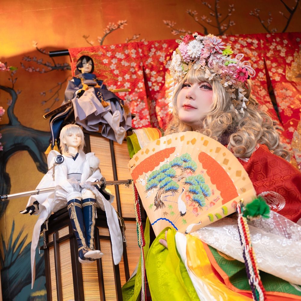
ลืมลงในนี้ (อเกน)
แล้วพบกัน ณ #CA10 #ComicAvenue10
บูธ O15-16 วันเสาร์เท่านั้น #CA10_SAT
หนังสือกิโมโนสอง แฟนฟิคหนึ่ง แฟนอาร์ตแอนด์โฟโต้บุ๊คสอง
แล้วพบกันค่า
แล้วพบกัน ณ #CA10 #ComicAvenue10
บูธ O15-16 วันเสาร์เท่านั้น #CA10_SAT
หนังสือกิโมโนสอง แฟนฟิคหนึ่ง แฟนอาร์ตแอนด์โฟโต้บุ๊คสอง
แล้วพบกันค่า


October 29, 2025 at 12:20 PM
ลืมลงในนี้ (อเกน)
แล้วพบกัน ณ #CA10 #ComicAvenue10
บูธ O15-16 วันเสาร์เท่านั้น #CA10_SAT
หนังสือกิโมโนสอง แฟนฟิคหนึ่ง แฟนอาร์ตแอนด์โฟโต้บุ๊คสอง
แล้วพบกันค่า
แล้วพบกัน ณ #CA10 #ComicAvenue10
บูธ O15-16 วันเสาร์เท่านั้น #CA10_SAT
หนังสือกิโมโนสอง แฟนฟิคหนึ่ง แฟนอาร์ตแอนด์โฟโต้บุ๊คสอง
แล้วพบกันค่า
happy to see X18.5 is going on♥
October 24, 2025 at 1:46 PM
happy to see X18.5 is going on♥
maybe Yuuko asked TRC!Fuuma to bring all these back for her😂

October 20, 2025 at 1:16 PM
maybe Yuuko asked TRC!Fuuma to bring all these back for her😂
it's just my high copium again😂
but i'm happy to see TRC!Fuuma working for Watanuki... (which i can't understand why he has to PAY back that much..)
Watanuki isn't like Yuuko... and to obtain objects from other dimensions... maybe TRC!Fuuma is the only choice by now (not including Syaoran gang...)
but i'm happy to see TRC!Fuuma working for Watanuki... (which i can't understand why he has to PAY back that much..)
Watanuki isn't like Yuuko... and to obtain objects from other dimensions... maybe TRC!Fuuma is the only choice by now (not including Syaoran gang...)
October 20, 2025 at 1:10 PM
it's just my high copium again😂
but i'm happy to see TRC!Fuuma working for Watanuki... (which i can't understand why he has to PAY back that much..)
Watanuki isn't like Yuuko... and to obtain objects from other dimensions... maybe TRC!Fuuma is the only choice by now (not including Syaoran gang...)
but i'm happy to see TRC!Fuuma working for Watanuki... (which i can't understand why he has to PAY back that much..)
Watanuki isn't like Yuuko... and to obtain objects from other dimensions... maybe TRC!Fuuma is the only choice by now (not including Syaoran gang...)
only Momo joined Holic as characters from other series by far ... it'd be fun to see more later😂
(i missed my Amazon boy too LOL)
(i missed my Amazon boy too LOL)
October 20, 2025 at 1:08 PM
only Momo joined Holic as characters from other series by far ... it'd be fun to see more later😂
(i missed my Amazon boy too LOL)
(i missed my Amazon boy too LOL)
I really LOVE the fact that Kadokawa intentionally "save" the title for"X"
Even the original manga has been terminated to replace with CPC edition, they only used the title "CPC X" everywhere...🥰 not even included both version in the same tag (kadostore)
there's only place using "X" -- Kadocomi 😂
Even the original manga has been terminated to replace with CPC edition, they only used the title "CPC X" everywhere...🥰 not even included both version in the same tag (kadostore)
there's only place using "X" -- Kadocomi 😂
October 20, 2025 at 4:51 AM
I really LOVE the fact that Kadokawa intentionally "save" the title for"X"
Even the original manga has been terminated to replace with CPC edition, they only used the title "CPC X" everywhere...🥰 not even included both version in the same tag (kadostore)
there's only place using "X" -- Kadocomi 😂
Even the original manga has been terminated to replace with CPC edition, they only used the title "CPC X" everywhere...🥰 not even included both version in the same tag (kadostore)
there's only place using "X" -- Kadocomi 😂
I'm proud of you Mokona-sensei, all the girls are gorgeous again✨✨
btw, when will i see men from you again....that's what i hope to see the most LOL
btw, when will i see men from you again....that's what i hope to see the most LOL
October 19, 2025 at 3:25 PM
I'm proud of you Mokona-sensei, all the girls are gorgeous again✨✨
btw, when will i see men from you again....that's what i hope to see the most LOL
btw, when will i see men from you again....that's what i hope to see the most LOL
tbh, what i want the most right now...
is X BD/DVD--- both movie and tv series-----
is X BD/DVD--- both movie and tv series-----
October 19, 2025 at 1:25 PM
tbh, what i want the most right now...
is X BD/DVD--- both movie and tv series-----
is X BD/DVD--- both movie and tv series-----
Since the 1st time they revealed the key visual of its 15th anniversary... Now, they're gonna start "the celebration" next month...but.. 7 series have been killed off..
Is it the time---?? Pleaseee🤣🤣🤣🤞
Is it the time---?? Pleaseee🤣🤣🤣🤞

October 18, 2025 at 5:33 PM
Since the 1st time they revealed the key visual of its 15th anniversary... Now, they're gonna start "the celebration" next month...but.. 7 series have been killed off..
Is it the time---?? Pleaseee🤣🤣🤣🤞
Is it the time---?? Pleaseee🤣🤣🤣🤞
Ok, listen, i speak truly from my POV,
I think Kadokawa is sneakly "preparing" something related to "X"
🤣...it doesn't mean it should be very secretive... But they're working without any notices by now...+
I think Kadokawa is sneakly "preparing" something related to "X"
🤣...it doesn't mean it should be very secretive... But they're working without any notices by now...+
October 14, 2025 at 2:31 PM
Ok, listen, i speak truly from my POV,
I think Kadokawa is sneakly "preparing" something related to "X"
🤣...it doesn't mean it should be very secretive... But they're working without any notices by now...+
I think Kadokawa is sneakly "preparing" something related to "X"
🤣...it doesn't mean it should be very secretive... But they're working without any notices by now...+
..another one has left Young Ace---- and X is still there with the same info---😂 (TBA, serialized, stay in the corner---)
c'mon kadokawa, don't let me down---
c'mon kadokawa, don't let me down---

October 14, 2025 at 12:43 PM
..another one has left Young Ace---- and X is still there with the same info---😂 (TBA, serialized, stay in the corner---)
c'mon kadokawa, don't let me down---
c'mon kadokawa, don't let me down---
with all of these... i am so surprised everytime seeing how well Kadokawa treats clamp...
Clamp with
Kodansha's :
- cpc with campaigb
- clearcard anime
- mkr anime
- holic manga
Kadokawa:
...........
🥹🥹🥹🥹
Kodansha's :
- cpc with campaigb
- clearcard anime
- mkr anime
- holic manga
Kadokawa:
...........
🥹🥹🥹🥹
October 14, 2025 at 12:41 PM
with all of these... i am so surprised everytime seeing how well Kadokawa treats clamp...
TB cpc is likely out of print all now
CSD cpc is seemingly stable // always stocked
X is the one that has the most running... but right now, it seems they slowly restock or they might think it's time to stop circulation --
CSD cpc is seemingly stable // always stocked
X is the one that has the most running... but right now, it seems they slowly restock or they might think it's time to stop circulation --
October 14, 2025 at 3:31 AM
TB cpc is likely out of print all now
CSD cpc is seemingly stable // always stocked
X is the one that has the most running... but right now, it seems they slowly restock or they might think it's time to stop circulation --
CSD cpc is seemingly stable // always stocked
X is the one that has the most running... but right now, it seems they slowly restock or they might think it's time to stop circulation --
Clamp with
Kodansha's :
- cpc with campaigb
- clearcard anime
- mkr anime
- holic manga
Kadokawa:
...........
🥹🥹🥹🥹
Kodansha's :
- cpc with campaigb
- clearcard anime
- mkr anime
- holic manga
Kadokawa:
...........
🥹🥹🥹🥹
October 14, 2025 at 3:17 AM
Clamp with
Kodansha's :
- cpc with campaigb
- clearcard anime
- mkr anime
- holic manga
Kadokawa:
...........
🥹🥹🥹🥹
Kodansha's :
- cpc with campaigb
- clearcard anime
- mkr anime
- holic manga
Kadokawa:
...........
🥹🥹🥹🥹
Btw, is clamp really to leave for "calendar" like this??🤣
Both MKR and CXS have no any new arts at all....
For real???🤣
Both MKR and CXS have no any new arts at all....
For real???🤣
October 11, 2025 at 5:51 PM
Btw, is clamp really to leave for "calendar" like this??🤣
Both MKR and CXS have no any new arts at all....
For real???🤣
Both MKR and CXS have no any new arts at all....
For real???🤣
Come to think of it,...
Kodansha's side seems to be more "strict" on the rule of "full body"...
While they seem to be more flexible with Kadokawa's 🤣..
(X has no rule at all-- CSD is so playful)
Kodansha's side seems to be more "strict" on the rule of "full body"...
While they seem to be more flexible with Kadokawa's 🤣..
(X has no rule at all-- CSD is so playful)
October 11, 2025 at 5:49 PM
Come to think of it,...
Kodansha's side seems to be more "strict" on the rule of "full body"...
While they seem to be more flexible with Kadokawa's 🤣..
(X has no rule at all-- CSD is so playful)
Kodansha's side seems to be more "strict" on the rule of "full body"...
While they seem to be more flexible with Kadokawa's 🤣..
(X has no rule at all-- CSD is so playful)
if we're gonna talk about how great Clamp art was back then, i'll use this illust...
very sexy by just looking into their eyes...
very sexy by just looking into their eyes...

October 10, 2025 at 3:49 PM
if we're gonna talk about how great Clamp art was back then, i'll use this illust...
very sexy by just looking into their eyes...
very sexy by just looking into their eyes...