


Parween
@parween.bsky.social
✦ Graphic Designer who enjoys boba, Digimon, & cute things. ✧ COMMS WAITLIST OPEN
Social Links: http://parweenie.carrd.co Comms : http://vgen.co/Parween
Social Links: http://parweenie.carrd.co Comms : http://vgen.co/Parween
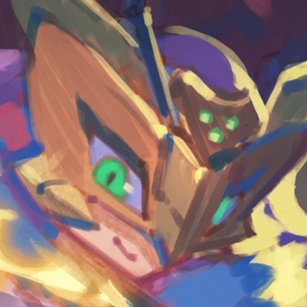
The apps are open! Go hydrate because you’ll need all the mental fortitude to choose your top Digigirls.

January 8, 2026 at 7:02 PM
The apps are open! Go hydrate because you’ll need all the mental fortitude to choose your top Digigirls.

Just a friendly reminder that I will be raising my prices next year. So if you are thinking about commissioning me and wanting to keep my current rates my waitlist is open. If you change your mind, you may cancel the waitlist at any time!
✦ ANNOUNCEMENT ✧
I will be raising my prices for commissions next year. The change won’t be drastically high but if you'd like to keep my current prices my Waitlist for all services will open.
✦ I won’t start on the commissions until next year.
✧ Waitlist will close at the end of 2025.
I will be raising my prices for commissions next year. The change won’t be drastically high but if you'd like to keep my current prices my Waitlist for all services will open.
✦ I won’t start on the commissions until next year.
✧ Waitlist will close at the end of 2025.

December 21, 2025 at 10:13 PM
Just a friendly reminder that I will be raising my prices next year. So if you are thinking about commissioning me and wanting to keep my current rates my waitlist is open. If you change your mind, you may cancel the waitlist at any time!
Reposted by Parween

umm just a hunch but I think u should pay attention to this account in the new year... might be something happening....
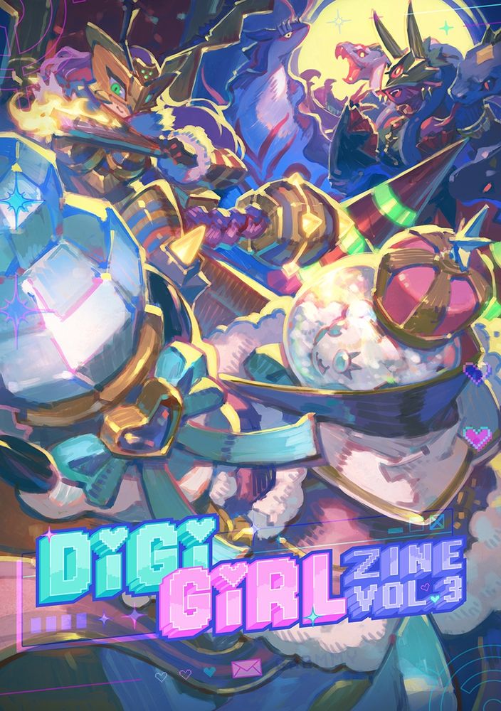
💙🩷💜 The DigiGirl Zine Vol.3 is here! 💙🩷💜
Enjoy over 180 unique illustrations in celebration of Odaiba Memorial Day and our fandom's talented artists
You can download the zine in the link below, it's completely free!
Enjoy over 180 unique illustrations in celebration of Odaiba Memorial Day and our fandom's talented artists
You can download the zine in the link below, it's completely free!
December 18, 2025 at 1:20 PM
umm just a hunch but I think u should pay attention to this account in the new year... might be something happening....
Reposted by Parween
I normally don’t like posting WIPs because it feels like I am revealing spoilers.
But this is just a fan logo, so here is a sneak peek!
But this is just a fan logo, so here is a sneak peek!

November 14, 2025 at 8:51 PM
I normally don’t like posting WIPs because it feels like I am revealing spoilers.
But this is just a fan logo, so here is a sneak peek!
But this is just a fan logo, so here is a sneak peek!
I normally don’t like posting WIPs because it feels like I am revealing spoilers.
But this is just a fan logo, so here is a sneak peek!
But this is just a fan logo, so here is a sneak peek!
November 14, 2025 at 8:51 PM
I normally don’t like posting WIPs because it feels like I am revealing spoilers.
But this is just a fan logo, so here is a sneak peek!
But this is just a fan logo, so here is a sneak peek!
Reposted by Parween

my current merch guide is up! 🎨✨
if you'd like to learn all about making merch and how to get started, please check it out- and feel free to ask me any questions c:
ko-fi.com/post/2025202...
if you'd like to learn all about making merch and how to get started, please check it out- and feel free to ask me any questions c:
ko-fi.com/post/2025202...

2025/2026 merch guide!
Rae published a post on Ko-fi
ko-fi.com
November 3, 2025 at 12:50 AM
my current merch guide is up! 🎨✨
if you'd like to learn all about making merch and how to get started, please check it out- and feel free to ask me any questions c:
ko-fi.com/post/2025202...
if you'd like to learn all about making merch and how to get started, please check it out- and feel free to ask me any questions c:
ko-fi.com/post/2025202...
✦ ANNOUNCEMENT ✧
I will be raising my prices for commissions next year. The change won’t be drastically high but if you'd like to keep my current prices my Waitlist for all services will open.
✦ I won’t start on the commissions until next year.
✧ Waitlist will close at the end of 2025.
I will be raising my prices for commissions next year. The change won’t be drastically high but if you'd like to keep my current prices my Waitlist for all services will open.
✦ I won’t start on the commissions until next year.
✧ Waitlist will close at the end of 2025.
October 22, 2025 at 5:19 AM
✦ ANNOUNCEMENT ✧
I will be raising my prices for commissions next year. The change won’t be drastically high but if you'd like to keep my current prices my Waitlist for all services will open.
✦ I won’t start on the commissions until next year.
✧ Waitlist will close at the end of 2025.
I will be raising my prices for commissions next year. The change won’t be drastically high but if you'd like to keep my current prices my Waitlist for all services will open.
✦ I won’t start on the commissions until next year.
✧ Waitlist will close at the end of 2025.
✦ LOGO DESIGN SHOWCASE ✧
These logos designs were made for
@zennydeer.bsky.social
Thank you once again for entrusting me to make your logo, emblem and patterns!
♡ + ↻ are appreciated!
#parweendesign
These logos designs were made for
@zennydeer.bsky.social
Thank you once again for entrusting me to make your logo, emblem and patterns!
♡ + ↻ are appreciated!
#parweendesign


September 17, 2025 at 7:33 PM
✦ LOGO DESIGN SHOWCASE ✧
These logos designs were made for
@zennydeer.bsky.social
Thank you once again for entrusting me to make your logo, emblem and patterns!
♡ + ↻ are appreciated!
#parweendesign
These logos designs were made for
@zennydeer.bsky.social
Thank you once again for entrusting me to make your logo, emblem and patterns!
♡ + ↻ are appreciated!
#parweendesign
✦ ASSETS SHOWCASE ✧
You thought it was over? It's never over. Some of the assets I made for the zine can be downloaded in my vgen or kofi for FREE.
Ferris wheels not included. Just showing them off, haha
#Digimon #デジモン
vgen.co/Parween/prod...
ko-fi.com/s/00ac317e15
You thought it was over? It's never over. Some of the assets I made for the zine can be downloaded in my vgen or kofi for FREE.
Ferris wheels not included. Just showing them off, haha
#Digimon #デジモン
vgen.co/Parween/prod...
ko-fi.com/s/00ac317e15


August 1, 2025 at 9:08 PM
✦ ASSETS SHOWCASE ✧
You thought it was over? It's never over. Some of the assets I made for the zine can be downloaded in my vgen or kofi for FREE.
Ferris wheels not included. Just showing them off, haha
#Digimon #デジモン
vgen.co/Parween/prod...
ko-fi.com/s/00ac317e15
You thought it was over? It's never over. Some of the assets I made for the zine can be downloaded in my vgen or kofi for FREE.
Ferris wheels not included. Just showing them off, haha
#Digimon #デジモン
vgen.co/Parween/prod...
ko-fi.com/s/00ac317e15


Reposted by Parween

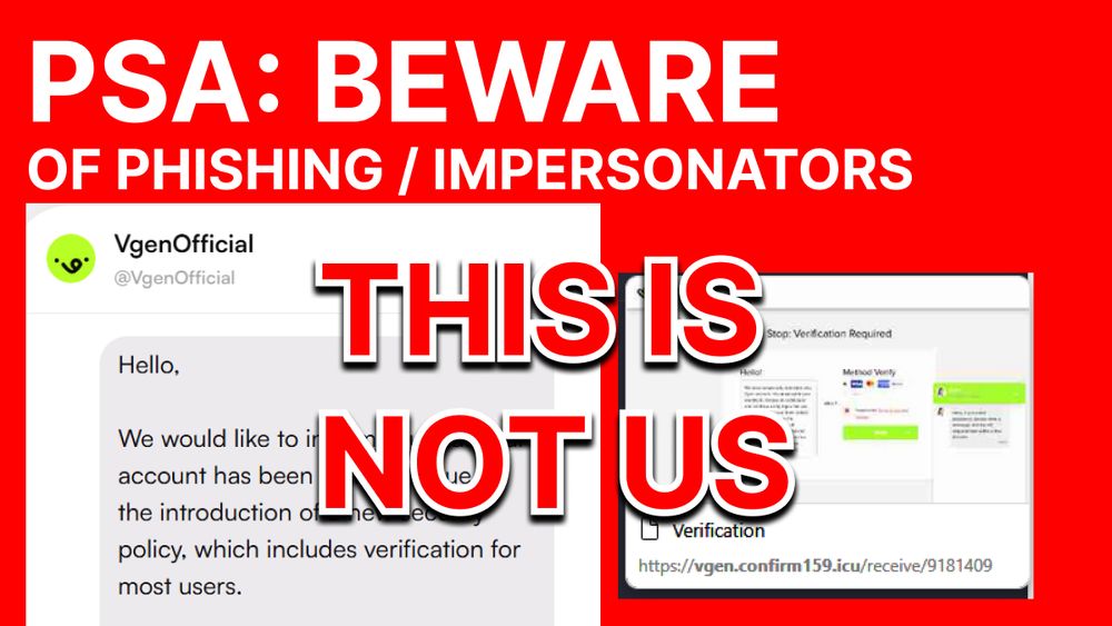
⚠️ PLEASE STAY SAFE ⚠️
We've been notified of accounts claiming to be VGen staff through DMs on-site. THEY ARE NOT US. Please report them if you encounter any of these.
We've been notified of accounts claiming to be VGen staff through DMs on-site. THEY ARE NOT US. Please report them if you encounter any of these.
July 2, 2025 at 9:36 PM
⚠️ PLEASE STAY SAFE ⚠️
We've been notified of accounts claiming to be VGen staff through DMs on-site. THEY ARE NOT US. Please report them if you encounter any of these.
We've been notified of accounts claiming to be VGen staff through DMs on-site. THEY ARE NOT US. Please report them if you encounter any of these.
Reposted by Parween
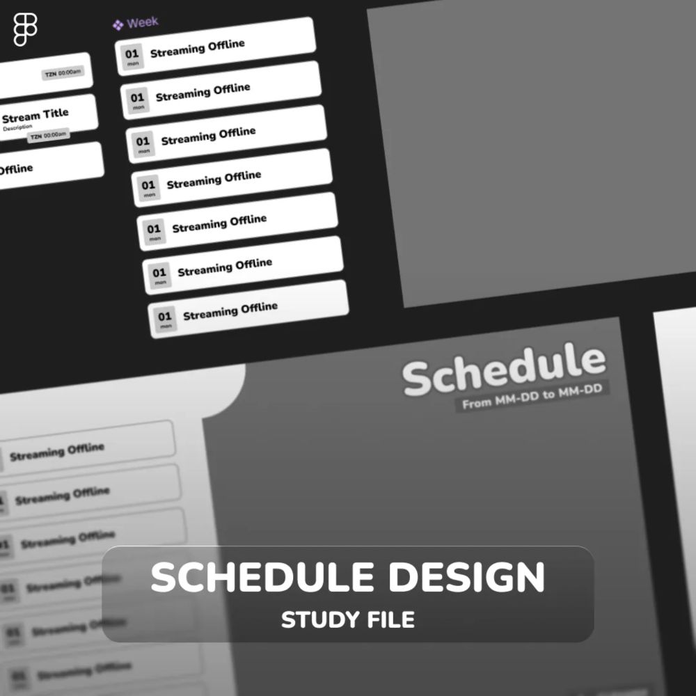
Made a free Figma study file for creating editable schedules—just like I do for my clients!
Super beginner-friendly, no Figma experience needed.
Grab it here👇
vgen.co/ReisuDesign/...
Super beginner-friendly, no Figma experience needed.
Grab it here👇
vgen.co/ReisuDesign/...
[ FIGMA ] Customizable Schedule Design Study File by Rei ✨ (@ReisuDesign)
vgen.co
June 14, 2025 at 2:28 PM
Made a free Figma study file for creating editable schedules—just like I do for my clients!
Super beginner-friendly, no Figma experience needed.
Grab it here👇
vgen.co/ReisuDesign/...
Super beginner-friendly, no Figma experience needed.
Grab it here👇
vgen.co/ReisuDesign/...
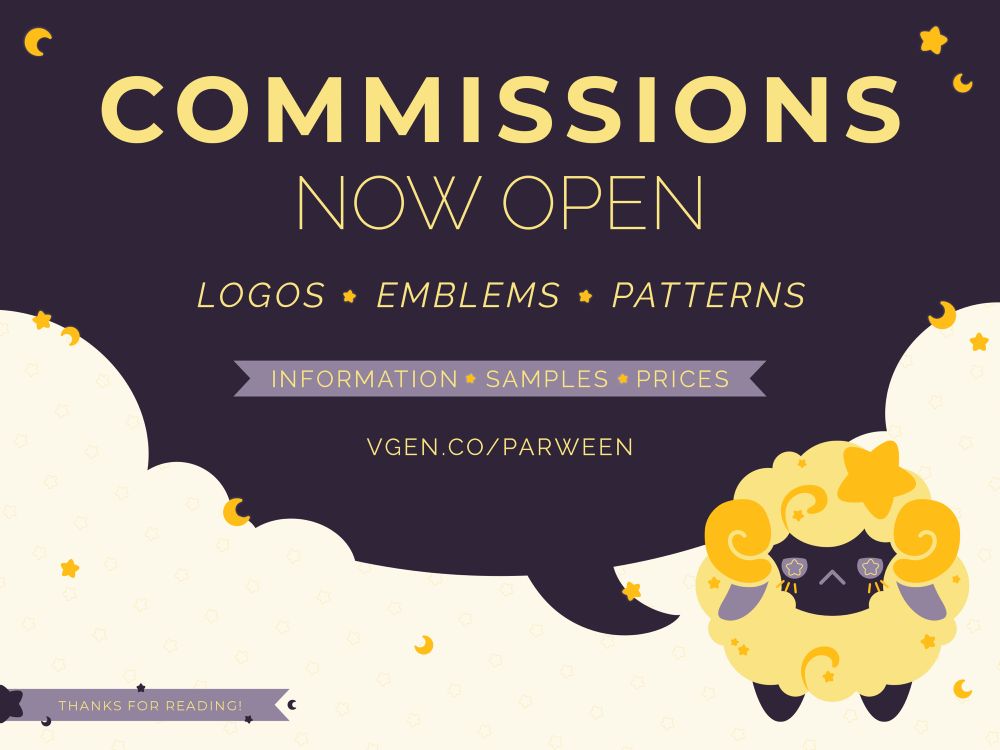
✧ It’s been a while but commissions are finally open! ✧
✦ vgen.co/parween
If you have any questions feel free to message me or post below~
✦ vgen.co/parween
If you have any questions feel free to message me or post below~
June 10, 2025 at 12:19 AM
✧ It’s been a while but commissions are finally open! ✧
✦ vgen.co/parween
If you have any questions feel free to message me or post below~
✦ vgen.co/parween
If you have any questions feel free to message me or post below~
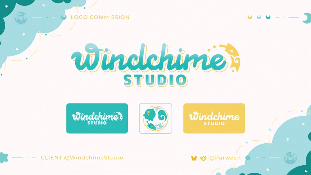
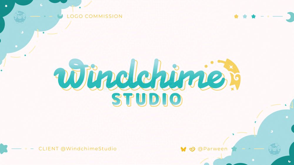
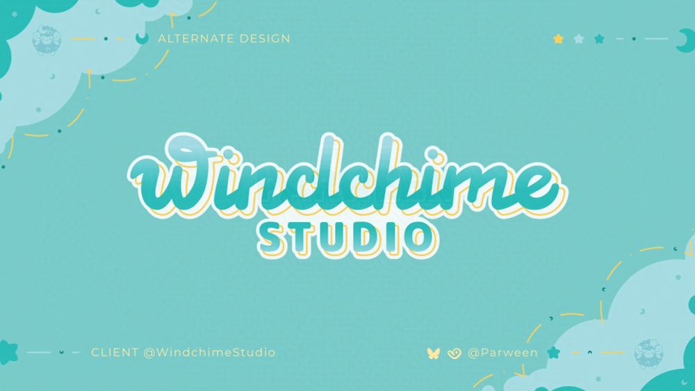
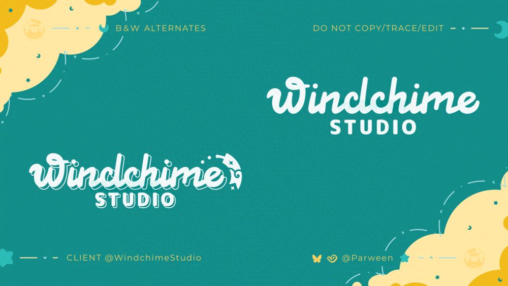
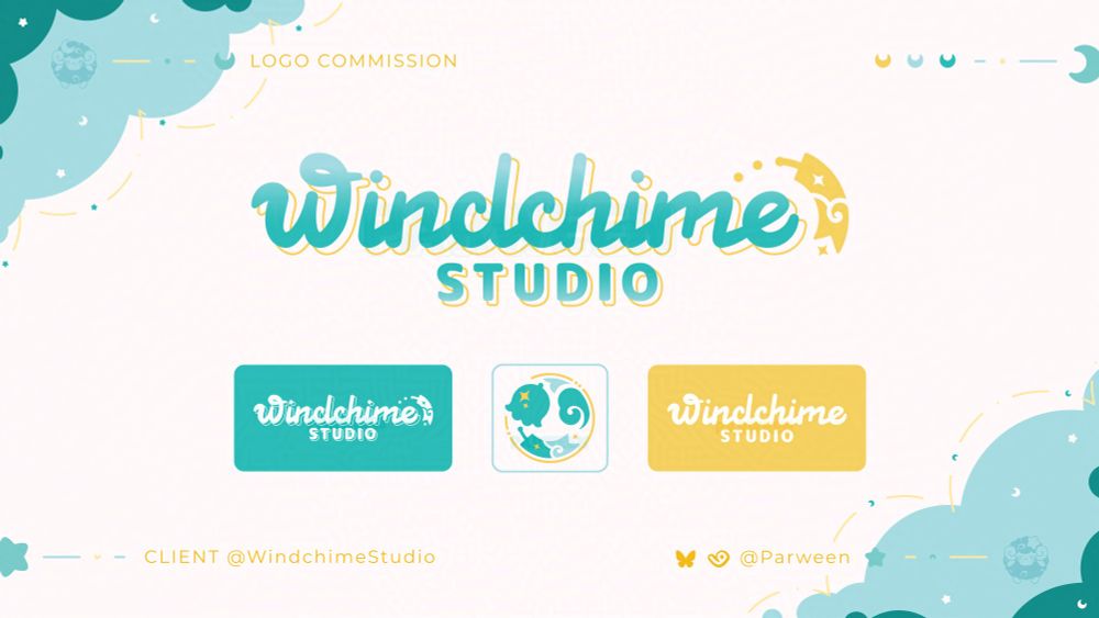
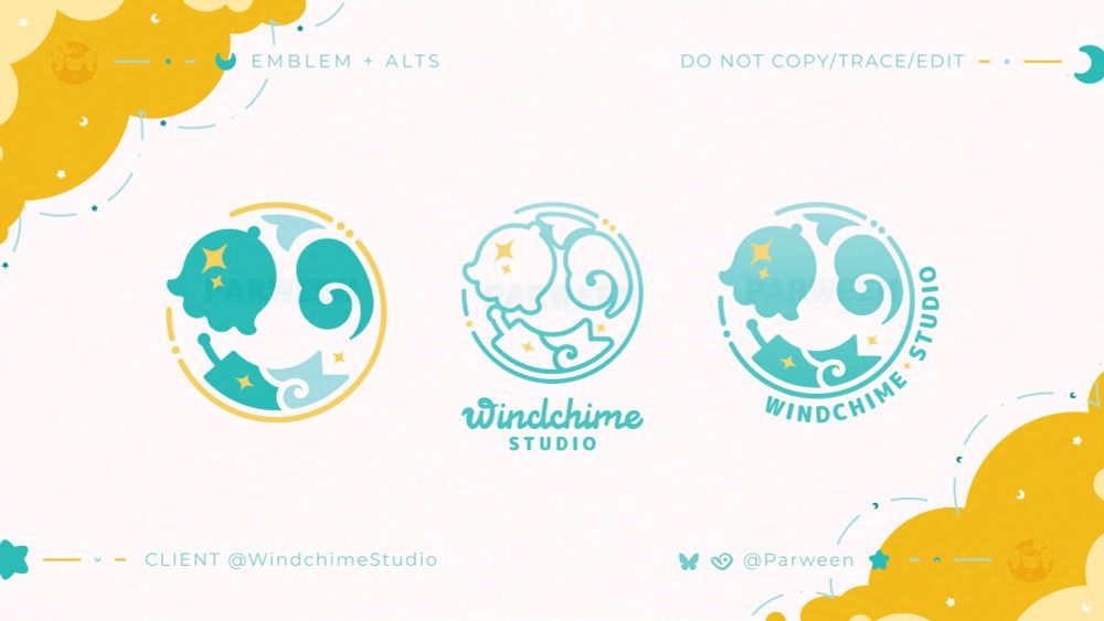
✦ LOGO DESIGN SHOWCASE ✧
These logos designs were made for
@windchimestudio.bsky.social
Thank you once again for entrusting me to make your logo and emblem!
♡ + ↻ are appreciated!
#parweendesign
These logos designs were made for
@windchimestudio.bsky.social
Thank you once again for entrusting me to make your logo and emblem!
♡ + ↻ are appreciated!
#parweendesign
June 5, 2025 at 8:26 PM
✦ LOGO DESIGN SHOWCASE ✧
These logos designs were made for
@windchimestudio.bsky.social
Thank you once again for entrusting me to make your logo and emblem!
♡ + ↻ are appreciated!
#parweendesign
These logos designs were made for
@windchimestudio.bsky.social
Thank you once again for entrusting me to make your logo and emblem!
♡ + ↻ are appreciated!
#parweendesign
✦ Updates
- I should be opening comms soooon
- I made too much of a bad pasta salad, it's been three days
- A third thing
- I should be opening comms soooon
- I made too much of a bad pasta salad, it's been three days
- A third thing
May 20, 2025 at 12:37 AM
✦ Updates
- I should be opening comms soooon
- I made too much of a bad pasta salad, it's been three days
- A third thing
- I should be opening comms soooon
- I made too much of a bad pasta salad, it's been three days
- A third thing
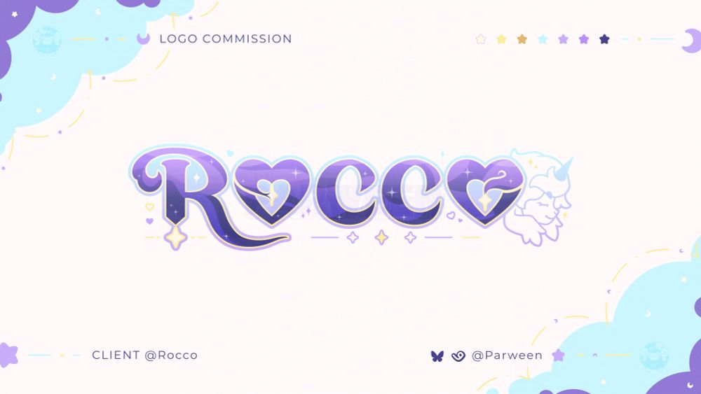
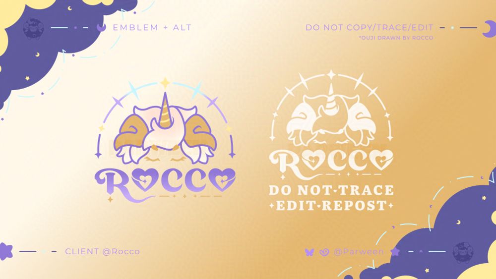
✦ LOGO + EMBLEM DESIGN SHOWCASE ✧
These logos designs were made for
@roccoco-co.bsky.social
Thank you once again for entrusting me to make your logo and emblem!
♡ + ↻ are appreciated!
#parweendesign
These logos designs were made for
@roccoco-co.bsky.social
Thank you once again for entrusting me to make your logo and emblem!
♡ + ↻ are appreciated!
#parweendesign
May 19, 2025 at 11:45 PM
✦ LOGO + EMBLEM DESIGN SHOWCASE ✧
These logos designs were made for
@roccoco-co.bsky.social
Thank you once again for entrusting me to make your logo and emblem!
♡ + ↻ are appreciated!
#parweendesign
These logos designs were made for
@roccoco-co.bsky.social
Thank you once again for entrusting me to make your logo and emblem!
♡ + ↻ are appreciated!
#parweendesign
✦ I made dis ✧
Thank you once more for your support!
Thank you once more for your support!

We're so excited to reveal our new look and logo! Thank you to our amazing designer @parween.bsky.social - please check out their portfolio at vgen.co/Parween
We're still offering a free initial consulting session and are open to new clients in need of narrative development work!
We're still offering a free initial consulting session and are open to new clients in need of narrative development work!
May 13, 2025 at 9:22 PM
✦ I made dis ✧
Thank you once more for your support!
Thank you once more for your support!
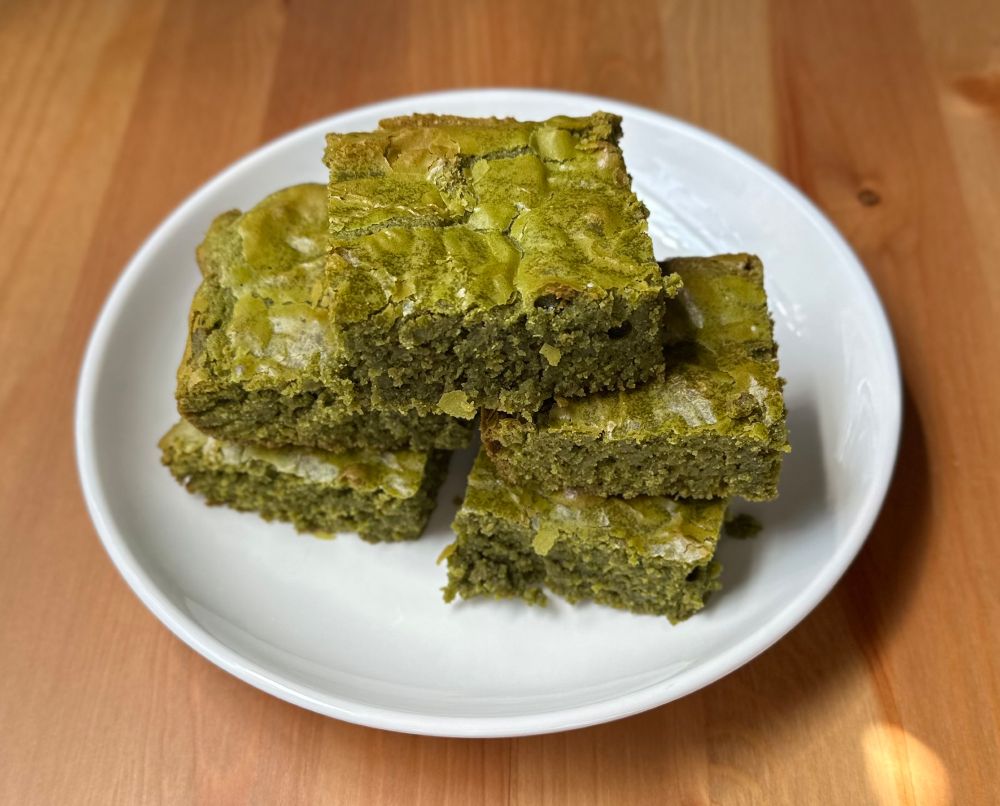
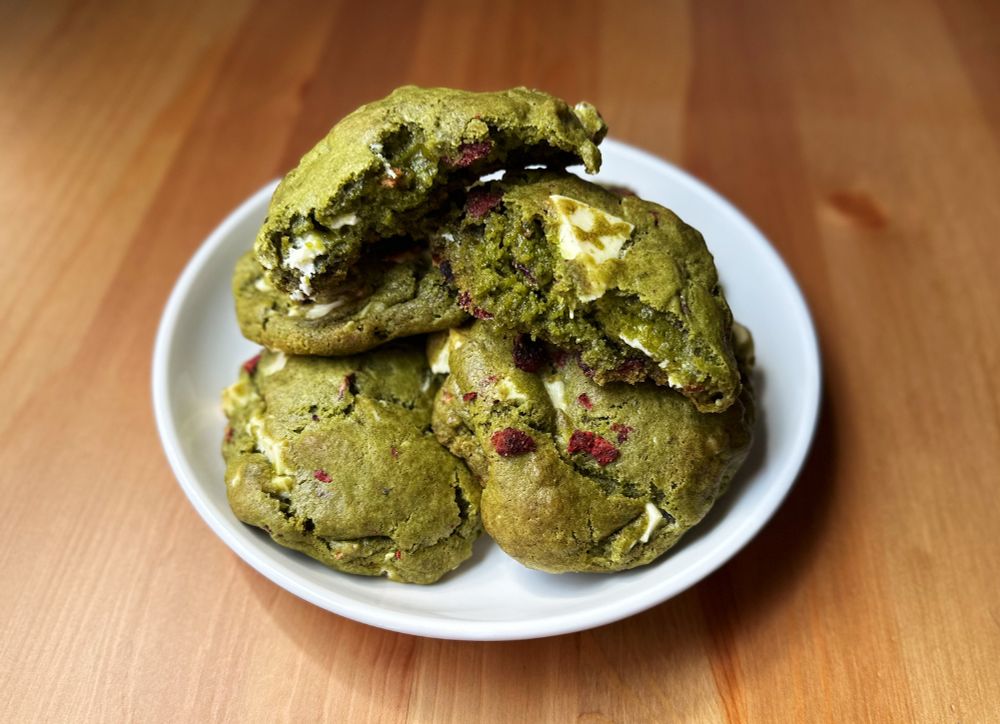
Come hither, feast your eyes on green food that is not a salad.
✦ I made matcha greenies* and cookies~ ✧
*I was told they should be called greenies because they are not brown
✦ I made matcha greenies* and cookies~ ✧
*I was told they should be called greenies because they are not brown
April 15, 2025 at 7:19 PM
Come hither, feast your eyes on green food that is not a salad.
✦ I made matcha greenies* and cookies~ ✧
*I was told they should be called greenies because they are not brown
✦ I made matcha greenies* and cookies~ ✧
*I was told they should be called greenies because they are not brown
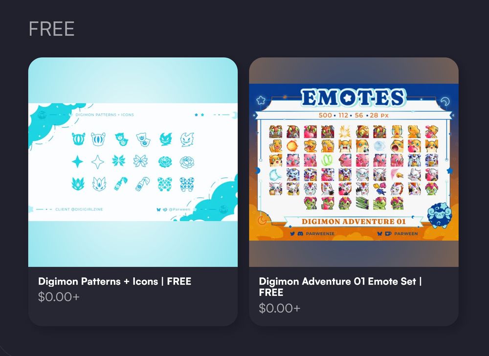
✨ FREEBIE TIME ✨
You can now down get these two digimon freebies from my Vgen shop. They are 100% FREEEE
✦ The first one includes patterns and icons I made for the Digirls Zine vol.2.
✧ The second includes 56ish emotes
✦ Shop Link: vgen.co/Parween/shop
#digimon #デジモン
You can now down get these two digimon freebies from my Vgen shop. They are 100% FREEEE
✦ The first one includes patterns and icons I made for the Digirls Zine vol.2.
✧ The second includes 56ish emotes
✦ Shop Link: vgen.co/Parween/shop
#digimon #デジモン
April 10, 2025 at 9:32 PM
✨ FREEBIE TIME ✨
You can now down get these two digimon freebies from my Vgen shop. They are 100% FREEEE
✦ The first one includes patterns and icons I made for the Digirls Zine vol.2.
✧ The second includes 56ish emotes
✦ Shop Link: vgen.co/Parween/shop
#digimon #デジモン
You can now down get these two digimon freebies from my Vgen shop. They are 100% FREEEE
✦ The first one includes patterns and icons I made for the Digirls Zine vol.2.
✧ The second includes 56ish emotes
✦ Shop Link: vgen.co/Parween/shop
#digimon #デジモン
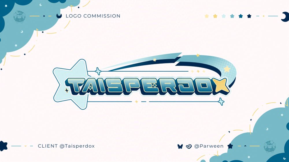
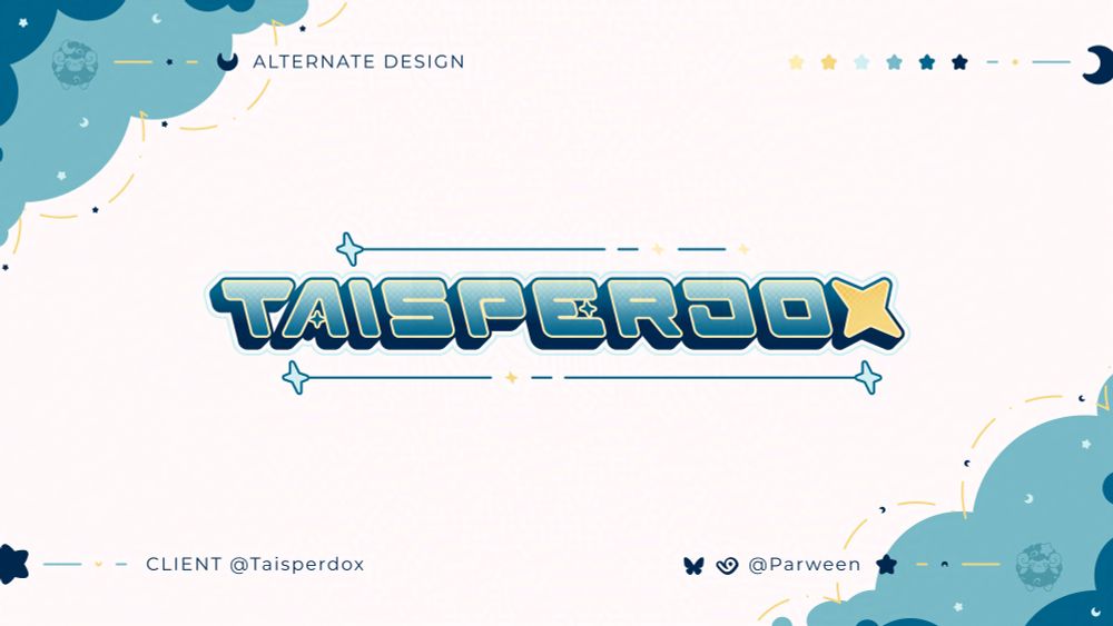
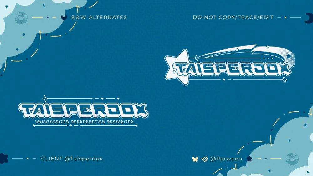
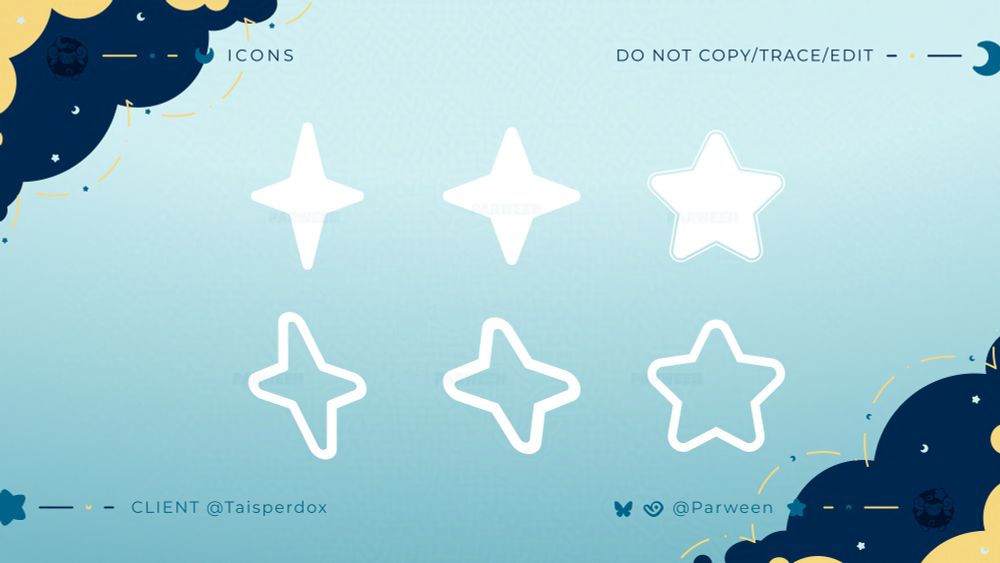
✦ LOGO WATERMARK DESIGN SHOWCASE ✧
This logo was made for
@taisperdox.bsky.social
Thank you once again for entrusting me to make your logo watermark!
♡ + ↻ are appreciated!
#parweendesign
This logo was made for
@taisperdox.bsky.social
Thank you once again for entrusting me to make your logo watermark!
♡ + ↻ are appreciated!
#parweendesign
April 10, 2025 at 9:10 PM
✦ LOGO WATERMARK DESIGN SHOWCASE ✧
This logo was made for
@taisperdox.bsky.social
Thank you once again for entrusting me to make your logo watermark!
♡ + ↻ are appreciated!
#parweendesign
This logo was made for
@taisperdox.bsky.social
Thank you once again for entrusting me to make your logo watermark!
♡ + ↻ are appreciated!
#parweendesign
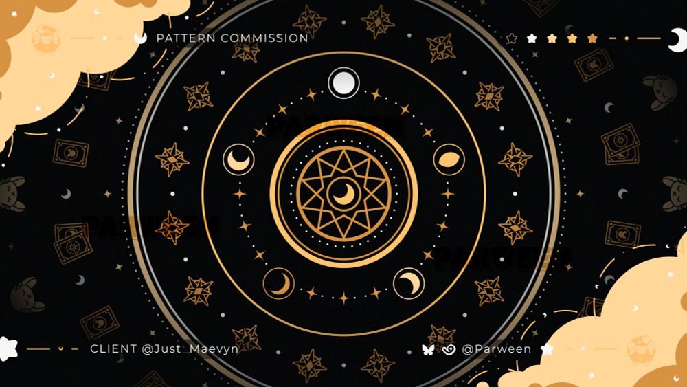
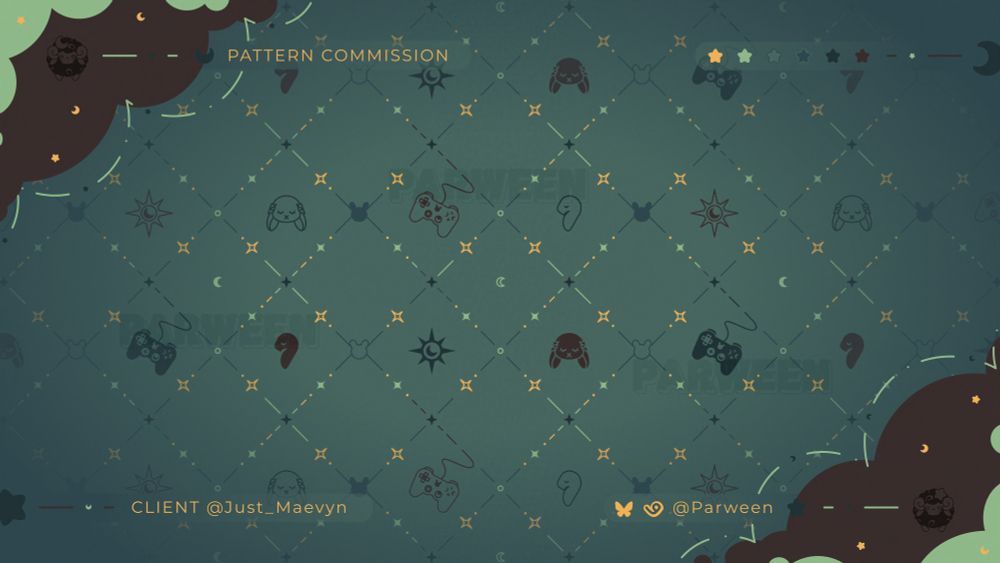
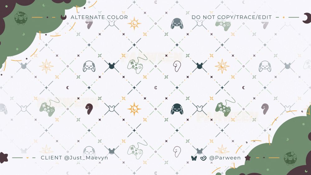
✦ PATTERN COMMISSION SHOWCASE ✧
These patterns were made for @maevyn.crystalhaven.me
Thank you once again for entrusting me to make your patterns and emblem!
♡ + ↻ are appreciated!
#parweendesign
These patterns were made for @maevyn.crystalhaven.me
Thank you once again for entrusting me to make your patterns and emblem!
♡ + ↻ are appreciated!
#parweendesign
March 17, 2025 at 11:44 PM
✦ PATTERN COMMISSION SHOWCASE ✧
These patterns were made for @maevyn.crystalhaven.me
Thank you once again for entrusting me to make your patterns and emblem!
♡ + ↻ are appreciated!
#parweendesign
These patterns were made for @maevyn.crystalhaven.me
Thank you once again for entrusting me to make your patterns and emblem!
♡ + ↻ are appreciated!
#parweendesign
I am here to post my new cute Digimon merch I got from Taobao!
Look at them, they are all so precious~ 🌵🌺
✦ Standees & keychain are from youzai.bsky.social
✧ Mimi plush is from 吧唧霖
#digimon #デジモン
Look at them, they are all so precious~ 🌵🌺
✦ Standees & keychain are from youzai.bsky.social
✧ Mimi plush is from 吧唧霖
#digimon #デジモン


March 13, 2025 at 8:39 PM
I am here to post my new cute Digimon merch I got from Taobao!
Look at them, they are all so precious~ 🌵🌺
✦ Standees & keychain are from youzai.bsky.social
✧ Mimi plush is from 吧唧霖
#digimon #デジモン
Look at them, they are all so precious~ 🌵🌺
✦ Standees & keychain are from youzai.bsky.social
✧ Mimi plush is from 吧唧霖
#digimon #デジモン
Reposted by Parween
hii kofimon are open! I wanna buy myself a birthday present so pls check them out 🙏

February 16, 2025 at 7:27 PM
hii kofimon are open! I wanna buy myself a birthday present so pls check them out 🙏
I guess since I deleted 98% of my stuff from Twitter, it’s time to host a giveaway of sorts on here.
Stay tuned~
Stay tuned~
February 13, 2025 at 7:27 PM
I guess since I deleted 98% of my stuff from Twitter, it’s time to host a giveaway of sorts on here.
Stay tuned~
Stay tuned~