Fabio Sasso
abduzeedo.bsky.social
Fabio Sasso
@abduzeedo.bsky.social
In case you missed it: New blog post: Reformed Characters: A Bold New Alcohol-Free Brand Identity
Reformed Characters: A Bold New Alcohol-Free Brand Identity
Reformed Characters: A Bold New Alcohol-Free Brand Identity ibby 11/17 — 2025 Reformed Characters redefines alcohol-free with bold design, strong personality, and zero compromise. A fresh, disruptive brand from Greatergood. The no-and-low drinks aisle has officially met its match, and she’s bold, shiny, and a little bit reformed. The team at Greatergood® Brands just dropped Reformed Characters, an alcohol-free brand that refuses to behave like the rest of the sober-curious shelf. No beige minimalism, no “hydration but make it humble,” no quiet wellness vibes. This one shows up to the party fully dressed and demanding aux-cord privileges. And honestly? We’re here for it. All Character, Zero Compromise Reformed Characters is designed for the people who are the party, just not tonight. You know the type: first on the dance floor, last to leave, the friend who doesn’t need tequila to make questionable (but iconic) decisions. Greatergood clocked that insight and built an entire brand around it. The name Reformed Characters plays on themes of reinvention with a wink. It’s sober but not serious. “Unapologetically Alcohol Free.” “All Character, No Compromise.” A Visual Identity With… Character (Literally) In a category drowning in neutral tones, botanical illustrations, and quiet wellness whispers, Reformed Characters does the opposite. Each can is a little metallic moment, bold, patterned, and unapologetically extroverted: * The Herbaceous Character   * The Dark & Decadent Character   * The Bittersweet Character   Think of them as personality archetypes, except instead of working through their issues in therapy, they’re sitting in your fridge sparkling with chaotic good energy. It’s packaging that says: “Sure, I’m sober. But I’m still fun at brunch.” Beyond Branding Greatergood didn’t just design the cans. They built the entire brand from the ground up. That includes naming, strategy, brand identity, packaging, recipe development, the DTC launch, and retailer pitching. In other words, they played the full “we can do it all” card and retailers noticed. Reformed Characters is already drawing interest from major grocers, drinks buyers, and international distributors. Category innovation with shelf swagger? Consider the aisle officially disrupted. Why Abduzeedo Readers Should Care Because this is a masterclass in how not to play it safe in a saturated category. It’s a strategic insight turned into a strong brand personality, a visual language that breaks category tropes, and a bold packaging move that genuinely earns attention. This is what happens when you design for the vibe, not the category. And honestly, it’s refreshing to see a booze-free brand that looks like it wants to start trouble, not meditate about it. Ha. Shop Reformed Characters here. 
dlvr.it
November 22, 2025 at 9:46 PM
In case you missed it: New blog post: Marblis Typeface: The Grotesque That’s Anything But Grotesque
Marblis Typeface: The Grotesque That’s Anything But Grotesque
Marblis Typeface: The Grotesque That’s Anything But Grotesque ibby 11/17 — 2025 Meet Marblis, a modern sans serif typeface with clarity, warmth, and range. Its 10 weights and 1400+ glyphs make it a versatile new go-to for designers. Move over Helvetica, there’s a new neutral in town, and it’s got range, reliability, and just the right amount of personality. Meet Marblis, a fresh modern sans serif from designer Julien Fincker, crafted for clear communication and built like a typographic Swiss Army knife (but sleeker). If you’ve been searching for a typeface that won’t steal the spotlight but still holds its own weight, Marblis comes in ten of them. Plus italics. Plus over 1410 glyphs, because who doesn’t love an overachiever? Marblis is available exclusively at Font Cuisine (yes, typography is on the menu) with a 50% discount until January 16, 2026 using Marblis50. A Typeface You Can Build On, Literally Fincker describes Marblis as “a foundation you can build on,” and honestly, the metaphor stands. This is the typographic equivalent of a dependable friend who always shows up on time and remembers your coffee order. Neutral? Yes. Reliable? Absolutely. Boring? Not at all. Marblis hits that sweet spot between functional grotesque and quiet charm, delivering: Balanced proportions for stability; Straight strokes in letters like t and f for structural clarity; Soft curves in characters like a and l for warmth and approachability.   Behind the Font: Helvetica Walked So Marblis Could Run Marblis began as a pragmatic attempt to answer the global Helvetica fatigue, a “we get it, you’re neutral” reaction many designers secretly feel but rarely admit. But somewhere between the first sketches and the 1,410th glyph, strategy gave way to passion. What started as a functional alternative became a personal homage to classic grotesque forms, reshaped with: extended language support, refined spacing, a multitude of OpenType features, and glyphs for nearly every typographic situation you can throw at it be editorial, signage, corporate design, UI, print, wayfinding, you name it, Marblis will behave. It’s clear, consistent, and incredibly usable—the kind of font you discover once and rely on for the next decade. Grab Marblis While It’s Still Hot Off the Press:  fontcuisine.com/fonts/marblis Embargo your hesitation, this might just be your new go-to grotesque. And as always, kern responsibly.
dlvr.it
November 22, 2025 at 4:11 PM
In case you missed it: New blog post: Calmaria 3.0: My Journey from Solo Developer to AI-Augmented Creator
Calmaria 3.0: My Journey from Solo Developer to AI-Augmented Creator
Calmaria 3.0: My Journey from Solo Developer to AI-Augmented Creator abduzeedo 11/16 — 2025 From building alone in 2020 to experimenting with AI for the v2 last year to deep partnership with Cursor's Planning and Agents for Calmaria 3.0. Last week I launched Calmaria 3.0, the culmination of a three-version journey that completely changed how I think about app development. This isn't just a feature update. It's the result of progressively embracing AI-assisted development, from skeptical beginner to what now is called "vibecoding" I was able to work in deep partnership between human creativity and AI capability and build things I had zero clue how to do and, the best of it, very quickly, working mostly in my spare time. How three versions taught me the future of app development Three Versions, Three Approaches * V1 in 2020 The Traditional Way: The first version of Calmaria was built the traditional way, limited by my solo coding skills. Complex features like Apple Watch support came a bit later, Health integration, or GPU-accelerated graphics were too difficult to tackle alone. * V2 in 2024 Dipping My Toes In: For this, I started experimenting with AI coding assistants, using them only for specific problems or code snippets. I still viewed the AI as a fancy autocomplete, and the complex architecture of the app remained beyond what I thought I could handle. * V3 in 2025 Deep Partnership: Everything changed when I began a deep partnership with AI, utilizing advanced features like Planning and Agents. I now treat the AI as a true collaborator. I bring the vision, the design, and the user experience, while the AI brings the technical implementation, planning the architecture and implementing complex features like bidirectional Watch sync. This process, which is called "vibecoding," allows us to build things neither of us could accomplish independently. What I Built with Deep AI Partnership Building things I could never imagine building by myself alone.  1. Seamless Cross-Device Sync Real-time bidirectional synchronization between iPhone, iPad, and Apple Watch. This was the most important feature for me and I wanted it from day one but couldn't tackle alone. With Cursor's Planning, we mapped out the entire sync architecture: * WatchConnectivity message handling * Offline queue management * Conflict resolution strategies * App Group data sharing * Widget integration Then Agents helped implement each piece, explaining WatchConnectivity patterns I'd never encountered. We debugged edge cases together. We optimized performance. Change themes on iPhone and changes on the Watch. Your progress, presets, settings—everything stays synchronized. This is what I always wanted Calmaria to be.   2. Deep Apple Health Integration This was the most requested feature. Initially I was against it because I didn’t want to add a popup to break the experience, but the benefits of tracking became clear. Every breathing session automatically saves to Apple Health as a Mindful Session with rich metadata: technique used, duration, mood, device origin, theme, even a unique identifier for deduplication. HealthKit was intimidating in v1. By v3, with Cursor guiding me through authorization flows, data models, and privacy requirements, it became manageable. We implemented automatic sync, prevented duplicate entries, and followed all of Apple's guidelines.Your wellness journey, tracked in one place. Your data, always yours. 3. Custom Breathing Presets with Full Sync Users can now create unlimited personalized breathing patterns that sync across all devices. Behind the simple interface is a complete preset management system: * CRUD operations for custom presets * Conflict resolution (what if you edit on two devices?) * Cross-device sync via WatchConnectivity * Persistence in both UserDefaults and App Groups * Integration with the breathing engine Planning this feature with Cursor, we identified 15+ edge cases I wouldn't have considered. Then Agents helped implement the robust solution needed. 4. GPU-Accelerated Dots Theme I've always been obsessed with motion design (even though I suck at it). For v3, I envisioned dots transforming into a breathing 3D sphere, but this required Metal shaders, something I'd never touched. With Cursor, I described the visual effect I wanted. We planned the shader pipeline, broke down the math for sphere deformation, and implemented GPU-accelerated rendering with smooth spring animations. I learned shader programming by building it. That's the power of this partnership.More themes are coming. I'm just getting started. The Tools That Changed Everything Cursor Planning Before writing code, I use Planning to: * Map out feature architecture * Identify dependencies and edge cases * Design data models * Plan testing strategies * Break complex features into manageable steps It's like having a senior engineer help you think through problems before you start coding. Cursor Agents Agents help me: * Implement entire features based on plans * Refactor complex code * Debug subtle issues * Add comprehensive error handling * Optimize performance They don't just write code—they explain what they're doing and why. I learn with every feature we build. The Result The V3 has features I couldn't have built in 2020: * 50+ source files with clean architecture * Metal shaders for GPU rendering * Complex state management with Combine * Bidirectional Watch sync with fallbacks * HealthKit integration following best practices * Widget extensions with App Groups * Comprehensive error handling All built by one person, deeply partnered with AI. The journey from Calmaria in 2020 to V3 now taught a clear lesson: I am only limited by my imagination when working in deep partnership with AI. While my initial efforts were confined by my solo technical abilities, the third version completely redefined what was possible. The core insight for me is that AI isn't replacing developers; it's amplifying creators. The human role remains paramount, bringing the vision, design, and creative direction. The AI, meanwhile, serves as a powerful partner, handling the technical implementation, complex architecture, and optimization. This division of labor allows a single creator to tackle projects that once required a full engineering team. This super smooth workflow represents the future of development for me with vibecoding. The most exciting outcome is that the traditional barrier between 'designer' and 'developer' is rapidly dissolving. Creators with passion and great ideas now have the power to build production-quality (or almost) applications, regardless of their proficiency in traditional coding, making the limits of app development today far less technical and far more imaginative. Download Calmaria from the App Store.
dlvr.it
November 22, 2025 at 5:11 AM
In case you missed it: New blog post: Rainy Streets — the Ultimate Canvas for Urban Photography
Rainy Streets — the Ultimate Canvas for Urban Photography
Rainy Streets — the Ultimate Canvas for Urban Photography abduzeedo 11/16 — 2025 Dive into the gritty, rain-soaked aesthetic of the 80s. Learn to capture the cinematic Neon Noir mood in your next street photography session. As a child of the 80s, I grew up glued to the screen, captivated by action movies and classic video games. The defining aesthetic of that era was unmistakable: a gritty, rain-soaked big city, towering skyscrapers shrouded in mist, and the lone protagonist, the hero who always did the right thing, even if they didn't follow the rules. This moody backdrop, often featuring wet streets glistening under neon signs, laid the foundation for my current approach to photography. The music of that time, a classic mix of jazz, synth-heavy electronic scores, and raw rock and roll, paired with the visuals to create an unforgettable atmosphere. Video games like Streets of Rage 1 and 2 and Final Fight perfectly encapsulated this Neon Noir vibe. Has anyone else felt the urge to jump into the world of Big Trouble in Little China just by looking at a rainy cityscape? The Inevitable Attraction to Wet Street Photography Since those early experiences, I've been perpetually attracted to that specific mood and style. Every time the clouds open, it feels like I am instantly transported to that cinematic time. My move to the US and walking the dramatically lit streets of San Francisco further convinced me that this atmosphere is the perfect canvas for urban photography. The interplay of headlight trails, reflections on wet asphalt, and the diffused glow of streetlights provides endless opportunities for dramatic composition. Last week, the forecast predicted heavy rain: the perfect scenario for a street photography session. Camera in hand, I headed out to the office, determined to capture a piece of that nostalgic vibe. It was a fun and challenging exercise in composition and exposure. Dealing with the elements is always part of the adventure when attempting this style of wet-weather photography. The challenge is capturing the feeling of tension and movement while still highlighting the beautiful, reflective textures the rain creates. The result is a series of images that feel less like simple photos and more like stills from a forgotten 80s movie. Here are some photography samples from that day. You can see others in my Unsplash page. To help set the mood as you browse the images, here is a Spotify playlist I listened to while shooting: Photography
dlvr.it
November 21, 2025 at 9:17 PM
New blog post: Everbloom’s Brand Identity by How&How: Subtle, Tactile, and Design-Forward
Everbloom’s Brand Identity by How&How: Subtle, Tactile, and Design-Forward
Everbloom’s Brand Identity by How&How: Subtle, Tactile, and Design-Forward ibby 11/20 — 2025 A design-centric look at How&How’s identity for Everbloom, where texture, type, and material storytelling shape a modern, understated brand system. The latest work from How&How is a beautiful reminder that sustainability doesn’t have to look rustic, earthy, or “eco-chic.” For Everbloom, a company turning organic waste into regenerated high-performance fibers, the studio created a visual identity that feels elegant, technical, and deeply tactile without slipping into the clichés that often follow next-gen materials. This is a project where design does what design should do: extend the logic of the product into the visual world. A Logo That Weaves the Concept Together The Everbloom logo pairs a refined wordmark with a woven monogram that almost behaves like a cursor. It’s subtle but highly considered, a mark that hints at textiles, construction, and process rather than literally depicting them. It works as well on a label as it does on lab documentation, which feels intentional given the science-meets-craft nature of the brand. Tactile Without Being Literal How&How leaned into texture in a way that feels modern rather than nostalgic. Surfaces feel touchable, but nothing mimics fabric directly. Instead, the system uses delicate thread motifs, soft, structured gradients and macro photography that studies the material’s form rather than its final context.   A Classic Aesthetic with a Technical Pulse The type pairing is sharp: Season VF brings editorial elegance while Haffer Mono adds a hint of scientific rigor. It’s a nice tension, luxury meets lab work, without either side overpowering the other. The digital experience follows the same philosophy: editorial pacing, generous whitespace, and a slow-build reveal that mirrors the way you’d examine a material sample in real life. A Brand About Feel, Not Flash What stands out here is restraint. There’s no heavy messaging, no sustainability sermon, no urgency. Just a clean, thoughtful identity that lets the materials speak through texture, form, and tone. In an industry where sustainable materials often feel forced into “green” aesthetics, Everbloom’s identity is refreshing. It suggests that the future of material design might look less like a recycled cardboard box and more like this, considered, confident, and quietly luxurious.
dlvr.it
November 21, 2025 at 1:48 AM
In case you missed it: New blog post: Cash App’s New Design Language and AI Assistant, Moneybot
Cash App’s New Design Language and AI Assistant, Moneybot
Cash App’s New Design Language and AI Assistant, Moneybot ibby 11/13 — 2025 Cash App unveils a bold new design language and introduces Moneybot, an AI-powered assistant built to help users manage their money with intuitive, beautifully crafted interactions. Explore the refreshed visual system, new typography, expanded iconography, and the future-forward interface shaping Cash App’s next chapter. Earlier today, Cash App revealed a bundled preview of its biggest design and product evolution to date—150+ improvements delivered in one coordinated drop. But what caught our eye most wasn’t the scale of the update (though it’s huge)… it’s the clarity of its design ambition. This refresh marks a strategic shift for Cash App: a reimagined interface powered by AI, wrapped in a bold, expressive, unmistakably Cash visual system. And at the center of it all is Moneybot, a new AI-driven assistant designed to help people actually use their money, not just track it. Meet Moneybot: Personal Finance, Designed With Intention AI in fintech has been trending for years, but Cash App’s research uncovered a surprising gap: 6 in 10 Americans use AI tools, yet only 12% use AI features inside financial apps. That’s the creative opportunity. Moneybot isn’t a generic chatbot bolted onto a product, it’s a proactive, design-integrated assistant that learns from customer behavior and surfaces actions that matter. Users can give commands such as sending money to a contact, checking their weekly spending, or scheduling routine payments and Moneybot handles the task with their confirmation. The interaction sits at the intersection of human-centered design, intelligent automation, trust, and craft, an approach that feels much closer to the next generation of interface thinking than a novelty feature. And crucially: control and privacy remain the pillars. This is AI with guardrails and good UX. The New Cash App Design Language Cash App didn’t just add AI. It used this moment to refine the entire system—from typography to motion to 3D imagery, resulting in a design language that feels louder, sharper, more intentional, and unmistakably “Cash.” Some highlights: Hyper Neon Green: The signature brand color goes even bolder—like digital phosphor. It’s loud in the best way possible. Cash Sans + Refined Type Scale: A custom typographic foundation that balances personality with clarity. Strong character, no noise. 650+ New Icons: A massive expansion of the icon set—geometric, modern, and expressive enough to match the ecosystem’s scale. Personalized Assets: Payments and cards get visual individuality, adding emotion and ownership to routine financial actions. Custom Motion + Haptics: Micro-animation and feedback loops that make interactions feel alive, intentional, and human. Expressive 3D Imagery: A visual world that elevates Cash App beyond a utility tool—closer to a creative platform with attitude. Shape, Scale, Grids: A system refreshed at the atomic level, building the foundation for the AI-powered interface that’s coming next. This isn’t a redesign. It’s a recalibration of Cash App’s personality, with system thinking at every layer. A Design System as Product Strategy The Cash App team has built a foundation that treats design as a strategic engine. The system is expressive enough for brand expansion, rigorous enough for product scale, and flexible enough for an AI-powered future.   Credits: * Cameron Worboys (Head of Product Design)   * Justin Danks (Head of Moneybot Design)   * Lauren LoPrete (Head of Design Systems)  
dlvr.it
November 18, 2025 at 8:51 PM
New blog post: Reformed Characters: A Bold New Alcohol-Free Brand Identity
Reformed Characters: A Bold New Alcohol-Free Brand Identity
Reformed Characters: A Bold New Alcohol-Free Brand Identity ibby 11/17 — 2025 Reformed Characters redefines alcohol-free with bold design, strong personality, and zero compromise. A fresh, disruptive brand from Greatergood. The no-and-low drinks aisle has officially met its match, and she’s bold, shiny, and a little bit reformed. The team at Greatergood® Brands just dropped Reformed Characters, an alcohol-free brand that refuses to behave like the rest of the sober-curious shelf. No beige minimalism, no “hydration but make it humble,” no quiet wellness vibes. This one shows up to the party fully dressed and demanding aux-cord privileges. And honestly? We’re here for it. All Character, Zero Compromise Reformed Characters is designed for the people who are the party, just not tonight. You know the type: first on the dance floor, last to leave, the friend who doesn’t need tequila to make questionable (but iconic) decisions. Greatergood clocked that insight and built an entire brand around it. The name Reformed Characters plays on themes of reinvention with a wink. It’s sober but not serious. “Unapologetically Alcohol Free.” “All Character, No Compromise.” A Visual Identity With… Character (Literally) In a category drowning in neutral tones, botanical illustrations, and quiet wellness whispers, Reformed Characters does the opposite. Each can is a little metallic moment, bold, patterned, and unapologetically extroverted: * The Herbaceous Character   * The Dark & Decadent Character   * The Bittersweet Character   Think of them as personality archetypes, except instead of working through their issues in therapy, they’re sitting in your fridge sparkling with chaotic good energy. It’s packaging that says: “Sure, I’m sober. But I’m still fun at brunch.” Beyond Branding Greatergood didn’t just design the cans. They built the entire brand from the ground up. That includes naming, strategy, brand identity, packaging, recipe development, the DTC launch, and retailer pitching. In other words, they played the full “we can do it all” card and retailers noticed. Reformed Characters is already drawing interest from major grocers, drinks buyers, and international distributors. Category innovation with shelf swagger? Consider the aisle officially disrupted. Why Abduzeedo Readers Should Care Because this is a masterclass in how not to play it safe in a saturated category. It’s a strategic insight turned into a strong brand personality, a visual language that breaks category tropes, and a bold packaging move that genuinely earns attention. This is what happens when you design for the vibe, not the category. And honestly, it’s refreshing to see a booze-free brand that looks like it wants to start trouble, not meditate about it. Ha. Shop Reformed Characters here. 
dlvr.it
November 17, 2025 at 9:45 PM
In case you missed it: New blog post: Illustrator Pete Oswald Serves Up Humble Pie: Design and Life Lessons for Every Age
Illustrator Pete Oswald Serves Up Humble Pie: Design and Life Lessons for Every Age
Illustrator Pete Oswald Serves Up Humble Pie: Design and Life Lessons for Every Age ibby 11/12 — 2025 In Humble Pie, illustrator Pete Oswald and author Jory John blend humor, heart, and design mastery. Abduzeedo explores how Oswald’s warm palette, simple geometry, and cinematic composition deliver both design lessons and life lessons for all ages, a visual feast on empathy, color, and storytelling. With Humble Pie, Pete Oswald and Jory John once again serve up something we love most, a story that delivers design lessons for creatives and life lessons for everyone else. It’s clever, kind, and beautifully crafted, proof that picture books can teach composition, color theory, and emotional intelligence all at once. Oswald’s ability to balance expressive character work with cinematic composition makes every spread feel alive, emotional, funny, and deeply intentional. A graduate of Loyola Marymount University’s animation program, Pete began his career as a visual development and character designer for film, contributing to animated favorites like The Angry Birds Movie, Cloudy with a Chance of Meatballs, and ParaNorman. That cinematic sensibility translates seamlessly into his picture book work: composition as storytelling, lighting as emotion, and color as character. The palette in Humble Pie leans warm and comforting, buttery yellows, pie-crust browns, and pastel pinks that feel straight from a cozy bakery kitchen. Layered with subtle gradients and paper textures, the visuals carry a tactile softness that’s become Oswald’s signature. His characters, shaped from simple geometry and micro-expressions, communicate emotion through restraint, a hallmark of mature design thinking hidden in kid-friendly form. Each book in The Food Group series (The Bad Seed, The Good Egg, The Cool Bean, The Couch Potato, The Smart Cookie, The Big Cheese) has its own rhythm and Humble Pie continues that lineage with a quiet reminder: confidence and humility can share the same page. We’ve long admired Pete’s work that is always expressive, sincere, and deceptively simple. He’s one of our favorite illustrators because he continues to make kindness and curiosity look cool through visual design. 3 Design Takeaways from Illustrator Pete Oswald’s Work Emotion lives in geometry. Oswald’s characters are built from circles, ovals, and arcs, shapes that instantly communicate warmth and approachability. Simplicity, when done well, tells the truest story.   Texture is tone. His use of layered backgrounds, soft grain, and lighting gradients gives digital illustration a tactile humanity. His worlds feel hand-crafted, even when rendered digitally.   Composition as character. Framing and negative space become emotional tools, a shy pie framed small, a confident cake filling the spread. Every layout choice mirrors the inner arc of the story. In short: Pete Oswald doesn’t just illustrate he designs empathy. And in Humble Pie, he reminds us that good design, like good storytelling is as much about listening, balance, and heart as it is about form, color, and line. Buy the book here.
dlvr.it
November 17, 2025 at 9:13 PM
New blog post: Marblis Typeface: The Grotesque That’s Anything But Grotesque
Marblis Typeface: The Grotesque That’s Anything But Grotesque
Marblis Typeface: The Grotesque That’s Anything But Grotesque ibby 11/17 — 2025 Meet Marblis, a modern sans serif typeface with clarity, warmth, and range. Its 10 weights and 1400+ glyphs make it a versatile new go-to for designers. Move over Helvetica, there’s a new neutral in town, and it’s got range, reliability, and just the right amount of personality. Meet Marblis, a fresh modern sans serif from designer Julien Fincker, crafted for clear communication and built like a typographic Swiss Army knife (but sleeker). If you’ve been searching for a typeface that won’t steal the spotlight but still holds its own weight, Marblis comes in ten of them. Plus italics. Plus over 1410 glyphs, because who doesn’t love an overachiever? Marblis is available exclusively at Font Cuisine (yes, typography is on the menu) with a 50% discount until January 16, 2026 using Marblis50. A Typeface You Can Build On, Literally Fincker describes Marblis as “a foundation you can build on,” and honestly, the metaphor stands. This is the typographic equivalent of a dependable friend who always shows up on time and remembers your coffee order. Neutral? Yes. Reliable? Absolutely. Boring? Not at all. Marblis hits that sweet spot between functional grotesque and quiet charm, delivering: Balanced proportions for stability; Straight strokes in letters like t and f for structural clarity; Soft curves in characters like a and l for warmth and approachability.   Behind the Font: Helvetica Walked So Marblis Could Run Marblis began as a pragmatic attempt to answer the global Helvetica fatigue, a “we get it, you’re neutral” reaction many designers secretly feel but rarely admit. But somewhere between the first sketches and the 1,410th glyph, strategy gave way to passion. What started as a functional alternative became a personal homage to classic grotesque forms, reshaped with: extended language support, refined spacing, a multitude of OpenType features, and glyphs for nearly every typographic situation you can throw at it be editorial, signage, corporate design, UI, print, wayfinding, you name it, Marblis will behave. It’s clear, consistent, and incredibly usable—the kind of font you discover once and rely on for the next decade. Grab Marblis While It’s Still Hot Off the Press:  fontcuisine.com/fonts/marblis Embargo your hesitation, this might just be your new go-to grotesque. And as always, kern responsibly.
dlvr.it
November 17, 2025 at 4:10 PM
New blog post: Calmaria 3.0: My Journey from Solo Developer to AI-Augmented Creator
Calmaria 3.0: My Journey from Solo Developer to AI-Augmented Creator
Calmaria 3.0: My Journey from Solo Developer to AI-Augmented Creator abduzeedo 11/16 — 2025 From building alone in 2020 to experimenting with AI for the v2 last year to deep partnership with Cursor's Planning and Agents for Calmaria 3.0. Last week I launched Calmaria 3.0, the culmination of a three-version journey that completely changed how I think about app development. This isn't just a feature update. It's the result of progressively embracing AI-assisted development, from skeptical beginner to what now is called "vibecoding" I was able to work in deep partnership between human creativity and AI capability and build things I had zero clue how to do and, the best of it, very quickly, working mostly in my spare time. How three versions taught me the future of app development Three Versions, Three Approaches * V1 in 2020 The Traditional Way: The first version of Calmaria was built the traditional way, limited by my solo coding skills. Complex features like Apple Watch support came a bit later, Health integration, or GPU-accelerated graphics were too difficult to tackle alone. * V2 in 2024 Dipping My Toes In: For this, I started experimenting with AI coding assistants, using them only for specific problems or code snippets. I still viewed the AI as a fancy autocomplete, and the complex architecture of the app remained beyond what I thought I could handle. * V3 in 2025 Deep Partnership: Everything changed when I began a deep partnership with AI, utilizing advanced features like Planning and Agents. I now treat the AI as a true collaborator. I bring the vision, the design, and the user experience, while the AI brings the technical implementation, planning the architecture and implementing complex features like bidirectional Watch sync. This process, which is called "vibecoding," allows us to build things neither of us could accomplish independently. What I Built with Deep AI Partnership Building things I could never imagine building by myself alone.  1. Seamless Cross-Device Sync Real-time bidirectional synchronization between iPhone, iPad, and Apple Watch. This was the most important feature for me and I wanted it from day one but couldn't tackle alone. With Cursor's Planning, we mapped out the entire sync architecture: * WatchConnectivity message handling * Offline queue management * Conflict resolution strategies * App Group data sharing * Widget integration Then Agents helped implement each piece, explaining WatchConnectivity patterns I'd never encountered. We debugged edge cases together. We optimized performance. Change themes on iPhone and changes on the Watch. Your progress, presets, settings—everything stays synchronized. This is what I always wanted Calmaria to be.   2. Deep Apple Health Integration This was the most requested feature. Initially I was against it because I didn’t want to add a popup to break the experience, but the benefits of tracking became clear. Every breathing session automatically saves to Apple Health as a Mindful Session with rich metadata: technique used, duration, mood, device origin, theme, even a unique identifier for deduplication. HealthKit was intimidating in v1. By v3, with Cursor guiding me through authorization flows, data models, and privacy requirements, it became manageable. We implemented automatic sync, prevented duplicate entries, and followed all of Apple's guidelines.Your wellness journey, tracked in one place. Your data, always yours. 3. Custom Breathing Presets with Full Sync Users can now create unlimited personalized breathing patterns that sync across all devices. Behind the simple interface is a complete preset management system: * CRUD operations for custom presets * Conflict resolution (what if you edit on two devices?) * Cross-device sync via WatchConnectivity * Persistence in both UserDefaults and App Groups * Integration with the breathing engine Planning this feature with Cursor, we identified 15+ edge cases I wouldn't have considered. Then Agents helped implement the robust solution needed. 4. GPU-Accelerated Dots Theme I've always been obsessed with motion design (even though I suck at it). For v3, I envisioned dots transforming into a breathing 3D sphere, but this required Metal shaders, something I'd never touched. With Cursor, I described the visual effect I wanted. We planned the shader pipeline, broke down the math for sphere deformation, and implemented GPU-accelerated rendering with smooth spring animations. I learned shader programming by building it. That's the power of this partnership.More themes are coming. I'm just getting started. The Tools That Changed Everything Cursor Planning Before writing code, I use Planning to: * Map out feature architecture * Identify dependencies and edge cases * Design data models * Plan testing strategies * Break complex features into manageable steps It's like having a senior engineer help you think through problems before you start coding. Cursor Agents Agents help me: * Implement entire features based on plans * Refactor complex code * Debug subtle issues * Add comprehensive error handling * Optimize performance They don't just write code—they explain what they're doing and why. I learn with every feature we build. The Result The V3 has features I couldn't have built in 2020: * 50+ source files with clean architecture * Metal shaders for GPU rendering * Complex state management with Combine * Bidirectional Watch sync with fallbacks * HealthKit integration following best practices * Widget extensions with App Groups * Comprehensive error handling All built by one person, deeply partnered with AI. The journey from Calmaria in 2020 to V3 now taught a clear lesson: I am only limited by my imagination when working in deep partnership with AI. While my initial efforts were confined by my solo technical abilities, the third version completely redefined what was possible. The core insight for me is that AI isn't replacing developers; it's amplifying creators. The human role remains paramount, bringing the vision, design, and creative direction. The AI, meanwhile, serves as a powerful partner, handling the technical implementation, complex architecture, and optimization. This division of labor allows a single creator to tackle projects that once required a full engineering team. This super smooth workflow represents the future of development for me with vibecoding. The most exciting outcome is that the traditional barrier between 'designer' and 'developer' is rapidly dissolving. Creators with passion and great ideas now have the power to build production-quality (or almost) applications, regardless of their proficiency in traditional coding, making the limits of app development today far less technical and far more imaginative. Download Calmaria from the App Store.

dlvr.it
November 17, 2025 at 5:09 AM
New blog post: Rainy Streets — the Ultimate Canvas for Urban Photography
Rainy Streets — the Ultimate Canvas for Urban Photography
Rainy Streets — the Ultimate Canvas for Urban Photography abduzeedo 11/16 — 2025 Dive into the gritty, rain-soaked aesthetic of the 80s. Learn to capture the cinematic Neon Noir mood in your next street photography session. As a child of the 80s, I grew up glued to the screen, captivated by action movies and classic video games. The defining aesthetic of that era was unmistakable: a gritty, rain-soaked big city, towering skyscrapers shrouded in mist, and the lone protagonist, the hero who always did the right thing, even if they didn't follow the rules. This moody backdrop, often featuring wet streets glistening under neon signs, laid the foundation for my current approach to photography. The music of that time, a classic mix of jazz, synth-heavy electronic scores, and raw rock and roll, paired with the visuals to create an unforgettable atmosphere. Video games like Streets of Rage 1 and 2 and Final Fight perfectly encapsulated this Neon Noir vibe. Has anyone else felt the urge to jump into the world of Big Trouble in Little China just by looking at a rainy cityscape? The Inevitable Attraction to Wet Street Photography Since those early experiences, I've been perpetually attracted to that specific mood and style. Every time the clouds open, it feels like I am instantly transported to that cinematic time. My move to the US and walking the dramatically lit streets of San Francisco further convinced me that this atmosphere is the perfect canvas for urban photography. The interplay of headlight trails, reflections on wet asphalt, and the diffused glow of streetlights provides endless opportunities for dramatic composition. Last week, the forecast predicted heavy rain: the perfect scenario for a street photography session. Camera in hand, I headed out to the office, determined to capture a piece of that nostalgic vibe. It was a fun and challenging exercise in composition and exposure. Dealing with the elements is always part of the adventure when attempting this style of wet-weather photography. The challenge is capturing the feeling of tension and movement while still highlighting the beautiful, reflective textures the rain creates. The result is a series of images that feel less like simple photos and more like stills from a forgotten 80s movie. Here are some photography samples from that day. You can see others in my Unsplash page. To help set the mood as you browse the images, here is a Spotify playlist I listened to while shooting: Photography
dlvr.it
November 16, 2025 at 9:16 PM
In case you missed it: New blog post: London Type Foundry taps Ian Ritchie for two fresh faces
London Type Foundry taps Ian Ritchie for two fresh faces
London Type Foundry taps Ian Ritchie for two fresh faces ibby 11/10 — 2025 London Type Foundry launches IR Lüthold Sans and IR Lüthold Sans Text by Ian Ritchie—two DIN-inspired typefaces crafted for branding, editorial design, and digital typography with precision and modern character. Big news from London Type: the foundry just rolled out the typographic red carpet for Ian Ritchie, former partner at Jones Knowles Ritchie and he didn’t arrive empty-handed. Call it a JKR → LTF evolution with serious typographic pedigree. Ritchie drops not one but two new type families, each rooted in the structured beauty of DIN 1451 and lovingly engineered into something sharper, cooler, and decidedly contemporary. Meet The Typefaces: IR Lüthold Sans Born from Ritchie’s art-school sign-writing days in the ’70s (yes, analog hustle!), IR Lüthold Sans carries industrial DNA with graphic finesse. Think DIN meets design-studio swagger: condensed proportions, authoritative stance, and those delicious ink traps and high-contrast spines that give it both precision and personality. 12 styles, italics across the board, and enough weights to take your headline hierarchy from whisper to thunder. Also Introducing its Softer-Spoken Sibling: IR Lüthold Sans Text Every hero needs a partner. Enter IR Lüthold Sans Text, same lineage, re-tuned for warmth, rhythm, and reliable long-form readability. Where Lüthold Sans brings the billboard energy, Text handles the captions, UI labels, decks, and paragraphs without breaking a sweat. Slightly wider, lower contrast strokes, and optimized for keeping the eyes happy. A dynamic duo: one makes the statement, the other keeps the story moving. A Collaboration with Heritage Originally sketched by Ritchie and refined alongside Paul Harpin (and once cheekily named “Günther!” — we love a font with lore), Lüthold continues a lineage of real-world utility elevated by designer sensibility. This is industrial heritage rebuilt for modern brand systems, editorial layouts, and identity work that requires both muscle and finesse. New Fonts, New site, Same impeccable taste Both families debut exclusively on London Type Foundry’s freshly redesigned site that boasts a clean, confident platform worthy of its roster. IR Lüthold Sans & IR Lüthold Sans Text now live at londontype.co.uk. Go forth and kern responsibly.
dlvr.it
November 15, 2025 at 7:17 PM
New blog post: Cash App’s New Design Language and AI Assistant, Moneybot
Cash App’s New Design Language and AI Assistant, Moneybot
Cash App’s New Design Language and AI Assistant, Moneybot ibby 11/13 — 2025 Cash App unveils a bold new design language and introduces Moneybot, an AI-powered assistant built to help users manage their money with intuitive, beautifully crafted interactions. Explore the refreshed visual system, new typography, expanded iconography, and the future-forward interface shaping Cash App’s next chapter. Earlier today, Cash App revealed a bundled preview of its biggest design and product evolution to date—150+ improvements delivered in one coordinated drop. But what caught our eye most wasn’t the scale of the update (though it’s huge)… it’s the clarity of its design ambition. This refresh marks a strategic shift for Cash App: a reimagined interface powered by AI, wrapped in a bold, expressive, unmistakably Cash visual system. And at the center of it all is Moneybot, a new AI-driven assistant designed to help people actually use their money, not just track it. Meet Moneybot: Personal Finance, Designed With Intention AI in fintech has been trending for years, but Cash App’s research uncovered a surprising gap: 6 in 10 Americans use AI tools, yet only 12% use AI features inside financial apps. That’s the creative opportunity. Moneybot isn’t a generic chatbot bolted onto a product, it’s a proactive, design-integrated assistant that learns from customer behavior and surfaces actions that matter. Users can give commands such as sending money to a contact, checking their weekly spending, or scheduling routine payments and Moneybot handles the task with their confirmation. The interaction sits at the intersection of human-centered design, intelligent automation, trust, and craft, an approach that feels much closer to the next generation of interface thinking than a novelty feature. And crucially: control and privacy remain the pillars. This is AI with guardrails and good UX. The New Cash App Design Language Cash App didn’t just add AI. It used this moment to refine the entire system—from typography to motion to 3D imagery, resulting in a design language that feels louder, sharper, more intentional, and unmistakably “Cash.” Some highlights: Hyper Neon Green: The signature brand color goes even bolder—like digital phosphor. It’s loud in the best way possible. Cash Sans + Refined Type Scale: A custom typographic foundation that balances personality with clarity. Strong character, no noise. 650+ New Icons: A massive expansion of the icon set—geometric, modern, and expressive enough to match the ecosystem’s scale. Personalized Assets: Payments and cards get visual individuality, adding emotion and ownership to routine financial actions. Custom Motion + Haptics: Micro-animation and feedback loops that make interactions feel alive, intentional, and human. Expressive 3D Imagery: A visual world that elevates Cash App beyond a utility tool—closer to a creative platform with attitude. Shape, Scale, Grids: A system refreshed at the atomic level, building the foundation for the AI-powered interface that’s coming next. This isn’t a redesign. It’s a recalibration of Cash App’s personality, with system thinking at every layer. A Design System as Product Strategy The Cash App team has built a foundation that treats design as a strategic engine. The system is expressive enough for brand expansion, rigorous enough for product scale, and flexible enough for an AI-powered future.   Credits: * Cameron Worboys (Head of Product Design)   * Justin Danks (Head of Moneybot Design)   * Lauren LoPrete (Head of Design Systems)  
dlvr.it
November 13, 2025 at 8:49 PM
New blog post: Illustrator Pete Oswald Serves Up Humble Pie: Design and Life Lessons for Every Age
Illustrator Pete Oswald Serves Up Humble Pie: Design and Life Lessons for Every Age
Illustrator Pete Oswald Serves Up Humble Pie: Design and Life Lessons for Every Age ibby 11/12 — 2025 In Humble Pie, illustrator Pete Oswald and author Jory John blend humor, heart, and design mastery. Abduzeedo explores how Oswald’s warm palette, simple geometry, and cinematic composition deliver both design lessons and life lessons for all ages, a visual feast on empathy, color, and storytelling. With Humble Pie, Pete Oswald and Jory John once again serve up something we love most, a story that delivers design lessons for creatives and life lessons for everyone else. It’s clever, kind, and beautifully crafted, proof that picture books can teach composition, color theory, and emotional intelligence all at once. Oswald’s ability to balance expressive character work with cinematic composition makes every spread feel alive, emotional, funny, and deeply intentional. A graduate of Loyola Marymount University’s animation program, Pete began his career as a visual development and character designer for film, contributing to animated favorites like The Angry Birds Movie, Cloudy with a Chance of Meatballs, and ParaNorman. That cinematic sensibility translates seamlessly into his picture book work: composition as storytelling, lighting as emotion, and color as character. The palette in Humble Pie leans warm and comforting, buttery yellows, pie-crust browns, and pastel pinks that feel straight from a cozy bakery kitchen. Layered with subtle gradients and paper textures, the visuals carry a tactile softness that’s become Oswald’s signature. His characters, shaped from simple geometry and micro-expressions, communicate emotion through restraint, a hallmark of mature design thinking hidden in kid-friendly form. Each book in The Food Group series (The Bad Seed, The Good Egg, The Cool Bean, The Couch Potato, The Smart Cookie, The Big Cheese) has its own rhythm and Humble Pie continues that lineage with a quiet reminder: confidence and humility can share the same page. We’ve long admired Pete’s work that is always expressive, sincere, and deceptively simple. He’s one of our favorite illustrators because he continues to make kindness and curiosity look cool through visual design. 3 Design Takeaways from Illustrator Pete Oswald’s Work Emotion lives in geometry. Oswald’s characters are built from circles, ovals, and arcs, shapes that instantly communicate warmth and approachability. Simplicity, when done well, tells the truest story.   Texture is tone. His use of layered backgrounds, soft grain, and lighting gradients gives digital illustration a tactile humanity. His worlds feel hand-crafted, even when rendered digitally.   Composition as character. Framing and negative space become emotional tools, a shy pie framed small, a confident cake filling the spread. Every layout choice mirrors the inner arc of the story. In short: Pete Oswald doesn’t just illustrate he designs empathy. And in Humble Pie, he reminds us that good design, like good storytelling is as much about listening, balance, and heart as it is about form, color, and line. Buy the book here.
dlvr.it
November 12, 2025 at 9:12 PM
In case you missed it: New blog post: Bellissimo gives Lavazza’s Tablì a bold new identity, reimagining the coffee ritual
Bellissimo gives Lavazza’s Tablì a bold new identity, reimagining the coffee ritual
Bellissimo gives Lavazza’s Tablì a bold new identity, reimagining the coffee ritual ibby 11/07 — 2025 Bellissimo designs Lavazza’s Tablì system—100% coffee tabs with no capsules. Debuted at Milan Design Week 2025, the identity blends clarity, sustainability, and Italian design. Lavazza introduces Tablì, a system that replaces single-use capsules with compostable tabs made of 100% coffee, no foil, no plastic, just pure ground coffee pressed into precise discs. It’s a quiet but meaningful shift toward cleaner design and cleaner consumption. Design First, Sustainability Forward Unveiled at Milan Design Week 2025, Tablì represents a rethink of the home coffee ritual. The visual identity, led by Turin-based studio Bellissimo, balances innovation and restraint. The tab, the core product, becomes the organizing shape for the entire identity system, signaling the product’s purpose with both clarity and confidence. This structure delivers immediate recognition and a visual hierarchy that makes sense at a glance. The tab silhouette drives the layout across SKUs. * Upper band: Lavazza and Tablì on crisp white   * Lower band: Bold, clean blocks of color for each blend   * Inside the tab: The message “100% coffee” — a direct statement of intent   A Typographic Accent With Purpose The logotype’s accent mark becomes a flexible brand signal, shifting color across the line to drive product differentiation. Paired with a black-on-white core palette and Lavazza’s signature gold, the system cuts through crowded shelves while maintaining brand heritage. An Ecosystem Designed With Restraint Machine, tabs, and accessories share one visual language — refined, minimal, timeless. Rather than shouting “innovation,” the design sits with quiet confidence, reflecting trust between Lavazza and Bellissimo, whose decade-long collaboration includes the restyling of Qualità Oro. Where Tradition Meets Future As Tablì expands globally, Bellissimo continues to shape the system’s evolution, a union of design, sustainability, and ritual for a modern coffee experience rooted in Italian heritage. Original project: Bellissimo — https://bellissimo.it/projects/tabli/
dlvr.it
November 12, 2025 at 5:28 PM
In case you missed it: New blog post: Trellis Rebrand by How&How: A New Digital Blueprint for Generational Healthcare
Trellis Rebrand by How&How: A New Digital Blueprint for Generational Healthcare
Trellis Rebrand by How&How: A New Digital Blueprint for Generational Healthcare ibby 11/06 — 2025 Trellis rebrand by How&How reimagines generational healthcare with a thoughtful identity, modular grid system, and human-first visuals designed to bring clarity to motherhood and medical history. Design can clarify chaos. And if there’s a category begging for clarity it’s healthcare. Especially the part quietly powered by moms. In the US, nine out of ten mothers manage their family’s medical history in Apple Notes. Not because they want to but because the system leaves them nowhere else to put it. Records scattered across states. Insurance portals that feel like escape rooms. A data trail so fragmented it almost guarantees something gets lost along the way. Enter Trellis, a new platform designed to organize and preserve generational health built for the realities of mothers today, and the families who come after them. London- and LA-based studio How&How partnered with Trellis to craft a brand and interface that honors complexity without letting it overwhelm. A Framework for Life The identity starts with structure — a flexible, modular grid that becomes a quiet stage for stories, data, and personal detail. It grows and shifts like family life itself, a system that adapts instead of forcing users to. Soft-toned, natural photography grounds the platform in real families — pregnancy, postpartum, and the everyday chapters in between. It’s not stock photo perfect; it’s honest, warm, human. Look closely and you’ll find a fingerprint motif threaded throughout, a subtle reminder that medical data isn’t abstract — it’s personal. It also shapes the new Trellis mark, a fingerprint swirl forming a hidden “T”, anchoring the identity in this idea of personal legacy. Tone with Tender Strength Trellis introduces a voice borrowed from midwives — grounded, direct, fearless, and empathetic. It’s design language that knows when to soften and when to tell the truth with clarity. No sugar-coating, no jargon, no confusion. The result is a platform that feels equal parts medical vault and emotional archive — a place where data becomes continuity, memory, and future planning. A Brand That Stands Up to the System “For mothers today and generations to come” isn’t just a line. With Trellis, generational health becomes something that isn’t just hoped for, but designed for. A rare example of healthcare tech where the branding is as thoughtful as the mission. Mother of all healthcare apps. Explore the full case study: Explore the full project here: how.studio/branding/trellis
dlvr.it
November 11, 2025 at 9:26 PM
New blog post: London Type Foundry taps Ian Ritchie for two fresh faces
London Type Foundry taps Ian Ritchie for two fresh faces
London Type Foundry taps Ian Ritchie for two fresh faces ibby 11/10 — 2025 London Type Foundry launches IR Lüthold Sans and IR Lüthold Sans Text by Ian Ritchie—two DIN-inspired typefaces crafted for branding, editorial design, and digital typography with precision and modern character. Big news from London Type: the foundry just rolled out the typographic red carpet for Ian Ritchie, former partner at Jones Knowles Ritchie and he didn’t arrive empty-handed. Call it a JKR → LTF evolution with serious typographic pedigree. Ritchie drops not one but two new type families, each rooted in the structured beauty of DIN 1451 and lovingly engineered into something sharper, cooler, and decidedly contemporary. Meet The Typefaces: IR Lüthold Sans Born from Ritchie’s art-school sign-writing days in the ’70s (yes, analog hustle!), IR Lüthold Sans carries industrial DNA with graphic finesse. Think DIN meets design-studio swagger: condensed proportions, authoritative stance, and those delicious ink traps and high-contrast spines that give it both precision and personality. 12 styles, italics across the board, and enough weights to take your headline hierarchy from whisper to thunder. Also Introducing its Softer-Spoken Sibling: IR Lüthold Sans Text Every hero needs a partner. Enter IR Lüthold Sans Text, same lineage, re-tuned for warmth, rhythm, and reliable long-form readability. Where Lüthold Sans brings the billboard energy, Text handles the captions, UI labels, decks, and paragraphs without breaking a sweat. Slightly wider, lower contrast strokes, and optimized for keeping the eyes happy. A dynamic duo: one makes the statement, the other keeps the story moving. A Collaboration with Heritage Originally sketched by Ritchie and refined alongside Paul Harpin (and once cheekily named “Günther!” — we love a font with lore), Lüthold continues a lineage of real-world utility elevated by designer sensibility. This is industrial heritage rebuilt for modern brand systems, editorial layouts, and identity work that requires both muscle and finesse. New Fonts, New site, Same impeccable taste Both families debut exclusively on London Type Foundry’s freshly redesigned site that boasts a clean, confident platform worthy of its roster. IR Lüthold Sans & IR Lüthold Sans Text now live at londontype.co.uk. Go forth and kern responsibly.
dlvr.it
November 10, 2025 at 7:15 PM
In case you missed it: New blog post: Fight for Kindness 2025 — Explore the Global Poster Gallery
Fight for Kindness 2025 — Explore the Global Poster Gallery
Fight for Kindness 2025 — Explore the Global Poster Gallery ibby 11/04 — 2025 See how designers worldwide reinterpret kindness through typography in the Fight for Kindness 2025 gallery — a creative call for empathy and inclusion.  Every typeface, every letter spool, every bold headline has the power to influence how we feel and how we act. That’s the core idea behind Fight for Kindness 2025, a global typographic initiative by TypeCampus in partnership with Zetafonts. The 2025 Poster Gallery is now live. What’s happening The Fight for Kindness 2025 poster gallery is now live bringing together a global community of designers using typography as a tool for empathy and connection. This edition showcases expressive type experiments, cultural scripts, motion-inspired forms, and bold visual storytelling, all created in celebration of World Kindness Day on November 13. Alongside the online showcase, exhibitions will roll out in cities worldwide, inviting creatives to reflect on how design can shift culture in subtle and meaningful ways. Organized as a non-profit creative initiative, the project remains open to anyone who believes in design as a force for generosity, inclusion, and shared humanity. Why this matters For designers and creatives, Fight for Kindness represents more than a poster competition. It offers: A platform for social impact through visual culture where letterforms become vehicles of change. A chance to see global voices, across scripts, languages and regions, offering perspectives that often go under-represented. A timely moment: art meets advocacy as the world marks a day dedicated to kindness. How you can engage Take a moment to dive into the full gallery and share the works that resonate most. Consider how scale, spacing, color, and form turn typography into a vessel for emotion and meaning. Let these pieces seep into your own creative practice, whether you’re designing, teaching, or sparking conversation in your community. And with November 13 on the horizon, keep an eye out for local exhibitions so you can experience this global celebration of kindness and design in person. Yypography isn’t just about what you read, it’s about what you feel. The Fight for Kindness 2025 gallery invites us to feel and then act. Abduzeedo’s Favorite Posters from Fight for Kindness 2025
dlvr.it
November 9, 2025 at 8:51 PM
In case you missed it: New blog post: Danish Football Branding: Identity and Visuals
Danish Football Branding: Identity and Visuals
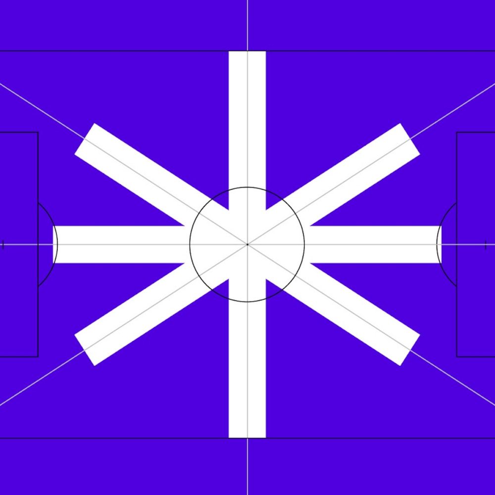
Danish Football Branding: Identity and Visuals abduzeedo 11/04 — 2025 The Danish women's football league new branding for its visual identity and branding to elevate the sport and focus on the game. Globally, women’s football is growing in popularity. In 2024, it was deemed to be the most valuable women's sport in the world with an estimated global yearly revenue of €500+ million. Danish clubs also benefit from this international trend. So much so, the association behind the Danish women’s football league decided to embark on a rebrand to support this national growth and ambition. "Our most important task is to further accelerate the development of elite women's football in Denmark. This requires a significant amount of money. Therefore, our success depends on making elite women's football much more attractive, not least to sponsors. In this context, we decided to do something about the names of our leagues and our visual identity, so that we could better match our product and ambition," says Marie Greve, director of the League Association, formerly the Women's Division Association. To help with this rebrand, NORD ID’s Copenhagen team was brought on to explore and develop the new chapter for the association. New focus, new name Despite increasing global interest, NORD ID had to understand the local context and perception. Through market analysis and interviews, the team and association understood they had to reevaluate how they wanted the league to be perceived moving forward. “For too long, Danish women’s football has been standing in the shadow of men’s football,” explains Frederik Sommer, COO at NORD ID. “Not intentional, but because of how it’s been framed. We built a naming system that is intuitive and helps elevate the entire league. The focus should be on the game, not the gender.” The result was to remove the gendered part of the name. The entire division has been renamed from “Women’s Division Association" (in Danish, Kvindedivisionsforeningen) to “the League Association" (Ligaforbundet). Each division has also been renamed from “Women’s League” (Kvindeligaen), 1st division and 2nd division to now being called “Division A”, “Division B division” and “Division C” (A-Liga, B-Liga, C-Liga). “We don’t want to position the Danish women’s soccer league as a derivative of the men’s league. It’s the complete opposite of The Champions League and The Women’s Champions League. We deliberately chose to move away from a gendered name to ensure that the league stands on its own, that it’s an independent and proud brand,” Frederik Sommer sums up. Motion and emotion in a modular system Each and every match is an epos, emotions playing out on the field. NORD ID brought this intensity and passion into a new visual identity for the association and league. “The lines and angles on the pitch inspired a new symbol, an asterisk,” explains Michael Mandrup, Design Director at NORD ID. “It serves as a recognizable focal point in a simple and modular design system that unifies the look and provides flexibility in use.” The straight lines also inspired the typeface, custom-made for A-ligaen. Together with Danish type designer Trine Rask, NORD ID developed a monospaced typeface which unites functionality and character. A brand element that will help build consistency and identity across all touchpoints, like websites, social media and TV. The new identity is live across websites and social media, implemented by the association itself. Branding and visual identity artifacts
dlvr.it
November 9, 2025 at 5:28 PM
In case you missed it: New blog post: Café Olimpico Heritage Tin: Packaging Design Meets Montréal Soul
Café Olimpico Heritage Tin: Packaging Design Meets Montréal Soul
Café Olimpico Heritage Tin: Packaging Design Meets Montréal Soul ibby 11/03 — 2025 Montréal’s Café Olimpico celebrates its legacy with the Heritage Tin, a vintage-inspired packaging design by stnmtl capturing Italian craft and community spirit. If you’ve ever been to Montréal, your must-do list probably looks something like this: bagels from St-Viateur, smoked meat from Schwartz’s, and an espresso from Café Olimpico. Established in 1970 by Italian immigrant Rocco Furfaro, Café Olimpico began as a neighborhood hangout where Rocco and his friends could watch La Liga matches. Over five decades later, it’s become a cultural institution, a place where coffee, community, and conversation blend as seamlessly as the crema on your espresso. The Mile End café’s charm isn’t just in the coffee. It’s in the atmosphere, the laughter, the walls layered with stories, and that unmistakable warmth that makes even first-time visitors feel like regulars. So the question became: how do you capture that history, that feeling, in an object? A Tin Steeped in Heritage Enter stnmtl, the Montréal-based creative studio behind one of their favorite projects to date — the Café Olimpico Heritage Tin. This limited-edition release pays homage to the vintage Italian coffee tins you’d find in every Nonna’s kitchen, a testament to Italian craft, storytelling, and timeless design. Every detail of the tin is rooted in the café’s architecture and history. The studio drew inspiration from the ornamental ceilings, wood engravings, and interior flourishes that define Olimpico’s space. The result is an intricate, tactile object that feels both nostalgic and new — a collectible piece of design that literally contains the spirit of the café. “We literally took everything that made the café, and put it in a tin — in traditional Italian fashion,” says the team at stnmtl. Design Meets Memory Beyond its beauty, the Heritage Tin is an exercise in storytelling through design. Each curve, emboss, and typographic detail is a celebration of cultural legacy aka Italian roots meeting Montréal soul. Since its release, the tin has become Café Olimpico’s best-selling product, cherished by both locals and tourists eager to bring a piece of the city, and its coffee culture, home. Available online and at all four Café Olimpico locations, the tin has quickly become more than packaging. It’s a design object that captures time, place, and community, brewed with care, layered with memory, and sealed with affection. Design by: stnmtl Client: Café Olimpico Photography: Courtesy of stnmtl / Café Olimpico
dlvr.it
November 8, 2025 at 6:45 PM
In case you missed it: New blog post: Dalziel & Pow and Pixel Artworks Reimagine the Guinness Yeast Room Through Experiential Design
Dalziel & Pow and Pixel Artworks Reimagine the Guinness Yeast Room Through Experiential Design
Dalziel & Pow and Pixel Artworks Reimagine the Guinness Yeast Room Through Experiential Design ibby 11/03 — 2025 When design meets storytelling, the result can be something close to alchemy and few places celebrate that magic better than the Guinness Storehouse in Dublin. This year, the landmark attraction celebrates its 25th anniversary with a reimagined Yeast Room, an immersive new experience designed by Dalziel & Pow in collaboration with Pixel Artworks. Part of the Storehouse’s acclaimed Ingredients Experience, the Yeast Room transforms one of Guinness’s most essential, yet invisible, ingredients into an environment that feels alive, mysterious, and quietly scientific. An Ingredient Reimagined Guinness yeast is legendary, a direct descendant of the strain first stored in the Guinness Yeast Library in 1903, known for giving the stout its signature depth and flavor. The new Yeast Room celebrates this hidden hero through a mix of digital art, sensory storytelling, and spatial design. Visitors are introduced to the space through a corridor of glowing screens that share stories of the scientists and brewers who care for the yeast and reveal that, to this day, it’s stored in liquid nitrogen at the St. James’s Gate brewery. Inside, the experience becomes truly immersive. Four synchronized projectors create a circular focal point representing a petri dish, a living, moving digital organism that responds to the presence of visitors. As guests walk through the projection, sensors translate their movement into rippling patterns of motion, allowing them to “move” budding yeast cells with a gesture. Above, mirrored ceilings extend the illusion, while digital fog, ambient lighting, and subtle sound and scent cues envelop the senses. It’s science through the lens of storytelling — equal parts educational and enchanting. Design as Discovery For Sarah Fairhurst, Design Director at Dalziel & Pow, the challenge was to make the unseen both visible and emotional: “With the Yeast Room, we wanted to transform an invisible but vital ingredient into a truly memorable experience. Yeast is the soul of Guinness, and our aim was to capture its mystery, science, and legacy through immersive storytelling that’s as playful as it is meaningful.” That balance of playfulness and depth defines the space. The room is both installation and laboratory — a hands-on design experience that invites participation, reflection, and yes, the occasional selfie (thanks to the mirrored ceiling). Technology That Breathes Pixel Artworks, known for creating environments that blend digital craft and emotion, used Notch and TouchDesigner to build a real-time system of generative visuals. “We wanted to create a living, breathing real-time system of yeast in liquid nitrogen; something as delicate as it is dynamic,” says Riaz Farooq, Senior Creative Director at Pixel Artworks. “Our aim was to make the science not just visible, but immersive and tangible.” By combining multi-projector mapping with motion tracking, the installation achieves an uncanny sense of tactility, as if visitors are floating through a living culture, suspended in nitrogen and light. A Living Tribute to Craft For a brand so deeply tied to craft and chemistry, the Yeast Room is both an homage and a metaphor: a space where invisible processes are made visible through the language of design. The project extends the legacy of the Guinness Storehouse as a place where history, innovation, and storytelling converge, now reimagined for a generation raised on interactivity and immersion. Design by: Dalziel & Pow Collaboration with: Pixel Artworks Photography: Courtesy of Guinness Storehouse / Dalziel & Pow
dlvr.it
November 8, 2025 at 6:04 PM
New blog post: Bellissimo gives Lavazza’s Tablì a bold new identity, reimagining the coffee ritual
Bellissimo gives Lavazza’s Tablì a bold new identity, reimagining the coffee ritual
Bellissimo gives Lavazza’s Tablì a bold new identity, reimagining the coffee ritual ibby 11/07 — 2025 Bellissimo designs Lavazza’s Tablì system—100% coffee tabs with no capsules. Debuted at Milan Design Week 2025, the identity blends clarity, sustainability, and Italian design. Lavazza introduces Tablì, a system that replaces single-use capsules with compostable tabs made of 100% coffee, no foil, no plastic, just pure ground coffee pressed into precise discs. It’s a quiet but meaningful shift toward cleaner design and cleaner consumption. Design First, Sustainability Forward Unveiled at Milan Design Week 2025, Tablì represents a rethink of the home coffee ritual. The visual identity, led by Turin-based studio Bellissimo, balances innovation and restraint. The tab, the core product, becomes the organizing shape for the entire identity system, signaling the product’s purpose with both clarity and confidence. This structure delivers immediate recognition and a visual hierarchy that makes sense at a glance. The tab silhouette drives the layout across SKUs. * Upper band: Lavazza and Tablì on crisp white   * Lower band: Bold, clean blocks of color for each blend   * Inside the tab: The message “100% coffee” — a direct statement of intent   A Typographic Accent With Purpose The logotype’s accent mark becomes a flexible brand signal, shifting color across the line to drive product differentiation. Paired with a black-on-white core palette and Lavazza’s signature gold, the system cuts through crowded shelves while maintaining brand heritage. An Ecosystem Designed With Restraint Machine, tabs, and accessories share one visual language — refined, minimal, timeless. Rather than shouting “innovation,” the design sits with quiet confidence, reflecting trust between Lavazza and Bellissimo, whose decade-long collaboration includes the restyling of Qualità Oro. Where Tradition Meets Future As Tablì expands globally, Bellissimo continues to shape the system’s evolution, a union of design, sustainability, and ritual for a modern coffee experience rooted in Italian heritage. Original project: Bellissimo — https://bellissimo.it/projects/tabli/
dlvr.it
November 7, 2025 at 5:27 PM
New blog post: Trellis Rebrand by How&How: A New Digital Blueprint for Generational Healthcare
Trellis Rebrand by How&How: A New Digital Blueprint for Generational Healthcare
Trellis Rebrand by How&How: A New Digital Blueprint for Generational Healthcare ibby 11/06 — 2025 Trellis rebrand by How&How reimagines generational healthcare with a thoughtful identity, modular grid system, and human-first visuals designed to bring clarity to motherhood and medical history. Design can clarify chaos. And if there’s a category begging for clarity it’s healthcare. Especially the part quietly powered by moms. In the US, nine out of ten mothers manage their family’s medical history in Apple Notes. Not because they want to but because the system leaves them nowhere else to put it. Records scattered across states. Insurance portals that feel like escape rooms. A data trail so fragmented it almost guarantees something gets lost along the way. Enter Trellis, a new platform designed to organize and preserve generational health built for the realities of mothers today, and the families who come after them. London- and LA-based studio How&How partnered with Trellis to craft a brand and interface that honors complexity without letting it overwhelm. A Framework for Life The identity starts with structure — a flexible, modular grid that becomes a quiet stage for stories, data, and personal detail. It grows and shifts like family life itself, a system that adapts instead of forcing users to. Soft-toned, natural photography grounds the platform in real families — pregnancy, postpartum, and the everyday chapters in between. It’s not stock photo perfect; it’s honest, warm, human. Look closely and you’ll find a fingerprint motif threaded throughout, a subtle reminder that medical data isn’t abstract — it’s personal. It also shapes the new Trellis mark, a fingerprint swirl forming a hidden “T”, anchoring the identity in this idea of personal legacy. Tone with Tender Strength Trellis introduces a voice borrowed from midwives — grounded, direct, fearless, and empathetic. It’s design language that knows when to soften and when to tell the truth with clarity. No sugar-coating, no jargon, no confusion. The result is a platform that feels equal parts medical vault and emotional archive — a place where data becomes continuity, memory, and future planning. A Brand That Stands Up to the System “For mothers today and generations to come” isn’t just a line. With Trellis, generational health becomes something that isn’t just hoped for, but designed for. A rare example of healthcare tech where the branding is as thoughtful as the mission. Mother of all healthcare apps. Explore the full case study: Explore the full project here: how.studio/branding/trellis
dlvr.it
November 6, 2025 at 9:25 PM
In case you missed it: New blog post: Ghosts of Design Past: The Eames Gauze Study and the Art of the In-Between
Ghosts of Design Past: The Eames Gauze Study and the Art of the In-Between
Ghosts of Design Past: The Eames Gauze Study and the Art of the In-Between ibby 10/31 — 2025 Celebrate Halloween with the Eames Gauze Study, a hauntingly beautiful look at form, material, and process from design legends Charles and Ray Eames. To celebrate Halloween here in the U.S., we’re summoning a design experiment that perfectly balances form, material, and mystery: the Gauze Study for Side Shell by Charles and Ray Eames. Preserved in the Eames Institute collection, this piece feels like the spirit of design itself. Translucent, delicate, and suspended between idea and object, it’s as if a ghostly chair materialized mid-thought, whispering clues about the creative process. Ray and Charles Eames were never ones to design from a distance. They preferred to think through making, prototyping directly with their hands, testing ideas in real time. They built everything from small mock-ups to full-scale models like this one. Formed from a gauzy textile that stiffened as it dried, the study was a material experiment — an exploration of what shape could emerge when you let the process lead. By watching what the material could and couldn’t do, the Eameses let design evolve naturally, each discovery informing the next. The result? A chair that seems to hover between states — part idea, part apparition. Halloween Meets Mid-Century Modern Look closer and you’ll see it: the gauze draped like a shroud, the skeletal frame beneath, the way shadows cling to every curve. It’s mid-century modern by way of the supernatural, a ghost of innovation made visible. The gauze isn’t just a surface; it’s the residue of an idea, caught in the moment before it solidified. What We Learn Material as Medium: The Eameses didn’t force their materials into form they learned from them. The gauze wasn’t decorative; it was instructive. Process as Presence: Every fold, wrinkle, and tension mark is a record of curiosity. It’s what happens when you let making be a form of thinking. The Beauty of the In-Between: Like Halloween itself, the Gauze Study celebrates what’s ephemeral, the in-between phase where imagination meets matter. So as you carve pumpkins or tweak your latest prototype, take a cue from the Eameses: embrace the ghostly, the uncertain, the not-yet-finished. Happy Halloween from the Abduzeedo design fam and may your ideas take shape in mysterious and beautiful ways! 
dlvr.it
November 5, 2025 at 9:55 PM
New blog post: Fight for Kindness 2025 — Explore the Global Poster Gallery
Fight for Kindness 2025 — Explore the Global Poster Gallery
Fight for Kindness 2025 — Explore the Global Poster Gallery ibby 11/04 — 2025 See how designers worldwide reinterpret kindness through typography in the Fight for Kindness 2025 gallery — a creative call for empathy and inclusion.  Every typeface, every letter spool, every bold headline has the power to influence how we feel and how we act. That’s the core idea behind Fight for Kindness 2025, a global typographic initiative by TypeCampus in partnership with Zetafonts. The 2025 Poster Gallery is now live. What’s happening The Fight for Kindness 2025 poster gallery is now live bringing together a global community of designers using typography as a tool for empathy and connection. This edition showcases expressive type experiments, cultural scripts, motion-inspired forms, and bold visual storytelling, all created in celebration of World Kindness Day on November 13. Alongside the online showcase, exhibitions will roll out in cities worldwide, inviting creatives to reflect on how design can shift culture in subtle and meaningful ways. Organized as a non-profit creative initiative, the project remains open to anyone who believes in design as a force for generosity, inclusion, and shared humanity. Why this matters For designers and creatives, Fight for Kindness represents more than a poster competition. It offers: A platform for social impact through visual culture where letterforms become vehicles of change. A chance to see global voices, across scripts, languages and regions, offering perspectives that often go under-represented. A timely moment: art meets advocacy as the world marks a day dedicated to kindness. How you can engage Take a moment to dive into the full gallery and share the works that resonate most. Consider how scale, spacing, color, and form turn typography into a vessel for emotion and meaning. Let these pieces seep into your own creative practice, whether you’re designing, teaching, or sparking conversation in your community. And with November 13 on the horizon, keep an eye out for local exhibitions so you can experience this global celebration of kindness and design in person. Yypography isn’t just about what you read, it’s about what you feel. The Fight for Kindness 2025 gallery invites us to feel and then act. Abduzeedo’s Favorite Posters from Fight for Kindness 2025
dlvr.it
November 4, 2025 at 8:50 PM