


Alice Corona
@alice-corona.bsky.social
Constantly thinking about the politics of data ✨ #DataJournalism & partner @sheldon_studio • #DatActivism OCIO, @InsideAirbnb • Prof @unibo , #DataPhys @batjo_data | [email protected]
--
alice-corona.eu
--
alice-corona.eu
The piece reminded me of the activist work I do with OCIO and Inside Airbnb on housing accessibility, STR and corporate landlords, as we often have used similar phrases like "5% of host manage 30% of Airbnb listings and 34% of the revenue", to accompany network vizs which indeed look like octopi.
May 19, 2025 at 6:39 PM
The piece reminded me of the activist work I do with OCIO and Inside Airbnb on housing accessibility, STR and corporate landlords, as we often have used similar phrases like "5% of host manage 30% of Airbnb listings and 34% of the revenue", to accompany network vizs which indeed look like octopi.
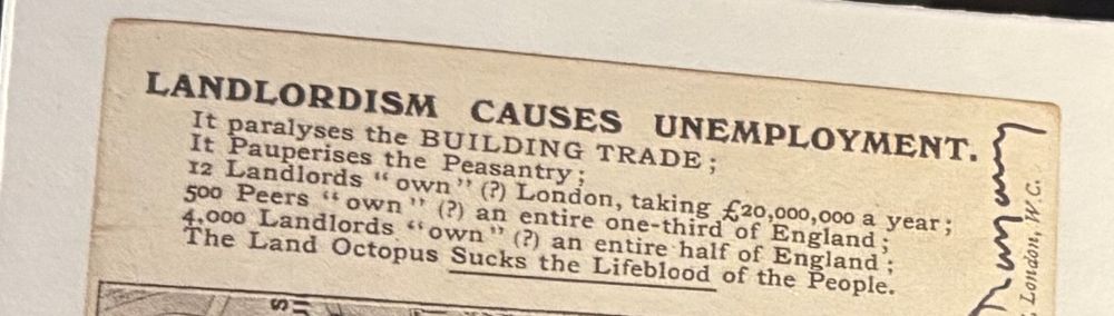
In another room, distant yet conceptually connected by this reflection on power, sat my favorite piece: a card with an etched octopus whose tentacles enclose London, framed by the text "12 Landlords 'own'(?) London, taking £20,000,000 a year[...]The Land Octopus Sucks the Lifeblood of the People."

May 19, 2025 at 6:39 PM
In another room, distant yet conceptually connected by this reflection on power, sat my favorite piece: a card with an etched octopus whose tentacles enclose London, framed by the text "12 Landlords 'own'(?) London, taking £20,000,000 a year[...]The Land Octopus Sucks the Lifeblood of the People."
There was a neat, minimalist drawing that immediately caught my attention. Upon closer scrutiny, I was shocked as the diagram was captioned "Bombing plan for the dropping of the atomic bomb on Hiroshima (August 6, 1945) by Robert A. Lewis", the co-pilot of the Enola Gay who dropped the Bomb

May 19, 2025 at 6:39 PM
There was a neat, minimalist drawing that immediately caught my attention. Upon closer scrutiny, I was shocked as the diagram was captioned "Bombing plan for the dropping of the atomic bomb on Hiroshima (August 6, 1945) by Robert A. Lewis", the co-pilot of the Enola Gay who dropped the Bomb
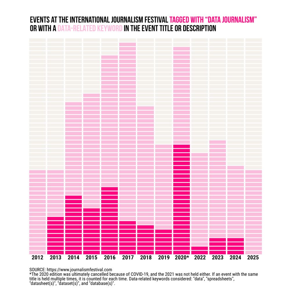
Rather than a disappearance of data journalism, #IJF2025 marks its normalization :) For example, about half of the events tagged as "investigative journalism" or "climate & environment" mention data-related keywords. Other categories are emerging, like #AI, at its 6th appearance at the Festival.


April 11, 2025 at 6:57 AM
#ijf2025 has started, and since I can't be there, I dove into the full program to ease the FOMO. And, surprise! For the first time since 2013, there's no dedicated #DataJournalism section. To mourn its absence, I analyzed @journalismfestival.com data from 2012 - 2025. The takeaway? Read on [1/2]
[4/4] ...each with its strength and weaknesses when it comes to communicating specific angles. At the same time, there are many choices beyond chart type that play a crucial role in ensuring a chart effectively communicates what we intend it. In the next series of posts, I'll highlight some more.


February 28, 2025 at 4:05 PM
[4/4] ...each with its strength and weaknesses when it comes to communicating specific angles. At the same time, there are many choices beyond chart type that play a crucial role in ensuring a chart effectively communicates what we intend it. In the next series of posts, I'll highlight some more.
[3/4] The same data about life expectancy in EU regions can be visualized with different charts...


February 28, 2025 at 4:05 PM
[3/4] The same data about life expectancy in EU regions can be visualized with different charts...
[2/4] So I've decided to inaugurate my Bluesky account with a series of post trying to explain why this is the wrong question to ask, and what could work instead.
PART 1 looks at how chart choosers focused around "messages" can help, but also oversimplify, the process of deciding upon a chart.
PART 1 looks at how chart choosers focused around "messages" can help, but also oversimplify, the process of deciding upon a chart.


February 28, 2025 at 4:05 PM
[2/4] So I've decided to inaugurate my Bluesky account with a series of post trying to explain why this is the wrong question to ask, and what could work instead.
PART 1 looks at how chart choosers focused around "messages" can help, but also oversimplify, the process of deciding upon a chart.
PART 1 looks at how chart choosers focused around "messages" can help, but also oversimplify, the process of deciding upon a chart.
[1/4] I have just finished teaching a lesson in my course centered around one of the most common, yet misframed, questions I get from my students: "What is the best chart for my data"? #dataliteracy #criticaldata #dataviz #datajournalism

February 28, 2025 at 4:05 PM
[1/4] I have just finished teaching a lesson in my course centered around one of the most common, yet misframed, questions I get from my students: "What is the best chart for my data"? #dataliteracy #criticaldata #dataviz #datajournalism