The Carlson Lab @ Yale
@carlsonlab.bsky.social
1.2K followers 3.5K following 44 posts
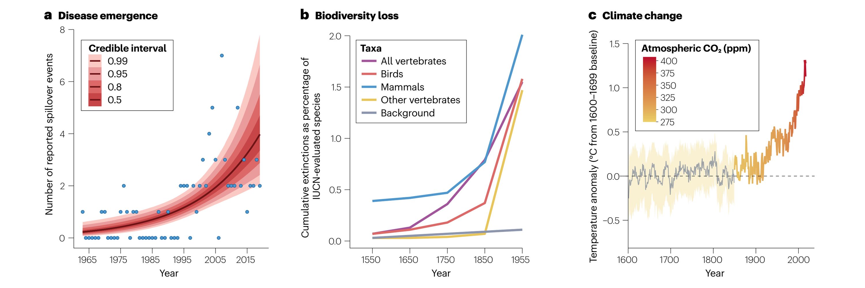
We work on planetary problems. Currently: counting climate change-related deaths; pandemic risk assessment in a changing biosphere; data, science, and vaccine access during public health emergencies. 👉 carlsonlab.bio
Posts Media Videos Starter Packs
carlsonlab.bsky.social
🚨 We're about to start reviewing applications, but there's still time to reach out for our postdoc position on climate change impact attribution! If you have experience with attribution science or climate epidemiology, and want to help us launch the Global Burden of Climate Change Study, reach out!
yale's beautiful campus from overhead
Reposted by The Carlson Lab @ Yale
colincarlson.bsky.social
Believe it or not, @alexandraphelan.bsky.social and I started talking about the concept for this workshop 5? 6? years ago, so it was absolutely amazing to finally pull this off with exactly the right people, especially in a year when it feels like we're taking a lot of L's on actionable science 🥰
carlsonlab.bsky.social
Last week's workshop on scenario development for pandemic risk assessment was a critical step forward for our broader effort on the establishment of an "IPCC for pandemics," with the UN Foundation and the National Academy of Medicine. Thank you to all of our amazing speakers and participants!
chris callahan, alex phelan, and lizzy blackmore speaking in a group discussion steph eaneff, angela chang, and bobby reiner speaking in a group discussion shonali pachauri speaking in a group discussion as several people listen a panel consisting of angela chang, nita madhav (speaking), gregg gonsalves, shweta bansal, and alex phelan. everyone is smiling
carlsonlab.bsky.social
Last week, we were lucky to host an international workshop on Pandemic Risk Scenarios for the 21st Century, with generous support from PAX sapiens and @viralemergence.org. Lots of lessons learned from climate and biodiversity science on how to design useful models and imagine better futures!
workshop group photo
Reposted by The Carlson Lab @ Yale
torrelavelle.bsky.social
Check it out! New work in which we undertake the first systematic look at the science of health impact attribution, plus a great thread by @colincarlson.bsky.social below on attribution science and what we tried to accomplish with this study.
colincarlson.bsky.social
🚨 NEW: Climate change is already causing 30,000 deaths per year - a global annual economic loss of $100-350B USD - but the true damage is probably 10x higher. Out TODAY in Nature Climate Change: the first systematic look at the science of "health impact attribution" 🔓 www.nature.com/articles/s41...
"Health losses attributed to anthropogenic climate change," a brief communication in the journal Nature Climate Change. There's a map showing regions of the world, and pie charts of relevant studies as they apply to different health impacts like "heat-related deaths" and "maternal and child health"
Reposted by The Carlson Lab @ Yale
julianataube.bsky.social
3️⃣ During the pandemic & at baseline, younger adults, men, & Hispanic & Black individuals have more contacts & are at greater disease risk

These geographic & social differences in risk can help target public health resources & surveillance 📢

/11
Figure showing contact by age, gender, race or ethnicity, and setting during the pandemic and at baseline

(A) Mean pandemic and baseline non-household contact rate by age. Each point represents a county-age category. Analysis was limited to counties with five or more responses per age category per week. Contact decreases with age.

(B) Mean pandemic and baseline non-household contact rate by gender. Each point represents a county-gender category. Analysis was limited to counties with five or more responses per gender category
per week. Contact is higher in men than women.

(C) Mean pandemic and baseline non-household contact rate by race or ethnicity. Each point represents a state-race or ethnicity category. Analysis was limited to states with ten or more responses
per race or ethnicity category per week. All racial and ethnic categories are non-Hispanic unless labelled otherwise. Other denotes individuals who reported their race as American Indian or Alaska Native, Native Hawaiian or Pacific Islander, or other, or as falling in multiple categories. Contact is lowest in Asian respondents, and highest in individuals reporting other or multiple race categories.

(D) Mean pandemic and baseline non-household contact rate by setting. Each point represents a county-setting. Analysis was
limited to counties with ten or more responses per setting per week. Contact is highest at work, followed by shopping, then social settings.
Reposted by The Carlson Lab @ Yale
julianataube.bsky.social
2️⃣ Contact patterns vary across US counties regardless of disease 🌎

Based on population density, we expected urban counties 🏙️ to have higher contact rates than rural ones 🚜

This is true at baseline, but not during the pandemic, when urban areas were more responsive to gathering restrictions

/10
Figure showing spatial heterogeneity and urban–rural gradient of pandemic and estimated non-pandemic contact

(A) Mean number of non-household contacts per person per day for each county relative to the national mean (8⋅7 contacts per person per day) during the COVID-19
pandemic (Oct 1, 2020, to April 30, 2021). There was high spatial heterogeneity in contact, even within states, which was fairly consistent across time. Counties shaded in grey did not have a sufficient sample size to estimate contact. 

(B) Map of inferred mean number of non-household contacts per person per day for
each county relative to the national mean (10⋅9 contacts per person per day) in a non-pandemic scenario. Spatial heterogeneity in contact remains high, although which counties have values above and below the national mean has shifted compared with the pattern observed during the COVID-19 pandemic. 

(C) The mean contact rate (non-household contacts) for each county decreases with increasing urbanicity during the pandemic, but increases with urbanicity during inferred non-pandemic times.
Only counties with ten or more responses per week each week (from Oct 1, 2020, to April 30, 2021) are included. NCHS class describes the urbanicity of the county, with 1 indicating a large central metropolitan area and 6 representing rural, non-core areas. NCHS=National Center for Health Statistics.
Reposted by The Carlson Lab @ Yale
julianataube.bsky.social
1️⃣ Early in the pandemic, contact varied over time 📆

However, contact and COVID-19 incidence were anti-correlated during this period (when disease went ⬆️, contacts went ⬇️)

Thus, after controlling for disease, there was no longer any systematic variation in contact over time

/8
Figure showing contact dynamics observed over time during the COVID-19 pandemic and estimated non-pandemic contact dynamics, by county

(A) Mean number of daily non-household contacts for individual counties over time during the COVID-19 pandemic. Contact is presented as a Z score relative to each
county’s mean to allow comparison between time series despite the large range of mean contact values across counties. Each line represents a county and is coloured by mean contact relative to the national mean. The black line shows the Z score of the centred 3-week rolling average of national COVID-19 case incidence for context.
Counties had similar contact dynamics over time: most counties had higher contact during the summer of 2020, and all had lower contact during the winter of 2020–21. Counties in which contact decreased in the summer of 2020 were typically in states that had a higher incidence of COVID-19 during that time. 

(B) Mean contact rate (non- household contacts) in the absence of disease (baseline; slate) was effectively constant over time, compared with observed contact during the pandemic (teal), across a diverse set of counties. We controlled for disease using a linear regression model that predicts contact from national case incidence, state and county policy data, and county vaccination coverage. This analysis is restricted to Oct 1, 2020, to April 30, 2021, to encompass a full wave of COVID-19. Shaded areas represent 1 SD above and below the fitted contact value or estimated non-pandemic value.
Reposted by The Carlson Lab @ Yale
julianataube.bsky.social
Our paper on US contact patterns is now published in The Lancet Digital Health!

doi.org/10.1016/j.la...

Thanks to my brilliant coauthors @zsusswein.bsky.social, @vcolizza.bsky.social, & @bansallab.bsky.social for their help with this project.

Read on for an overview of our findings... 🧵
Screenshot of the paper titled "Characterising non-household contact patterns relevant to respiratory transmission in the USA: analysis of a cross-sectional survey"
Reposted by The Carlson Lab @ Yale
colincarlson.bsky.social
New preprint! 🥳🎉 We looked at viral coinfection patterns at the largest scale ever in wildlife. We found a strong association among CoVs, PMVs, and influenza A, and higher coinfection rates in wildlife trade; plus, evidence that bats accumulate persistent infections. www.biorxiv.org/content/10.1...
Figure 3 of our paper, which shows viral coinfection networks at the virus level
Reposted by The Carlson Lab @ Yale
colincarlson.bsky.social
We're hiring! We have funding for a 1-year (to start with, but hopefully longer) postdoc working on climate change impacts on health broadly, and helping us launch gbcc.study. Strong skills in epi methods or attribution science needed. Can potentially be remote. Please share!
The Global Burden of Climate Change Study
gbcc.study
Reposted by The Carlson Lab @ Yale
carlsonlab.bsky.social
We may have a one-year postdoctoral position opening! We're looking for someone with experience in attribution science OR very strong skills in climate epidemiology to come help us launch a Global Burden of Climate Change Study. Remote possible for the right person; aim to raise $ for a second year.
The Global Burden of Climate Change Study Working Group
carlsonlab.bsky.social
We had a great time at #ESA2025! Disclaimer: Ekiben sandwich not included in conference registration or ESA membership
Hailey Robertson presenting about the role of primates in arbovirus sylvatic maintenance Collin Schwantes presenting about how to make an effective data management plan Colin Carlson presenting about scaling in host-virus networks The Ekiben neighborhood bird (fried chicken) and tofu brah (fried tofu sandwich with a cool sort of carrot slaw) and a yuzu white peach soda
Reposted by The Carlson Lab @ Yale
johnholbein1.bsky.social
"Conditional cash transfer could substantially contribute towards reducing AIDS-related inequalities and achieving the AIDS-related Sustainable Development Goal."
johnholbein1.bsky.social
Cash transfer reduced AIDS incidence and AIDS-related mortality in Brazil.

Score one for team cash transfers.

www.nature.com/articles/s41...
Reposted by The Carlson Lab @ Yale
napaaqtuk.bsky.social
I am really excited to be a part of this team. We took our time writing this, putting a lot of thought into how our journeys as #NativesInSTEM were affected by different aspects of Universities and looking for commonalities across the world. I hope folks in academia appreciate this work.
Reposted by The Carlson Lab @ Yale
colincarlson.bsky.social
This was just a fun side quest, but if our lab thought about this more in the future, I'd want to revisit some of the ideas from this 2020 preprint - rare or unique clinical presentations can improve syndromic surveillance for emerging diseases among endemic ones
www.medrxiv.org/content/10.1...
Graphs with beautiful paint-drippy colors showing that after a certain number of cases it becomes easy to correctly classify different diseases with similar clinical presentations
Reposted by The Carlson Lab @ Yale
colincarlson.bsky.social
Like I said: a small part of a much bigger project, which I'll let @faustobustos.bsky.social tell you about - including a much longer-term effort to figure out how to improve WHO and PAHO case definitions / syndromic surveillance / clinical treatment for very hard to distinguish endemic arboviruses.
A table of syndromic features that best distinguish dengue, chikungunya, and Zika