Commercial Type
@commercialtype.bsky.social
890 followers 100 following 35 posts
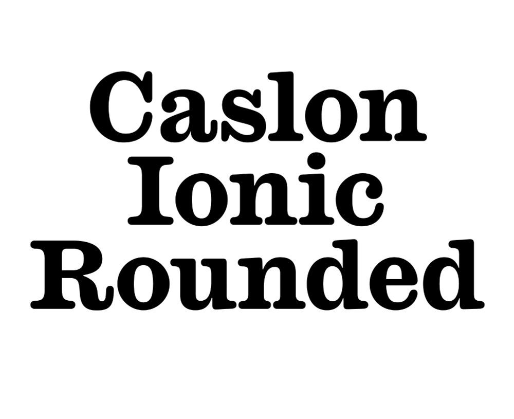
Type foundry in New York and London. commercialtype.com
Posts Media Videos Starter Packs
commercialtype.bsky.social
James Mosely's series of lectures on the history of letterforms were delivered every year to students in the Department of Typography and Graphic Communication at the University of Reading. These were recorded in 2020-21, and are now available for everyone to watch:

www.youtube.com/playlist?lis...
James Mosley's History of Letterforms - YouTube
James Mosley’s lectures on the history of letterforms were delivered in the Department of Typography & Graphic Communication over many years. They represent ...
www.youtube.com
commercialtype.bsky.social
New work: a fresh new nameplate for @torontolifemag.bsky.social, drawn by Julien Priez @boogypaper.bsky.social for design director Colleen Nicholson.

commercialtype.com/custom/toron...
Toronto Life cover from August 2025. REVENGE OF THE COTTAGERS is the main headline. Toronto Life cover from June 2025. Best New Restaurants 2025 is the main headline.
commercialtype.bsky.social
I am so sorry you never received your copy. Shipping this book has been a nightmare. At least 25% of the books we've sent out have disappeared. We'll ship a new copy out to you right away.
Reposted by Commercial Type
andypressman.itch.io
I'm laying out Gun Magic Techno Pop in Focal and it's such a blast to work with. I wish phototypesetting had still been in use when I began my career, I would have eaten that shit up. Focal designed by @greggazdowicz.bsky.social, available from @commercialtype.bsky.social
The inside cover and front page of Gun Magic Techno Pop. The inside cover reads "It's 1999 and time is speeding up," with the 'p' in arc being looped endlessly, getting skinnier and skinnier, as if the word were being squeezed into a high-pitch electronic note. The other page is a lengthy book introduction. A later spread from Gun Magic Techno Pop. On the left-hand page is an overview of how characters work in the game, with a diagram of the character sheet itself. On the right-hand page is a character sheet for the Mundane Mage. The character description reads "Make the trains run on time."
commercialtype.bsky.social
This was a fun project to help out on. Miguel Reyes redrew the logotype, and Control is used throughout the identity, including an early version of Control Compressed.
its-nice-that.bsky.social
Richard Turley gives Air’s identity space to breathe through simplicity and parody > buff.ly/2L3T0or
commercialtype.bsky.social
Jim Parkinson was a kind and gentle soul, in addition to being unbelievably talented. He will be missed.
commercialtype.bsky.social
Please take this survey and help the Fontstand Cooperative figure out how font licensing needs have evolved.
fontstand.com
We’re are launching an independent industry-wide survey for font users. We want to hear about your experiences: What works? What’s confusing or frustrating? What would you change? Your answers will help us decide how licensing works within the Fontstand Cooperative.

fontstand.com/survey
Fontstand font user survey.
commercialtype.bsky.social
NEW RELEASE! Royal Gothic by @paul-barnes.bsky.social, with help from Luke Charsley and Tim Ripper, comes out of the Vault with a full range of seven weights. Starting from a single bold weight, and folding in influences from the US and Germany, it preserves the quirks of early squarish sans serifs.
Text in Royal Gothic Black Text in Royal Gothic Light Full range of 14 styles in Royal Gothic family, in order of weight. Interior spread from "Happy Gas", a monograph on artist Sarah Lucas, designed by Fraser Muggeridge.
commercialtype.bsky.social
Anna will give a talk about the project at ATypI in Copenhagen on Saturday, definitely worth seeing if you're there!

atypi.org/presentation...
commercialtype.bsky.social
New work: Greg Gazdowicz and Christian Schwartz drew a new nameplate for Swedish news outlet Aftonbladet, directed by Anna Thurfjell.

Read our case study here:
commercialtype.com/custom/namep...

More about the thinking here:
annathurfjell.com/work/brand-r...
AFTONBLADET nameplate in yellow with a black shadow on a red background Two variations on the SPORTBLADET logotype in yellow with a black shadow on a pink background
commercialtype.bsky.social
This was the reference. The R is really something.
1975 poster for A Chorus Line
commercialtype.bsky.social
New work for New York Magazine's annual Yesteryear issue.
commercialtype.com/news/ny_mag_...

We recreated the lettering on the 1975 poster for A Chorus Line for design director Tom Alberty and his team.
commercialtype.bsky.social
We have some case studies from the Commercial Type Design Studio here, with more to come:

commercialtype.com/design
commercialtype.com
commercialtype.bsky.social
Though Commercial Studio didn't survive 2020, we regrouped and have rebuilt our corporate identity studio within Commercial Type, under the direction of Dino Sanchez. This has quietly been going on alongside our other work for the past couple of years, and now we're taking a moment to talk about it.
creativeboom.com
How a type foundry started a brand studio (and why it makes perfect sense) 👀
www.creativeboom.com/insight/how-...
commercialtype.bsky.social
New in our news section, Caren @lither.land interviewed Shiva Nallaperumal about Delegate, how he came to type design, and the studio November that he runs jointly with Juhi Vishani: commercialtype.com/news/shiva_n...
Pullquote from an interview with Shiva Nallaperumal: "I've always oscillated between type and graphic design. I love the rigor and craft of the former and the conceptual side of the latter."
Typeset in Delegate Bold
commercialtype.bsky.social
New in the Vault: Caslon Ionic Rounded, adapted from Caslon Ionic by @greggazdowicz.bsky.social

vault.commercialtype.com
Caslon Ionic Rounded (Bold) There are certain visual motifs we keep coming back to. Stencils are great. We never get tired of swashes. And we love soft letterforms. (Caslon Ionic Rounded Light) Softness adds warmth and charm. (Caslon Ionic Rounded Extrabold) Greg Gazdowicz has spent 
the last few years exploring various aspects of softness in type: in contrast with sharpness, in Terza; as an artefact of production processes, in Focal; and now the transformative properties of softness when applied to a historical genre  — the Ionic — known for its solidity. (Caslon Ionic Rounded Medium Italic)
commercialtype.bsky.social
Lovely use of Orleans ↓
jackflag.bsky.social
Cover for Tenterhooks by Claire-Lise Kieffer.
Out now, published by Banshee Press.

Type by @commercialtype.bsky.social
commercialtype.bsky.social
New in the Vault: Jargon, a condensed headline typeface with a giant x-height by Thomas Bouillet.

vault.commercialtype.com
Jargon in Jargon Black Jargon is a gently flared headline typeface by Thomas Bouillet, with newsy proportions and an elegant finish.
in Jargon Thin The uprights have some Dutch influence—not surprising, since Jargon started as a small part of Thomas’s degree project at the Type]Media program in the Hague—while the italics reference Roger Excoffon & François Ganeau’s stylish sloped romans for Vendôme.
in Jargon Bold and Bold Italic Its extreme x-height is well-suited to Posters and Book Covers.
in Jargon Ultra
commercialtype.bsky.social
Congratulations to Lisa Huang and the whole team behind @wordsoftype.com on today's beta launch! This is already a great resource and is going to keep getting better.

wiki.wordsoftype.com/