John Russell
@drjohnrussell.com
110 followers 90 following 97 posts
Senior Director, Data and Assessment at KIPP NYC, Adjunct at American Museum of Natural History. Passionate about STEM, data, education and students.
Posts Media Videos Starter Packs
drjohnrussell.com
#TidyTuesday (2025 W40)

Just love an excuse to do an animation... this map shows the location of Eurobasketball teams, with a gif highlighting the country of the team that won.

#rstats

Code: github.com/drjohnrussel...
drjohnrussell.com
#TidyTuesday (2025 W39)

Used the ggmap package to make an inset for the graph, and noticed that there seems to be two seasons of observations. Fun dataset, I'm curious whether the increase in cranes is an observer effect, or an actual increase!

#rstats

Code: github.com/drjohnrussel...
drjohnrussell.com
(e.g., perhaps more people do chess who are in their twenties, so including the whole sample pulls down the mean)
drjohnrussell.com
Appreciate this! The reasoning for cutting was that taking the full average would have the effect of introducing a sample size effect with different entrances into chess by age. But to your point, I wanted to make that cutting clear in the methodology.
drjohnrussell.com
#TidyTuesday (2025 W38)

I had heard about the age effect in chess, and wanted to see it for myself - took the top 20 chess players at each age to show how chess, like other sports, very much peaks (also, there are some old chess players still around!)

#rstats

Code: github.com/drjohnrussel...
drjohnrussell.com
This one was a really good episode
drjohnrussell.com
#TidyTuesday (2025 W37)

Went into cleaning mode this week, filtering out common pantry ingredients and instructions to find the most common other calls for ingredients that are given.

#rstats

Code: github.com/drjohnrussel...
Reposted by John Russell
andrew.heiss.phd
look what you made me do

(#rstats code here gist.github.com/andrewheiss/... )
Original world map sliced into 8 areas, using the Mercator projection The same 8 slices, but with the Robinson projection. Slice A is tiny and curvy now The same 8 slices, but with the Robinson projection. Slice A is even tinier and curvier now
drjohnrussell.com
#TidyTuesday (2025 W36)

The Henley Passport index is interesting because it allows ties, which was a nice challenge for a ranking plot using the ggflags package to see which passports allow one to travel to the most countries.

#rstats

Code: github.com/drjohnrussel...
Reposted by John Russell
nrennie.bsky.social
Super fun #TidyTuesday data all about frogs this week! 🐸

I decided to try to visualise the scientific names of the different frogs using a sunburst diagram 📊 Thanks to {ggiraph} - it's also interactive!

Code: github.com/nrennie/tidy...

#RStats #DataViz #ggplot2
drjohnrussell.com
#TidyTuesday (2025 W35)

We often think of distributions among categories, but spatial and temporal distributions are also important for exploration. It's also interesting to think, as a citizen science project, about issues of selection bias.

#rstats

Code: drjohnrussell.com/posts/2025-0...
drjohnrussell.com
code is too short to make into a post, but can be found in this screenshot
drjohnrussell.com
#TidyTuesday (2025 W34)

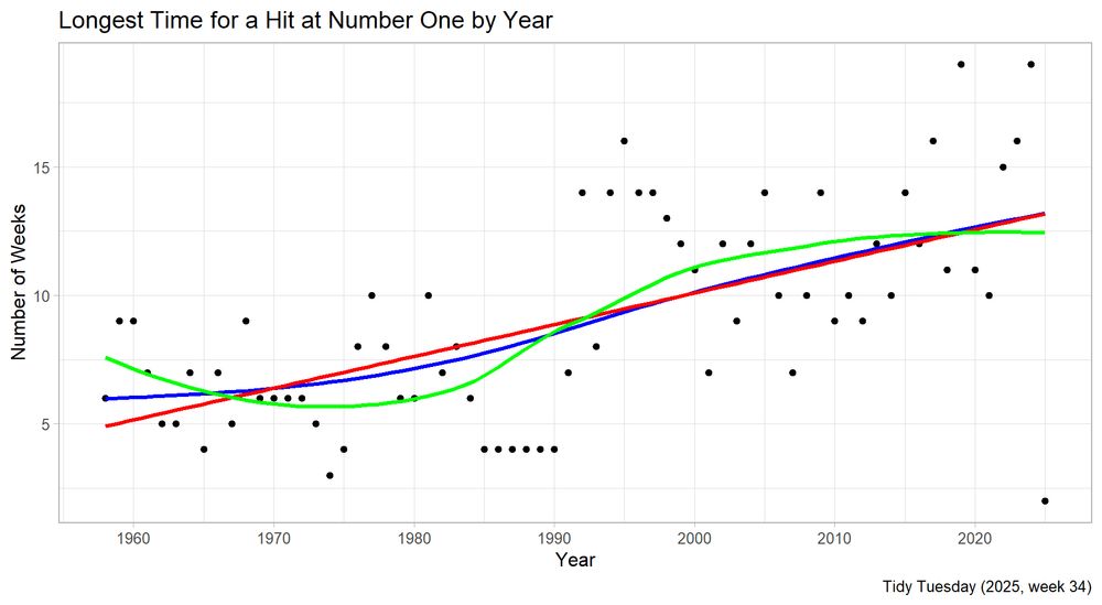
I wondered if the maximum time that a song spent as a Number One Hit had changed over time. What is interesting is that different models tell different stories, with the GAM (blue) and LM (red) mostly agreeing, but the loess (green) being pulled down in the middle.

#rstats
drjohnrussell.com
#TidyTuesday (2025 W33)

I'm in Edinburgh for the fringe, so this was timely!

Many thanks to @nrennie.bsky.social for curating this dataset of Scottish Munros. Loch Ness & Loch Lochy serve as a dividing line because of the underlying fault system!

#rstats

Code: drjohnrussell.com/posts/2025-0...
drjohnrussell.com
or maybe marginal histograms/density plots from the `ggExtra` package?
drjohnrussell.com
Some stakeholders like the data output for their review as an Excel file, especially if I can have a summary sheet, and then the data underlying it in other sheets. I use the excellent `writexl` package to form these, then will go into excel to play with the column widths. #rstats
drjohnrussell.com
This was a great challenge for me to do a few explorations on datasets from @datavisfriendly.bsky.social, @ropensci.org and NYC Open Data. Really appreciate that this work is out there to explore and learn from!
drjohnrussell.com
Day 30(!) of #30DayChartChallenge (national geographic)

Mapping our animal friends (and their repercussions) in NYC using NYCOpenData and the tigris and socrata #rstats packages. Interesting that it doesn't quite correlate.

github.com/drjohnrussel...
drjohnrussell.com
Day 29 of #30DayChallenge (extraterrestrial)

Borrowing a dataset that my co-teacher uses, it is amazing to look at the ways in which exoplanets are discovered, and to understand that, within the astronomer's toolkit, different methods preference different exoplanets.

github.com/drjohnrussel...
drjohnrussell.com
Appreciate the comment - I found it interesting that the most common number of whorls or loops (0) is different from the most common combination (0,3), which makes me want to do Pearson's test of independence to check it out!
drjohnrussell.com
@datavisfriendly.bsky.social - the predicted values were added from his 1907 paper, and I wonder if it may be a nice inclusion in the HistData package

www.medicine.mcgill.ca/epidemiology...
www.medicine.mcgill.ca
drjohnrussell.com
Day 28 of #30DayChartChallenge (inclusion)

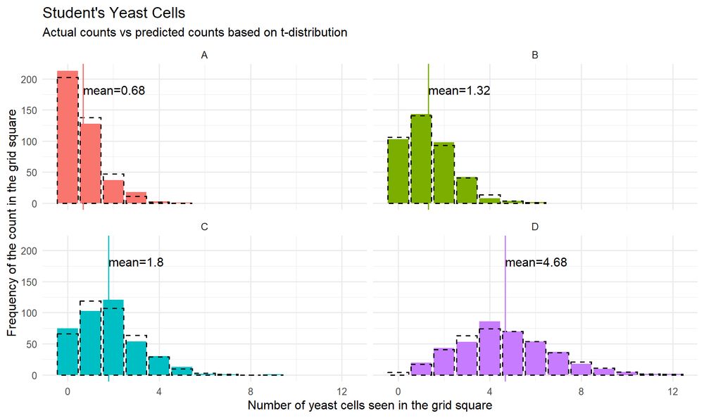
W Gosset was only allowed to write if he did not include beer, Guinness, or their own surname - and as such, Student was born. In his first paper, he predicted the distribution of cells in 4 grids. Both graphed using #rstats

github.com/drjohnrussel...
drjohnrussell.com
Day 27 of #30DayChartChallenge (noise)

H. Waite's data (1915) on whorls and loops on the right hands of 2000 people became a case for Pearson's work on independence.

I love how the most common number of loops or whorls is different than the most common number of both.

github.com/drjohnrussel...
drjohnrussell.com
Day 26 of #30DayChartChallenge (monochrome)

In 1954 in 272 counties with the highest incidence of polio, the vaccine was tested, affecting ~1.6m elementary children.

There were two different designs, an RCT (using a placebo), and a matching study. Both succeeded.

Code: github.com/drjohnrussel...