Fonts In Use
@fontsinuse.com
1.6K followers 3 following 34 posts
Type at work in the real world. Fonts In Use is an independent archive of typography. https://fontsinuse.com Primarily on Mastodon: https://typo.social/@fontsinuse Newsletter: https://newsletter.fontsinuse.com?tag=bluesky
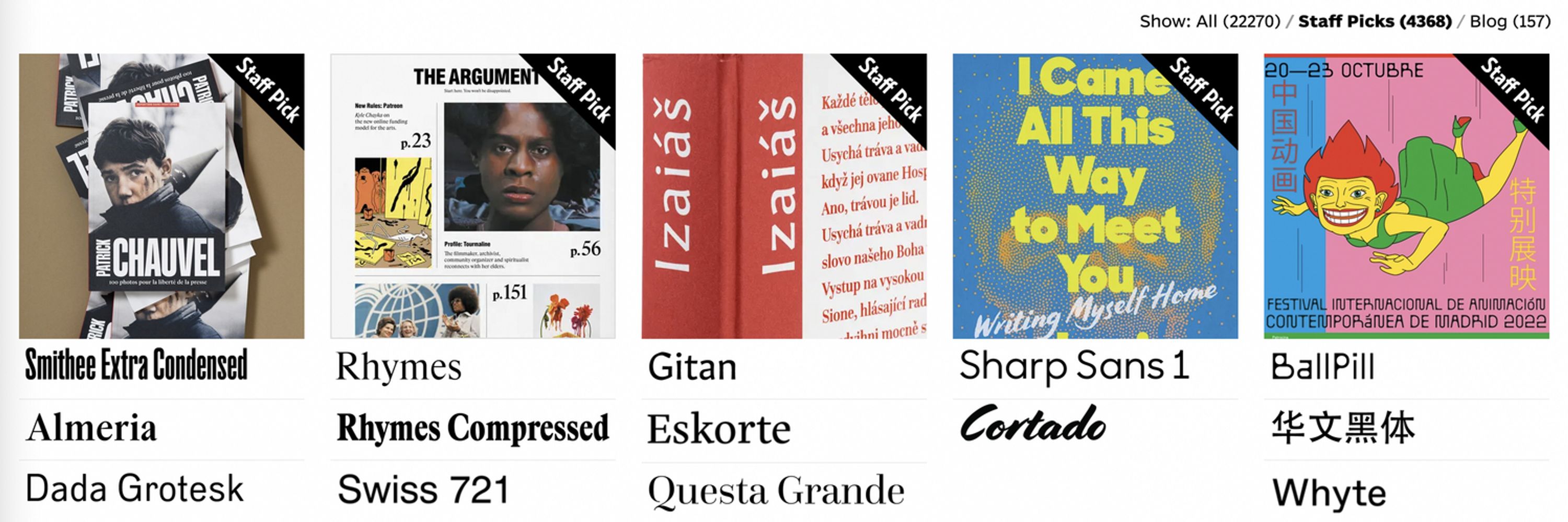
Posts Media Videos Starter Packs
Reposted by Fonts In Use
symbo1ics.bsky.social
DJR really is a treasure and I'm thrilled he's promoting other designers.

Independent type design is critical to the future of written communication, as well as a subtle, exacting and exciting means of expression in its own right.

#typography
fontsinuse.com
Not only is David Jonathan Ross one of our longest-running sponsors, he’s now devoting some of his ad space to other type designers whose work he admires – starting with Petra Dočekalová, who just launched her new foundry site, petra-d.com. What a gent!
Cropped screenshot of fontsinuse.com showing a square image filled with script font samples. Below the image: 

Sponsor
Petra-D Type Foundry
Beautifully crafted handwritten fonts
that explore the endless possibilities of
hand lettering & sign-writing.
Check them out!
fontsinuse.com
Don’t have an account yet? It lets you do stuff like save likes, create sets, and create a custom “Stream” of Typefaces, Foundries, Type Designers, and Users you want to follow.
fontsinuse.com
As we mentioned in our June blog post (fontsinuse.com/uses/63903/f...), we’re gearing up to send the first issue of our email newsletter.

You can subscribe here: fontsinuse.com/newsletter

Or check the box on your account settings page: fontsinuse.com/user/settings
Fonts In Use is not active on Instagram
We’ve abandoned problematic platforms, embraced ethical alternatives, and survived to talk about it.
fontsinuse.com
Reposted by Fonts In Use
ruralindexing.bsky.social
Moore Computer typeface (modified)
Linton, ND
Reposted by Fonts In Use
crcstudio.bsky.social
[SPOTTED] Cool branding for Cherry Creek Framing, designed by Amélie Lehoux.

Very clever work.

● More: amelielehoux.com/cherry-creek...
● Via: fontsinuse.com/uses/69360/c...
fontsinuse.com
New on the blog: The arcane alphabets of Black Sabbath

To commemorate Ozzy Osbourne, we took a deep dive into the obscure typefaces used on Black Sabbath’s first four album covers.

fontsinuse.com/uses/35835/t...

(Buckle up, it’s a long one.)
A collage of typographic details from Black Sabbath’s first four albums, shown alongside cropped specimens of the typefaces used.
Reposted by Fonts In Use
humuhumu.com
My world just got a little bigger, a little brighter, thanks to @fontsinuse.com. fontsinuse.com/uses/41221/r...
The cover of Rosey Grier's Needlepoint for Men, published in 1972. On the cover, Rosey is working on some needlepoint. He's looking into the camera. He's ready to talk to you, but he's not going to put his needlepoint down to do it.
fontsinuse.com
Fonts In Use is not active on Instagram.

We’ve abandoned problematic platforms, embraced ethical alternatives, and survived to talk about it.

More here:
fontsinuse.com/uses/63903/f...
Geordi La Forge “No/Yes” meme.
No: Dystopian corporate platforms.
Yes: Autonomy, standards, and the Open Web.
fontsinuse.com
Thanks to Elizabeth Goodspeed at @typographicsnyc.bsky.social for suggesting Fonts In Use as a place to find true and varied references to specific moments in the past (in an age when AI gives a false impression of design eras based on a tossed salad of samey pastiches of that past).
fontsinuse.com
1929–1961, The Inland Printer ran a “Typographic Scoreboard” column tallying up typefaces used in full-page ads in “The Saturday Evening Post“ & “Vogue”.

We should put this data into graphical form showing how typefaces rose & fell in popularity over those 30 years.

archive.org/search?query...
Internet Archive: Digital Library of Free & Borrowable Texts, Movies, Music & Wayback Machine
archive.org
Reposted by Fonts In Use
typographica.org
@dardenstudio.bsky.social’s Joyce Ketterer has been demystifying font licenses for years. Her June 25 workshop is a great opportunity to improve the way you buy fonts: www.eventbrite.com/e/demystifyi...

@typographicsnyc.bsky.social ticket holders get 10% off.

#Fonts #FontLicensing #Typography
Demystifying Font Licensing with Joyce Ketterer
You probably know that you don’t “buy” fonts, you “license” them… but what does that mean?
www.eventbrite.com
fontsinuse.com
Along with #SusanKare designs, Venice was one the “City” fonts that came with the original #Macintosh. fontsinuse.com/type_designe...

#BitmapFonts #TypeDesign #BillAtkinson
Bill Atkinson
Bill Atkinson
fontsinuse.com
fontsinuse.com
RIP Bill Atkinson (1951–2025). During his time at Apple, he was central to the development of the graphical user interface of the Lisa and later the Macintosh, and is best known for creating MacPaint, QuickDraw, and HyperCard.

Atkinson also designed Venice, a chancery script bitmap font.
Glyph sets for Venice in two weights, taken from The Apple Macintosh Book by Cary Lu. Bellevue: Microsoft Press, 1984. Digitized by the Internet Archive: https://archive.org/details/mac_The_Apple_Macintosh_Book_Cary_Lu_1984/page/n291/mode/2up
fontsinuse.com
Congrats to Romie!
The display serif by Margot Lévêque now has one hundred Uses in the #FontsInUse Collection. This makes it the first #typeface exclusively* designed by a woman to join Club 💯!

First released in 2019, Romie was updated a year ago to span six weights in roman and italic.
A 4×3 grid with thumbnail images for twelve Uses of Romie, as shown on fontsinuse.com
fontsinuse.com
It is Futura Display, indeed.
fontsinuse.com
New on the Blog: #StarWars movie posters from Hungary.

Tibor Helényi’s design demonstrates how the world’s most famous space opera looked very different behind the Iron Curtain. fontsinuse.com/uses/41850/s...

#TiborHelényi #JohnLangdon #MayThe4th #MayTheFourth
#StarWarsDay #FontsInUse #Fonts
Star Wars movie posters from Hungary
Tibor Helényi’s art and typography demonstrate how the world’s most famous space opera looked very different behind the Iron Curtain.
fontsinuse.com