Jeff Gilchrist
@jeffgilchrist.bsky.social
6.9K followers 240 following 1.2K posts
PhD Biomedical researcher, data scientist, and finder of large prime numbers. Views are my own. Twitter: @jeffgilchrist Mastadon: @[email protected] COVID-19 guides, stats, calculators & 600+ scientific articles: http://covid.gilchrist.ca
Posts Media Videos Starter Packs
Pinned
jeffgilchrist.bsky.social
COVID-19: Stats, Guides, Articles, Calculators

COVID-19 guides, useful info, stats, calculators & 600+ scientific articles: covid.gilchrist.ca

Ottawa, Canada weekly stats: covid.gilchrist.ca/Ottawa.html

Ontario, Canada weekly stats: covid.gilchrist.ca/Ontario.html

🧪🧵 1/
Graph of COVID-19 wastewater levels in Ottawa, Ontario, measured from Sept. 1, 2021. Weekly stats available at ( http://covid.gilchrist.ca/Ottawa.html ) Sankey graph (height of each bar is # of sequences for that variant) showing top variants and their lineages over the past 6 weeks from PCR test genomic sequencing in Ontario, Canada. Visualization tool was created by @Mike_Honey_ ( https://app.powerbi.com/view?r=eyJrIjoiNzE5YzczODItMDQzMS00M2EzLWFjNWYtMjg3OTY3NTNhZDM3IiwidCI6ImRjMWYwNGY1LWMxZTUtNDQyOS1hODEyLTU3OTNiZTQ1YmY5ZCIsImMiOjEwfQ%3D%3D&pageName=ReportSection32240d6b62ba73667e98 )
jeffgilchrist.bsky.social
Not sure where you are but some parts of the world including Japan are getting an updated Novavax LP.8.1 formula while USA is reusing the same formula as last year due to regulatory issues. Almost no reaction for Novavax for me too but mRNA this fall is using an updated LP.8.1 formula.
jeffgilchrist.bsky.social
They are supposed to update their technical notes with more details in the next month. The last update was a year ago ( www.publichealthontario.ca/-/media/Data... ). 4/
www.publichealthontario.ca
jeffgilchrist.bsky.social
I'm glad at least they didn't merge the 0-4 group into the other kids. It should already be broken down as <1 and 1-4 since that first year of life is vastly different for rates and impact on health than the kids 1-4 so it looks much less serious for infants when it gets averaged out. 3/
jeffgilchrist.bsky.social
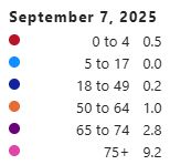
You can see that the latest data grouped the 5-11 and 12-17 into one age category of 5-17, the 18-39 & 40-59 categories have been grouped into 18-49 and the older adults are now grouped as 50-64, 65-74, and 75+. That is going to change the populate rates with the new groups. 2/
jeffgilchrist.bsky.social
I found out for Ontario that "the Ministry of Health updated the age groups on the I9 bed census data collection forms" so some data in the Ontario Respiratory Virus Tool ( www.publichealthontario.ca/en/Data-and-... ) will be grouped differently starting in September. 🧵1/
Table of age groups before September 2025 Table of age groups starting September 2025
jeffgilchrist.bsky.social
It is interesting how companies are now highlighting just the fold increase in neutralizing antibodies since the absolute levels are many fold lower than what the original formula gave against the original variant and don't want to draw attention to that.
Reposted by Jeff Gilchrist
smcgrath.phd
🧪 Can researchers stop AI from fabricating citations? Probably not entirely.

While models like GPT-5 are improving, hallucination is fundamental to their statistical design, shifting the burden onto users to build new intuitions for an AI age.
#MLSky #AcademicSky
Can researchers stop AI making up citations?
OpenAI’s GPT-5 hallucinates less than previous models do, but cutting hallucination completely might prove impossible.
www.nature.com
jeffgilchrist.bsky.social
It depends on what part of the world you are in, but in Ontario during August 2024 the KP.3.1.1 variant (or some form of DeFLuQE mutation variant) would have been common.
jeffgilchrist.bsky.social
To learn how to see what variants are circulating in your area, please read this guide ( bsky.app/profile/jeff... ). 18/
jeffgilchrist.bsky.social
How To: See what variants are circulating in your country/province/state

This thread will walk you through how to see which variants are circulating in your area using Mike Honey's visualization tool. 🧪🧵1/

On page unrolled version here ( pingthread.com/thread/16472... ).
Graph of COVID variant families frequency from PCR test genomic sequencing. Visualization tool was created by Mike Honey @Mike_Honey_ ( https://app.powerbi.com/view?r=eyJrIjoiNzE5YzczODItMDQzMS00M2EzLWFjNWYtMjg3OTY3NTNhZDM3IiwidCI6ImRjMWYwNGY1LWMxZTUtNDQyOS1hODEyLTU3OTNiZTQ1YmY5ZCIsImMiOjEwfQ%3D%3D ) Graph of top 7 specific COVID variant frequencies from PCR test genomic sequencing. Visualization tool was created by Mike Honey @Mike_Honey_ ( https://app.powerbi.com/view?r=eyJrIjoiNzE5YzczODItMDQzMS00M2EzLWFjNWYtMjg3OTY3NTNhZDM3IiwidCI6ImRjMWYwNGY1LWMxZTUtNDQyOS1hODEyLTU3OTNiZTQ1YmY5ZCIsImMiOjEwfQ%3D%3D ) Graph of specific BA.2.86.1 variant frequency from PCR test genomic sequencing. Visualization tool was created by Mike Honey @Mike_Honey_ ( https://app.powerbi.com/view?r=eyJrIjoiNzE5YzczODItMDQzMS00M2EzLWFjNWYtMjg3OTY3NTNhZDM3IiwidCI6ImRjMWYwNGY1LWMxZTUtNDQyOS1hODEyLTU3OTNiZTQ1YmY5ZCIsImMiOjEwfQ%3D%3D )
jeffgilchrist.bsky.social
To learn how to create a Sankey diagram of variants circulating in your area, please read this guide ( bsky.app/profile/jeff... ). 17/
jeffgilchrist.bsky.social
How To: Create a Sankey diagram of variants circulating in your area

This thread will walk you through the process of using Mike Honey visualization tool to generate a Sankey diagram for your country, province or State. 🧪🧵1/

Unrolled version: threadreaderapp.com/thread/17454...
Filtered Sankey diagram view with "Lineage Level" set to 3 and 11 and the Minimum # Samples per Lineage to show" to 60 and all labels shown. Visualization tool was created by Mike Honey @Mike_Honey_ ( https://app.powerbi.com/view?r=eyJrIjoiNzE5YzczODItMDQzMS00M2EzLWFjNWYtMjg3OTY3NTNhZDM3IiwidCI6ImRjMWYwNGY1LWMxZTUtNDQyOS1hODEyLTU3OTNiZTQ1YmY5ZCIsImMiOjEwfQ%3D%3D )
jeffgilchrist.bsky.social
The visualization tool for variants was created by @mikehoney.bsky.social and the source of this data can be found at ( app.powerbi.com/view?r=eyJrI... ). 16/
Power BI Report
Report powered by Power BI
app.powerbi.com
jeffgilchrist.bsky.social
You can find weekly Ontario stats including variants at ( covid.gilchrist.ca/Ontario.html ). 15/
covid.gilchrist.ca
jeffgilchrist.bsky.social
@mikehoney.bsky.social is now automatically generating new variant reports when he updates his data for various locations so it is easy to just click on a link and get the latest PDF version of the report instead of having to navigate through his tool. 12/
jeffgilchrist.bsky.social
It will be very interesting to see how Novavax LP.8.1 compares to Novavax JN.1 against the current XFG Stratus family considering LP.8.1.2 recombined with LF.7 to form XFG. 11/
jeffgilchrist.bsky.social
The X in XFG immediately signifies that it is a recombinant variant which means parts of two different variants combined with each other, in this case LF.7 and LP.8.1.2 which is why it has some mutations in common with the LP.8.1 variant. 9/
jeffgilchrist.bsky.social
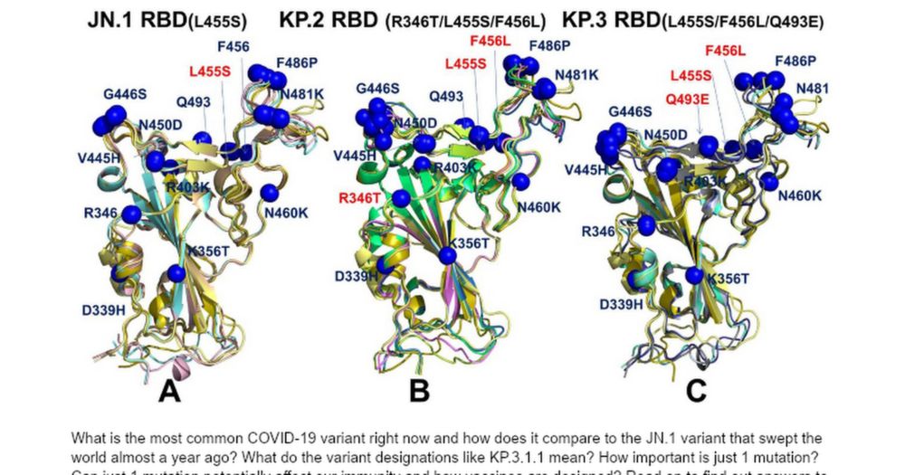
The # of mutations alone can't tell you how different a variant will behave, sometimes just 1 key mutation can make the difference getting past current immune protections in a person who was vaccinated or infected with previous variants. 8/
jeffgilchrist.bsky.social
LP.8.1 and XFG.5 have 5 amino acid mutations that are common between them in the spike protein so would be present in the fall 2025 LP.8.1 mRNA & Novavax Japan vaccine formulas. 7/
jeffgilchrist.bsky.social
You can see from the Venn diagram that LP.8.1 has 4 different amino acid mutations that aren't in the XFG.5 or JN.1 spike protein, and XFG.5 has 6 amino acid mutations not present in the other two ( cov-spectrum.org/explore/Worl... ). 6/
Venn diagram with three overlapping circles labeled JN.1, LP.8.1, and XFG.5, showing shared and unique elements. JN.1 has 1 unique element, LP.8.1 has 4, and XFG.5 has 6. No elements are shared only between JN.1 and LP.8.1 or between JN.1 and XFG.5. LP.8.1 and XFG.5 share 5 elements. All three share 59 elements
jeffgilchrist.bsky.social
How different is LP.8.1 compared to the current XFG.5 variant circulating in Ontario? 5/
jeffgilchrist.bsky.social
LP.8.1 is a descendant of JN.1 from several years ago which became KP.1 before it became LP.8 as seen in the Sankey diagram. Last year's mRNA vaccines were based on KP.2 which was a different branch of variants. 4/
Sankey diagram showing the evolution of 750 sequenced viral genomes in Ontario, Canada, from July 5 to August 16, 2023. Colored vertical blocks represent specific genome lineages, including XBC, XBC.1, XBC.1.1, BA.2.75, BA.2.75.3, BA.2.75.3.1, BN.1.3, BN.1.3.1, and BN.1.3.1.1. Curved, color-matched bands connect these blocks across time, illustrating how genomes transition or branch into new lineages. The width of each band reflects the number of genomes in that transition, with thicker bands indicating larger volumes. The diagram emphasizes lineage branching and the relative prevalence of each variant over the six-week period.
jeffgilchrist.bsky.social
LP.8.1 is what this fall's Japan Novavax vaccine and the mRNA vaccines are designed for which is now almost gone and typical of how these things work with vaccine manufacturing timing while Novavax is providing the previous year's JN.1 vaccine formula for the USA again. 3/
jeffgilchrist.bsky.social
Looking at specific variants as of mid August, XFG.5.1 is most prevalent at 13%, NB.1.8.1 in second at 10%, XFG.2 in third at 8.6% and XFG.3 in fourth at 7.4%. 2/
Line graph showing COVID-19 variant frequencies in Ontario from 5 July to 16 August 2025, based on 750 sequenced genomes. Seven variants are tracked: NB.1.8.1, XFG.2, XFG.3, XFG.3.4.1, XFG.3.1, XFG.4.1, and XFG.5.1. Frequencies range from 0% to about 14%, with some variants rising, others falling, and some fluctuating over time. A bar chart below shows the number of samples collected on each date.