👨🍳 staff design engineer @shopify (ex @google, @vercel 🫡)
📚 making ui/ux course craftofui.dev
👰♀️ @seaotta.dev
.sticky-atc {
position: fixed;
inset: auto 0 0 0;
transition: translate 0.26s cubic-bezier(.55,0,.67,1.25);
/* hide when scrolling down */
@container scroll-state(scrolled: bottom) {
translate: 0 100%;
transition-delay: 0.5s;
}
}
.sticky-atc {
position: fixed;
inset: auto 0 0 0;
transition: translate 0.26s cubic-bezier(.55,0,.67,1.25);
/* hide when scrolling down */
@container scroll-state(scrolled: bottom) {
translate: 0 100%;
transition-delay: 0.5s;
}
}
use CSS pseudoelements to bridge the :hover gap w/ :has() + inset
a:has(+ .dots) a::after,
.dots + a::after {
position: absolute;
content: '';
}
a:has(+ .dots) a::after { inset: 0 -50% 0 100%; }
.dots + a::after { inset: 0 100% 0 -50%; }
use CSS pseudoelements to bridge the :hover gap w/ :has() + inset
a:has(+ .dots) a::after,
.dots + a::after {
position: absolute;
content: '';
}
a:has(+ .dots) a::after { inset: 0 -50% 0 100%; }
.dots + a::after { inset: 0 100% 0 -50%; }

::details-content {
interpolate-size: allow-keywords;
transition: content-visibility, height;
transition-behavior: allow-discrete;
}
[open]::details-content { height: fit-content; }
CSS :has() handling the image swaps 🤙
::details-content {
interpolate-size: allow-keywords;
transition: content-visibility, height;
transition-behavior: allow-discrete;
}
[open]::details-content { height: fit-content; }
CSS :has() handling the image swaps 🤙
use different CSS timing functions per axis for motion paths 👨🍳
.p {
animation: x .8s var(--x-time), y .8s var(--y-time);
animation-composition: accumulate; 👈
}
@keyframes x { to { translate: var(--x) 0 }
@keyframes y { to { translate: 0 var(--y) }
use different CSS timing functions per axis for motion paths 👨🍳
.p {
animation: x .8s var(--x-time), y .8s var(--y-time);
animation-composition: accumulate; 👈
}
@keyframes x { to { translate: var(--x) 0 }
@keyframes y { to { translate: 0 var(--y) }
nav::before { position-anchor: --h; }
nav::before { left: anchor(left); }
a:hover { anchor-name: --h; }
use the nav pseudoelements, ::before for intent, ::after for current 🤙
nav::before { position-anchor: --h; }
nav::before { left: anchor(left); }
a:hover { anchor-name: --h; }
use the nav pseudoelements, ::before for intent, ::after for current 🤙
type 3

type 3
[popover].dropdown {
top: anchor(bottom);
right: anchor(right);
position-try-fallbacks: flip-block,flip-inline;
}
That's it 👆 Keeps the menu tethered to the button
(may as well bring over some hits from the other place)
[popover].dropdown {
top: anchor(bottom);
right: anchor(right);
position-try-fallbacks: flip-block,flip-inline;
}
That's it 👆 Keeps the menu tethered to the button
(may as well bring over some hits from the other place)
The results will not always be immediate but dedication and perfecting whatever your craft is and showing up publicly does lead to new doors.
You have to show up how you want to be perceived though.
The results will not always be immediate but dedication and perfecting whatever your craft is and showing up publicly does lead to new doors.
You have to show up how you want to be perceived though.
CSS + SVG filter + drag mechanics 🧑🍳
(exploding view 👇)
CSS + SVG filter + drag mechanics 🧑🍳
(exploding view 👇)
.layout:has(:popover-open) {
grid-template-columns: var(--sidebar-width) 1fr;
}
aside:popover-open {
translate: 0 var(--ctrl);
height: var(--extend);
}
actual zero JS for the layout transition here
so many details to play with! 🧑🍳
.layout:has(:popover-open) {
grid-template-columns: var(--sidebar-width) 1fr;
}
aside:popover-open {
translate: 0 var(--ctrl);
height: var(--extend);
}
actual zero JS for the layout transition here
so many details to play with! 🧑🍳
configurable css + svg 👇
configurable css + svg 👇
inverse projection mappin' to calculate proximity in 3D space and apply an eased 0-1 value 🤙
the key: measuring the 4 corners, check the reveal 👇
(ideal for 2D canvas w/ 3D transforms)
inverse projection mappin' to calculate proximity in 3D space and apply an eased 0-1 value 🤙
the key: measuring the 4 corners, check the reveal 👇
(ideal for 2D canvas w/ 3D transforms)
signature playback mirrors the timing of your strokes
not just what you drew, but how you drew it, retaining the feel and personality
signature playback mirrors the timing of your strokes
not just what you drew, but how you drew it, retaining the feel and personality
... not as powerful as MacOS implementation but pretty cool
... not as powerful as MacOS implementation but pretty cool
custom select with CSS (progressively enhanced)
select {
&,
&::picker(select) { appearance: base-select; }
}
custom select with CSS (progressively enhanced)
select {
&,
&::picker(select) { appearance: base-select; }
}
wHAt dO i inSTaLl fiRsT?
i jus' run a node script and it does it all for me 🧑🍳
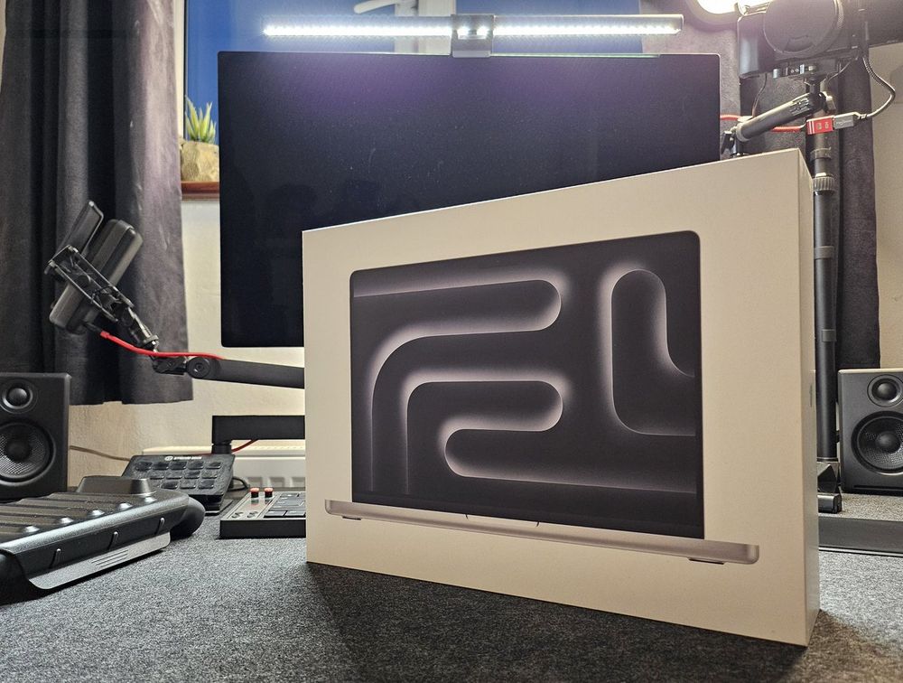
wHAt dO i inSTaLl fiRsT?
i jus' run a node script and it does it all for me 🧑🍳
jus' javascript for the audio and keyboard shortcuts — [popover], starting-style, linear(), and mask for the rest 🤙
jus' javascript for the audio and keyboard shortcuts — [popover], starting-style, linear(), and mask for the rest 🤙
~3 years ago, went to speak at a conference in leeds, the rest is history
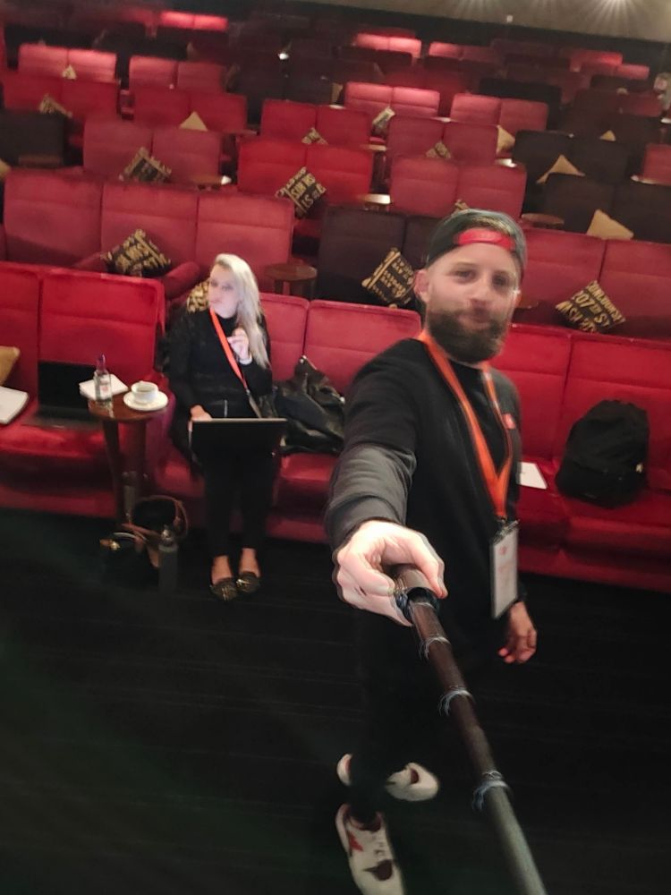
~3 years ago, went to speak at a conference in leeds, the rest is history
