Georgios Karamanis
@karaman.is
2.6K followers 180 following 260 posts
Dataviz designer, psychiatrist, PhD student https://karaman.is
Posts Media Videos Starter Packs
karaman.is
For this week's #TidyTuesday, crane migration at Lake Hornborga, Sweden, from 2002 to 2024

Code: github.com/gkaramanis/t...

#RStats #dataviz
A set of bar charts showing the number of cranes observed at Lake Hornborga in Sweden from 2002 to 2024. The left panel displays daily counts for March and April, revealing a clear seasonal peak in crane numbers in late March and early April each year, followed by a decline. The right panel shows weekly counts for August to October, with lower and more variable numbers, indicating that most cranes have already migrated by this period. The data include the date, number of observations, comments, and indicators for weather disruptions. A map highlights the location of Lake Hornborga and Sweden
karaman.is
For this week's #TidyTuesday, the top 16 chess players for August and September

Code: github.com/gkaramanis/t...

#RStats #dataviz
A chess-themed plot compares the top 16 FIDE-rated chess players for August and September 2025. Each player is represented by a chess piece icon on a stylized board, with August pieces in black and September pieces in white. Diagonal lines connect each player's position from August to September, showing changes in rank. The top six names—Magnus Carlsen, Hikaru Nakamura, Fabiano Caruana, Praggnanandhaa R, Erigaisi Arjun, and Gukesh D—remained unchanged in both months. The top three players are Magnus Carlsen (2 839), Hikaru Nakamura (2 807), and Fabiano Caruana (2 784). Player labels include rank, name, and rating. The plot title is "FIDE chess player ratings".
karaman.is
For this week's #TidyTuesday, pasta carbs and fat. Inspired by @cborstell.bsky.social's plot bsky.app/profile/cbor...

Code: github.com/gkaramanis/t...

#RStats #dataviz
This scatter plot shows how 54 pasta dishes from around the world compare in their carbohydrate and fat content per serving. Each point represents a pasta dish, colored by the country or cuisine it comes from, positioned on a grid where the x-axis shows normalized carbohydrate content (0 to 1) and the y-axis shows normalized fat content (0 to 1). The data is normalized against 2 200 recipes of different dish types in the dataset.
The plot is divided into four quadrants by dashed lines at the 0.5 mark on both axes, with directional labels indicating "High carb" (right), "Low carb" (left), "High fat" (top), and "Low fat" (bottom). Most pasta dishes cluster in the lower-right quadrant, indicating they tend to be higher in carbs but lower in fat. Notable outliers are labeled with dish names and their countries of origin, including dishes like "Copycat Chicken Fritta" from Italy (highest carb content), "Creamy Chicken Pasta" from Cajun and Creole cuisine (highest fat content), and "Lemon Chicken Orzo Soup" from Greece (lowest fat content).
karaman.is
For this week's #TidyTuesday, a visualization showing how more and more countries allow visa-free travel to most of the world's destinations

Code: github.com/gkaramanis/t...

#RStats #dataviz
A density plot showing the distribution of visa-free destinations accessible by country passports in 2006 versus 2025. The horizontal axis shows the number of visa-free destinations (0 to 200), while the vertical axis shows probability density. Two prominent curves are displayed: a burgundy curve for 2006 data peaks sharply around 25 destinations, indicating most countries' passports provided access to relatively few places without visas. A blue curve for 2025 data shows a much flatter, broader distribution with a peak around 180 destinations, demonstrating that significantly more passports now provide access to most of the world's destinations. Multiple faint gray curves in the background represent the years between 2006 and 2025, showing the gradual transition. Two text annotations explain that in 2006 most countries' passports provided access to only a few destinations, while in 2025 significantly more passports give access to most of the world's destinations.
karaman.is
For this week's #TidyTuesday, hex grid maps showing seasonal shifts in frog observations across Australia

Code: github.com/gkaramanis/t...

#RStats #dataviz
Faceted map of Australia showing hexagonal grids colored by the number of frog observations from the FrogID project in 2023. Each facet represents a combination of frog tribe and season (Summer, Autumn, Winter, Spring). The color intensity of each hexagon indicates the count of observations, with labels marking the hexagon with the highest count per frog tribe and season. The map background is light gray, and the legend at the bottom explains the color scale for the number of observations.
karaman.is
For this week’s #TidyTuesday I looked at summer Billboard Hot 100 number one songs. Since the 90s fewer song debut at #1 in summer but those that do tend to stay at the top for more weeks

Code: github.com/gkaramanis/t...

#RStats #dataviz
Bar chart and heatmap showing trends in Billboard Hot 100 number one songs during summer months (June, July, August) from 1960 to 2024. The top panel displays the number of summer number one songs per decade, with annotations for average weeks at number one. The bottom panel is a heatmap of individual songs by year and week, colored by total weeks at number one. Fewer songs reach number one in summer since the 1990s, but those that do spend more weeks at the top.
karaman.is
Explore Scotland’s tallest Munros and Munro tops with this week’s #TidyTuesday

Code: github.com/gkaramanis/t...

#RStats #dataviz
The plot displays the 20 highest Munros and Munro tops in Scotland. The main chart is a vertical bar plot showing mountain names and their heights in meters and feet, with striped bars indicating Munro tops. The tallest peak, Ben Nevis, is highlighted in both meters and feet. An inset map of Scotland shows the geographic locations of all Munros, with Ben Nevis marked in red and labeled.
karaman.is
1 is obviously for Mastodon
karaman.is
Explore extreme weather attribution studies with a Shiny app for this week's #TidyTuesday

App: karamanis.shinyapps.io/ExtremeWeath...
Code: github.com/gkaramanis/t...

#RStats #dataviz
Screenshot of an interactive Shiny app displaying a world map with country boundaries. Countries are shaded in varying colors based on the number of extreme weather attribution studies. A draggable control panel on the right shows details for a selected country, including event types, study summaries, and publication years. The app includes a table tab that lists all studies. The data is sourced from Carbon Brief's tracking of attribution studies, which analyze the influence of climate change on extreme weather events.
Reposted by Georgios Karamanis
emilhvitfeldt.bsky.social
some light teasing for an upcoming quarto revealjs plugin I have been working on
karaman.is
Income inequality for this week's #TidyTuesday. How do countries redistribute income through taxes and transfers?

Code: github.com/gkaramanis/t...

#RStats #dataviz
A horizontal line chart showing income inequality before and after government redistribution across 30 countries, organized by world regions. Each horizontal line represents one country, starting from market income inequality (right side) and ending at disposable income inequality after taxes and transfers (left side). The x-axis shows Gini coefficients from 0.2 to 0.7, where higher values indicate more inequality.

Countries are grouped into regions: Europe with 20 countries, North America (3), Asia (2), and one each from Oceania, South America, and Africa. The lines are colored by the ratio of redistribution effectiveness, with darker colors indicating countries that achieve greater inequality reduction.

Notable patterns include: Belgium achieves the most dramatic reduction, cutting inequality nearly in half from 0.49 to 0.26. In contrast, Dominican Republic shows minimal change from 0.52 to 0.52 (rounded). European countries generally show stronger redistribution effects than other regions. South Africa has both the highest initial inequality (0.71) and final inequality (0.62) despite some redistribution. Most countries reduce inequality to some degree, but the magnitude varies significantly even among countries with similar starting inequality levels.
Reposted by Georgios Karamanis
karaman.is
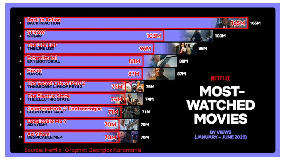
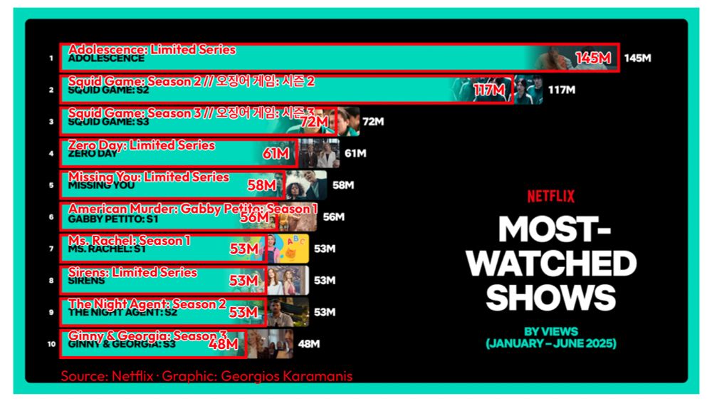
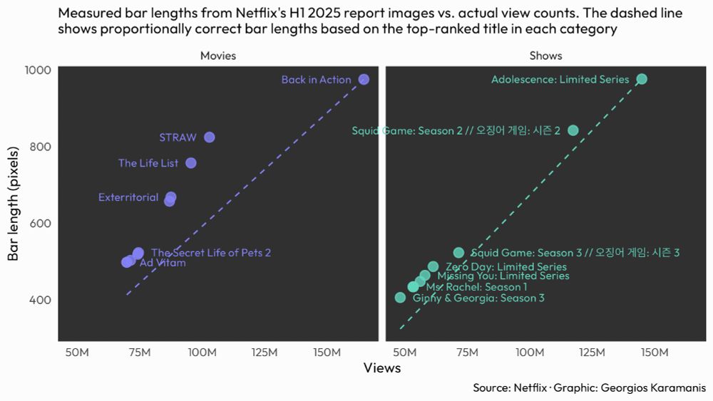
Movies are more problematic, several bars are 30%+ longer than they should be. Shows bars are generally more accurate but still misleading

Code: github.com/gkaramanis/t...

Nicola's post:
bsky.app/profile/nren...
nrennie.bsky.social
Netflix seems to have a suspicious choice of x-axis since their first bar is way shorter than it should be! Here's the original for comparison!
Bar chart of top 10 movies
karaman.is
Something different for this week's #TidyTuesday, looking at Netflix's creative charting, as spotted by @nrennie.bsky.social

I measured the actual bar lengths from Netflix's H1 2025 engagement report and compared them to what they should be based on view counts.

#RStats #dataviz
A horizontal bar chart recreating Netflix's top 10 movies from H1 2025, overlaid on the original report image to reveal visual discrepancies. Red outlined bars show the proportionally correct lengths based on actual view counts, with "Back in Action" leading at 165M views. The overlay demonstrates how Netflix's original bars don't accurately represent the data proportions, with several movies appearing visually larger than their view counts warrant. A horizontal bar chart recreating Netflix's top 10 shows from H1 2025, overlaid on the original report image to expose proportional inaccuracies. Red outlined bars display the correct visual proportions based on actual view counts, with "Adolescence: Limited Series" leading at 145M views. The comparison reveals how Netflix's original visualization misleads viewers about the relative performance differences between shows. A dual-panel scatter plot analyzing Netflix's bar chart accuracy. The left panel shows Movies and right panel shows Shows, both plotting actual measured bar lengths (y-axis, in pixels) against view counts (x-axis). Purple points represent Movies, teal points represent Shows. Dashed lines show proportionally correct bar lengths. Movies show larger deviations from the expected line, with several points well above it, while Shows generally follow the expected line more closely. Point labels identify specific titles.
karaman.is
Wow, really well done! 🤩
karaman.is
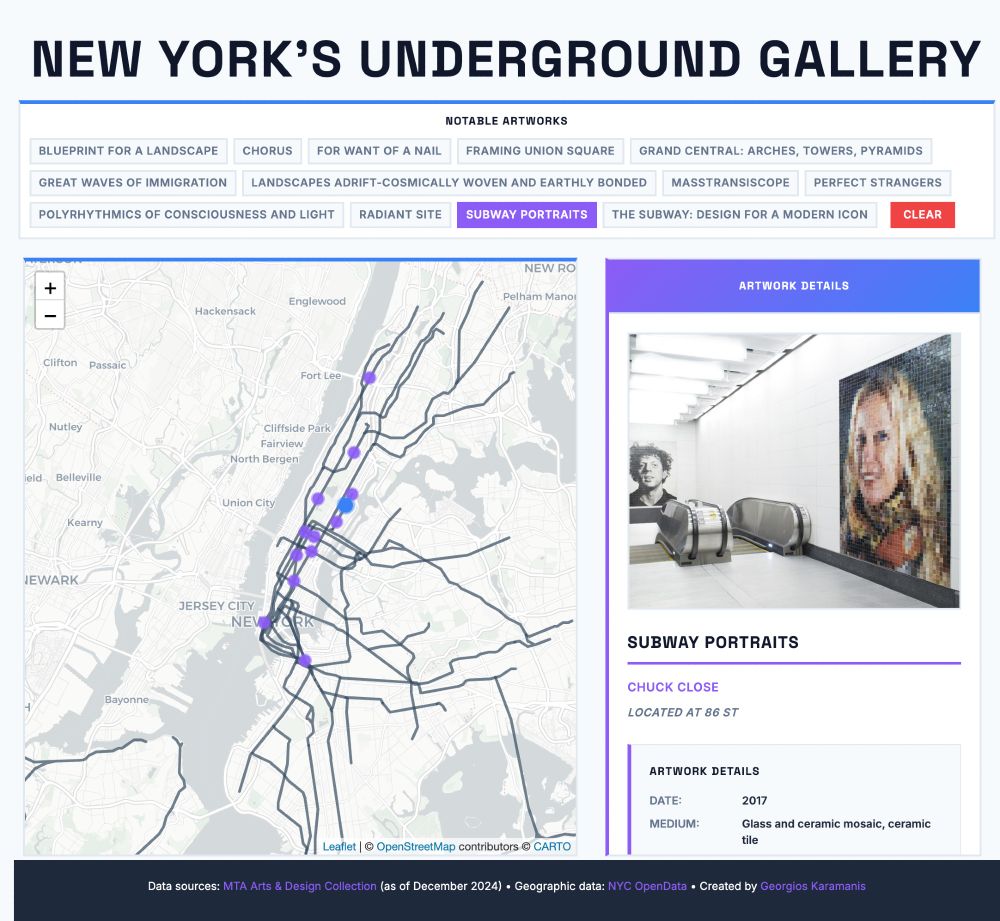
A Shiny app for last week's #TidyTuesday. Explore and learn about selected NYC subway artworks

App: karamanis.shinyapps.io/New_Yorks_Un...
Code: github.com/gkaramanis/t...

#RStats #dataviz
Screenshot of 'New York's Underground Gallery' interactive web application showing MTA subway art locations. The interface features a large title at the top, followed by a control panel with small clickable buttons for notable artworks including 'Wall-Slide', 'Subway Portraits', 'Blueprint for a Landscape', and others, with a red 'CLEAR' button. The main content area displays a map of New York City subway lines on the left side with purple circular markers indicating artwork locations, and a detailed artwork viewer panel on the right side titled 'ARTWORK DETAILS' with a purple gradient header. The right panel shows information for a selected artwork including an image placeholder, artwork title, artist name, station location, metadata such as date and medium, and a description. The interface uses a modern design with Space Grotesk and Inter fonts, purple and blue accent colors, and a clean white background. A dark footer at the bottom credits data sources including MTA Arts & Design Collection and NYC OpenData, and lists the creator as Georgios Karamanis.
karaman.is
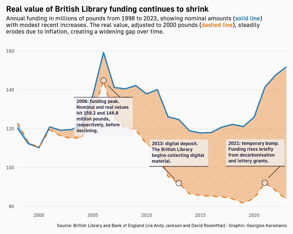
British Library
‪@britishlibrary.bsky.social‬ funding for this week's #TidyTuesday

Code: github.com/gkaramanis/t...

#RStats #dataviz
Line chart showing British Library annual funding from 1998 to 2023. A solid blue line represents nominal funding in millions of pounds, which rises modestly in recent years. The dashed orange line shows real funding adjusted to 2000 pounds, which steadily declines due to inflation. Key years are highlighted: a funding peak in 2006, the start of digital deposit in 2013, and a temporary funding bump in 2021. The gap between the two lines widens over time.
karaman.is
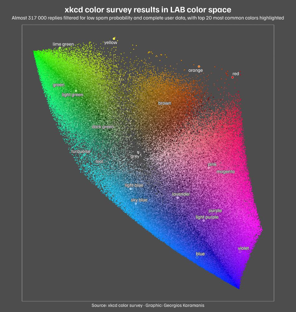
xkcd color survey results for this week's #TidyTuesday

Code: github.com/gkaramanis/t...

#RStats #dataviz
A scatter plot showing xkcd color survey results plotted in LAB color space. The plot displays almost 317 000 individual color responses as tiny colored dots scattered across the coordinate system, with the a-axis (green-red) running horizontally and b-axis (blue-yellow) running vertically. Overlaid on this cloud are larger black-outlined circles representing the 949 most common colors, with the top 20 most common colors highlighted as white-outlined circles and labeled with their names. The plot has a dark gray background with white text.
karaman.is
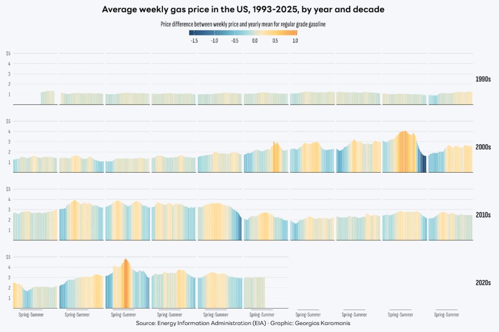
Gas prices in the US for this week's #TidyTuesday

Code: github.com/gkaramanis/t...

#RStats #dataviz
A grid of bar charts showing the average weekly price of regular grade gasoline in the United States from 1993 to 2025, grouped by decade and year. Each bar represents a week, colored by the difference from the yearly mean price. The color scale ranges from deep blue for below-average weeks to orange for above-average weeks.
karaman.is
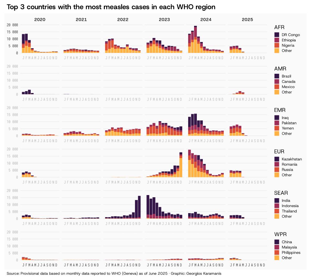
Measles cases by WHO region for this week's #TidyTuesday

Code: github.com/gkaramanis/t...

#RStats #dataviz
A stacked column chart showing monthly measles cases from 2020 onwards across six WHO regions. Each region displays the top 3 countries with the most cases plus an "Other" category: AFR (DR Congo, Ethiopia, Nigeria), AMR (Brazil, Canada, Mexico), EMR (Iraq, Pakistan, Yemen), EUR (Kazakhstan, Romania, Russia), SEAR (India, Indonesia, Thailand), and WPR (China, Malaysia, Philippines). AFR and EUR regions had surges in late 2023 through early 2024, while SEAR surged about one year earlier. Recent years show a reappearance of cases even in regions that previously had few cases, continuing into 2025.