


Neil Pettinger
@kurtstat.bsky.social
Healthcare data analyst.
Aspiring Munroist.
Aspiring Munroist.
My AMU 'heaviness' metric came about after I tried showing AMU lengths of stay so far (ALoSSF) as horizontal timelines on top of each other. On the left: a snapshot that captured 60 patients with an ALoSSF of 24.6 hours. On the right: 58 patients with an ALoSSF of 37.8 hours.
#rstats #ggplot2
#rstats #ggplot2

October 23, 2025 at 1:04 PM
I want to have a go at adapting Stuart Hall's encoding/decoding model so that it works for how healthcare data messages are communicated. I think the key to this is how I flesh out the meaning structures on each side of the diagram.

October 23, 2025 at 6:18 AM
I want to have a go at adapting Stuart Hall's encoding/decoding model so that it works for how healthcare data messages are communicated. I think the key to this is how I flesh out the meaning structures on each side of the diagram.

Acute Medical Unit (AMU) 'heaviness' scores are calculated by multiplying each day's AMU mean lengths of stay by the same day's AMU fullness snapshots. The scores are closely correlated with Emergency Department (ED) performance, so I thought a scatterplot would be the way to go.
#rstats #ggplot2
#rstats #ggplot2

October 21, 2025 at 3:44 PM
Here's the graph after the correction. I'm trying out different ways of showing how a specialty's inpatients get more displaced as its workload increases. As @em-dr-jacklin.bsky.social might put it: the fuller the specialty, the greater the "wrongward-ness".
#rstats #ggplot2
#rstats #ggplot2

October 21, 2025 at 12:17 PM
Here's the graph after the correction. I'm trying out different ways of showing how a specialty's inpatients get more displaced as its workload increases. As @em-dr-jacklin.bsky.social might put it: the fuller the specialty, the greater the "wrongward-ness".
#rstats #ggplot2
#rstats #ggplot2

I'm working on a diagram that shows how we might incorporate emotion into data visualizations. I'm trying to mash together some ideas from Gavin McMahon's new book (www.story-business.com) with Don Norman's three layers of design (www.interaction-design.org/literature/a...).

October 20, 2025 at 4:10 PM
I'm working on a diagram that shows how we might incorporate emotion into data visualizations. I'm trying to mash together some ideas from Gavin McMahon's new book (www.story-business.com) with Don Norman's three layers of design (www.interaction-design.org/literature/a...).
Most of us bring “generic” preconceptions to percentages. We think higher numbers are better. Like the anecdote about the optimist who sees a glass half-full, a pessimist who sees a glass half-empty and a hospital manager who sees a glass twice as big as it needs to be.
3/6
3/6

October 20, 2025 at 1:38 PM
Most of us bring “generic” preconceptions to percentages. We think higher numbers are better. Like the anecdote about the optimist who sees a glass half-full, a pessimist who sees a glass half-empty and a hospital manager who sees a glass twice as big as it needs to be.
3/6
3/6
Average percentage bed occupancy is the conventional way we measure bed usage in the NHS. (Here’s a visual example: 8,784 consecutive hour-by-hour snapshots of the number of beds occupied in a 46-bed hospital ward.) But the NHS has problems with bed occupancy as a metric.
2/6
2/6

October 20, 2025 at 1:38 PM
Average percentage bed occupancy is the conventional way we measure bed usage in the NHS. (Here’s a visual example: 8,784 consecutive hour-by-hour snapshots of the number of beds occupied in a 46-bed hospital ward.) But the NHS has problems with bed occupancy as a metric.
2/6
2/6
As it stands, it's a snapshot metric. I tried doing it for one specialty (Respiratory Medicine) based on hour-by-hour snapshots from two years ago. I posted it on X; can't remember if I posted it here. So here it is - in all its dual-vertical-axis glory...

October 20, 2025 at 12:43 PM
As it stands, it's a snapshot metric. I tried doing it for one specialty (Respiratory Medicine) based on hour-by-hour snapshots from two years ago. I posted it on X; can't remember if I posted it here. So here it is - in all its dual-vertical-axis glory...
I still think of pivot_wider() as magic, basically.

October 16, 2025 at 4:03 PM
I still think of pivot_wider() as magic, basically.
I've been using open access data to explore the relationship between Emergency Department 12-hour performance and ambulance turnaround times. Each blue dot is a week between mid-November last year and early September this year. It's a pretty close relationship for this hospital.

September 26, 2025 at 3:48 PM
I've been using open access data to explore the relationship between Emergency Department 12-hour performance and ambulance turnaround times. Each blue dot is a week between mid-November last year and early September this year. It's a pretty close relationship for this hospital.
Oh, I love that distinction between louder/shoutier and firmer/more drawn out! It's making me remember different types of telling-offs by my Mum as a kid!
(And when you're as old as I am, underlined text is only hyperlinked if it's *blue* underlined text!)
(And when you're as old as I am, underlined text is only hyperlinked if it's *blue* underlined text!)

September 25, 2025 at 10:27 AM
Oh, I love that distinction between louder/shoutier and firmer/more drawn out! It's making me remember different types of telling-offs by my Mum as a kid!
(And when you're as old as I am, underlined text is only hyperlinked if it's *blue* underlined text!)
(And when you're as old as I am, underlined text is only hyperlinked if it's *blue* underlined text!)
Is there a difference between upper case emphasis and bold-and-underlined emphasis?

September 25, 2025 at 10:08 AM
Is there a difference between upper case emphasis and bold-and-underlined emphasis?
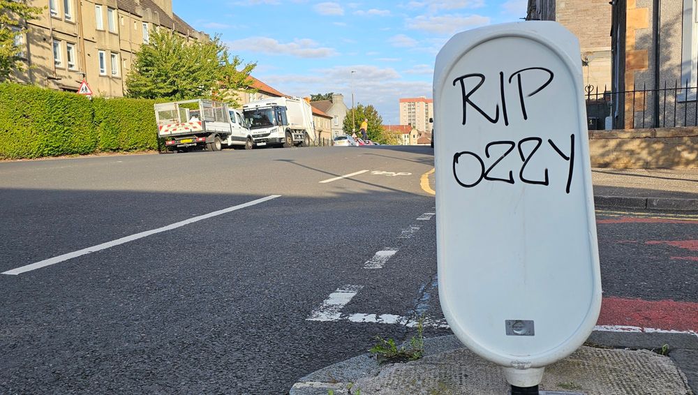
This graffiti on Restalrig Road made me remember that fantastic article by Nicholas Carr ("The Tyranny of Now") in which he wrote about Harold Innis's distinction between 'time-biased' media and 'space-biased' media!
www.thenewatlantis.com/publications...
www.thenewatlantis.com/publications...
September 25, 2025 at 10:01 AM
This graffiti on Restalrig Road made me remember that fantastic article by Nicholas Carr ("The Tyranny of Now") in which he wrote about Harold Innis's distinction between 'time-biased' media and 'space-biased' media!
www.thenewatlantis.com/publications...
www.thenewatlantis.com/publications...
You don't have to be old to be right wing, but it helps.
Great graph by @owenwntr.bsky.social in @samfr.bsky.social's latest newsletter.
Great graph by @owenwntr.bsky.social in @samfr.bsky.social's latest newsletter.

September 25, 2025 at 9:26 AM
You don't have to be old to be right wing, but it helps.
Great graph by @owenwntr.bsky.social in @samfr.bsky.social's latest newsletter.
Great graph by @owenwntr.bsky.social in @samfr.bsky.social's latest newsletter.
The top of Arthur's Seat (Edinburgh) seen from Crow Hill this morning.

September 6, 2025 at 11:05 AM
The top of Arthur's Seat (Edinburgh) seen from Crow Hill this morning.
You can access long - and interesting - emergency care data timelines from the @publichealthscot.bsky.social website.
www.publichealthscotland.scot/healthcare-s...
www.publichealthscotland.scot/healthcare-s...

September 3, 2025 at 3:51 PM
You can access long - and interesting - emergency care data timelines from the @publichealthscot.bsky.social website.
www.publichealthscotland.scot/healthcare-s...
www.publichealthscotland.scot/healthcare-s...
This is how the NHS sees its patient flow problem.

August 27, 2025 at 2:47 PM
This is how the NHS sees its patient flow problem.
@chrisbrogan.bsky.social This is what happens when you try to be brutally honest with yourself in relation to the Impact Attributes...

August 26, 2025 at 12:21 PM
@chrisbrogan.bsky.social This is what happens when you try to be brutally honest with yourself in relation to the Impact Attributes...
I bought this book by @chrisbrogan.bsky.social and Julien Smith ages ago. Well, I'm finally getting round to reading it. Up to page 70 already. It's very, very good.

August 26, 2025 at 11:05 AM
I bought this book by @chrisbrogan.bsky.social and Julien Smith ages ago. Well, I'm finally getting round to reading it. Up to page 70 already. It's very, very good.
Looking over north Edinburgh towards the Firth of Forth from the top of Crow Hill (the hill next to Arthur's Seat).

August 26, 2025 at 10:55 AM
Looking over north Edinburgh towards the Firth of Forth from the top of Crow Hill (the hill next to Arthur's Seat).
Thanks very much. I'm still finding my way with maps, so to speak (!), but between your advice and @drjohnrussell.com's #tidytuesday contribution, I managed to get a version of what I was after...

August 26, 2025 at 7:29 AM
Thanks very much. I'm still finding my way with maps, so to speak (!), but between your advice and @drjohnrussell.com's #tidytuesday contribution, I managed to get a version of what I was after...
I was inspired by @nrennie.bsky.social's datafile of the Scottish Munros, and managed to create a rough 'progress-so-far' scatterplot. But - alas! - I am new to #rstats maps and have absolutely no idea how to superimpose an outline of Scotland on this...

August 25, 2025 at 4:36 PM
I was inspired by @nrennie.bsky.social's datafile of the Scottish Munros, and managed to create a rough 'progress-so-far' scatterplot. But - alas! - I am new to #rstats maps and have absolutely no idea how to superimpose an outline of Scotland on this...
I took Scotland's four-hour compliance data going back to 2008 and drew a 17-year trendline. I'm trying to come up with names for The Five Stages of Four-hour Compliance. So far I've got:
1. Achievement
2. Hankering
3. Brief - very brief - remission
4. Collapse
5. Late rally
#rstats #ggplot2
1. Achievement
2. Hankering
3. Brief - very brief - remission
4. Collapse
5. Late rally
#rstats #ggplot2

August 18, 2025 at 5:37 PM