


Mark Simonson
@marksimonson.bsky.social
Type designer and font developer. www.marksimonson.com
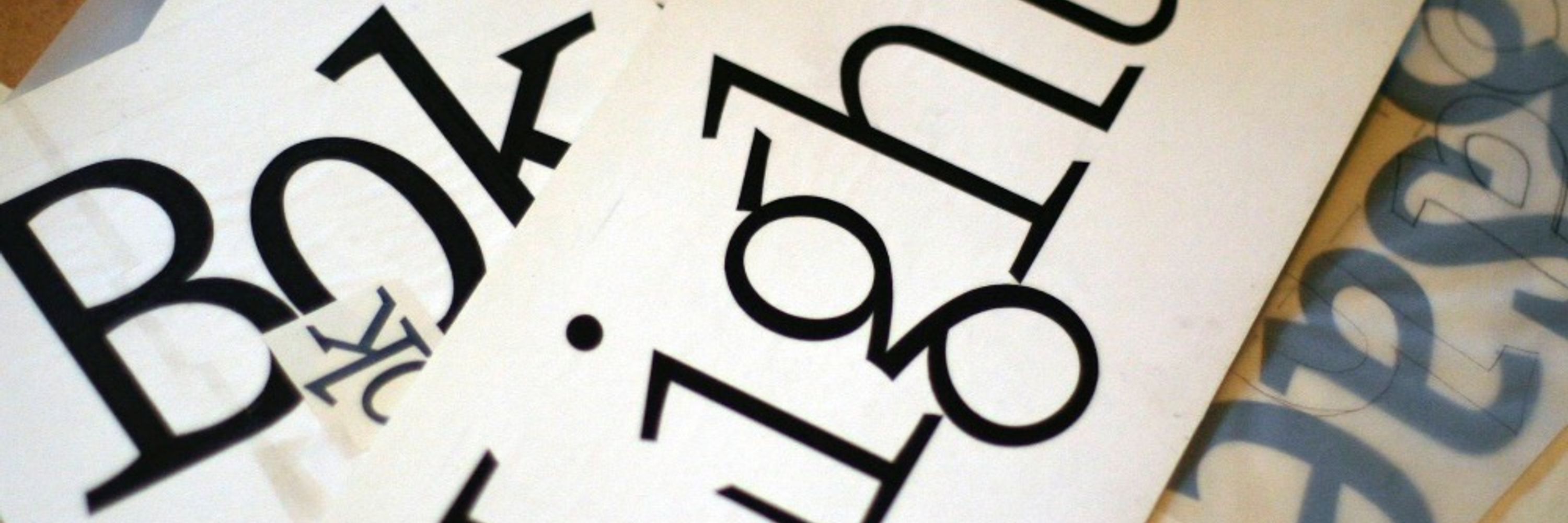
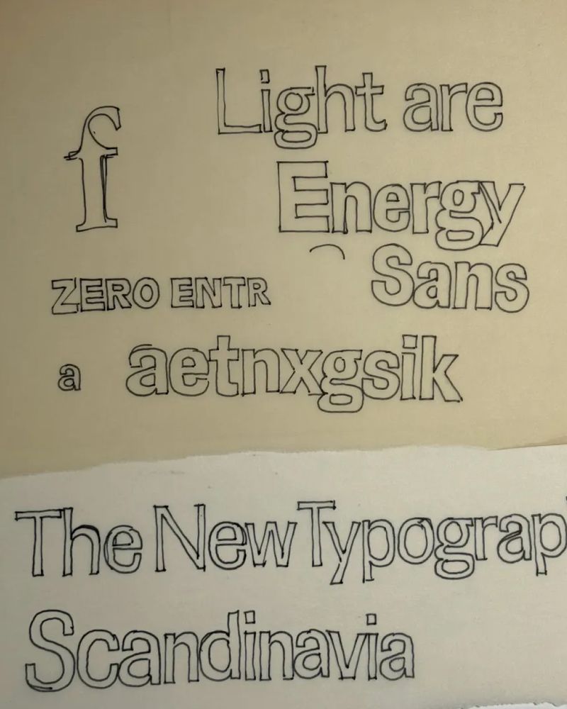
Hardcover is an elegant new serif typeface for display use. It's one of my earliest typeface ideas, dating back to a sketch in 1978, inspired by the lettering I’d seen on mass-market book covers. More info here: www.marksimonson.com/notebook/vie... And here: www.marksimonson.com/fonts/view/h...


November 10, 2025 at 7:53 PM
Hardcover is an elegant new serif typeface for display use. It's one of my earliest typeface ideas, dating back to a sketch in 1978, inspired by the lettering I’d seen on mass-market book covers. More info here: www.marksimonson.com/notebook/vie... And here: www.marksimonson.com/fonts/view/h...
Mark Simonson Studio at 25: It didn't start out as a digital type foundry... www.marksimonson.com/notebook/vie...

September 24, 2025 at 3:21 PM
Mark Simonson Studio at 25: It didn't start out as a digital type foundry... www.marksimonson.com/notebook/vie...
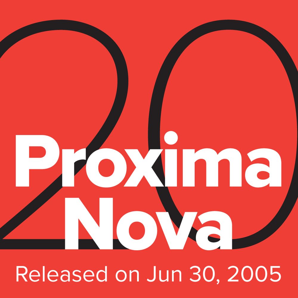
The growth & popularity of Proxima Nova in the last 20 years is beyond my wildest dreams when I released it in 2005. I feel incredibly lucky & grateful to all who has helped along the way, especially to the designers who decided it was the best font for the job. www.marksimonson.com/notebook/vie...
June 30, 2025 at 9:09 PM
The growth & popularity of Proxima Nova in the last 20 years is beyond my wildest dreams when I released it in 2005. I feel incredibly lucky & grateful to all who has helped along the way, especially to the designers who decided it was the best font for the job. www.marksimonson.com/notebook/vie...
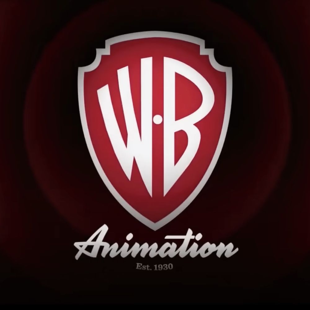
I'm happy to see that WB Animation is still using the lettering I did for them in 2008 (the part below the WB shield). Seen on the trailer for their latest feature, "The Day the Earth Blew Up," which I hear is good.
March 18, 2025 at 5:45 PM
I'm happy to see that WB Animation is still using the lettering I did for them in 2008 (the part below the WB shield). Seen on the trailer for their latest feature, "The Day the Earth Blew Up," which I hear is good.
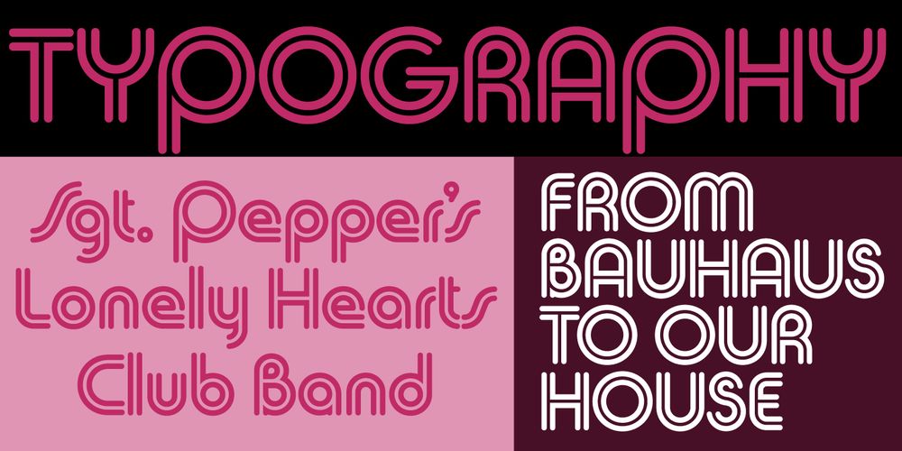
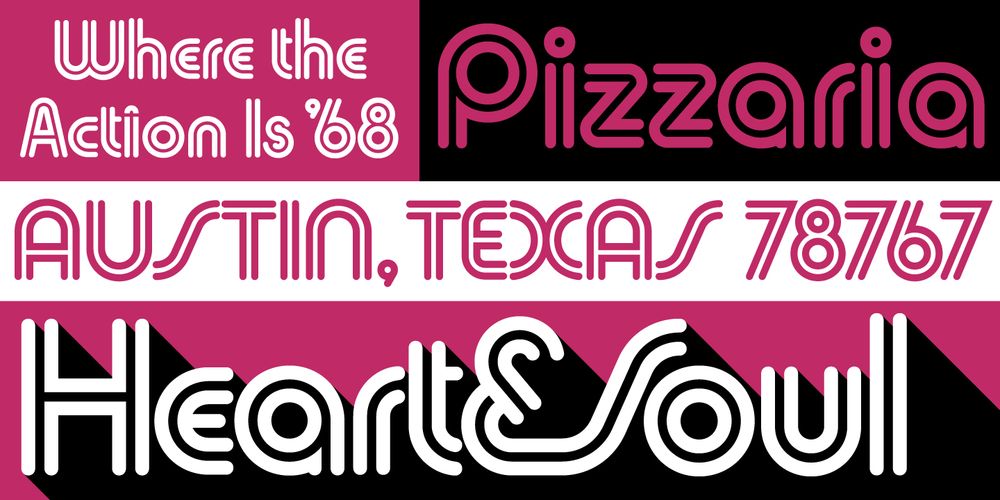
The story of my latest typeface, Synergy, goes back to a couple of sketches in 1981. Read more here: www.marksimonson.com/notebook/vie...
March 6, 2025 at 7:23 PM
The story of my latest typeface, Synergy, goes back to a couple of sketches in 1981. Read more here: www.marksimonson.com/notebook/vie...
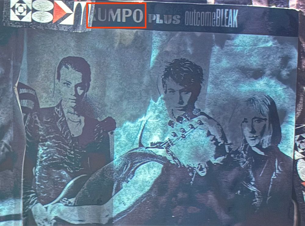
I've been rewatching season 1 of Severance and spotted my Acme Gothic on a band poster. It's only there for a split second, but it caught my eye, of course. The name is obscured, but thanks to a little research, I discovered that it's "ABRUMPO" (latin for "separated") fronting for "Fissureman."
February 23, 2025 at 3:10 AM
I've been rewatching season 1 of Severance and spotted my Acme Gothic on a band poster. It's only there for a split second, but it caught my eye, of course. The name is obscured, but thanks to a little research, I discovered that it's "ABRUMPO" (latin for "separated") fronting for "Fissureman."
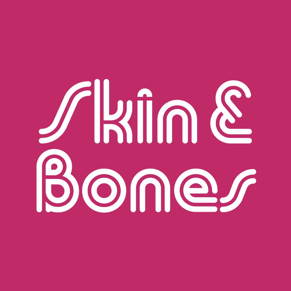
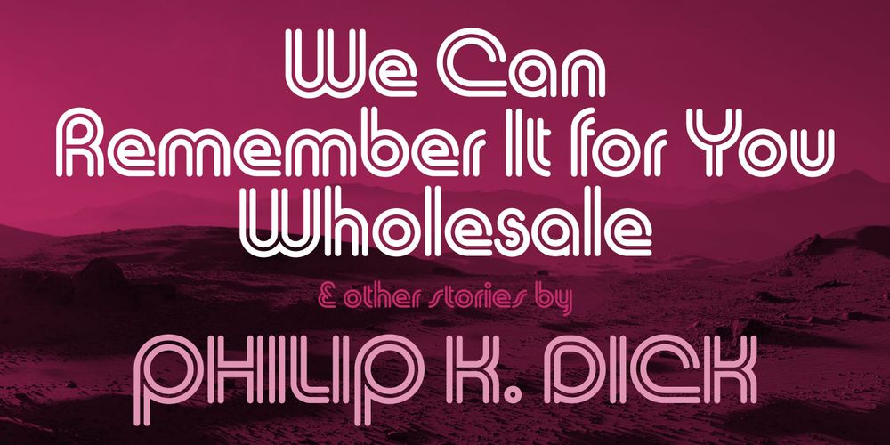
(Re)introducing Douglas F. Jones' Skin & Bones: www.marksimonson.com/notebook/vie...
April 22, 2024 at 7:31 PM
(Re)introducing Douglas F. Jones' Skin & Bones: www.marksimonson.com/notebook/vie...