John Kennedy
@micefearboggis.bsky.social
3.2K followers 3.1K following 1.7K posts
Occasional climate scientist, diagram monkey, probabilistic historian, science anti-communicator. All views and opinions are my own. This is not, sadly, a promise of novelty: it’s a disclaimer. He/him. https://www.jkclimate.fr/
Posts Media Videos Starter Packs
Reposted by John Kennedy
ruthmottram.bsky.social
🚨 New @oceaniceeu.bsky.social preprint🚨 why has Antarctica stopped (net) losing mass, in spite of increased discharge?
Declining sea ice is part of the answer but increasingly heavy and frequent atmospheric rivers are most important factor.

Lots of important subtleties:
arxiv.org/abs/2510.03590
Screenshot of figures from the paper: Above a graph showing wiggly lines depicting the cumulative mass budget of Antarctica: a dark line swoops and wiggles downwards before stabilising at the end, colourful dashed lines (depicting snow fall) wiggle along constantly before sloping upwards at the same tme stabilisation occurs. 
Below 6 maps of Antarctica in blues and red depicting the mass change in different basins.
Reposted by John Kennedy

micefearboggis.bsky.social
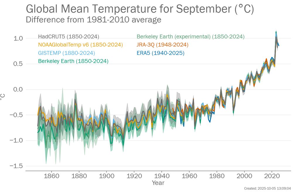
September global mean temperature is going to take a big leap from August it looks like. I looked at the mean of the daily averages from ERA5 and on an anomaly basis it's much warmer than August was and way above anything before the huge 2023 lurch.
Graph showing global mean temperature for Septembers from 1850 to 2025. Seven datasets are shown: HadCRUT5, NOAAGlobalTemp v6, GISTEMP, two flavours of Berkeley Earth, JRA-3Q and ERA5.
micefearboggis.bsky.social
I was supposed to drop the map of anomalies into this thread... It's quite warm in lots of places but there are some large anomalies over the NH.

bsky.app/profile/mice...
micefearboggis.bsky.social
The anomalies locally look like this...

(from pulse.climate.copernicus.eu)
Map of surface air temperature anomales from ERA5 for September 2025. Red areas are warmer than the 1991-2020 average and blue areas are colder than it. There are four different logos along the bottom of the graph and one of them appears twice.
micefearboggis.bsky.social
You can see the September bounce here too in a plot of all monthly averages. It will be interesting to see the final ERA5 figures.
Graph showing monthly global mean temperature from 2014 to September 2025. Seven datasets are shown: HadCRUT5, NOAAGlobalTemp v6, GISTEMP, two flavours of Berkeley Earth, JRA-3Q and ERA5.
micefearboggis.bsky.social
September global mean temperature is going to take a big leap from August it looks like. I looked at the mean of the daily averages from ERA5 and on an anomaly basis it's much warmer than August was and way above anything before the huge 2023 lurch.
Graph showing global mean temperature for Septembers from 1850 to 2025. Seven datasets are shown: HadCRUT5, NOAAGlobalTemp v6, GISTEMP, two flavours of Berkeley Earth, JRA-3Q and ERA5.
micefearboggis.bsky.social
Invincibly ignorant is a thing.
micefearboggis.bsky.social
There's another fault line: people who really look at their data and people who don't.