


Joey Cherdarchuk - Obumbratta
@obumbratta.com
Thanks to chroma.js it looks like the answer to the first question is yes

January 8, 2026 at 5:53 PM
Thanks to chroma.js it looks like the answer to the first question is yes
And sample UI gives you a dynamic chart and some generic app ui examples.
January 7, 2026 at 4:20 PM
And sample UI gives you a dynamic chart and some generic app ui examples.
Sample visuals lets you see your colours in data viz action.

January 7, 2026 at 4:20 PM
Sample visuals lets you see your colours in data viz action.
Contrast ratios give you contast for each colour against white, your lightest colour, your darkest colour, and black, letting you know which combinations don't pass WCAG guidelines. Clicking on any one will take you to my favourite two-colour contrast ratio tool with those colours pre-input.

January 7, 2026 at 4:20 PM
Contrast ratios give you contast for each colour against white, your lightest colour, your darkest colour, and black, letting you know which combinations don't pass WCAG guidelines. Clicking on any one will take you to my favourite two-colour contrast ratio tool with those colours pre-input.
Colour blindness does its best to simulate the deficiencies. Warnings pop up on the items where the colours are "significantly" less discernible than they are in the non-colourblind set, but beware the thresholds are kind of arbitrary, so use your best judgement.

January 7, 2026 at 4:20 PM
Colour blindness does its best to simulate the deficiencies. Warnings pop up on the items where the colours are "significantly" less discernible than they are in the non-colourblind set, but beware the thresholds are kind of arbitrary, so use your best judgement.
In addition to perceptual lightness there are a few other things you can view. The most ambitious (and experimental) of which is the colour plot.
January 7, 2026 at 4:20 PM
In addition to perceptual lightness there are a few other things you can view. The most ambitious (and experimental) of which is the colour plot.
You can drag the input swatches around to reorder them. Or click on them to adjust their colours in a colour picker, or quickly delete one.
January 7, 2026 at 4:20 PM
You can drag the input swatches around to reorder them. Or click on them to adjust their colours in a colour picker, or quickly delete one.
I imagine you'll find a lot that it doesn't handle, but it should manage comma or space delimiting (but not both at once), with or without quotes and #'s and even full CSS vars.
January 7, 2026 at 4:20 PM
I imagine you'll find a lot that it doesn't handle, but it should manage comma or space delimiting (but not both at once), with or without quotes and #'s and even full CSS vars.
If you give it just one colour, it'll give you a tailwind style set of colours to fill the selected number of colours. It defaults to 11 colours which I find is perfect. Swapping colour spaces will change them slightly.

January 7, 2026 at 4:20 PM
If you give it just one colour, it'll give you a tailwind style set of colours to fill the selected number of colours. It defaults to 11 colours which I find is perfect. Swapping colour spaces will change them slightly.
Like it's inspiration, it will interpolate between any number of colours, the main difference being you can now choose your colour space rather than always using LAB. This gives you some options to choose from and can steer you around some of the desaturated colours you might get in one space.
January 7, 2026 at 4:20 PM
The list is by no means exhaustive, HOPs, horizon charts and I'm sure other charts can be and have been used to show distributions. But attached is a handy one pager to summarize all the methods discussed here

July 16, 2025 at 1:20 PM
The list is by no means exhaustive, HOPs, horizon charts and I'm sure other charts can be and have been used to show distributions. But attached is a handy one pager to summarize all the methods discussed here
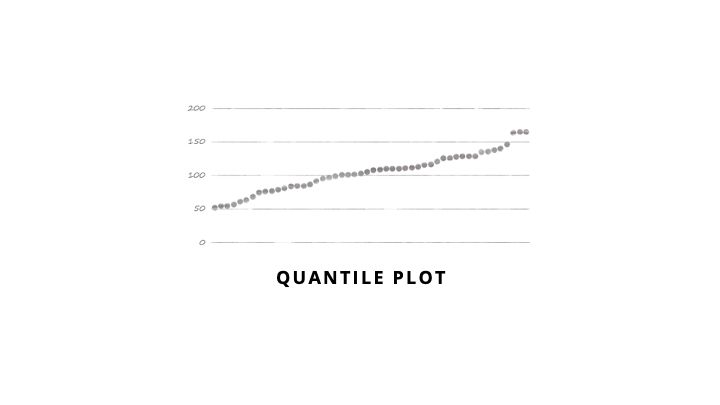
Quantile Plot
These can feel less cluttered than ranked bars, but can be harder to highlight a single data point. You usually plot each of the 100 percentiles rather than plotting every point in your data. Great for answering "what percent of my values are below/above a certain threshold?"
These can feel less cluttered than ranked bars, but can be harder to highlight a single data point. You usually plot each of the 100 percentiles rather than plotting every point in your data. Great for answering "what percent of my values are below/above a certain threshold?"
July 16, 2025 at 1:20 PM
Quantile Plot
These can feel less cluttered than ranked bars, but can be harder to highlight a single data point. You usually plot each of the 100 percentiles rather than plotting every point in your data. Great for answering "what percent of my values are below/above a certain threshold?"
These can feel less cluttered than ranked bars, but can be harder to highlight a single data point. You usually plot each of the 100 percentiles rather than plotting every point in your data. Great for answering "what percent of my values are below/above a certain threshold?"
OECD Better Life Index by @moritzstefaner.bsky.social, @do.minik.us & Raureif (current tool not working so here is Moritz's post)
truth-and-beauty.net/projects/oec...
Darkhorse Analytics on Alberta school grades
grades.dha.io
Density Design ranks cesarean sections
www.flickr.com/photos/densi...
truth-and-beauty.net/projects/oec...
Darkhorse Analytics on Alberta school grades
grades.dha.io
Density Design ranks cesarean sections
www.flickr.com/photos/densi...


July 16, 2025 at 1:20 PM
OECD Better Life Index by @moritzstefaner.bsky.social, @do.minik.us & Raureif (current tool not working so here is Moritz's post)
truth-and-beauty.net/projects/oec...
Darkhorse Analytics on Alberta school grades
grades.dha.io
Density Design ranks cesarean sections
www.flickr.com/photos/densi...
truth-and-beauty.net/projects/oec...
Darkhorse Analytics on Alberta school grades
grades.dha.io
Density Design ranks cesarean sections
www.flickr.com/photos/densi...
Ranked Bars
Great to communicate a single distribution while highlighting a particular data point. People love to rank things so it’s easy to interpret. It behaves in almost the opposite manner to a histogram in that flat areas represent clusters of data whereas with a histogram it is the peaks.
Great to communicate a single distribution while highlighting a particular data point. People love to rank things so it’s easy to interpret. It behaves in almost the opposite manner to a histogram in that flat areas represent clusters of data whereas with a histogram it is the peaks.

July 16, 2025 at 1:20 PM
Ranked Bars
Great to communicate a single distribution while highlighting a particular data point. People love to rank things so it’s easy to interpret. It behaves in almost the opposite manner to a histogram in that flat areas represent clusters of data whereas with a histogram it is the peaks.
Great to communicate a single distribution while highlighting a particular data point. People love to rank things so it’s easy to interpret. It behaves in almost the opposite manner to a histogram in that flat areas represent clusters of data whereas with a histogram it is the peaks.
We are back to plotting all the data, but this time we use one axis to plot the values and another to plot the ranking. This gives a different perspective on the shape of the data. These are excellent at providing context for where one data point fits in among many. Not great for comparing >1 dist.

July 16, 2025 at 1:20 PM
We are back to plotting all the data, but this time we use one axis to plot the values and another to plot the ranking. This gives a different perspective on the shape of the data. These are excellent at providing context for where one data point fits in among many. Not great for comparing >1 dist.
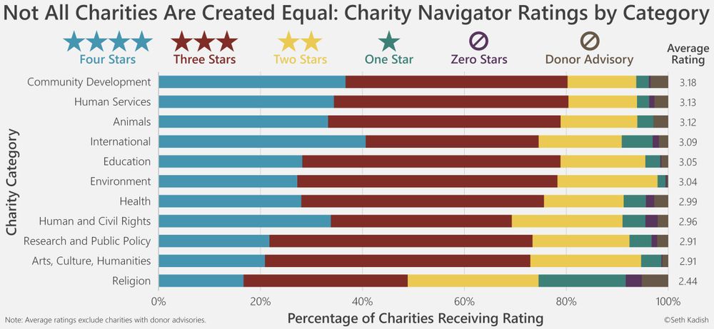
Seth Kadish visualizes charity ratings
vizual-statistix.tumblr.com/post/1207793...
I rework social media demographics
www.darkhorseanalytics.com/blog/divergi...
(I've since learned to have better contrast)
vizual-statistix.tumblr.com/post/1207793...
I rework social media demographics
www.darkhorseanalytics.com/blog/divergi...
(I've since learned to have better contrast)

July 16, 2025 at 1:20 PM
Seth Kadish visualizes charity ratings
vizual-statistix.tumblr.com/post/1207793...
I rework social media demographics
www.darkhorseanalytics.com/blog/divergi...
(I've since learned to have better contrast)
vizual-statistix.tumblr.com/post/1207793...
I rework social media demographics
www.darkhorseanalytics.com/blog/divergi...
(I've since learned to have better contrast)
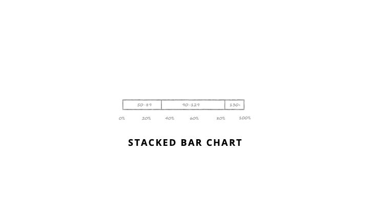
Stacked Bar
This plot involves a change in perspective. It has a much smaller number of bins and shows the proportion of the data that fits in each. It will provide a very coarse look at the shape of the data but is quite easy to interpret. It is most effective with a small number of categories.
This plot involves a change in perspective. It has a much smaller number of bins and shows the proportion of the data that fits in each. It will provide a very coarse look at the shape of the data but is quite easy to interpret. It is most effective with a small number of categories.
July 16, 2025 at 1:20 PM
Stacked Bar
This plot involves a change in perspective. It has a much smaller number of bins and shows the proportion of the data that fits in each. It will provide a very coarse look at the shape of the data but is quite easy to interpret. It is most effective with a small number of categories.
This plot involves a change in perspective. It has a much smaller number of bins and shows the proportion of the data that fits in each. It will provide a very coarse look at the shape of the data but is quite easy to interpret. It is most effective with a small number of categories.
FiveThirtyEight with a story on name based age estimates
fivethirtyeight.com/features/how...
@flowingdata.com plots 10th, Median, & 90th percentiles of salaries across industries
projects.flowingdata.com/2014/industry/
Flourish looks at the ages of olympians
flourish.studio/blog/visuali...
fivethirtyeight.com/features/how...
@flowingdata.com plots 10th, Median, & 90th percentiles of salaries across industries
projects.flowingdata.com/2014/industry/
Flourish looks at the ages of olympians
flourish.studio/blog/visuali...


July 16, 2025 at 1:20 PM
FiveThirtyEight with a story on name based age estimates
fivethirtyeight.com/features/how...
@flowingdata.com plots 10th, Median, & 90th percentiles of salaries across industries
projects.flowingdata.com/2014/industry/
Flourish looks at the ages of olympians
flourish.studio/blog/visuali...
fivethirtyeight.com/features/how...
@flowingdata.com plots 10th, Median, & 90th percentiles of salaries across industries
projects.flowingdata.com/2014/industry/
Flourish looks at the ages of olympians
flourish.studio/blog/visuali...
Range Plot
The ends of the line (usually) show the min and max of your data and the dot shows the average, or really any three metrics you find most useful. If the range of the data is the most important thing or your audience my struggle to interpret the other plots, this is nice and simple.
The ends of the line (usually) show the min and max of your data and the dot shows the average, or really any three metrics you find most useful. If the range of the data is the most important thing or your audience my struggle to interpret the other plots, this is nice and simple.

July 16, 2025 at 1:20 PM
Range Plot
The ends of the line (usually) show the min and max of your data and the dot shows the average, or really any three metrics you find most useful. If the range of the data is the most important thing or your audience my struggle to interpret the other plots, this is nice and simple.
The ends of the line (usually) show the min and max of your data and the dot shows the average, or really any three metrics you find most useful. If the range of the data is the most important thing or your audience my struggle to interpret the other plots, this is nice and simple.
FiveThirtyEight looks at the Red Sox roller coaster
fivethirtyeight.com/features/the...
Washington Post - Ivy League Grad Income
www.washingtonpost.com/news/wonk/wp...
Marcus Beck analyzes dissertation & thesis lengths
beckmw.wordpress.com/2014/07/15/a...
fivethirtyeight.com/features/the...
Washington Post - Ivy League Grad Income
www.washingtonpost.com/news/wonk/wp...
Marcus Beck analyzes dissertation & thesis lengths
beckmw.wordpress.com/2014/07/15/a...


July 16, 2025 at 1:20 PM
FiveThirtyEight looks at the Red Sox roller coaster
fivethirtyeight.com/features/the...
Washington Post - Ivy League Grad Income
www.washingtonpost.com/news/wonk/wp...
Marcus Beck analyzes dissertation & thesis lengths
beckmw.wordpress.com/2014/07/15/a...
fivethirtyeight.com/features/the...
Washington Post - Ivy League Grad Income
www.washingtonpost.com/news/wonk/wp...
Marcus Beck analyzes dissertation & thesis lengths
beckmw.wordpress.com/2014/07/15/a...
Box Plot
Box Plots focus on the min, 25th percentile, median, 75th percentile and max. Many will explicitly plot outliers and exclude them from the min-max
Box Plots focus on the min, 25th percentile, median, 75th percentile and max. Many will explicitly plot outliers and exclude them from the min-max

July 16, 2025 at 1:20 PM
Box Plot
Box Plots focus on the min, 25th percentile, median, 75th percentile and max. Many will explicitly plot outliers and exclude them from the min-max
Box Plots focus on the min, 25th percentile, median, 75th percentile and max. Many will explicitly plot outliers and exclude them from the min-max
You can also simplify the distribution by focusing on a few key aspects of the data, usually some measure of central tendency plus some measure of range. The following visuals give less detail but may make comparisons simpler.

July 16, 2025 at 1:20 PM
You can also simplify the distribution by focusing on a few key aspects of the data, usually some measure of central tendency plus some measure of range. The following visuals give less detail but may make comparisons simpler.
Nick Berry analyzes 4-digit PINs
www.datagenetics.com/blog/septemb...
Seth Kadish shows chess board utilization
vizual-statistix.tumblr.com/post/7882178...
Matt Styles looks at the distribution of birthdays
www.themarginalian.org/2013/10/08/b...
www.datagenetics.com/blog/septemb...
Seth Kadish shows chess board utilization
vizual-statistix.tumblr.com/post/7882178...
Matt Styles looks at the distribution of birthdays
www.themarginalian.org/2013/10/08/b...


July 16, 2025 at 1:20 PM
Nick Berry analyzes 4-digit PINs
www.datagenetics.com/blog/septemb...
Seth Kadish shows chess board utilization
vizual-statistix.tumblr.com/post/7882178...
Matt Styles looks at the distribution of birthdays
www.themarginalian.org/2013/10/08/b...
www.datagenetics.com/blog/septemb...
Seth Kadish shows chess board utilization
vizual-statistix.tumblr.com/post/7882178...
Matt Styles looks at the distribution of birthdays
www.themarginalian.org/2013/10/08/b...
Heatmaps
Heatmaps are extremely compact and excellent for looking for patterns across many distributions. They use variation in colour to show the counts and, as such, they are not very precise, only giving a crude sense of the data’s shape
Heatmaps are extremely compact and excellent for looking for patterns across many distributions. They use variation in colour to show the counts and, as such, they are not very precise, only giving a crude sense of the data’s shape

July 16, 2025 at 1:20 PM
Heatmaps
Heatmaps are extremely compact and excellent for looking for patterns across many distributions. They use variation in colour to show the counts and, as such, they are not very precise, only giving a crude sense of the data’s shape
Heatmaps are extremely compact and excellent for looking for patterns across many distributions. They use variation in colour to show the counts and, as such, they are not very precise, only giving a crude sense of the data’s shape