Paweł Ludwiczak
@plud.net
Product Designer helping early-stage startups with UI/UX • ex-Stack Overflow/Canva • 📭 Open to remote gigs & founding designer roles.
➡️ https://plud.net
➡️ https://plud.net
It's a pretty robust code editor with AI. But sure, let's call it "vibe coding app"...

May 6, 2025 at 7:05 AM
It's a pretty robust code editor with AI. But sure, let's call it "vibe coding app"...
The best kind of Friday afternoon

April 25, 2025 at 5:59 PM
The best kind of Friday afternoon
Just a simple logo design I’ve been working on lately.

April 24, 2025 at 7:00 AM
Just a simple logo design I’ve been working on lately.
yeah, it’s good enough, will fix it later…

March 21, 2025 at 2:41 PM
yeah, it’s good enough, will fix it later…
While ago I needed to build wireframes for engineering team who wanted to see more abstracted version of certain features or interfaces. Something more style- or platform-agnostic.
But greyscale wireframes are boring. So I turned everything into blueprints.
But greyscale wireframes are boring. So I turned everything into blueprints.

March 11, 2025 at 2:52 PM
While ago I needed to build wireframes for engineering team who wanted to see more abstracted version of certain features or interfaces. Something more style- or platform-agnostic.
But greyscale wireframes are boring. So I turned everything into blueprints.
But greyscale wireframes are boring. So I turned everything into blueprints.
I've done another logo...

March 11, 2025 at 1:14 PM
I've done another logo...
This is what I want in my calendar app...

March 11, 2025 at 1:09 PM
This is what I want in my calendar app...
I don't often design logos, but here's one I've done recently. It was meant to subtly show "MP" letters. But the brand is about fitness/health/nutrition/training, so besides letters I wanted to capture few things that at least I can see:
- growth (steps/stairs going up)
- muscle tendons
- dynamism
- growth (steps/stairs going up)
- muscle tendons
- dynamism


March 4, 2025 at 4:09 PM
I don't often design logos, but here's one I've done recently. It was meant to subtly show "MP" letters. But the brand is about fitness/health/nutrition/training, so besides letters I wanted to capture few things that at least I can see:
- growth (steps/stairs going up)
- muscle tendons
- dynamism
- growth (steps/stairs going up)
- muscle tendons
- dynamism
Must have for every fintech landing page: 3D globe illustration with lines connecting two different places...
Bonus points if animated!
Even more bonus points if you can spin the globe with drag/click gestures.
Bonus points if animated!
Even more bonus points if you can spin the globe with drag/click gestures.


February 18, 2025 at 8:31 AM
Must have for every fintech landing page: 3D globe illustration with lines connecting two different places...
Bonus points if animated!
Even more bonus points if you can spin the globe with drag/click gestures.
Bonus points if animated!
Even more bonus points if you can spin the globe with drag/click gestures.
@github.com hey github folks, you may want to add `flex-shrink: 0` to your sponsor buttons on home view..


February 17, 2025 at 5:38 PM
@github.com hey github folks, you may want to add `flex-shrink: 0` to your sponsor buttons on home view..
Visited twitter earlier today just to see how things are... And except bullshit threads, trump & musk, we now also have designers measuring who has bigger dick...
Now back to 🦋!
Now back to 🦋!

February 14, 2025 at 11:29 AM
Visited twitter earlier today just to see how things are... And except bullshit threads, trump & musk, we now also have designers measuring who has bigger dick...
Now back to 🦋!
Now back to 🦋!
Here's a room full of people who actually genuinely care about it...

February 11, 2025 at 11:52 AM
Here's a room full of people who actually genuinely care about it...
It's been a while since I last shared some pixels here... Here's something I really liked, especially around iconography meaning:
- 1 dot: single service
- 4 dots: set of services
- 1/3 dots: "Choose 1 out of 𝑛 services"
Little design detail.
#designsky
- 1 dot: single service
- 4 dots: set of services
- 1/3 dots: "Choose 1 out of 𝑛 services"
Little design detail.
#designsky

February 10, 2025 at 1:37 PM
It's been a while since I last shared some pixels here... Here's something I really liked, especially around iconography meaning:
- 1 dot: single service
- 4 dots: set of services
- 1/3 dots: "Choose 1 out of 𝑛 services"
Little design detail.
#designsky
- 1 dot: single service
- 4 dots: set of services
- 1/3 dots: "Choose 1 out of 𝑛 services"
Little design detail.
#designsky
Loom is such a massive company. And yet they have that little UI bug in their reactions bar.
Such a simple & basic CSS issue – almost embarrassing to ship it like that, especially with their resources and scale.
Make UI Great Again!
Such a simple & basic CSS issue – almost embarrassing to ship it like that, especially with their resources and scale.
Make UI Great Again!
February 10, 2025 at 11:36 AM
Loom is such a massive company. And yet they have that little UI bug in their reactions bar.
Such a simple & basic CSS issue – almost embarrassing to ship it like that, especially with their resources and scale.
Make UI Great Again!
Such a simple & basic CSS issue – almost embarrassing to ship it like that, especially with their resources and scale.
Make UI Great Again!
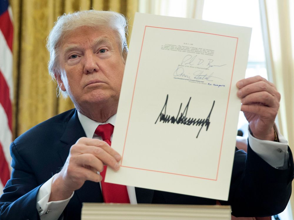
Starting today, I'll sign every document with a massive signature using fat Sharpie marker...

February 10, 2025 at 10:59 AM
Starting today, I'll sign every document with a massive signature using fat Sharpie marker...


February 8, 2025 at 6:15 AM
Wearing watch on vacations

February 3, 2025 at 4:12 PM
Wearing watch on vacations


