


Ray Newman
@raynewman.bsky.social
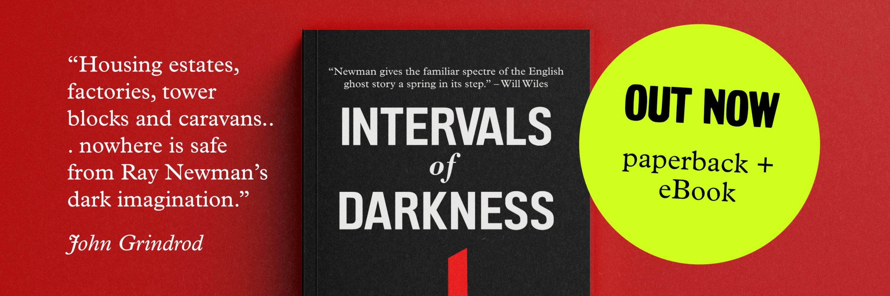
He/him. From Bridgwater, in Bristol. Writer, editor, content designer. Ghost stories, films. No alt text, no repost. Not here for politics. Linktree: https://linktr.ee/raynewman Header: my book Intervals of Darkness https://www.amazon.co.uk/dp/B0DDR8X9QY
More familiars: Jack, Prickears, Frog, Wynowe, Jeso and Panu.
February 13, 2026 at 8:56 PM
More familiars: Jack, Prickears, Frog, Wynowe, Jeso and Panu.
I've got a story about a witch's familiar trying to find a host in 21st century Britain in my collection ‘Municipal Gothic’, BTW. A bit of an album track... But those are sometimes people's favourites.
February 13, 2026 at 8:35 PM
I've got a story about a witch's familiar trying to find a host in 21st century Britain in my collection ‘Municipal Gothic’, BTW. A bit of an album track... But those are sometimes people's favourites.
Some witches’ familiars: Jesus, Jockey, Sandy, Collyn, Mistress Elizabeth.
February 13, 2026 at 8:33 PM
Some witches’ familiars: Jesus, Jockey, Sandy, Collyn, Mistress Elizabeth.
When I lived in Walthamstow there was a butcher who came up with the mad idea of opening later, then staying open until 8 (I think) a few nights a week and guess what? They had to move to a bigger, better shop after about a year.
February 13, 2026 at 12:35 PM
When I lived in Walthamstow there was a butcher who came up with the mad idea of opening later, then staying open until 8 (I think) a few nights a week and guess what? They had to move to a bigger, better shop after about a year.
Fundamentally operating on the basis that there are still 'housewives' doing their shopping during the day while the children are at school.
February 13, 2026 at 12:31 PM
Fundamentally operating on the basis that there are still 'housewives' doing their shopping during the day while the children are at school.
We have a joke in the trade that carousels only exist so you can tell everyone in the management team that their thing is on the homepage, at the top.
See also:
shouldiuseacarousel.com
See also:
shouldiuseacarousel.com
Should I Use A Carousel?
shouldiuseacarousel.com
February 13, 2026 at 12:09 PM
We have a joke in the trade that carousels only exist so you can tell everyone in the management team that their thing is on the homepage, at the top.
See also:
shouldiuseacarousel.com
See also:
shouldiuseacarousel.com
8. It uses lots of abbreviations, acronyms and initialisms; those are not spelled out the first time they're used.
bsky.app/profile/jemb...
bsky.app/profile/jemb...

The acronyms come thick and fast
February 13, 2026 at 11:53 AM
8. It uses lots of abbreviations, acronyms and initialisms; those are not spelled out the first time they're used.
bsky.app/profile/jemb...
bsky.app/profile/jemb...
Content design people: feel free to suggest other red flags.
People who don't know what the heck I'm talking about: feel free to ask questions that might help you understand what I'm talking about.
People who don't know what the heck I'm talking about: feel free to ask questions that might help you understand what I'm talking about.
February 13, 2026 at 11:36 AM
Content design people: feel free to suggest other red flags.
People who don't know what the heck I'm talking about: feel free to ask questions that might help you understand what I'm talking about.
People who don't know what the heck I'm talking about: feel free to ask questions that might help you understand what I'm talking about.
7. Links use text like 'click here' or 'learn more' instead of language that describes what will happen, or where the user will be taken, if they click that link. (My pal Laura Parker reminded me of this one.)
February 13, 2026 at 11:36 AM
7. Links use text like 'click here' or 'learn more' instead of language that describes what will happen, or where the user will be taken, if they click that link. (My pal Laura Parker reminded me of this one.)
6. It uses vague or oblique language to soften messages. Content design focuses on clarity and directness, it is not about burying bad news.
February 13, 2026 at 11:36 AM
6. It uses vague or oblique language to soften messages. Content design focuses on clarity and directness, it is not about burying bad news.
5a. Tip: content on the page is more likely to help people find your website through search engines or AI search, too.
February 13, 2026 at 11:36 AM
5a. Tip: content on the page is more likely to help people find your website through search engines or AI search, too.
5. It uses inaccessible features such as rotating carousels. If the information is really useful, content designers will want to extract it as proper on-page content. And if it isn't useful, which is perhaps why it's hidden in a carousel, they'll want to remove it altogether.
February 13, 2026 at 11:36 AM
5. It uses inaccessible features such as rotating carousels. If the information is really useful, content designers will want to extract it as proper on-page content. And if it isn't useful, which is perhaps why it's hidden in a carousel, they'll want to remove it altogether.
4. It presents a bunch of graphics, photographs and/or automatically playing videos. These might look cool and exciting but unless they help users complete a task, or find out what they need to know, they're probably less useful than simple, clear text.
February 13, 2026 at 11:36 AM
4. It presents a bunch of graphics, photographs and/or automatically playing videos. These might look cool and exciting but unless they help users complete a task, or find out what they need to know, they're probably less useful than simple, clear text.
3. It presents as a wall of text. Content designers can often make something more readable and accessible simply by (a) reducing the amount of words and (b) breaking those words up with white space and headings.
February 13, 2026 at 11:36 AM
3. It presents as a wall of text. Content designers can often make something more readable and accessible simply by (a) reducing the amount of words and (b) breaking those words up with white space and headings.
2. It uses unnecessarily complex words like "utilise" instead of "use", or "leverage" instead of "use", or "harness the power of" instead of "use". You get the idea.
February 13, 2026 at 11:36 AM
2. It uses unnecessarily complex words like "utilise" instead of "use", or "leverage" instead of "use", or "harness the power of" instead of "use". You get the idea.
1a. Tip: it should probably complete the unspoken phrase "I am ready to..." For example, the NHS has "Find information and services to help you manage your health", which almost fits that formula.
February 13, 2026 at 11:36 AM
1a. Tip: it should probably complete the unspoken phrase "I am ready to..." For example, the NHS has "Find information and services to help you manage your health", which almost fits that formula.