


Adrian Nastase
@sql-troubles.bsky.social
#D365 #FinOps #HR #CRM #BC🔸 #BI #Analytics #Dataviz #DWH 🔸 #DataOps #ITOps expert with #PowerBI #Synapse #Fabric 🔹 #SQLServer #SSRS #SSIS 🔹 #Oracle #PM #ITIL #DevOps know-how in #Cologne / #Köln / #DE
👉 sql-troubles.blogspot.com
👉 sql-troubles.blogspot.com
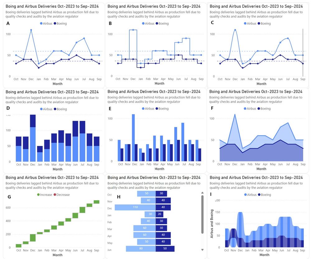
📢𝗗𝗮𝘁𝗮 𝗩𝗶𝘀𝘂𝗮𝗹𝗶𝘇𝗮𝘁𝗶𝗼𝗻: 𝗖𝗼𝗺𝗽𝗮𝗿𝗶𝘀𝗼𝗻𝘀 𝗕𝗲𝘁𝘄𝗲𝗲𝗻 𝗗𝗮𝘁𝗮 𝗦𝗲𝗿𝗶𝗲𝘀
For comparing two data series, one can use line charts (A-C), column charts (E), stacked column charts (D), area charts (F), water charts (G), tornado charts (H) and even ribbon charts (I). Which one you'd prefer?
👉https://tinyurl.com/bdekvwvu
For comparing two data series, one can use line charts (A-C), column charts (E), stacked column charts (D), area charts (F), water charts (G), tornado charts (H) and even ribbon charts (I). Which one you'd prefer?
👉https://tinyurl.com/bdekvwvu
May 2, 2025 at 11:33 PM
📢𝗗𝗮𝘁𝗮 𝗩𝗶𝘀𝘂𝗮𝗹𝗶𝘇𝗮𝘁𝗶𝗼𝗻: 𝗖𝗼𝗺𝗽𝗮𝗿𝗶𝘀𝗼𝗻𝘀 𝗕𝗲𝘁𝘄𝗲𝗲𝗻 𝗗𝗮𝘁𝗮 𝗦𝗲𝗿𝗶𝗲𝘀
For comparing two data series, one can use line charts (A-C), column charts (E), stacked column charts (D), area charts (F), water charts (G), tornado charts (H) and even ribbon charts (I). Which one you'd prefer?
👉https://tinyurl.com/bdekvwvu
For comparing two data series, one can use line charts (A-C), column charts (E), stacked column charts (D), area charts (F), water charts (G), tornado charts (H) and even ribbon charts (I). Which one you'd prefer?
👉https://tinyurl.com/bdekvwvu
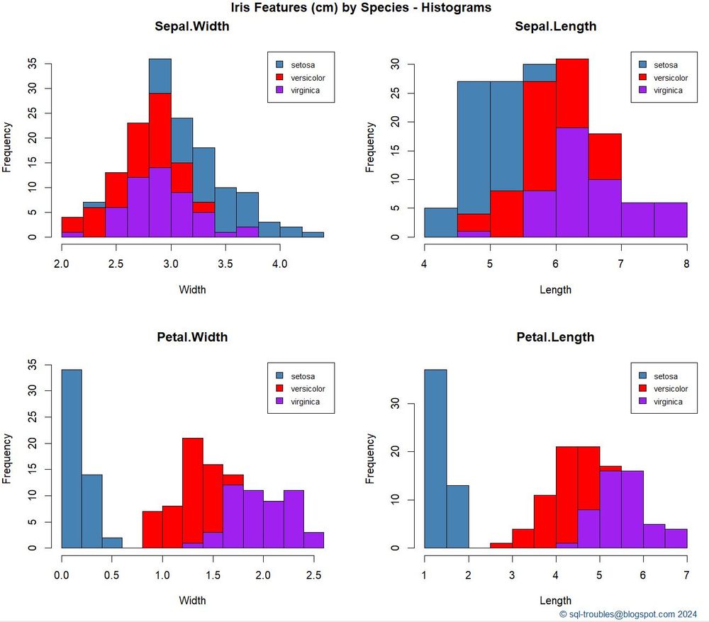
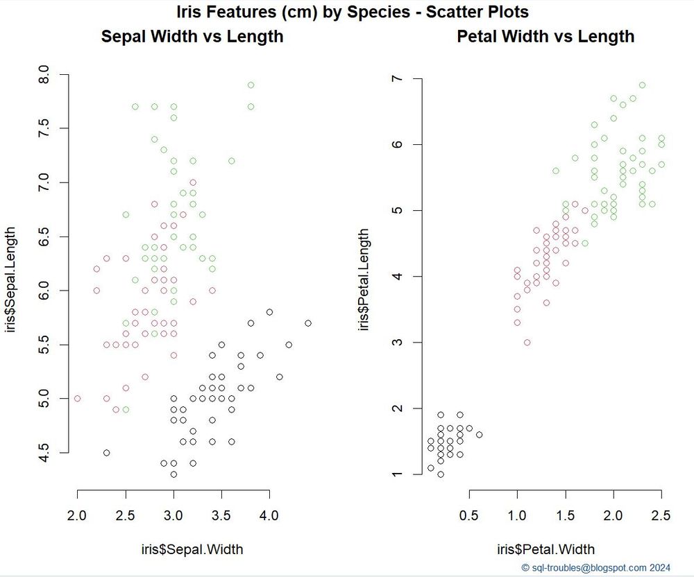
📊𝗩𝗶𝘀𝘂𝗮𝗹𝗶𝘇𝗶𝗻𝗴 𝘁𝗵𝗲 𝗜𝗿𝗶𝘀 𝗗𝗮𝘁𝗮𝘀𝗲𝘁 𝗶𝗻 𝗥
The #dataviz on the Iris dataset are already a classical because it allows to exemplify how #visuals can provide different #perspectives into the same data, e.g. stacked #histograms (left) vs #scatterplots (right) in #rlanguage.
tinyurl.com/3j5a2kd5
The #dataviz on the Iris dataset are already a classical because it allows to exemplify how #visuals can provide different #perspectives into the same data, e.g. stacked #histograms (left) vs #scatterplots (right) in #rlanguage.
tinyurl.com/3j5a2kd5
December 17, 2024 at 11:31 PM
📊𝗩𝗶𝘀𝘂𝗮𝗹𝗶𝘇𝗶𝗻𝗴 𝘁𝗵𝗲 𝗜𝗿𝗶𝘀 𝗗𝗮𝘁𝗮𝘀𝗲𝘁 𝗶𝗻 𝗥
The #dataviz on the Iris dataset are already a classical because it allows to exemplify how #visuals can provide different #perspectives into the same data, e.g. stacked #histograms (left) vs #scatterplots (right) in #rlanguage.
tinyurl.com/3j5a2kd5
The #dataviz on the Iris dataset are already a classical because it allows to exemplify how #visuals can provide different #perspectives into the same data, e.g. stacked #histograms (left) vs #scatterplots (right) in #rlanguage.
tinyurl.com/3j5a2kd5
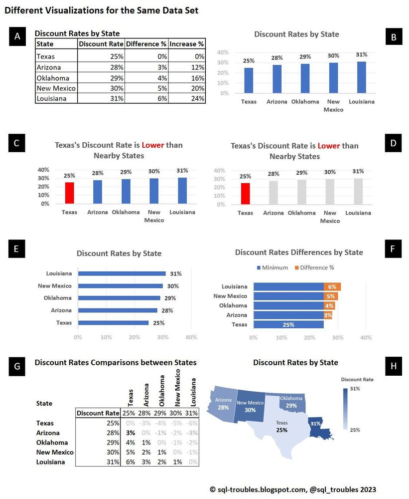
📊𝗗𝗶𝘀𝗰𝗼𝘂𝗻𝘁 𝗥𝗮𝘁𝗲𝘀 𝗶𝗻 𝗠𝗦 𝗘𝘅𝗰𝗲𝗹
Which of the data visualizations would you prefer?
(A) a table is simple enough in many cases
(B), (C), (D) column charts
(E), (F) bar charts
(G) a matrix table is more appropriate for technical readers
(H) a choropleth map
#dataviz #Excel
tinyurl.com/5ybssn33
Which of the data visualizations would you prefer?
(A) a table is simple enough in many cases
(B), (C), (D) column charts
(E), (F) bar charts
(G) a matrix table is more appropriate for technical readers
(H) a choropleth map
#dataviz #Excel
tinyurl.com/5ybssn33
December 16, 2024 at 1:43 AM
📊𝗗𝗶𝘀𝗰𝗼𝘂𝗻𝘁 𝗥𝗮𝘁𝗲𝘀 𝗶𝗻 𝗠𝗦 𝗘𝘅𝗰𝗲𝗹
Which of the data visualizations would you prefer?
(A) a table is simple enough in many cases
(B), (C), (D) column charts
(E), (F) bar charts
(G) a matrix table is more appropriate for technical readers
(H) a choropleth map
#dataviz #Excel
tinyurl.com/5ybssn33
Which of the data visualizations would you prefer?
(A) a table is simple enough in many cases
(B), (C), (D) column charts
(E), (F) bar charts
(G) a matrix table is more appropriate for technical readers
(H) a choropleth map
#dataviz #Excel
tinyurl.com/5ybssn33
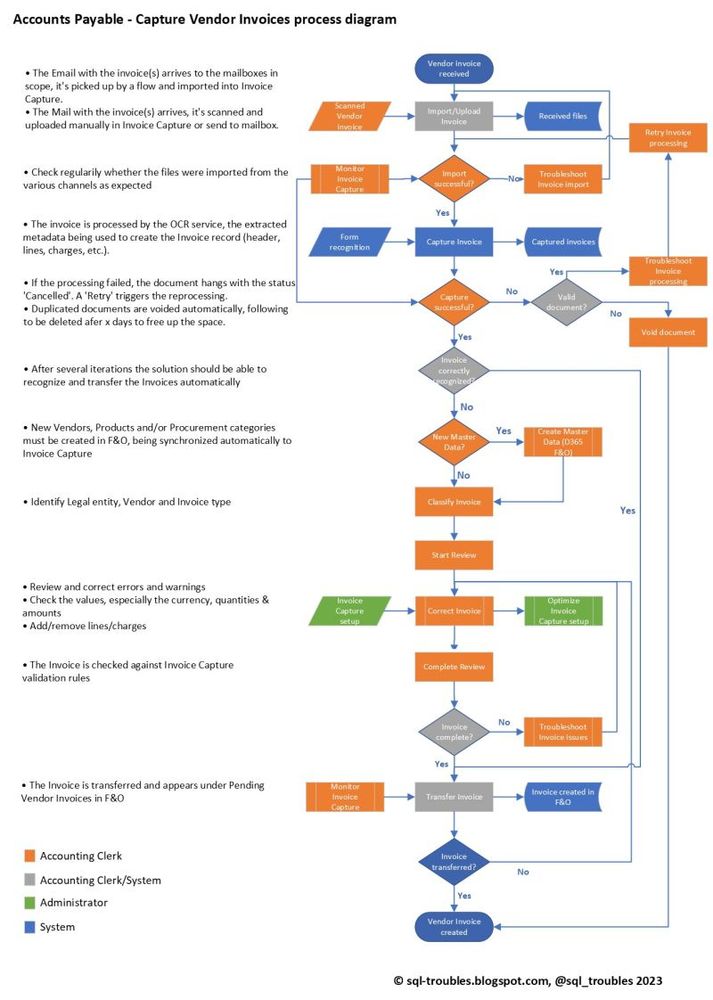
🗺️𝗗𝘆𝗻𝗮𝗺𝗶𝗰𝘀 𝟯𝟲𝟱: 𝗖𝗮𝗽𝘁𝘂𝗿𝗲𝘀 𝗩𝗲𝗻𝗱𝗼𝗿 𝗜𝗻𝘃𝗼𝗶𝗰𝗲 - 𝗣𝗿𝗼𝗰𝗲𝘀𝘀 𝗗𝗶𝗮𝗴𝗿𝗮𝗺
The below process diagram attempts to depict the main steps performed in Dynamics 365 CRM, respectively F&O for importing automatically the vendor invoices received by email.
#D365F&O #D365CRM #AccountsPayables #VendorInvoices #automation
The below process diagram attempts to depict the main steps performed in Dynamics 365 CRM, respectively F&O for importing automatically the vendor invoices received by email.
#D365F&O #D365CRM #AccountsPayables #VendorInvoices #automation
December 16, 2024 at 1:29 AM
🗺️𝗗𝘆𝗻𝗮𝗺𝗶𝗰𝘀 𝟯𝟲𝟱: 𝗖𝗮𝗽𝘁𝘂𝗿𝗲𝘀 𝗩𝗲𝗻𝗱𝗼𝗿 𝗜𝗻𝘃𝗼𝗶𝗰𝗲 - 𝗣𝗿𝗼𝗰𝗲𝘀𝘀 𝗗𝗶𝗮𝗴𝗿𝗮𝗺
The below process diagram attempts to depict the main steps performed in Dynamics 365 CRM, respectively F&O for importing automatically the vendor invoices received by email.
#D365F&O #D365CRM #AccountsPayables #VendorInvoices #automation
The below process diagram attempts to depict the main steps performed in Dynamics 365 CRM, respectively F&O for importing automatically the vendor invoices received by email.
#D365F&O #D365CRM #AccountsPayables #VendorInvoices #automation
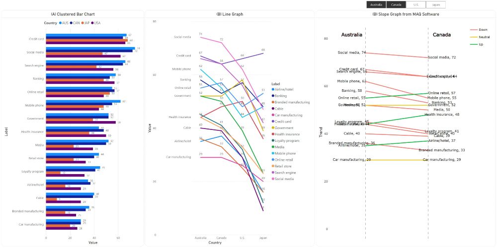
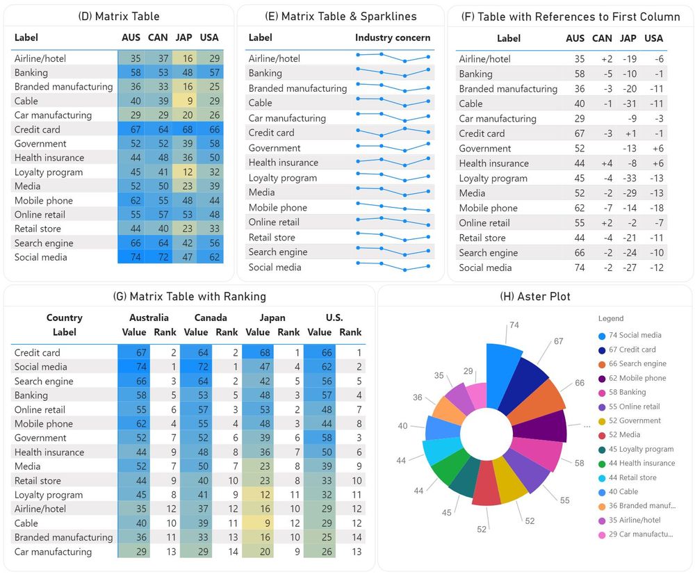
📊𝗟𝗶𝘀𝘁 𝗼𝗳 𝗜𝘁𝗲𝗺𝘀 𝗶𝗻 𝗣𝗼𝘄𝗲𝗿 𝗕𝗜
Clustered #barcharts seem to be often abused in #dataviz to compare the items from a cluster when line and slop graphs (B), respectively enhanced matrix #tables (D,E,F,G) and #aster plots (H) can occasionally do a better job.
#PowerBI
tinyurl.com/y2tjkbbv
Clustered #barcharts seem to be often abused in #dataviz to compare the items from a cluster when line and slop graphs (B), respectively enhanced matrix #tables (D,E,F,G) and #aster plots (H) can occasionally do a better job.
#PowerBI
tinyurl.com/y2tjkbbv
December 16, 2024 at 1:09 AM
📊𝗟𝗶𝘀𝘁 𝗼𝗳 𝗜𝘁𝗲𝗺𝘀 𝗶𝗻 𝗣𝗼𝘄𝗲𝗿 𝗕𝗜
Clustered #barcharts seem to be often abused in #dataviz to compare the items from a cluster when line and slop graphs (B), respectively enhanced matrix #tables (D,E,F,G) and #aster plots (H) can occasionally do a better job.
#PowerBI
tinyurl.com/y2tjkbbv
Clustered #barcharts seem to be often abused in #dataviz to compare the items from a cluster when line and slop graphs (B), respectively enhanced matrix #tables (D,E,F,G) and #aster plots (H) can occasionally do a better job.
#PowerBI
tinyurl.com/y2tjkbbv
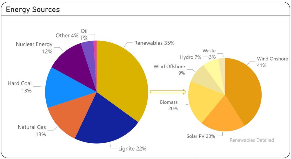
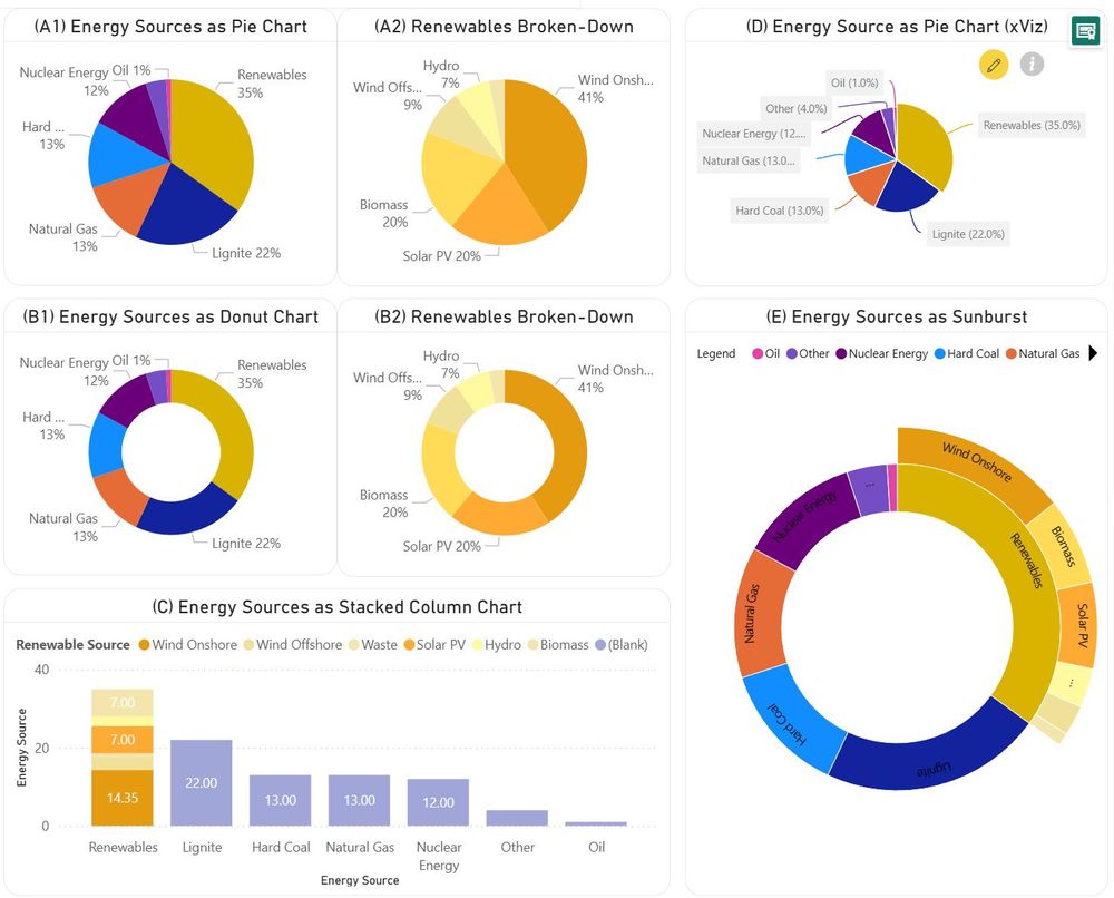
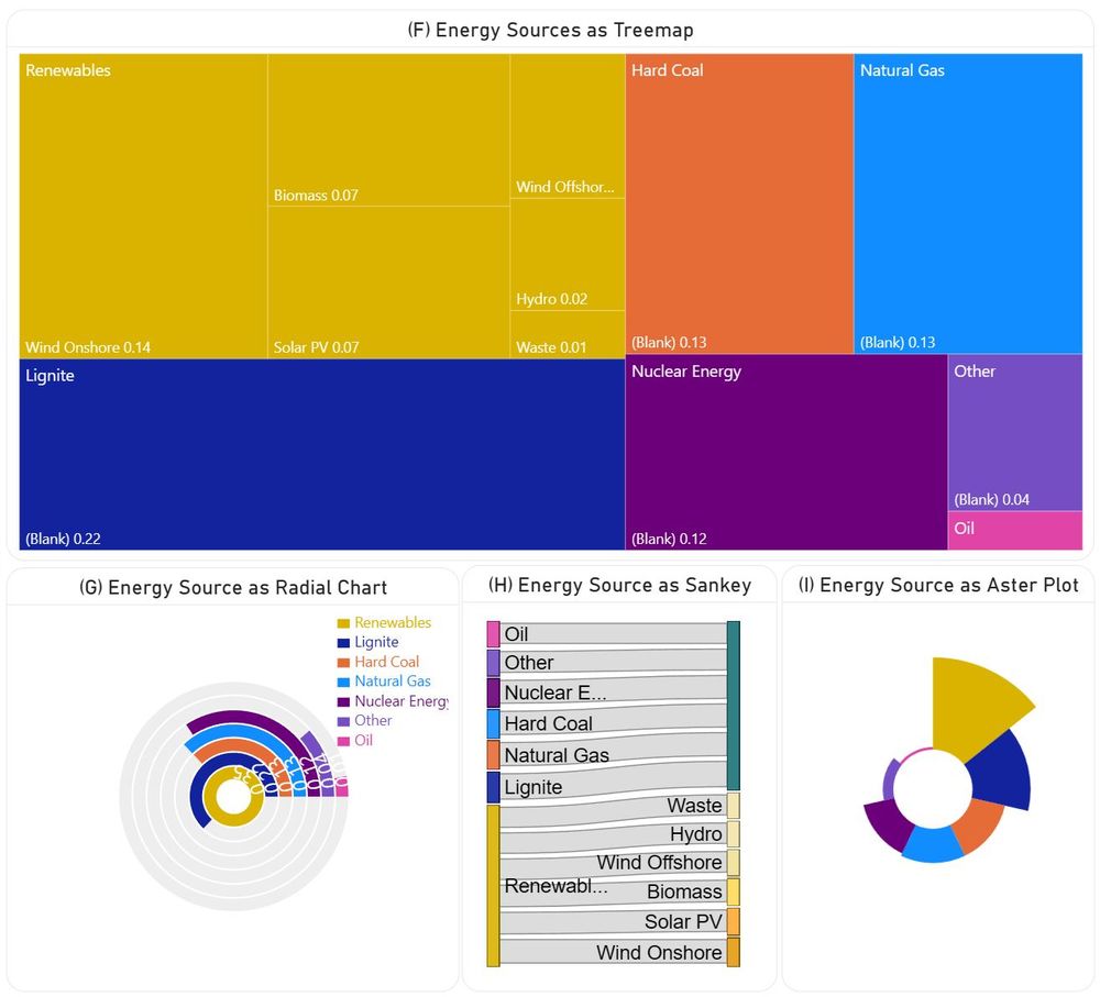
📊𝗣𝗶𝗲 𝗮𝗻𝗱 𝗗𝗼𝗻𝘂𝘁 𝗖𝗵𝗮𝗿𝘁𝘀 𝗶𝗻 𝗣𝗼𝘄𝗲𝗿 𝗕𝗜
There are many voices against the use of pie and donut #charts, though they have their place in #dataviz. However, one should consider also the alternatives, when appropriate.
#PowerBI #piechart #donut #treemap #sankey #aster #radialchart
tinyurl.com/5fkcys5f
There are many voices against the use of pie and donut #charts, though they have their place in #dataviz. However, one should consider also the alternatives, when appropriate.
#PowerBI #piechart #donut #treemap #sankey #aster #radialchart
tinyurl.com/5fkcys5f
December 16, 2024 at 12:50 AM
📊𝗣𝗶𝗲 𝗮𝗻𝗱 𝗗𝗼𝗻𝘂𝘁 𝗖𝗵𝗮𝗿𝘁𝘀 𝗶𝗻 𝗣𝗼𝘄𝗲𝗿 𝗕𝗜
There are many voices against the use of pie and donut #charts, though they have their place in #dataviz. However, one should consider also the alternatives, when appropriate.
#PowerBI #piechart #donut #treemap #sankey #aster #radialchart
tinyurl.com/5fkcys5f
There are many voices against the use of pie and donut #charts, though they have their place in #dataviz. However, one should consider also the alternatives, when appropriate.
#PowerBI #piechart #donut #treemap #sankey #aster #radialchart
tinyurl.com/5fkcys5f
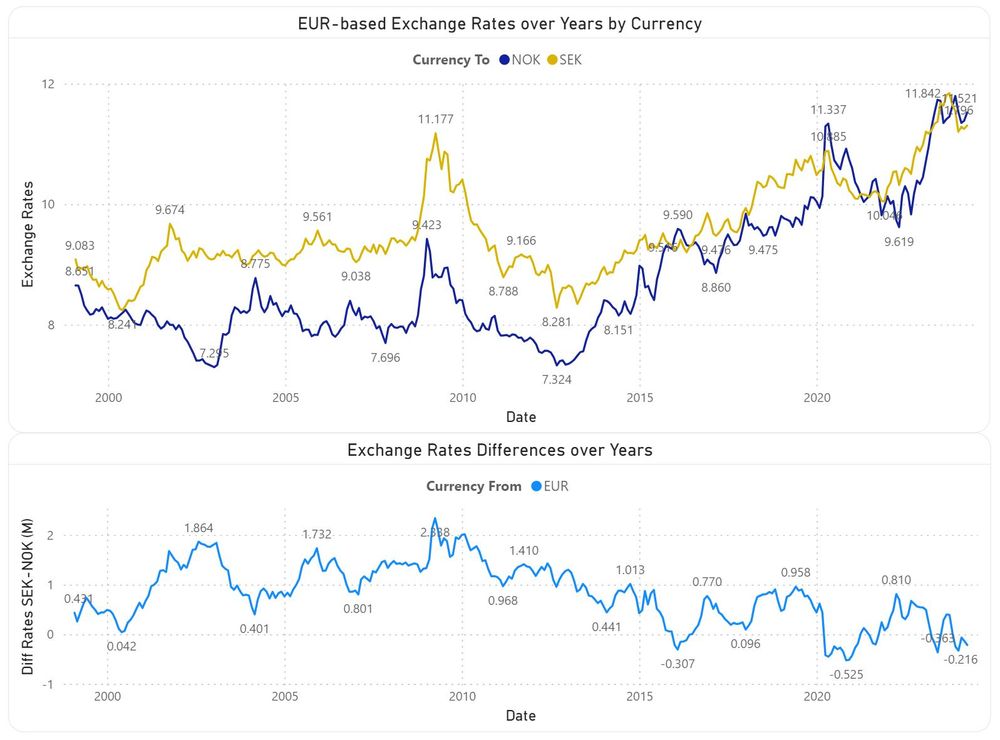
📊𝗖𝗼𝗻𝘃𝗲𝗿𝘀𝗶𝗼𝗻 𝗥𝗮𝘁𝗲𝘀' 𝗧𝗿𝗶𝗮𝗻𝗴𝘂𝗹𝗮𝘁𝗶𝗼𝗻 𝗶𝗻 𝗣𝗼𝘄𝗲𝗿 𝗕𝗜
Certain operations require comparing the trends of two currencies, e.g. the evolution of NOK and SEK in respect to EUR. A table is easy to read, though a chart provides a good overview of the trends.
#dataviz #PowerBI #triangulation
tinyurl.com/n66h3k2x
Certain operations require comparing the trends of two currencies, e.g. the evolution of NOK and SEK in respect to EUR. A table is easy to read, though a chart provides a good overview of the trends.
#dataviz #PowerBI #triangulation
tinyurl.com/n66h3k2x
December 16, 2024 at 12:32 AM
📊𝗖𝗼𝗻𝘃𝗲𝗿𝘀𝗶𝗼𝗻 𝗥𝗮𝘁𝗲𝘀' 𝗧𝗿𝗶𝗮𝗻𝗴𝘂𝗹𝗮𝘁𝗶𝗼𝗻 𝗶𝗻 𝗣𝗼𝘄𝗲𝗿 𝗕𝗜
Certain operations require comparing the trends of two currencies, e.g. the evolution of NOK and SEK in respect to EUR. A table is easy to read, though a chart provides a good overview of the trends.
#dataviz #PowerBI #triangulation
tinyurl.com/n66h3k2x
Certain operations require comparing the trends of two currencies, e.g. the evolution of NOK and SEK in respect to EUR. A table is easy to read, though a chart provides a good overview of the trends.
#dataviz #PowerBI #triangulation
tinyurl.com/n66h3k2x
📊𝗖𝗼𝗻𝘃𝗲𝗿𝘀𝗶𝗼𝗻 𝗥𝗮𝘁𝗲𝘀 𝗶𝗻 𝗣𝗼𝘄𝗲𝗿 𝗕𝗜
Various visuals can be used to represent conversion rates over time: tables (A,B), tornado (C), radar (D) & scatterplot (F) charts, stacked columns (G), dual axes (E,I,J,K), waterfall (H), sparklines (L).
#dataviz #PowerBI
sql-troubles.blogspot.com/2024/05/grap...
Various visuals can be used to represent conversion rates over time: tables (A,B), tornado (C), radar (D) & scatterplot (F) charts, stacked columns (G), dual axes (E,I,J,K), waterfall (H), sparklines (L).
#dataviz #PowerBI
sql-troubles.blogspot.com/2024/05/grap...

December 15, 2024 at 11:44 PM
📊𝗖𝗼𝗻𝘃𝗲𝗿𝘀𝗶𝗼𝗻 𝗥𝗮𝘁𝗲𝘀 𝗶𝗻 𝗣𝗼𝘄𝗲𝗿 𝗕𝗜
Various visuals can be used to represent conversion rates over time: tables (A,B), tornado (C), radar (D) & scatterplot (F) charts, stacked columns (G), dual axes (E,I,J,K), waterfall (H), sparklines (L).
#dataviz #PowerBI
sql-troubles.blogspot.com/2024/05/grap...
Various visuals can be used to represent conversion rates over time: tables (A,B), tornado (C), radar (D) & scatterplot (F) charts, stacked columns (G), dual axes (E,I,J,K), waterfall (H), sparklines (L).
#dataviz #PowerBI
sql-troubles.blogspot.com/2024/05/grap...