stevecarufel_
@stevecarufel.bsky.social
79 followers 260 following 64 posts
Mostly here for charts and maps 💁📊 especially about weather and space Montréal ⚜️🌹🌲🌷☘️ stevecarufel.com (needs an update) github.com/datacarvel
Posts Media Videos Starter Packs
stevecarufel.bsky.social
Gigantic blaze in the #Etosha National Park and around in #Namibia as seen from above

Burnt area was estimated at nearly 1M hectares 2 days ago. That's more than all the fires in British Columbia this year 😳

Fortunately, it didn't grow much since then and appears to be contained

#wildfire #Africa
stevecarufel.bsky.social
So it's #TidyTuesday and we're looking at US retail #gasoline and #diesel prices of the last 30 years

#rstats #dataviz ⛽ 🚗🚛
This dark mode charts shows the average US retail gas and diesel price per gallon in US Dollars from 1995 to 2025 (June). There are two square charts one after the other. On the left, in the background in transparent colors (yellow, orange, red) we see the full weekly data broken down by grade for gasoline and full color trend lines for each grade : regular, midgrade, premium. On the right, same idea but for diesel only and in purple, all grades included, not broken down.

We see that, since the 2010s, the 3 grades of gasoline naturally had some slight differences in their price but the differences widened since 2010 and even more so since the mid/late-2010.

In all cases, the general pattern is somewhat linear from 1995 to 2010 and then stays flat until the late 2010s. Since 2020, its been going up steadily.

Data is from the U.S. Energy Information Administration as cleaned and curated for #TidyTuesday by Jon Harmon.
stevecarufel.bsky.social
#Clouds cut with a knife 🔪☁️ from both below and above 😎 (with some sat imagery lag)

#Montreal
A screenshot of satellite imagery showing a sharp, East-West cloud limit above Southern Quebec with Montreal in the center. A red for and arrow tells where the viewer was when taking the video in the second post below.
stevecarufel.bsky.social
Et la ville de #Québec #QuebecCity
Multiple calendar heatmaps showing daily max temperatues, cloud cover and precipitations in Quebec City in April and May, from 2019 to 2025. May 2025 was dull because there was more rain and cloud cover hours, very much like 2019.
stevecarufel.bsky.social
So we just had a lame spring in #Quebec and wanted to see how obvious this was in the data

So I made this calendar heatmap for #Montreal, showing :

🌡️ Max temperatures

☀️☁️ Hours of cloud cover

🌧️ Precipitations

#weather #meteo #Rstats

In short, May was indeed dull
Multiple calendar heatmaps showing daily max temperatues, cloud cover and precipitations in Montreal in April and May, from 2019 to 2025. May 2025 was dull because there was more rain and cloud cover hours, very much like 2019.
stevecarufel.bsky.social
Merci! Pas certain pour le "expert" ☺️ mais non car ici dans la carte c'est un mix de données satellites et numériques.

J'imagine que ça serait faisable avec des données secondaires (livres ou études) ou documents publics numérisés s'ils existent mais ça ne serait pas aussi détaillé 😊
stevecarufel.bsky.social
Bonus : 3D rotating view
stevecarufel.bsky.social
Played with #Rstats and {rayshader} to make this #Quebec population density map, thanks to a tutorial by @milos-makes-maps.bsky.social ✌️⚜️

Code 👉 github.com/datacarvel/q...
Carte de la densité de population du Québec, faite avec {rayshader}
Quebec Population Density Map made with {rayshader}

Data from Kontur Population
stevecarufel.bsky.social
Looks like this. Photo courtesy of Alexe Godbout
stevecarufel.bsky.social
A lake just... completely drained in Northern #Quebec, in a matter of days. Lake Rouge, ~70km SW of Chapais.

Still a mystery, but it seems that a small natural dam has burst and all the water escaped.

Sentinel-1 | Copernicus Programme | EU | SentinelHub
stevecarufel.bsky.social
*most recent
*terminated
😊🙄
stevecarufel.bsky.social
#TidyTuesday

1000+ grants of scientific research from the NIH and NSF were terminated under the current Trump admin.

I compared their abstract against that list of 350+ banned words from federal sites and docs, with incendiary terms like "peanut allergies", "women" and "water quality".

#rstats
stevecarufel.bsky.social
I think {rvest} can exactly do this for you. With help from the map family in {purrr}. I'd write a function that grabs an individual observation from that external site and then map(your_df, your_function)?
Reposted by stevecarufel_
sponce1.bsky.social
📊 #SWDchallenge – MAY 2025 | compare human and machine
.
Transformed disaster death data into ridgeline plots revealing hidden patterns across seven decades.
.
🔗:
stevenponce.netlify.app/data_visuali...
.
#SWDchallenge | #dataviz | #rstats | #ggplot2
A ridgeline plot shows how disaster death distributions changed from 1950 to 2020 across five major disaster types: Drought, Flood, Earthquake, Extreme Weather, and Extreme Temperature. The visualization uses a rainbow color gradient from blue (1950s) to red (2020s) to display density curves of death patterns for each decade. The graph reveals shifting mortality distributions over time, with apparent variations in pattern and magnitude across different disaster types. Deaths are shown on a logarithmic scale from 0.1 to 1M.
stevecarufel.bsky.social
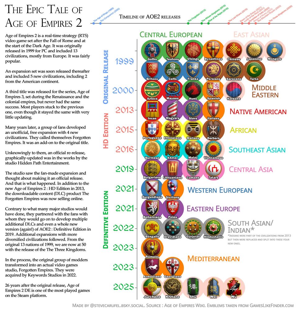
Shout out to the modders who kickstarted this (and that became an actual development studio) and the original developers who didn't cease-and-desist them like many big studios would have done (looking at you Nintendo and Square Enix)
stevecarufel.bsky.social
By far, the video game I played the most in the last ~15 years 🫣

Thanks to fan, the game had quite a revival since the early 2010's and just next week, yet another expansion is released, so from the original 13 civilizations in 1999, we'll get at 50 this Tuesday 🤯
stevecarufel.bsky.social
#30DayChartChallenge Day 30 : NetGeo Theme Day

[war horn in the distance]

The story of #AgeOfEmpires2 since its original 1999 release and all the available civilizations to play with and attack others, group by region and version.

#rstats #videogames
stevecarufel.bsky.social
#30DayChallenge Day 29 : Extraterrestrial

Here are the distances from Earth to other planets over time

Hardly useful, really just neat waveforms 〰️🪐〰️

Maybe I'll create a #synth patch with these someday 🎹🎛️👀

#space #Jupiter #Saturn #SolarSystem
stevecarufel.bsky.social
#30DayChartChallenge Day 27 : Noise

Our #Sun 's level of activity since 1749, as indicated by its number of sunspots.

Most coronal mass ejections come from these "colder" areas over the Sun. CMEs provoke the biggest aurora shows when Earth is in their way.

#rstats #space
stevecarufel.bsky.social
#30DayChartChallenge Day 26 : Monochrome

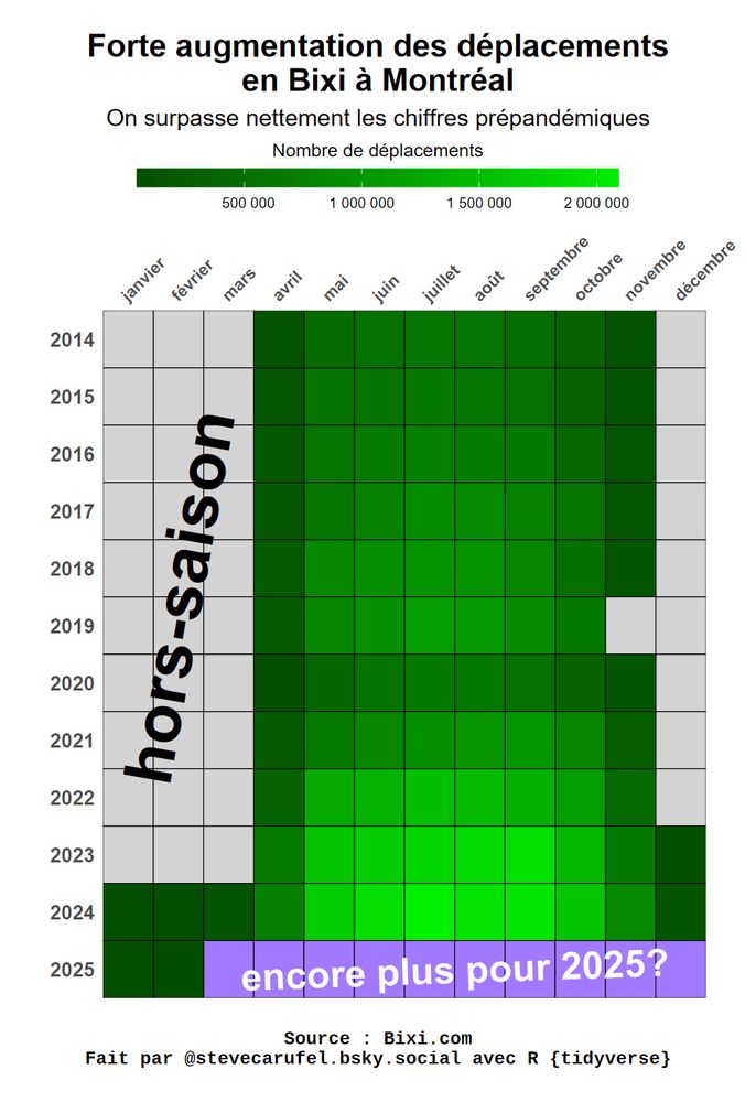
#Bixi rides in #Montreal - notable increase in the number of rides 🚴🔥🔥🔥

And since last year, they are available year round ⛄

#Quebec #velo #bicycle