


💫 The Wonderstream by @WarpedWorlds
@thewonderstream.bsky.social
🌌 Dedicated to Radical Wonder & Punk Kindness.
✨️ Sharing the art, people, and stories that keep the Wonder alive. ♾️
🎨 Artshares | Raffles | Community Spotlights
🤝 Collabs & Connections:
📩 [email protected]
🌐 warpedworldswonderverse.com
✨️ Sharing the art, people, and stories that keep the Wonder alive. ♾️
🎨 Artshares | Raffles | Community Spotlights
🤝 Collabs & Connections:
📩 [email protected]
🌐 warpedworldswonderverse.com
Oooo I like this.
January 29, 2026 at 4:54 PM
Oooo I like this.
Reposted by 💫 The Wonderstream by @WarpedWorlds

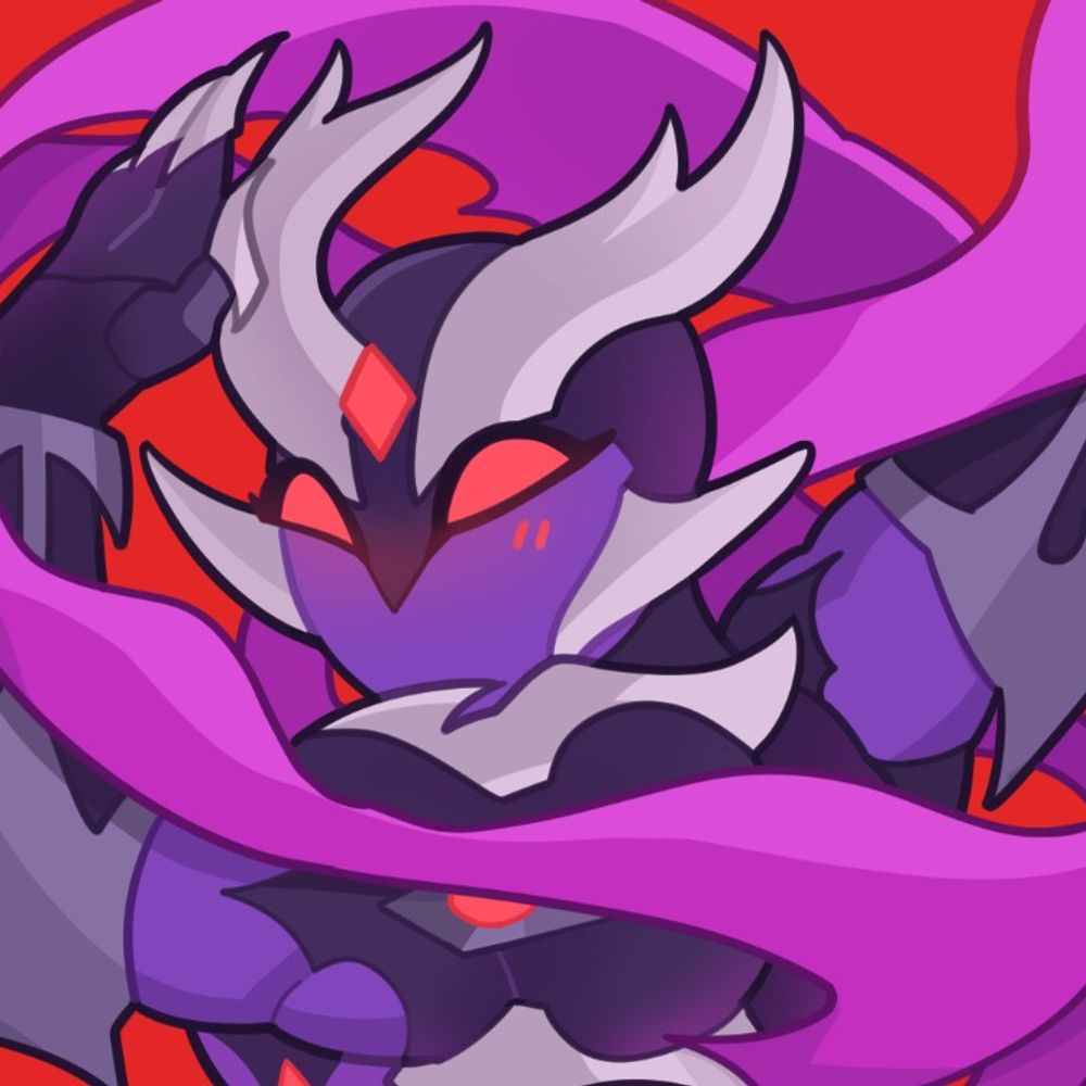
♠️» Jeff doodle dump
— Closeups —
The one where he's just goin' "🤨" is definitely my favorite, close second to the mirror one ♠️🪞
(Misc commentary and lore in each ALT text)
— Closeups —
The one where he's just goin' "🤨" is definitely my favorite, close second to the mirror one ♠️🪞
(Misc commentary and lore in each ALT text)


January 29, 2026 at 1:33 AM
♠️» Jeff doodle dump
— Closeups —
The one where he's just goin' "🤨" is definitely my favorite, close second to the mirror one ♠️🪞
(Misc commentary and lore in each ALT text)
— Closeups —
The one where he's just goin' "🤨" is definitely my favorite, close second to the mirror one ♠️🪞
(Misc commentary and lore in each ALT text)
Reposted by 💫 The Wonderstream by @WarpedWorlds

Is there still space? I'd love to be added! I make pixel art


January 28, 2026 at 10:56 AM
Is there still space? I'd love to be added! I make pixel art
Reposted by 💫 The Wonderstream by @WarpedWorlds

hello! i'd love to be added, thank you for the opportunity 💕
Hello #PortfolioDay! ✨
I'm Prisma, an illustrator and character designer! I'm a lover of OCs and enjoy making soft, cute art! I'm available for design and illustration commissions, and sell adopts! 💖
vgen ✧ ko-fi ✧ carrd
I'm Prisma, an illustrator and character designer! I'm a lover of OCs and enjoy making soft, cute art! I'm available for design and illustration commissions, and sell adopts! 💖
vgen ✧ ko-fi ✧ carrd


January 28, 2026 at 8:09 PM
hello! i'd love to be added, thank you for the opportunity 💕
Reposted by 💫 The Wonderstream by @WarpedWorlds
May I be added? I'm hoping to do with more eyes on my comic, by the time I get them printed


January 28, 2026 at 12:00 AM
May I be added? I'm hoping to do with more eyes on my comic, by the time I get them printed
Reposted by 💫 The Wonderstream by @WarpedWorlds

Ooh thank you for the starter pack!! I’d love to be added if you’d have me! Here’s some recent work I’ve done!


January 28, 2026 at 5:46 AM
Ooh thank you for the starter pack!! I’d love to be added if you’d have me! Here’s some recent work I’ve done!
Reposted by 💫 The Wonderstream by @WarpedWorlds

Oooh I'd love to be added, thank you for the opportunity 💚


January 28, 2026 at 10:45 AM
Oooh I'd love to be added, thank you for the opportunity 💚
Reposted by 💫 The Wonderstream by @WarpedWorlds

I'd love to be added—I'm making a new community-driven multiverse and TCG where audience influence affects the lore, stories, and cards we develop. All are welcome to come play and build a new brand focused on Radical Wonder! We also have a community-spotlight account @thewonderstream.bsky.social


January 28, 2026 at 10:47 PM
I'd love to be added—I'm making a new community-driven multiverse and TCG where audience influence affects the lore, stories, and cards we develop. All are welcome to come play and build a new brand focused on Radical Wonder! We also have a community-spotlight account @thewonderstream.bsky.social
Reposted by 💫 The Wonderstream by @WarpedWorlds

my tip: to improve, quantity > quality. do lots of bad pieces and theyll be good someday. if you worry about things being perfect, youll never get anything done. and a bad piece is better than no piece at all.
dorkfruit.blogspot.com i go in detail on this and other tips here!
dorkfruit.blogspot.com i go in detail on this and other tips here!


January 27, 2026 at 3:55 PM
my tip: to improve, quantity > quality. do lots of bad pieces and theyll be good someday. if you worry about things being perfect, youll never get anything done. and a bad piece is better than no piece at all.
dorkfruit.blogspot.com i go in detail on this and other tips here!
dorkfruit.blogspot.com i go in detail on this and other tips here!
Reposted by 💫 The Wonderstream by @WarpedWorlds

I’m not very good at this but—
✨Warm light will give you cold shadows and vice versa
✨Shading with colours that aren’t just a darker shade than the base colour will keep things from looking muddy (especially in skin tones I find)
✨Consider bounce light and how it reflects off different surfaces—
✨Warm light will give you cold shadows and vice versa
✨Shading with colours that aren’t just a darker shade than the base colour will keep things from looking muddy (especially in skin tones I find)
✨Consider bounce light and how it reflects off different surfaces—

January 27, 2026 at 11:26 AM
I’m not very good at this but—
✨Warm light will give you cold shadows and vice versa
✨Shading with colours that aren’t just a darker shade than the base colour will keep things from looking muddy (especially in skin tones I find)
✨Consider bounce light and how it reflects off different surfaces—
✨Warm light will give you cold shadows and vice versa
✨Shading with colours that aren’t just a darker shade than the base colour will keep things from looking muddy (especially in skin tones I find)
✨Consider bounce light and how it reflects off different surfaces—
Reposted by 💫 The Wonderstream by @WarpedWorlds

I'm honestly just a beginner on arts but one thing that saved me in my weird mixed media arts is that using a Divide layer at top of your pencil sketch and colorpicking the lightest shade of paper to fill the layer helps giving you a cleaner sketch to work on


January 27, 2026 at 11:10 AM
I'm honestly just a beginner on arts but one thing that saved me in my weird mixed media arts is that using a Divide layer at top of your pencil sketch and colorpicking the lightest shade of paper to fill the layer helps giving you a cleaner sketch to work on
Reposted by 💫 The Wonderstream by @WarpedWorlds

Curve of moment is your friend!!!! There are very good resorces in youtube that will explain the bases of it. Also doodle! Not everything has to be a masterpiece. It's ok to just doodle!!!


January 27, 2026 at 9:32 AM
Curve of moment is your friend!!!! There are very good resorces in youtube that will explain the bases of it. Also doodle! Not everything has to be a masterpiece. It's ok to just doodle!!!
Reposted by 💫 The Wonderstream by @WarpedWorlds

Will forever be an advocate for using negative spaces when referencing a pose IT HELPS SO MUCH ???


January 27, 2026 at 9:20 AM
Will forever be an advocate for using negative spaces when referencing a pose IT HELPS SO MUCH ???
Reposted by 💫 The Wonderstream by @WarpedWorlds
My Art tip
You don’t need to draw/paint every single tiny detail, the brain is really good at filling in the blanks.
Like this owl, I haven’t painted all the feathers in great detail, but you can still see them, because I outlined some and made suggestions for the brain to follow.
#arttips #art
You don’t need to draw/paint every single tiny detail, the brain is really good at filling in the blanks.
Like this owl, I haven’t painted all the feathers in great detail, but you can still see them, because I outlined some and made suggestions for the brain to follow.
#arttips #art

January 27, 2026 at 10:36 AM
Reposted by 💫 The Wonderstream by @WarpedWorlds
Something I've been playing around with lately, is dramatic lighting. It's super easy too! Pick a darker colour that matches the background, fill your entire character(s) with it, put it on multiply and lower the opacity. Then, start erasing parts with soft and hard erasers. 1/2

January 27, 2026 at 9:38 AM
Something I've been playing around with lately, is dramatic lighting. It's super easy too! Pick a darker colour that matches the background, fill your entire character(s) with it, put it on multiply and lower the opacity. Then, start erasing parts with soft and hard erasers. 1/2
Reposted by 💫 The Wonderstream by @WarpedWorlds

Kicking things off!
One thing I've learned is that contrast is incredibly important to making or breaking your art - not just colour contrast, but textures, edge types, shapes etc.
Specifically for texture, it's best to put all your detailed texture where you want the eye to go, otherwise, too busy!
One thing I've learned is that contrast is incredibly important to making or breaking your art - not just colour contrast, but textures, edge types, shapes etc.
Specifically for texture, it's best to put all your detailed texture where you want the eye to go, otherwise, too busy!

January 27, 2026 at 9:07 AM
Kicking things off!
One thing I've learned is that contrast is incredibly important to making or breaking your art - not just colour contrast, but textures, edge types, shapes etc.
Specifically for texture, it's best to put all your detailed texture where you want the eye to go, otherwise, too busy!
One thing I've learned is that contrast is incredibly important to making or breaking your art - not just colour contrast, but textures, edge types, shapes etc.
Specifically for texture, it's best to put all your detailed texture where you want the eye to go, otherwise, too busy!
Reposted by 💫 The Wonderstream by @WarpedWorlds

I'm Ayutta💜
Artist with love to glitter, pink colors and decorative arts ✨
Artist with love to glitter, pink colors and decorative arts ✨


January 27, 2026 at 10:12 PM
I'm Ayutta💜
Artist with love to glitter, pink colors and decorative arts ✨
Artist with love to glitter, pink colors and decorative arts ✨