


Edit Gyenge
@editgyenge.bsky.social
Information designer and entrepreneur passionate about data, innovation, and pushing the boundaries of design through experimentation.
https://linktr.ee/editgyenge
https://linktr.ee/editgyenge
The tallest religious buildings in the world.


November 5, 2025 at 12:07 PM
The tallest religious buildings in the world.
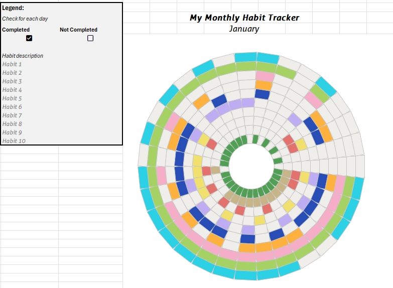
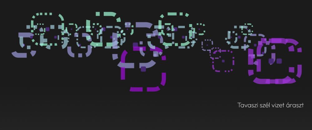
Design experiment with some mixed feelings

August 22, 2025 at 11:46 AM
Design experiment with some mixed feelings

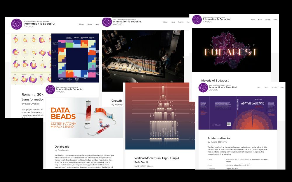
A wrap-up of last month's
#datavisualization projects.
#datavisualization projects.
June 5, 2025 at 1:52 PM
A wrap-up of last month's
#datavisualization projects.
#datavisualization projects.
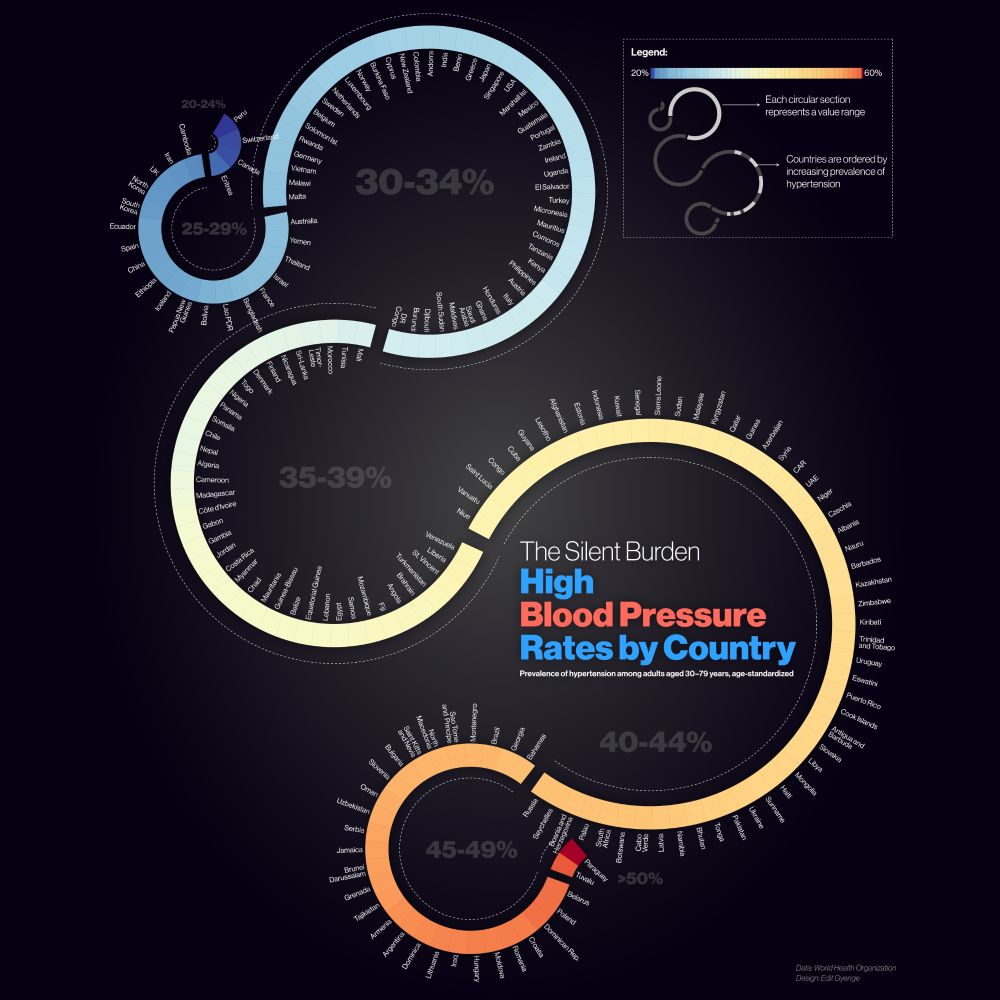
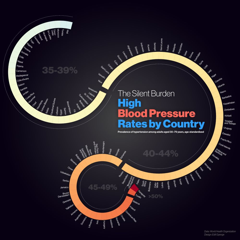
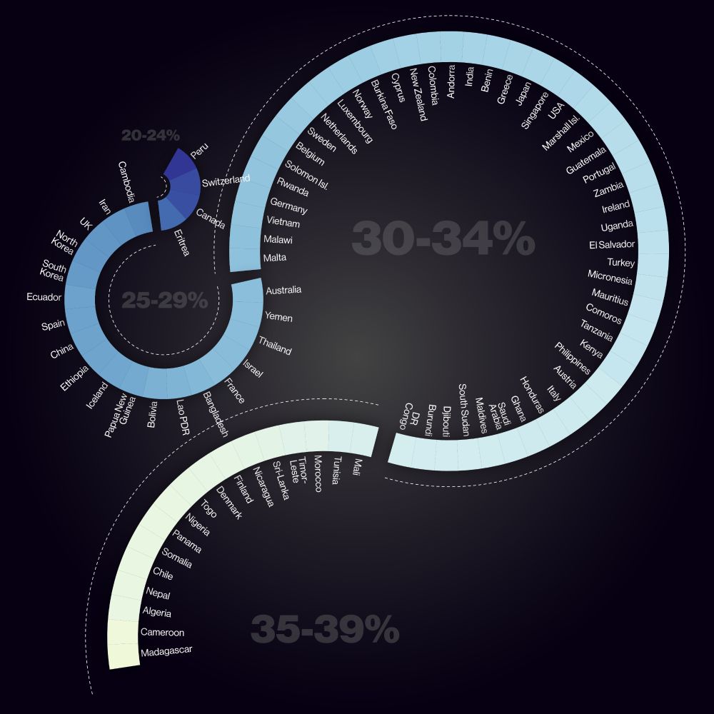
New infographic: See how 193 countries compare in hypertension rates.
#Hypertension #GlobalHealth #PublicHealth #Infographic
#Hypertension #GlobalHealth #PublicHealth #Infographic
June 5, 2025 at 5:57 AM
New infographic: See how 193 countries compare in hypertension rates.
#Hypertension #GlobalHealth #PublicHealth #Infographic
#Hypertension #GlobalHealth #PublicHealth #Infographic
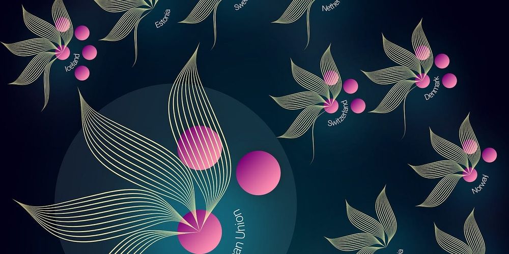
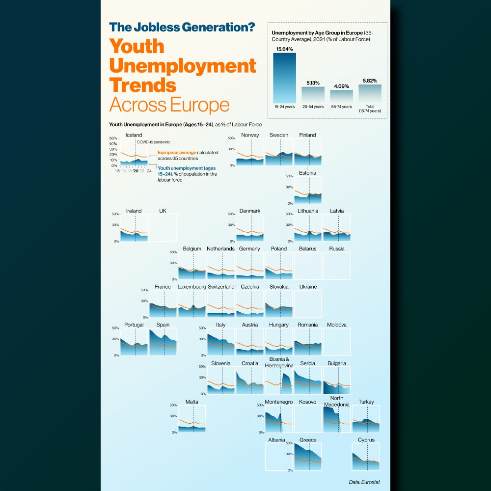
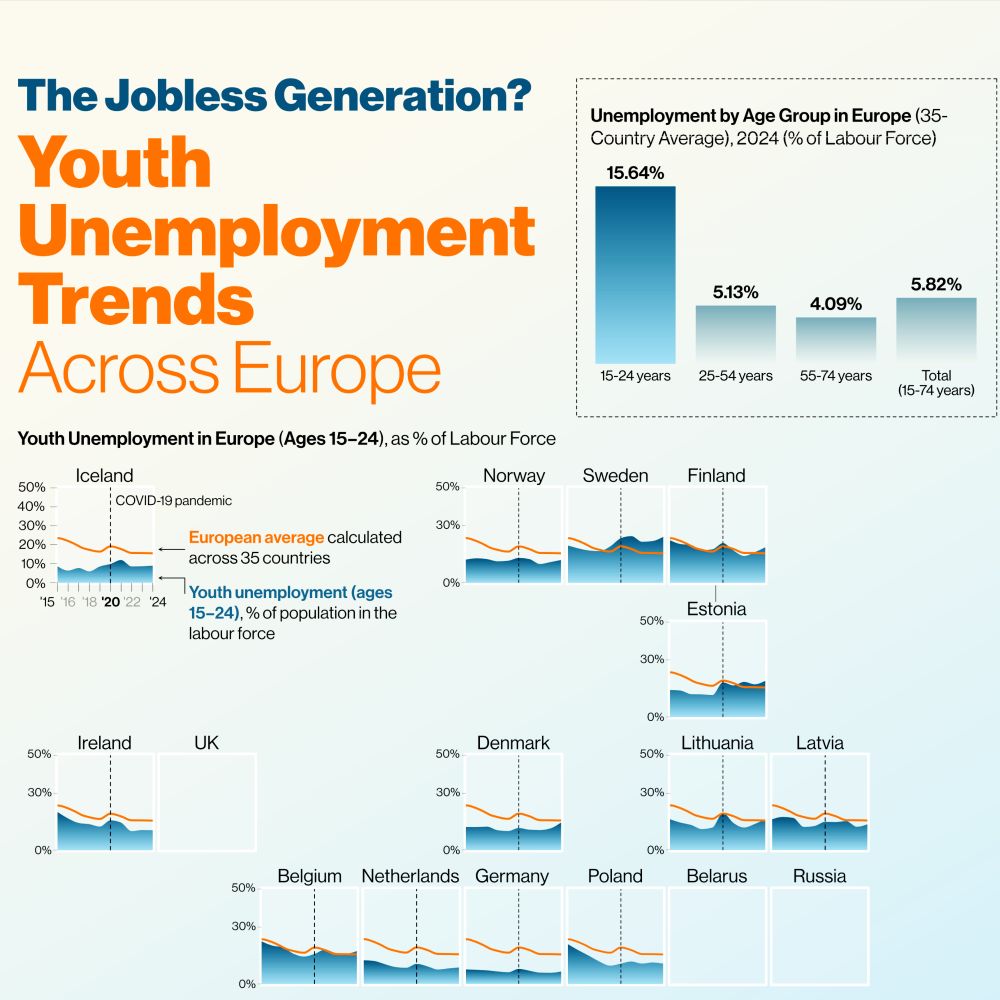
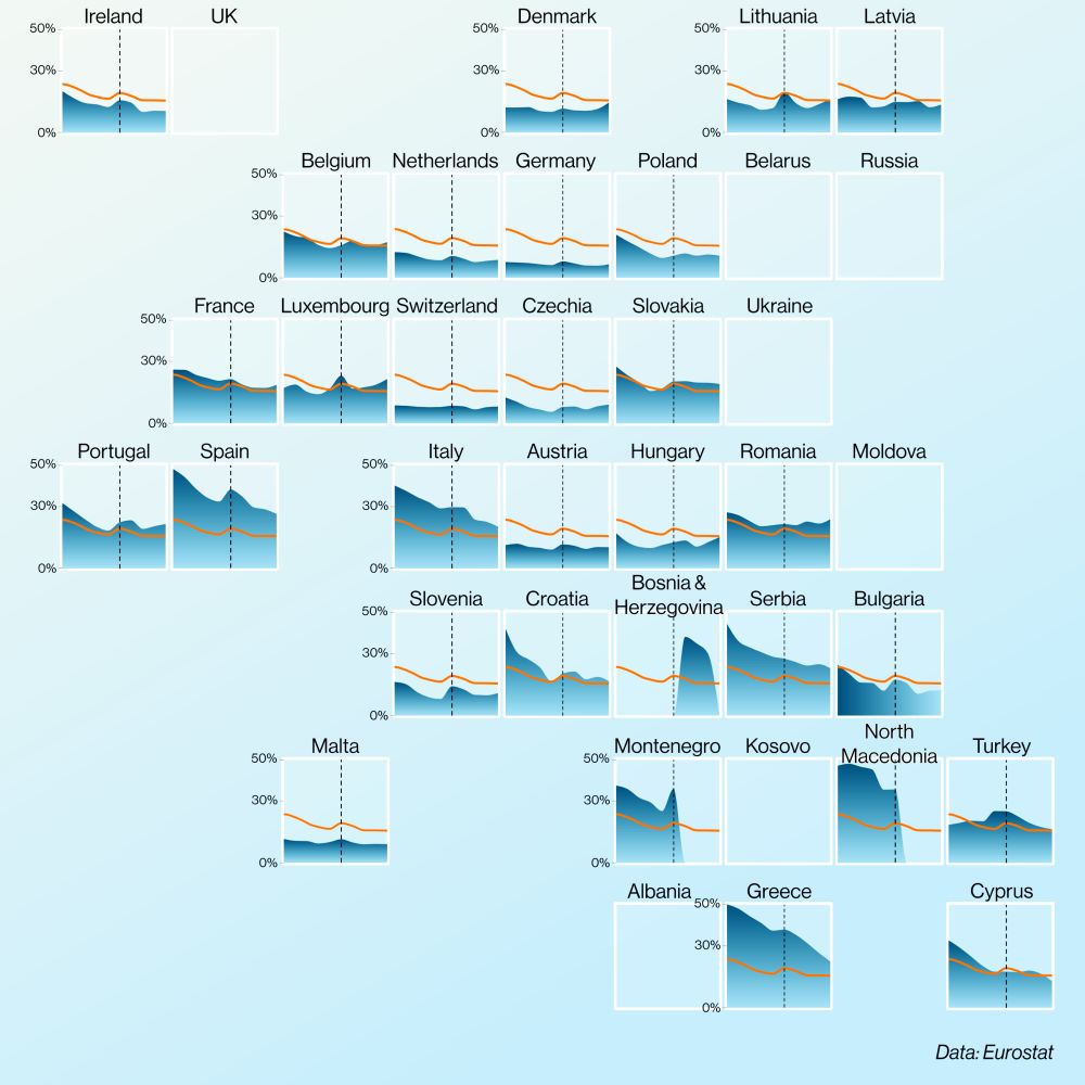
Youth unemployment is still a major issue in Europe.
Back in 2015, more than half of young people in the labour force couldn’t find work in countries like Greece, Spain, and North Macedonia.
By 2024, the numbers improved, but the problem hasn’t gone away.
#dataviz on @voronoiapp.bsky.social
Back in 2015, more than half of young people in the labour force couldn’t find work in countries like Greece, Spain, and North Macedonia.
By 2024, the numbers improved, but the problem hasn’t gone away.
#dataviz on @voronoiapp.bsky.social
May 28, 2025 at 6:31 PM
Youth unemployment is still a major issue in Europe.
Back in 2015, more than half of young people in the labour force couldn’t find work in countries like Greece, Spain, and North Macedonia.
By 2024, the numbers improved, but the problem hasn’t gone away.
#dataviz on @voronoiapp.bsky.social
Back in 2015, more than half of young people in the labour force couldn’t find work in countries like Greece, Spain, and North Macedonia.
By 2024, the numbers improved, but the problem hasn’t gone away.
#dataviz on @voronoiapp.bsky.social
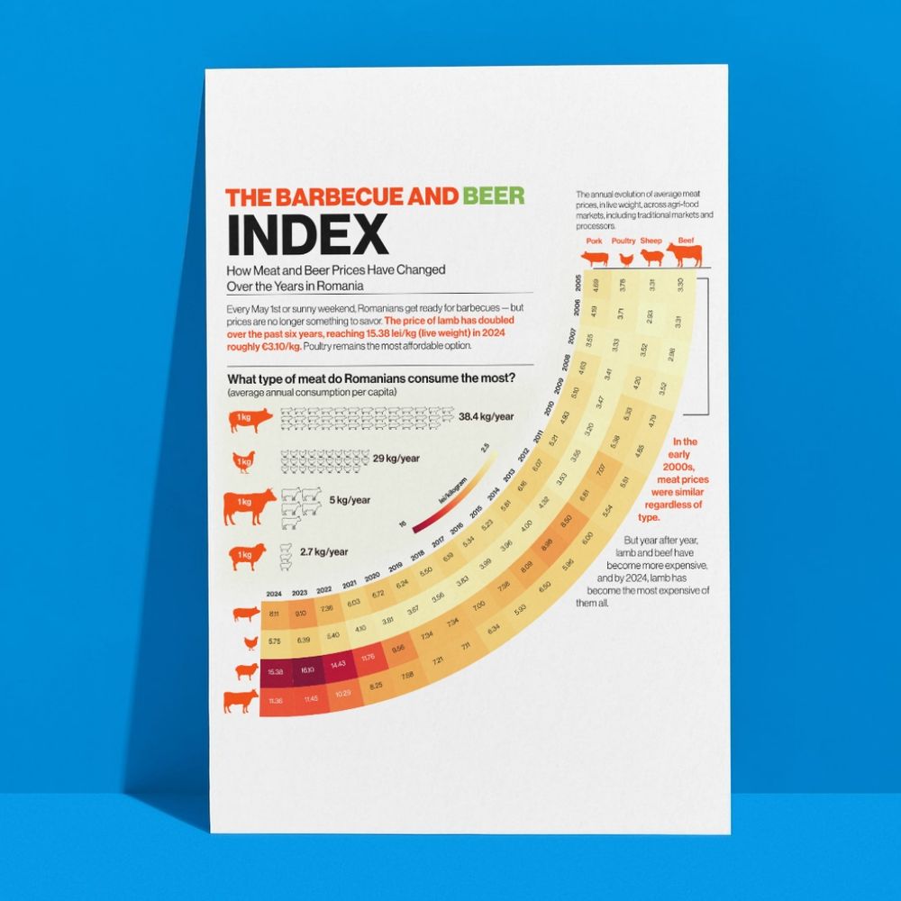
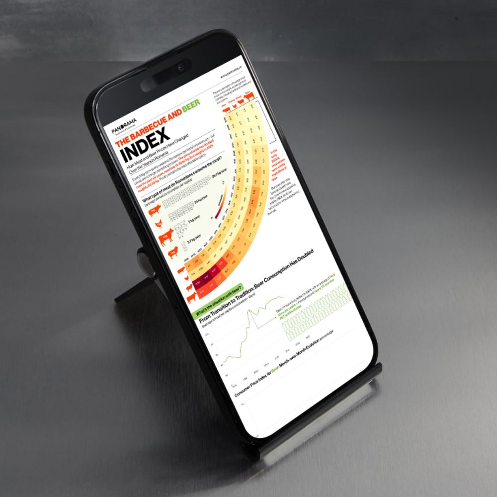
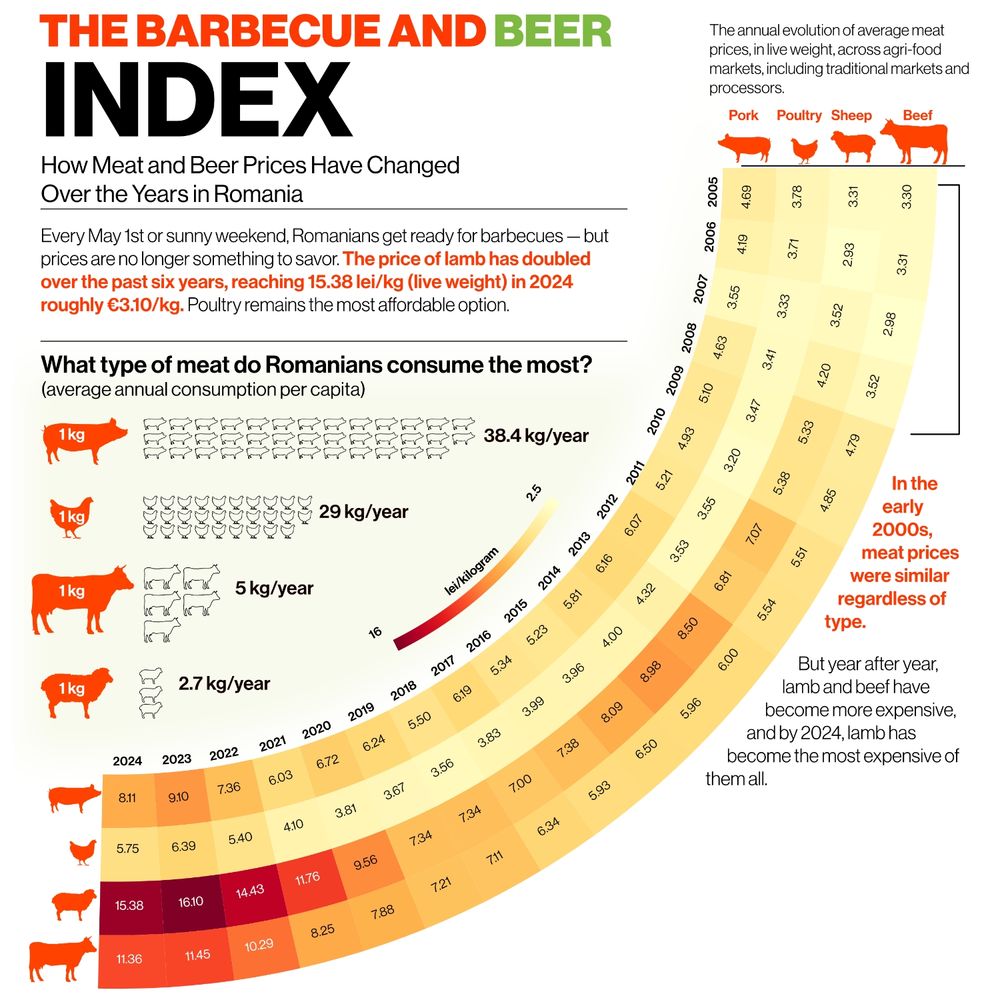
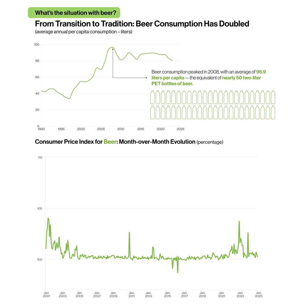
Today on Panorama.ro, I published a new #infographic exploring how the cost of Romania’s classic May 1st barbecue has changed over time. It looks at the evolution of #meat and #beer prices in recent years, including comparisons across types of meat and changes in per capita consumption.
May 1, 2025 at 5:46 PM
Today on Panorama.ro, I published a new #infographic exploring how the cost of Romania’s classic May 1st barbecue has changed over time. It looks at the evolution of #meat and #beer prices in recent years, including comparisons across types of meat and changes in per capita consumption.
For a personal project, I'm gathering #stories from people creating #datavisualizations in underrepresented or under-resourced places (LatAm, Africa, SE Asia etc.). Challenges, wins, creative hacks, anonymous if you want. DM, comment. Please share if you know someone!
#survey #shareyourstory
#survey #shareyourstory

April 27, 2025 at 8:08 AM
For a personal project, I'm gathering #stories from people creating #datavisualizations in underrepresented or under-resourced places (LatAm, Africa, SE Asia etc.). Challenges, wins, creative hacks, anonymous if you want. DM, comment. Please share if you know someone!
#survey #shareyourstory
#survey #shareyourstory
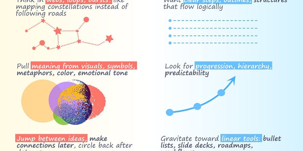
In yesterday’s newsletter, I shared why beauty in data visualization is about much more than looks, it’s about culture, timing, and how people feel about data. Data doesn’t speak for itself, it speaks through people. view.flodesk.com/emails/6797e...
April 26, 2025 at 9:02 AM
In yesterday’s newsletter, I shared why beauty in data visualization is about much more than looks, it’s about culture, timing, and how people feel about data. Data doesn’t speak for itself, it speaks through people. view.flodesk.com/emails/6797e...
It’s been a while since my last newsletter, life got busy, but I always enjoyed sharing. So I’m back with fresh stories, projects, and everyday moments. I'd love to have you subscribe! 👉 editgyenge.com/newsletter/
See you on Friday! 🙏🥰
#newsletter #informationdesign #charts #datavisualization
See you on Friday! 🙏🥰
#newsletter #informationdesign #charts #datavisualization
April 21, 2025 at 12:36 PM
It’s been a while since my last newsletter, life got busy, but I always enjoyed sharing. So I’m back with fresh stories, projects, and everyday moments. I'd love to have you subscribe! 👉 editgyenge.com/newsletter/
See you on Friday! 🙏🥰
#newsletter #informationdesign #charts #datavisualization
See you on Friday! 🙏🥰
#newsletter #informationdesign #charts #datavisualization
Reposted by Edit Gyenge

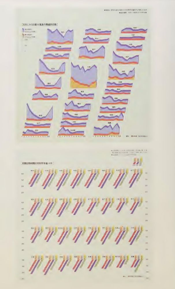
Some graphs from atlo.team/wp-content/u...
April 17, 2025 at 2:47 PM
Some graphs from atlo.team/wp-content/u...
Reposted by Edit Gyenge
Many Hungarian works are longlisted for the Information is Beautiful Award this year. @krisztinaszucs.bsky.social @editgyenge.bsky.social Milán Janosov, Misi Minkó and Eszter Katona, Melinda Sipos and Mátyás Fusz. And my book. www.informationisbeautifulawards.com/showcase?aca...
March 11, 2025 at 3:06 PM
Many Hungarian works are longlisted for the Information is Beautiful Award this year. @krisztinaszucs.bsky.social @editgyenge.bsky.social Milán Janosov, Misi Minkó and Eszter Katona, Melinda Sipos and Mátyás Fusz. And my book. www.informationisbeautifulawards.com/showcase?aca...
Such a beautiful surprise! Thank you! 🥰🥰🥰

I come with news of the winners of my book launch prize giveaway contests:
BestWorstViz - Felix Bernoully, and (special bonus prize) @datacitron.bsky.social
BookMarked - no entries so no winners!
StarBooks - @editgyenge.bsky.social
Details in this updated post visualisingdata.com/2025/01/3-x-...
BestWorstViz - Felix Bernoully, and (special bonus prize) @datacitron.bsky.social
BookMarked - no entries so no winners!
StarBooks - @editgyenge.bsky.social
Details in this updated post visualisingdata.com/2025/01/3-x-...

3 x Book Giveaway Contests! - Data Viz Excellence, Everywhere
To coincide with my book launch event in London on Thursday 6th February, and to recreate what I did for my previous books, I'm happy to launch not one, not two, but THREE book giveaway contests!
visualisingdata.com
February 7, 2025 at 2:35 PM
Such a beautiful surprise! Thank you! 🥰🥰🥰
Reposted by Edit Gyenge

📣 New podcast alert! 📣 We chat with Chiqui Esteban, Design & Art Director at the Washington Post Opinion section in the latest episode, with new co-host Scott Klein
Chiqui Esteban: Insights from the Washington Post Graphics Team
Chiqui Esteban visual explaining the Electoral College 📣 New podcast alert! 📣 Chiqui Esteban is Design & Art Director at the Washington Post Opinion section. In the first episode with new co-host Scott Klein, he talks to us about the lessons he's learned during his amazing career, from his early days as a student at a famous visual journalism program in Spain all the way to running the Washington Post’s graphics desk, one of the best in the world —and beyond. Chiqui talks about how data journalism and graphics help news stay relevant — and popular—with audiences.
simonrogers.net
February 6, 2025 at 5:19 AM
📣 New podcast alert! 📣 We chat with Chiqui Esteban, Design & Art Director at the Washington Post Opinion section in the latest episode, with new co-host Scott Klein
I'm excited to share a project that's been a labor of love! After diving into artcyclopedia.com's data on contemporary women artists, I've crafted 346 data portraits. The project is live on my website editgyenge.com/mapping-the-...
February 5, 2025 at 9:47 PM
I'm excited to share a project that's been a labor of love! After diving into artcyclopedia.com's data on contemporary women artists, I've crafted 346 data portraits. The project is live on my website editgyenge.com/mapping-the-...
This personal project was inspired by an article and insights from the Mental State of the World Report. It’s an interactive piece built with #D3 , and I just published it on my website!
editgyenge.com/visualizing-...
editgyenge.com/visualizing-...
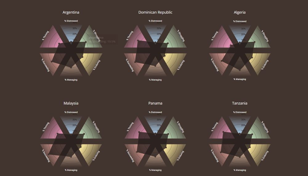
Visualizing the Mental State of the World – Edit Gyenge
editgyenge.com
January 27, 2025 at 6:54 PM
This personal project was inspired by an article and insights from the Mental State of the World Report. It’s an interactive piece built with #D3 , and I just published it on my website!
editgyenge.com/visualizing-...
editgyenge.com/visualizing-...
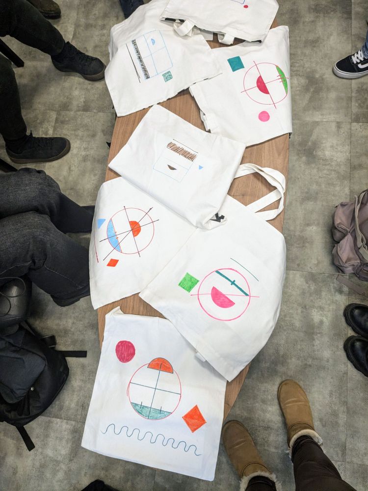
Data portrait tote bags from my first in-person workshop of the year! A creative and fun way to connect during Narrative Alchemy, the course I led. Truly a joy!
#datavizworkshop #sketching #drawing #creativity
#datavizworkshop #sketching #drawing #creativity
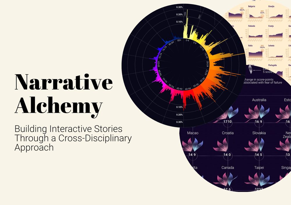
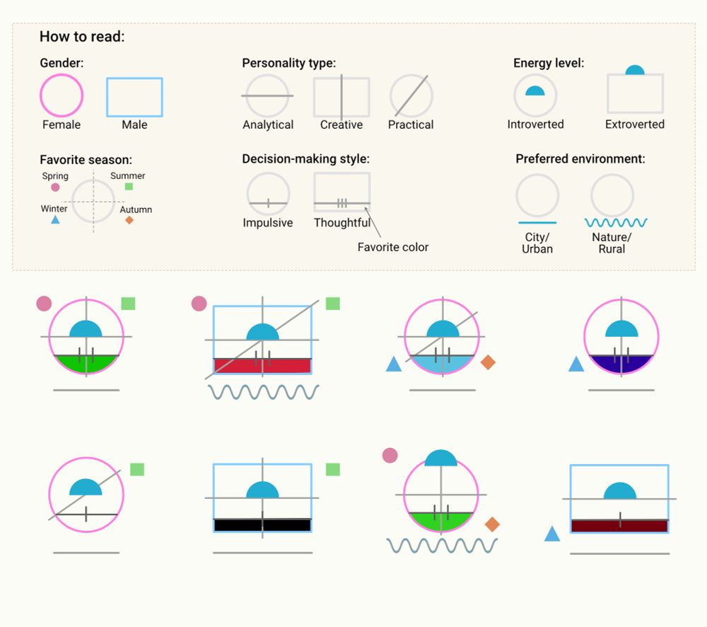
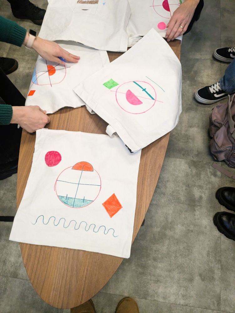
January 24, 2025 at 1:53 PM
Data portrait tote bags from my first in-person workshop of the year! A creative and fun way to connect during Narrative Alchemy, the course I led. Truly a joy!
#datavizworkshop #sketching #drawing #creativity
#datavizworkshop #sketching #drawing #creativity
New interactive piece on Panorama.
We analyzed the wealth of Trump’s top officials, visualizing it in scale - stacked $100 bills vs. the Washington Monument and Earth’s circumference. Because big numbers need context.
📊 Explore the full interactive piece here 👉 panorama.ro/trump-cabine...
We analyzed the wealth of Trump’s top officials, visualizing it in scale - stacked $100 bills vs. the Washington Monument and Earth’s circumference. Because big numbers need context.
📊 Explore the full interactive piece here 👉 panorama.ro/trump-cabine...
January 20, 2025 at 5:57 PM
New interactive piece on Panorama.
We analyzed the wealth of Trump’s top officials, visualizing it in scale - stacked $100 bills vs. the Washington Monument and Earth’s circumference. Because big numbers need context.
📊 Explore the full interactive piece here 👉 panorama.ro/trump-cabine...
We analyzed the wealth of Trump’s top officials, visualizing it in scale - stacked $100 bills vs. the Washington Monument and Earth’s circumference. Because big numbers need context.
📊 Explore the full interactive piece here 👉 panorama.ro/trump-cabine...
Reposted by Edit Gyenge
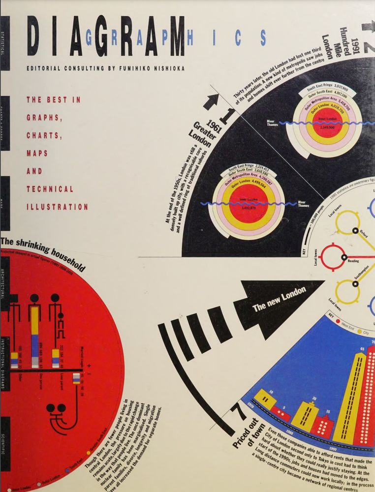
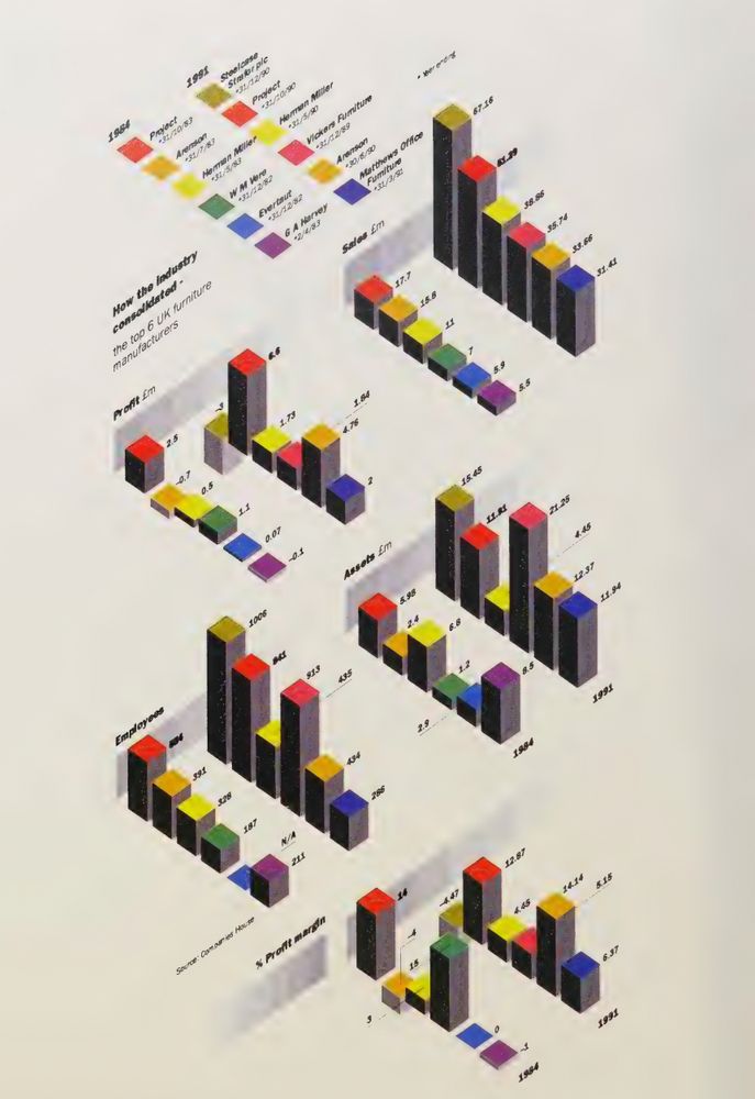
Diagram Graphics (editorial consulting by Fumihiko Nishioka), 1992. Similar to the Graphis Diagrams series, but still stunning collection of late '80s, early 90's visualizations. I really like this aesthetics, and I have absolutely no problem with these triumphant 3Ds :) archive.org/details/diag...
December 25, 2024 at 10:46 AM
Diagram Graphics (editorial consulting by Fumihiko Nishioka), 1992. Similar to the Graphis Diagrams series, but still stunning collection of late '80s, early 90's visualizations. I really like this aesthetics, and I have absolutely no problem with these triumphant 3Ds :) archive.org/details/diag...
🚀 Thrilled to share my latest project: an interactive deep dive into Romania's last 30 years through 16 socio-economic indicators.
400+ maps & charts, plus #sonified county rankings (yes, #data you can hear 🎹). #datavisulization
Check it out! 👇
panorama.ro/romania-30-y...
400+ maps & charts, plus #sonified county rankings (yes, #data you can hear 🎹). #datavisulization
Check it out! 👇
panorama.ro/romania-30-y...
December 16, 2024 at 10:55 AM
🚀 Thrilled to share my latest project: an interactive deep dive into Romania's last 30 years through 16 socio-economic indicators.
400+ maps & charts, plus #sonified county rankings (yes, #data you can hear 🎹). #datavisulization
Check it out! 👇
panorama.ro/romania-30-y...
400+ maps & charts, plus #sonified county rankings (yes, #data you can hear 🎹). #datavisulization
Check it out! 👇
panorama.ro/romania-30-y...
Reposted by Edit Gyenge

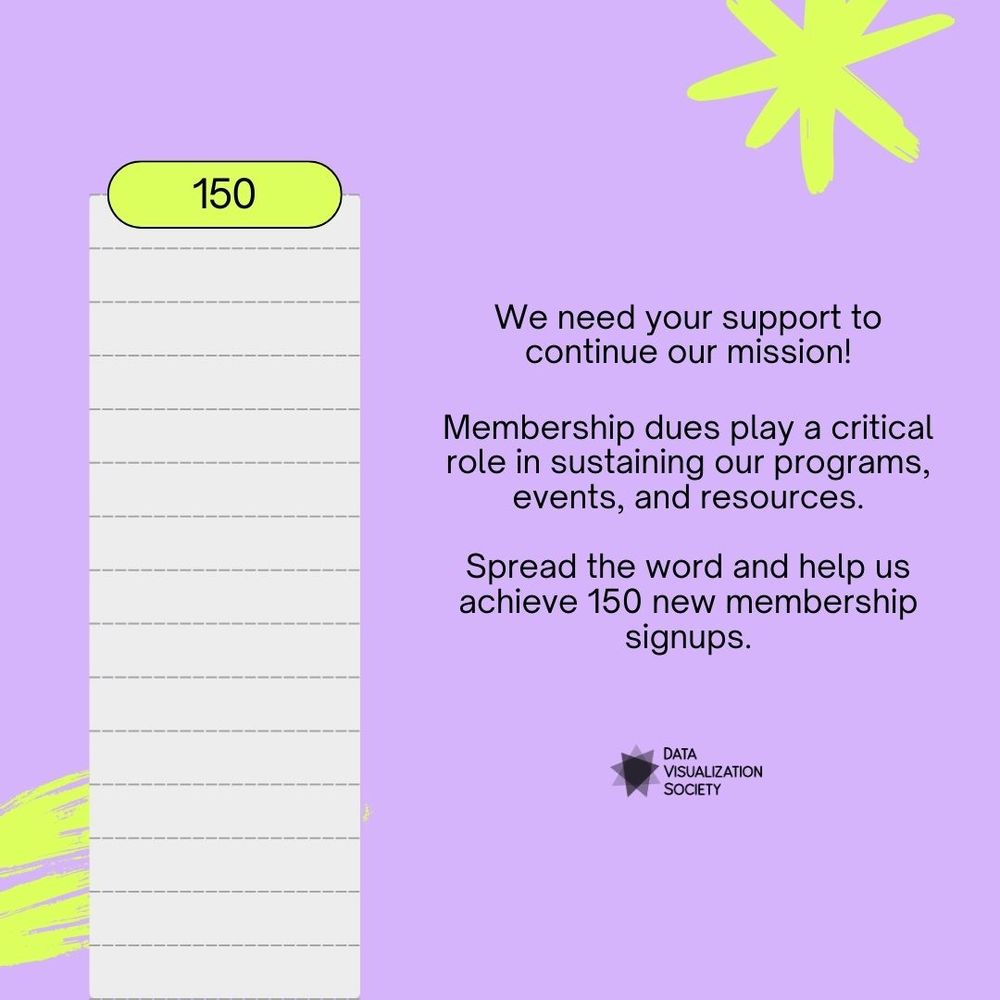
We're looking to add 150 more DVS Plus members by the end of this year to continue providing community, learning, and career resources for our members. Support us today: www.datavisualizationsociety.org/membership-d...
December 13, 2024 at 4:24 PM
We're looking to add 150 more DVS Plus members by the end of this year to continue providing community, learning, and career resources for our members. Support us today: www.datavisualizationsociety.org/membership-d...
Reposted by Edit Gyenge
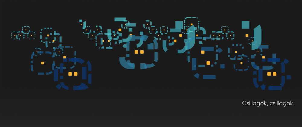
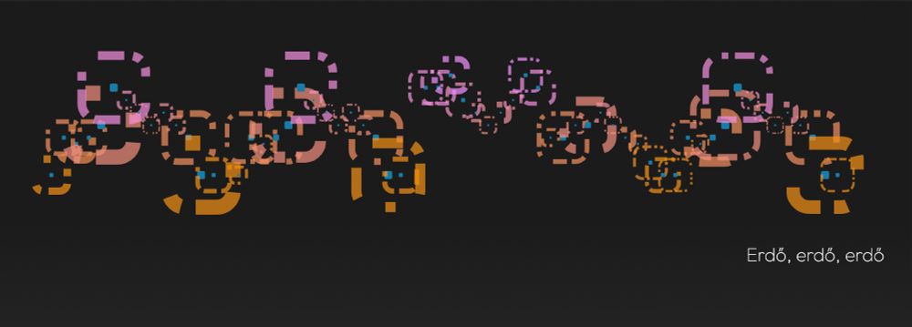
Interesting data sonification/sound visualization project by Balázs Benedek lesdadallamot.hu

December 12, 2024 at 2:36 PM
Interesting data sonification/sound visualization project by Balázs Benedek lesdadallamot.hu