


Joe Davies
@joewdavies.bsky.social
GIS and Cartography @EU_Eurostat
Exploring new ways of making maps.
observablehq.com/@joewdavies
Exploring new ways of making maps.
observablehq.com/@joewdavies
Pinned
Joe Davies
@joewdavies.bsky.social
· Jan 6
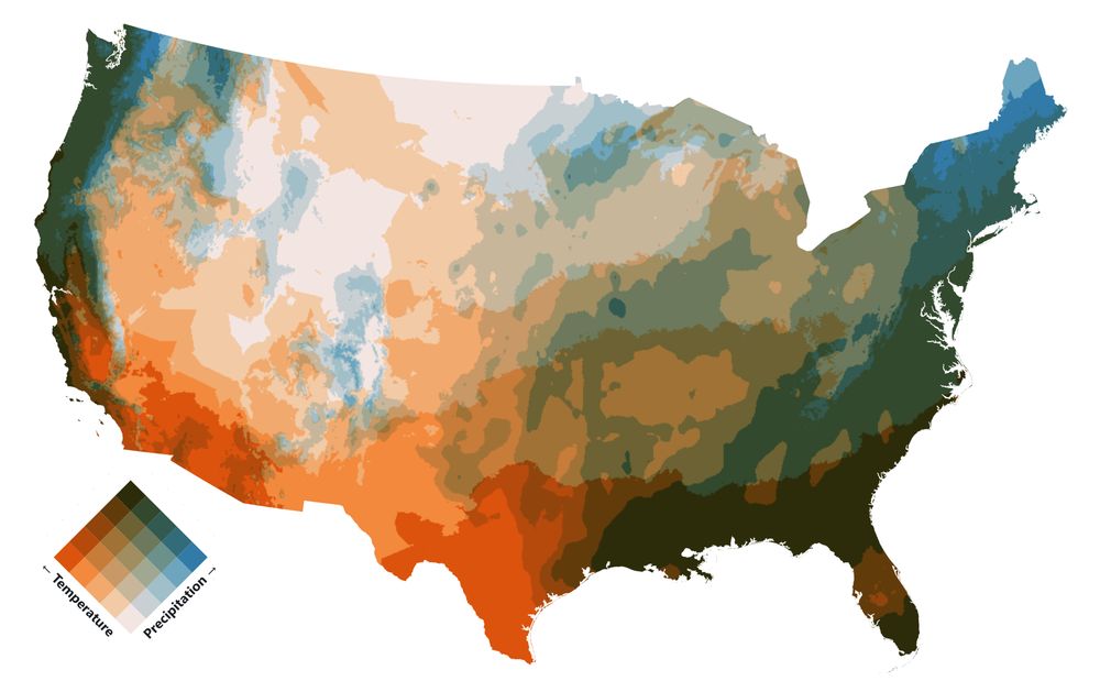
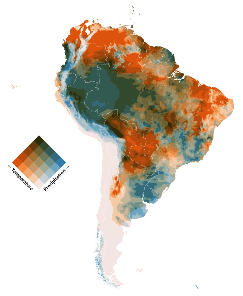
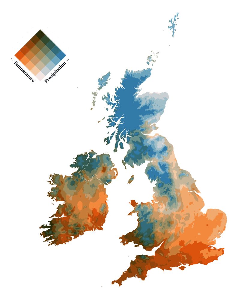
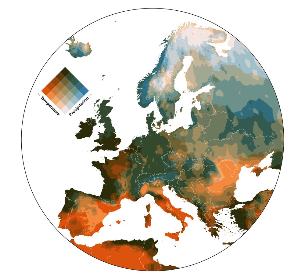
Bivariate maps showing the relationships between Temperature and Precipitation.
Made with Plot, based on a great tutorial by Fil: observablehq.com/@jo...
Data from TerraClimate (1958-present).
#cartography #maps #mapping #climate #dataviz #SciArt
Made with Plot, based on a great tutorial by Fil: observablehq.com/@jo...
Data from TerraClimate (1958-present).
#cartography #maps #mapping #climate #dataviz #SciArt
Reposted by Joe Davies

This morning, I had the chance to present Eurostat work on education and healthcare services accessibility in Europe, with my colleague @joewdavies.bsky.social. If you missed it, the replay is luckily available:
➡️ europa.eu/!GxbcDt
#map #gis #cartography #mapping #demography #europe #gischat
➡️ europa.eu/!GxbcDt
#map #gis #cartography #mapping #demography #europe #gischat

May 14, 2025 at 3:00 PM
This morning, I had the chance to present Eurostat work on education and healthcare services accessibility in Europe, with my colleague @joewdavies.bsky.social. If you missed it, the replay is luckily available:
➡️ europa.eu/!GxbcDt
#map #gis #cartography #mapping #demography #europe #gischat
➡️ europa.eu/!GxbcDt
#map #gis #cartography #mapping #demography #europe #gischat
Julien (@jgaffuri.bsky.social) and I will be giving a brief talk on some grid-based fun on wednesday in case you fancy tuning in:
ec.europa.eu/eurostat/new...
#maps #statistics #GIS
ec.europa.eu/eurostat/new...
#maps #statistics #GIS
Mastering map creation with Eurostat: from data to visualisations - EurostatLog inEnglishSearchSuccess
ec.europa.eu
May 12, 2025 at 8:44 AM
Julien (@jgaffuri.bsky.social) and I will be giving a brief talk on some grid-based fun on wednesday in case you fancy tuning in:
ec.europa.eu/eurostat/new...
#maps #statistics #GIS
ec.europa.eu/eurostat/new...
#maps #statistics #GIS
Reposted by Joe Davies

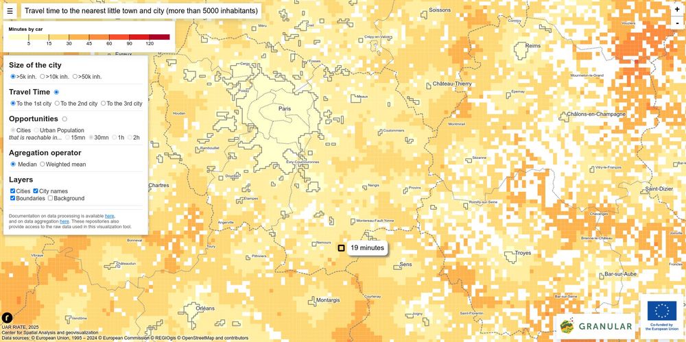
Travel times to European cities.
A web mapping tool based on the gridviz JavaScript library (Eurostat) for the H2020 Granular project.
- app: nlambert.gitpages.huma-num.fr/granular-gri...
- code: gitlab.huma-num.fr/nlambert/gra...
A web mapping tool based on the gridviz JavaScript library (Eurostat) for the H2020 Granular project.
- app: nlambert.gitpages.huma-num.fr/granular-gri...
- code: gitlab.huma-num.fr/nlambert/gra...
April 24, 2025 at 9:41 AM
Travel times to European cities.
A web mapping tool based on the gridviz JavaScript library (Eurostat) for the H2020 Granular project.
- app: nlambert.gitpages.huma-num.fr/granular-gri...
- code: gitlab.huma-num.fr/nlambert/gra...
A web mapping tool based on the gridviz JavaScript library (Eurostat) for the H2020 Granular project.
- app: nlambert.gitpages.huma-num.fr/granular-gri...
- code: gitlab.huma-num.fr/nlambert/gra...
Reposted by Joe Davies

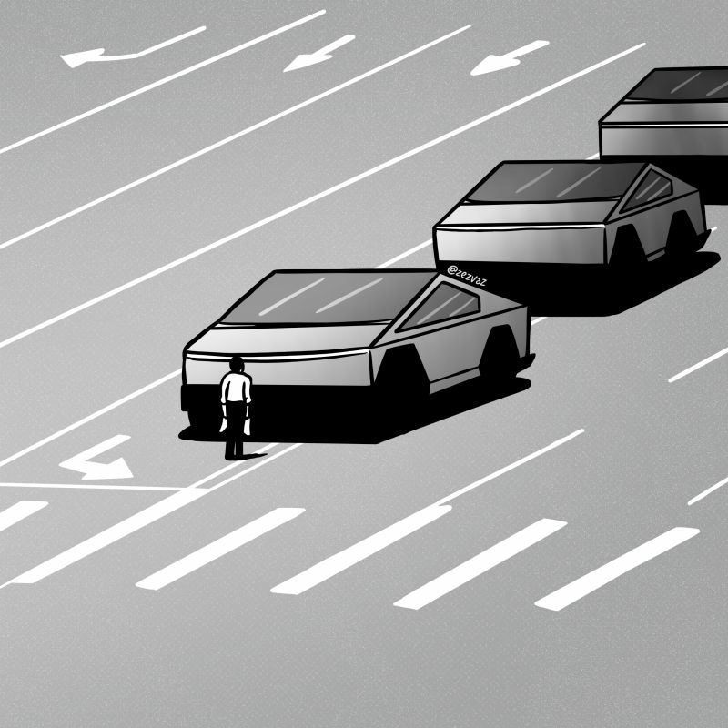
Portuguese editorial cartoonist Zez Vaz reaches back to Tiananmen Square to call on American defiance.
February 15, 2025 at 1:43 PM
Portuguese editorial cartoonist Zez Vaz reaches back to Tiananmen Square to call on American defiance.
Reposted by Joe Davies

Here are global currents in the Spilhaus one-world-ocean map projection.
February 4, 2025 at 5:58 PM
Here are global currents in the Spilhaus one-world-ocean map projection.
Grid Cartograms are now available in eurostat-map!
just use map.gridCartogram(true)
observablehq.com/@joewdavies/...
have a nice weekend :)
just use map.gridCartogram(true)
observablehq.com/@joewdavies/...
have a nice weekend :)


January 31, 2025 at 5:26 PM
Grid Cartograms are now available in eurostat-map!
just use map.gridCartogram(true)
observablehq.com/@joewdavies/...
have a nice weekend :)
just use map.gridCartogram(true)
observablehq.com/@joewdavies/...
have a nice weekend :)
Reposted by Joe Davies
'Put it into Blender and see what happens' #4
Bivariate maps showing the relationships between Temperature and Precipitation.
(Monthly data since 1958 by TerraClimate)
observablehq.com/@jo...
#maps #blender #climate #sciart #cartography #gis
Bivariate maps showing the relationships between Temperature and Precipitation.
(Monthly data since 1958 by TerraClimate)
observablehq.com/@jo...
#maps #blender #climate #sciart #cartography #gis


January 13, 2025 at 7:00 AM
'Put it into Blender and see what happens' #4
Bivariate maps showing the relationships between Temperature and Precipitation.
(Monthly data since 1958 by TerraClimate)
observablehq.com/@jo...
#maps #blender #climate #sciart #cartography #gis
Bivariate maps showing the relationships between Temperature and Precipitation.
(Monthly data since 1958 by TerraClimate)
observablehq.com/@jo...
#maps #blender #climate #sciart #cartography #gis
Reposted by Joe Davies

Today we have a Maps Dispatch for you. Find locator maps about fire 🔥, symbol maps about congestion 🚗, and choropleth maps about dengue fever 🦟.
Full Data Vis Dispatch here: https://blog.datawrapper.de/data-vis-dispatch-january-14-2025/
Full Data Vis Dispatch here: https://blog.datawrapper.de/data-vis-dispatch-january-14-2025/


January 14, 2025 at 6:14 PM
Today we have a Maps Dispatch for you. Find locator maps about fire 🔥, symbol maps about congestion 🚗, and choropleth maps about dengue fever 🦟.
Full Data Vis Dispatch here: https://blog.datawrapper.de/data-vis-dispatch-january-14-2025/
Full Data Vis Dispatch here: https://blog.datawrapper.de/data-vis-dispatch-january-14-2025/
Reposted by Joe Davies

Global temperature anomalies 1880-2024. svs.gsfc.nasa.gov/5450
January 10, 2025 at 8:07 PM
Global temperature anomalies 1880-2024. svs.gsfc.nasa.gov/5450


January 14, 2025 at 7:00 AM
Some maps from the Global Climate Highlights 2024 by @copernicusecmwf.bsky.social
"Atmospheric carbon dioxide concentrations were higher in 2024 than at any time in at least 2,000,000 years."
climate.copernicus.eu/global-clima...
"Atmospheric carbon dioxide concentrations were higher in 2024 than at any time in at least 2,000,000 years."
climate.copernicus.eu/global-clima...


January 13, 2025 at 2:11 PM
Some maps from the Global Climate Highlights 2024 by @copernicusecmwf.bsky.social
"Atmospheric carbon dioxide concentrations were higher in 2024 than at any time in at least 2,000,000 years."
climate.copernicus.eu/global-clima...
"Atmospheric carbon dioxide concentrations were higher in 2024 than at any time in at least 2,000,000 years."
climate.copernicus.eu/global-clima...
'Put it into Blender and see what happens' #4
Bivariate maps showing the relationships between Temperature and Precipitation.
(Monthly data since 1958 by TerraClimate)
observablehq.com/@jo...
#maps #blender #climate #sciart #cartography #gis
Bivariate maps showing the relationships between Temperature and Precipitation.
(Monthly data since 1958 by TerraClimate)
observablehq.com/@jo...
#maps #blender #climate #sciart #cartography #gis
January 13, 2025 at 7:00 AM
'Put it into Blender and see what happens' #4
Bivariate maps showing the relationships between Temperature and Precipitation.
(Monthly data since 1958 by TerraClimate)
observablehq.com/@jo...
#maps #blender #climate #sciart #cartography #gis
Bivariate maps showing the relationships between Temperature and Precipitation.
(Monthly data since 1958 by TerraClimate)
observablehq.com/@jo...
#maps #blender #climate #sciart #cartography #gis

Genuary 08 - Draw one million of something.
1 Million Points in Three.js.
observablehq.com/@joewdavies/...
#genuary8 #genuary2025 #genuary
1 Million Points in Three.js.
observablehq.com/@joewdavies/...
#genuary8 #genuary2025 #genuary
January 10, 2025 at 11:46 AM
Genuary 08 - Draw one million of something.
1 Million Points in Three.js.
observablehq.com/@joewdavies/...
#genuary8 #genuary2025 #genuary
1 Million Points in Three.js.
observablehq.com/@joewdavies/...
#genuary8 #genuary2025 #genuary
Reposted by Joe Davies


Reposted by Joe Davies

A Collaborative and Scalable Geospatial Data Set for Arctic Retrogressive Thaw Slumps with Data Standards
www.nature.com/articles/s41...
www.nature.com/articles/s41...

January 6, 2025 at 4:15 PM
A Collaborative and Scalable Geospatial Data Set for Arctic Retrogressive Thaw Slumps with Data Standards
www.nature.com/articles/s41...
www.nature.com/articles/s41...
Reposted by Joe Davies

La estafa del Brexit en cifras. Ni siquiera en inmigración se cumplieron las promesas de los promotores del referéndum.

January 5, 2025 at 1:35 PM
La estafa del Brexit en cifras. Ni siquiera en inmigración se cumplieron las promesas de los promotores del referéndum.
Reposted by Joe Davies
Bivariate maps showing the relationships between Temperature and Precipitation.
Made with Plot, based on a great tutorial by Fil: observablehq.com/@jo...
Data from TerraClimate (1958-present).
#cartography #maps #mapping #climate #dataviz #SciArt
Made with Plot, based on a great tutorial by Fil: observablehq.com/@jo...
Data from TerraClimate (1958-present).
#cartography #maps #mapping #climate #dataviz #SciArt
January 6, 2025 at 7:00 AM
Bivariate maps showing the relationships between Temperature and Precipitation.
Made with Plot, based on a great tutorial by Fil: observablehq.com/@jo...
Data from TerraClimate (1958-present).
#cartography #maps #mapping #climate #dataviz #SciArt
Made with Plot, based on a great tutorial by Fil: observablehq.com/@jo...
Data from TerraClimate (1958-present).
#cartography #maps #mapping #climate #dataviz #SciArt
Reposted by Joe Davies

I am starting 2025 with a completely renewed blog based on Quarto. I have also updated all the previous posts. The first post addresses the issue of the lack of data normalization I observed in the Spanish National Atlas.
#rstats #dataviz
dominicroye.github.io/blog/2025-01...
#rstats #dataviz
dominicroye.github.io/blog/2025-01...

Always normalize you data
I recently came across a map from the National Atlas of Spain showing the number of libraries by municipality. However, one thing directly caught my attention. There’s a saying that many maps show onl...
dominicroye.github.io
January 6, 2025 at 10:35 AM
I am starting 2025 with a completely renewed blog based on Quarto. I have also updated all the previous posts. The first post addresses the issue of the lack of data normalization I observed in the Spanish National Atlas.
#rstats #dataviz
dominicroye.github.io/blog/2025-01...
#rstats #dataviz
dominicroye.github.io/blog/2025-01...
Reposted by Joe Davies

🎉 Happy New Year! 🎉
🌍 MapLibre GL JS v5: Now with Globe Mode for seamless 3D global visualizations!
📅 Eastern-Friendly Calls: Back every last Wednesday of the month.
👉 Read more: maplibre.org/news/2025-01...
#MapLibre #OpenSource #Geospatial #MapLibreGLJS5
🌍 MapLibre GL JS v5: Now with Globe Mode for seamless 3D global visualizations!
📅 Eastern-Friendly Calls: Back every last Wednesday of the month.
👉 Read more: maplibre.org/news/2025-01...
#MapLibre #OpenSource #Geospatial #MapLibreGLJS5

MapLibre Newsletter December 2024
maplibre.org
January 6, 2025 at 4:14 AM
🎉 Happy New Year! 🎉
🌍 MapLibre GL JS v5: Now with Globe Mode for seamless 3D global visualizations!
📅 Eastern-Friendly Calls: Back every last Wednesday of the month.
👉 Read more: maplibre.org/news/2025-01...
#MapLibre #OpenSource #Geospatial #MapLibreGLJS5
🌍 MapLibre GL JS v5: Now with Globe Mode for seamless 3D global visualizations!
📅 Eastern-Friendly Calls: Back every last Wednesday of the month.
👉 Read more: maplibre.org/news/2025-01...
#MapLibre #OpenSource #Geospatial #MapLibreGLJS5
Bivariate maps showing the relationships between Temperature and Precipitation.
Made with Plot, based on a great tutorial by Fil: observablehq.com/@jo...
Data from TerraClimate (1958-present).
#cartography #maps #mapping #climate #dataviz #SciArt
Made with Plot, based on a great tutorial by Fil: observablehq.com/@jo...
Data from TerraClimate (1958-present).
#cartography #maps #mapping #climate #dataviz #SciArt
January 6, 2025 at 7:00 AM
Bivariate maps showing the relationships between Temperature and Precipitation.
Made with Plot, based on a great tutorial by Fil: observablehq.com/@jo...
Data from TerraClimate (1958-present).
#cartography #maps #mapping #climate #dataviz #SciArt
Made with Plot, based on a great tutorial by Fil: observablehq.com/@jo...
Data from TerraClimate (1958-present).
#cartography #maps #mapping #climate #dataviz #SciArt
Reposted by Joe Davies

Reposted by Joe Davies

Reposted by Joe Davies
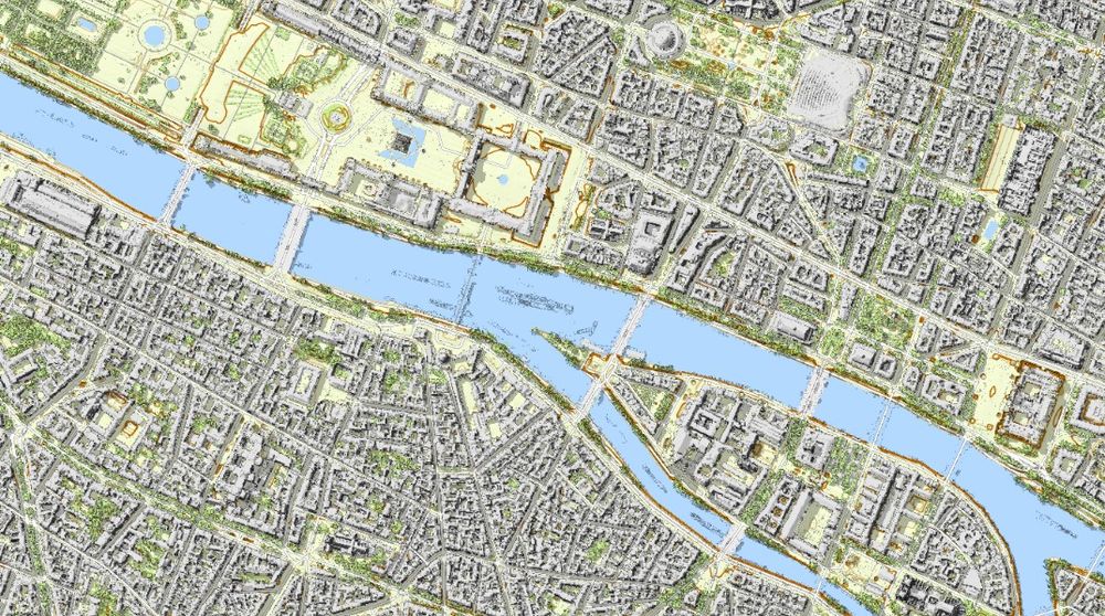
Welcome to my cartographic tour of France, with #LiDAR #mapping ! It starts from Paris here:
➡️ jgaffuri.github.io/CartoHD_webm...
#cartography #gis #gischat #map #maps #dataviz #datavis
➡️ jgaffuri.github.io/CartoHD_webm...
#cartography #gis #gischat #map #maps #dataviz #datavis
January 5, 2025 at 8:09 PM
Welcome to my cartographic tour of France, with #LiDAR #mapping ! It starts from Paris here:
➡️ jgaffuri.github.io/CartoHD_webm...
#cartography #gis #gischat #map #maps #dataviz #datavis
➡️ jgaffuri.github.io/CartoHD_webm...
#cartography #gis #gischat #map #maps #dataviz #datavis
Reposted by Joe Davies
A relief map I made a while back of Ukraine, thought i'd post it here because why not?
#b3d #shadedrelief #maps #cartography
#b3d #shadedrelief #maps #cartography

December 15, 2024 at 7:19 PM
A relief map I made a while back of Ukraine, thought i'd post it here because why not?
#b3d #shadedrelief #maps #cartography
#b3d #shadedrelief #maps #cartography