


Revisual Labs
@revisual.co
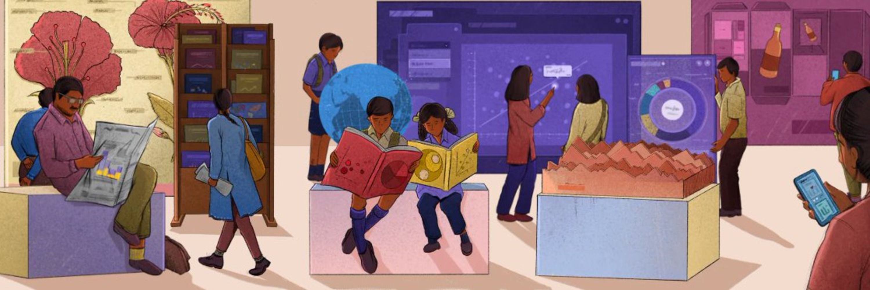
We’re an information design and development agency crafting memorable data stories. Rooted in India with a global outlook. 💻 https://revisual.co/ 💻
#dataviz #informationdesign
#dataviz #informationdesign
📊 Insight Out: Week 52 - Illustrated maps of countries in East Africa

February 6, 2026 at 9:11 AM
📊 Insight Out: Week 52 - Illustrated maps of countries in East Africa
It feels like we only just shared our Year in Numbers for 2025 and yet, January has already gone by! It has been quite a month for us at RVL. We've been busy with seven projects, three of which kicked off in January.


February 3, 2026 at 9:25 AM
It feels like we only just shared our Year in Numbers for 2025 and yet, January has already gone by! It has been quite a month for us at RVL. We've been busy with seven projects, three of which kicked off in January.
📊 Insight Out: Week 51- Visualising a tiered system of values through an interactive infographic.
For our first Insight Out of this year, we’re diving into a simple interactive infographic that was designed for PhonePe’s Investor Relations website.
For our first Insight Out of this year, we’re diving into a simple interactive infographic that was designed for PhonePe’s Investor Relations website.
January 23, 2026 at 12:25 PM
📊 Insight Out: Week 51- Visualising a tiered system of values through an interactive infographic.
For our first Insight Out of this year, we’re diving into a simple interactive infographic that was designed for PhonePe’s Investor Relations website.
For our first Insight Out of this year, we’re diving into a simple interactive infographic that was designed for PhonePe’s Investor Relations website.
How do you visualise the market impact of a fintech giant? 📈 That was the question we tackled in September 2025 when we partnered with PhonePe to design their Investor Relations website.


January 19, 2026 at 8:37 AM
How do you visualise the market impact of a fintech giant? 📈 That was the question we tackled in September 2025 when we partnered with PhonePe to design their Investor Relations website.
Big things are brewing at RVL! 🚀 We've been busy behind the scenes working on our debut project in the finance sector, and can’t wait to share the results. Stay tuned for the big reveal!
January 9, 2026 at 8:51 AM
Big things are brewing at RVL! 🚀 We've been busy behind the scenes working on our debut project in the finance sector, and can’t wait to share the results. Stay tuned for the big reveal!
We’re hiring a Developer Intern to kick off 2026 with us! ✨
At Revisual Labs, interns help us with internal tools, contribute to client projects, participate in talks and workshops, and more!
At Revisual Labs, interns help us with internal tools, contribute to client projects, participate in talks and workshops, and more!


January 7, 2026 at 11:25 AM
We’re hiring a Developer Intern to kick off 2026 with us! ✨
At Revisual Labs, interns help us with internal tools, contribute to client projects, participate in talks and workshops, and more!
At Revisual Labs, interns help us with internal tools, contribute to client projects, participate in talks and workshops, and more!
Once is a test, twice is a habit. To mark the end of 2025, we’re making a habit out of reflecting on our growth as a team through this second edition of Our Year In Numbers.

January 2, 2026 at 12:48 PM
Once is a test, twice is a habit. To mark the end of 2025, we’re making a habit out of reflecting on our growth as a team through this second edition of Our Year In Numbers.
2025 has brought with it many memorable moments–we won our first award, celebrated our second year as an agency, welcomed new team members and took on a range of interesting projects. But we're excited to see what 2026 brings. Until then, team RVL wishes you a happy new year. ✨🎇

December 31, 2025 at 10:07 AM
2025 has brought with it many memorable moments–we won our first award, celebrated our second year as an agency, welcomed new team members and took on a range of interesting projects. But we're excited to see what 2026 brings. Until then, team RVL wishes you a happy new year. ✨🎇
Revisual’s annual Secret Santa ritual is back 🎁
We’re a remote team—spread across different cities—so we don’t get to meet in person very often. But every holiday season, we take a moment to send our colleagues (and friends) a little something to brighten their week.
We’re a remote team—spread across different cities—so we don’t get to meet in person very often. But every holiday season, we take a moment to send our colleagues (and friends) a little something to brighten their week.

December 23, 2025 at 9:45 AM
Revisual’s annual Secret Santa ritual is back 🎁
We’re a remote team—spread across different cities—so we don’t get to meet in person very often. But every holiday season, we take a moment to send our colleagues (and friends) a little something to brighten their week.
We’re a remote team—spread across different cities—so we don’t get to meet in person very often. But every holiday season, we take a moment to send our colleagues (and friends) a little something to brighten their week.
📊 Insight Out: Week 50!- Showing the relationship between size of a city’s population and its revenue growth with a slope chart.

December 19, 2025 at 12:39 PM
📊 Insight Out: Week 50!- Showing the relationship between size of a city’s population and its revenue growth with a slope chart.
Welcome back to 'Journeys of Discovery,' where we continue to chart the unique career paths of our studio's team!

December 15, 2025 at 12:22 PM
Welcome back to 'Journeys of Discovery,' where we continue to chart the unique career paths of our studio's team!
As we head into the last few (and busiest) days of 2025, here’s a quick look back at some important numbers from our studio in November.


December 3, 2025 at 12:20 PM
As we head into the last few (and busiest) days of 2025, here’s a quick look back at some important numbers from our studio in November.
Welcome back to 'Journeys of Discovery,' the series where we explore the fascinating and varied careers of the RVL team!

December 1, 2025 at 1:38 PM
Welcome back to 'Journeys of Discovery,' the series where we explore the fascinating and varied careers of the RVL team!
📊 Insight Out: Week 49 - Showing disparity between city revenues through a bubble chart
This week, we're sharing a bubble chart we made for City Finance's primer on Indian city revenues.
This week, we're sharing a bubble chart we made for City Finance's primer on Indian city revenues.

November 28, 2025 at 12:14 PM
📊 Insight Out: Week 49 - Showing disparity between city revenues through a bubble chart
This week, we're sharing a bubble chart we made for City Finance's primer on Indian city revenues.
This week, we're sharing a bubble chart we made for City Finance's primer on Indian city revenues.
Our experiences–past and present–inform how each of us approach data viz. Some of us carry forward skills we learned in school into our day-to-day work, while others from college and professional experiences.

November 24, 2025 at 12:50 PM
Our experiences–past and present–inform how each of us approach data viz. Some of us carry forward skills we learned in school into our day-to-day work, while others from college and professional experiences.
Last week, we explored how they stumbled into this field. This week, we're diving deeper to answer the question: What were they doing before getting into data visualisation?

November 17, 2025 at 12:16 PM
Last week, we explored how they stumbled into this field. This week, we're diving deeper to answer the question: What were they doing before getting into data visualisation?
📊 Insight Out: Week 48 - Election graphics, Bihar 2025
Our team created 4 automated graphics for the elections, in collaboration with CVoter who provided the data behind the charts. These graphics were shown live on Mojo Story's YouTube channel.
Our team created 4 automated graphics for the elections, in collaboration with CVoter who provided the data behind the charts. These graphics were shown live on Mojo Story's YouTube channel.
November 14, 2025 at 1:28 PM
📊 Insight Out: Week 48 - Election graphics, Bihar 2025
Our team created 4 automated graphics for the elections, in collaboration with CVoter who provided the data behind the charts. These graphics were shown live on Mojo Story's YouTube channel.
Our team created 4 automated graphics for the elections, in collaboration with CVoter who provided the data behind the charts. These graphics were shown live on Mojo Story's YouTube channel.
If you haven't spotted it already, our chart gallery is up on our website. 🔍 Swipe to read about how it could be useful and click the link below to start browsing.
revisual.co/chart-gallery/
revisual.co/chart-gallery/


November 13, 2025 at 10:22 AM
If you haven't spotted it already, our chart gallery is up on our website. 🔍 Swipe to read about how it could be useful and click the link below to start browsing.
revisual.co/chart-gallery/
revisual.co/chart-gallery/
We’re kicking off a new series called ‘Journeys of Discovery,’ the idea for which came from Ipshita Raj, our youngest team member.


November 10, 2025 at 12:57 PM
We’re kicking off a new series called ‘Journeys of Discovery,’ the idea for which came from Ipshita Raj, our youngest team member.
And that's a wrap on October! ✨
With 13 members on board, we had a highly productive month at the studio. We launched 1 new project while keeping 6 others steadily humming along. All that work resulted in 321 code commits and required 6,858 Slack message exchanges.
With 13 members on board, we had a highly productive month at the studio. We launched 1 new project while keeping 6 others steadily humming along. All that work resulted in 321 code commits and required 6,858 Slack message exchanges.


November 5, 2025 at 10:26 AM
And that's a wrap on October! ✨
With 13 members on board, we had a highly productive month at the studio. We launched 1 new project while keeping 6 others steadily humming along. All that work resulted in 321 code commits and required 6,858 Slack message exchanges.
With 13 members on board, we had a highly productive month at the studio. We launched 1 new project while keeping 6 others steadily humming along. All that work resulted in 321 code commits and required 6,858 Slack message exchanges.
📊 Insight Out: Week 47 - Redesigning a waterfall chart
Today we’re spotlighting a chart we made for ICRIER’s State of India’s Digital Economy Report (SIDE), 2024.
Today we’re spotlighting a chart we made for ICRIER’s State of India’s Digital Economy Report (SIDE), 2024.


October 24, 2025 at 7:24 AM
📊 Insight Out: Week 47 - Redesigning a waterfall chart
Today we’re spotlighting a chart we made for ICRIER’s State of India’s Digital Economy Report (SIDE), 2024.
Today we’re spotlighting a chart we made for ICRIER’s State of India’s Digital Economy Report (SIDE), 2024.
In July, we published a set of video explainers in collaboration with Godrej Design Lab, the goal of which was to share key insights from their ‘Building A Climate Conscious India’ report focusing on low-carbon solutions for the buildings sector in India.


October 22, 2025 at 1:37 PM
In July, we published a set of video explainers in collaboration with Godrej Design Lab, the goal of which was to share key insights from their ‘Building A Climate Conscious India’ report focusing on low-carbon solutions for the buildings sector in India.
We wish you and your loved ones a very happy, prosperous and bright Diwali. 🪔 With a curious spark and clarity of thought, we hope to continue to enlighten one another in the pursuit to tell meaningful stories with data. ✨

October 20, 2025 at 6:41 AM
We wish you and your loved ones a very happy, prosperous and bright Diwali. 🪔 With a curious spark and clarity of thought, we hope to continue to enlighten one another in the pursuit to tell meaningful stories with data. ✨
We're finally back with another project post! Each of our projects have their own milestones and processes depending on the nature of the work, scope and more. In the first half of this year, we designed and developed an interactive dashboard of 100 impact stories by 3ie.


October 16, 2025 at 8:23 AM
We're finally back with another project post! Each of our projects have their own milestones and processes depending on the nature of the work, scope and more. In the first half of this year, we designed and developed an interactive dashboard of 100 impact stories by 3ie.
📊 Insight Out: Week 46 - An animated map showing the journeys of refugees from Ukraine to neighbouring countries.
This week, we're sharing a map created for IOM’s 'Journeys of Resilience', an interactive story about the lives of refugees from Ukraine, amidst the ongoing war.
This week, we're sharing a map created for IOM’s 'Journeys of Resilience', an interactive story about the lives of refugees from Ukraine, amidst the ongoing war.

October 10, 2025 at 1:13 PM
📊 Insight Out: Week 46 - An animated map showing the journeys of refugees from Ukraine to neighbouring countries.
This week, we're sharing a map created for IOM’s 'Journeys of Resilience', an interactive story about the lives of refugees from Ukraine, amidst the ongoing war.
This week, we're sharing a map created for IOM’s 'Journeys of Resilience', an interactive story about the lives of refugees from Ukraine, amidst the ongoing war.