


Robin Hawkes
@robhawkes.bsky.social
🐙 DataViz at @octopus.energy
⚡️ Obsessed with maps and energy
✨ Creator of ViziCities
👨💻 Previously Wood Mackenzie & devrel at Mozilla
⚡️ Obsessed with maps and energy
✨ Creator of ViziCities
👨💻 Previously Wood Mackenzie & devrel at Mozilla
Wind output and curtailment in Scotland during Storm Floris
August 11, 2025 at 12:13 PM
Wind output and curtailment in Scotland during Storm Floris
Experimenting with the styling of the wind particles as well as the colour ramp for the wind speed layer.
Kinda loving how much detail you can see now from the Meteomatics EURO1k weather model
Kinda loving how much detail you can see now from the Meteomatics EURO1k weather model
August 10, 2025 at 3:25 PM
Experimenting with the styling of the wind particles as well as the colour ramp for the wind speed layer.
Kinda loving how much detail you can see now from the Meteomatics EURO1k weather model
Kinda loving how much detail you can see now from the Meteomatics EURO1k weather model
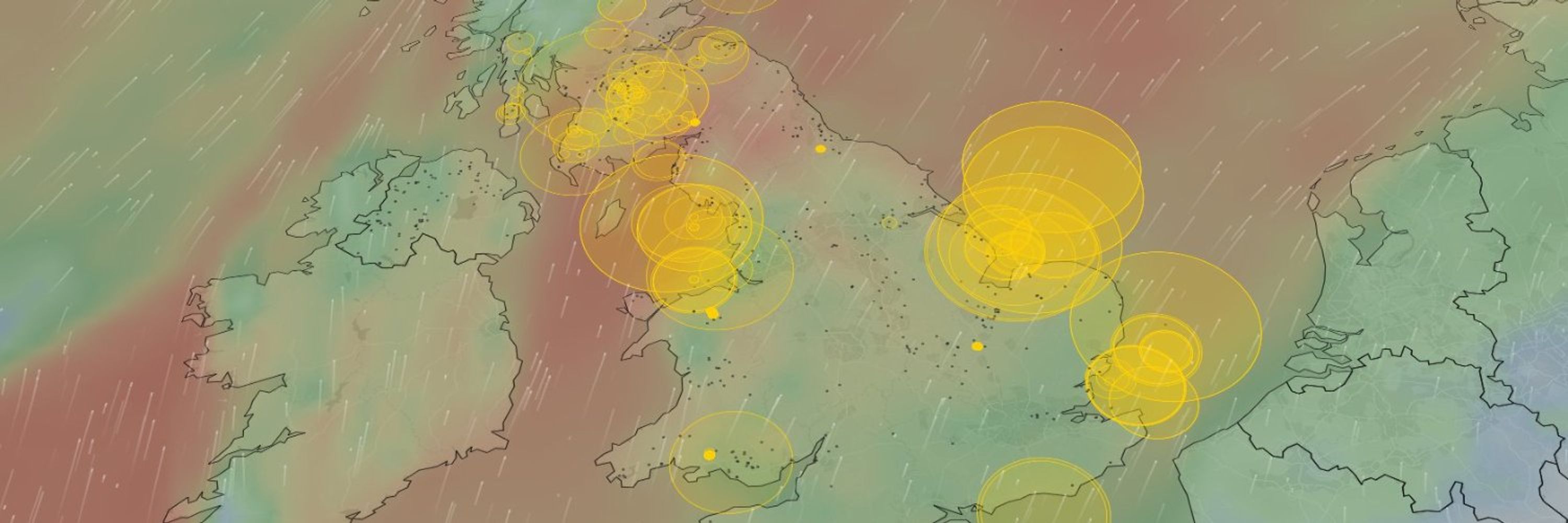
A zoomed in view of wind farm curtailment in Scotland during Storm Floris…
The yellow rings are showing the curtailed volume at each wind farm as a proportion of their installed capacity.
The yellow rings are showing the curtailed volume at each wind farm as a proportion of their installed capacity.
August 8, 2025 at 8:10 AM
A zoomed in view of wind farm curtailment in Scotland during Storm Floris…
The yellow rings are showing the curtailed volume at each wind farm as a proportion of their installed capacity.
The yellow rings are showing the curtailed volume at each wind farm as a proportion of their installed capacity.
Are the @neso-energy.bsky.social Operational Forums recorded anywhere? I'm unable to take part live and so keep missing out of them 😢
Some recordings are on the website but not all of them. For example, July 16th has slides but is missing a recording…
www.neso.energy/what-we-do/s...
Some recordings are on the website but not all of them. For example, July 16th has slides but is missing a recording…
www.neso.energy/what-we-do/s...

Operational Transparency Forum | National Energy System Operator
Join our weekly forum to find out more about ENCC actions.
www.neso.energy
August 6, 2025 at 3:28 PM
Are the @neso-energy.bsky.social Operational Forums recorded anywhere? I'm unable to take part live and so keep missing out of them 😢
Some recordings are on the website but not all of them. For example, July 16th has slides but is missing a recording…
www.neso.energy/what-we-do/s...
Some recordings are on the website but not all of them. For example, July 16th has slides but is missing a recording…
www.neso.energy/what-we-do/s...
I've never read as many books in a single year and I don't plan on stopping…
I also don't plan on stopping keeping track and making pointless data visualisations from my reading data 🤓
I also don't plan on stopping keeping track and making pointless data visualisations from my reading data 🤓


August 1, 2025 at 6:41 PM
I've never read as many books in a single year and I don't plan on stopping…
I also don't plan on stopping keeping track and making pointless data visualisations from my reading data 🤓
I also don't plan on stopping keeping track and making pointless data visualisations from my reading data 🤓
Experimenting with adding gas power plants on the map so you can see turn-up in the south in response to wind curtailment in the north.
The red rings show gas turn-up scaled to the capacity of each power plant. I'm currently showing all gas offers so it still needs work.
The red rings show gas turn-up scaled to the capacity of each power plant. I'm currently showing all gas offers so it still needs work.
July 25, 2025 at 8:54 PM
Experimenting with adding gas power plants on the map so you can see turn-up in the south in response to wind curtailment in the north.
The red rings show gas turn-up scaled to the capacity of each power plant. I'm currently showing all gas offers so it still needs work.
The red rings show gas turn-up scaled to the capacity of each power plant. I'm currently showing all gas offers so it still needs work.

Switching off wind farms on July 4th lost 113,831MWh of clean energy, only to replace it with gas.
The map shows how much wind farms were curtailed that day alongside boundary capacity:
🟢 Spare cap. at boundary
🟠 Close to limit (poss. constrained)
🔴 At limit (constrained)
The map shows how much wind farms were curtailed that day alongside boundary capacity:
🟢 Spare cap. at boundary
🟠 Close to limit (poss. constrained)
🔴 At limit (constrained)
July 24, 2025 at 12:13 PM
Switching off wind farms on July 4th lost 113,831MWh of clean energy, only to replace it with gas.
The map shows how much wind farms were curtailed that day alongside boundary capacity:
🟢 Spare cap. at boundary
🟠 Close to limit (poss. constrained)
🔴 At limit (constrained)
The map shows how much wind farms were curtailed that day alongside boundary capacity:
🟢 Spare cap. at boundary
🟠 Close to limit (poss. constrained)
🔴 At limit (constrained)
Experimenting with showing transmission boundaries on my renewables map, colour-coded based on forecast flow limits (red = boundary at limit)
This is critical context for understanding the reason why wind farms are often switched off in Scotland, even when it's windy
This is critical context for understanding the reason why wind farms are often switched off in Scotland, even when it's windy
July 23, 2025 at 5:04 PM
Experimenting with showing transmission boundaries on my renewables map, colour-coded based on forecast flow limits (red = boundary at limit)
This is critical context for understanding the reason why wind farms are often switched off in Scotland, even when it's windy
This is critical context for understanding the reason why wind farms are often switched off in Scotland, even when it's windy
Curious to see if people are as furiously against the funding of new nuclear generation via consumer bills as they are against the funding of new renewables via consumer bills…
"The financial framework designed to support the project […] will grant EDF support via energy bills from the start of its construction."
www.theguardian.com/business/202...
www.theguardian.com/business/202...

July 22, 2025 at 9:24 AM
Curious to see if people are as furiously against the funding of new nuclear generation via consumer bills as they are against the funding of new renewables via consumer bills…
"The financial framework designed to support the project […] will grant EDF support via energy bills from the start of its construction."
www.theguardian.com/business/202...
www.theguardian.com/business/202...
July 22, 2025 at 9:07 AM
"The financial framework designed to support the project […] will grant EDF support via energy bills from the start of its construction."
www.theguardian.com/business/202...
www.theguardian.com/business/202...
I'm trying to get my head around the frankly insane curtailment volumes predicted in the latest @neso-energy.bsky.social Future Energy Scenarios data
Am I right in saying that these curtailment volumes don't even include curtailment due to grid constraints? 🤯
www.neso.energy/publications...
Am I right in saying that these curtailment volumes don't even include curtailment due to grid constraints? 🤯
www.neso.energy/publications...


July 21, 2025 at 2:28 PM
I'm trying to get my head around the frankly insane curtailment volumes predicted in the latest @neso-energy.bsky.social Future Energy Scenarios data
Am I right in saying that these curtailment volumes don't even include curtailment due to grid constraints? 🤯
www.neso.energy/publications...
Am I right in saying that these curtailment volumes don't even include curtailment due to grid constraints? 🤯
www.neso.energy/publications...
Generation and curtailment at British wind farms during Storm Éowyn earlier this year 🌬️⚡
Notice the wind farms in Scotland turning off as the storm passes due to very high wind speeds and transmission constraints
You can see live and historic generation on the map:
renewables-map.robinhawkes.com
Notice the wind farms in Scotland turning off as the storm passes due to very high wind speeds and transmission constraints
You can see live and historic generation on the map:
renewables-map.robinhawkes.com
July 21, 2025 at 1:01 PM
Generation and curtailment at British wind farms during Storm Éowyn earlier this year 🌬️⚡
Notice the wind farms in Scotland turning off as the storm passes due to very high wind speeds and transmission constraints
You can see live and historic generation on the map:
renewables-map.robinhawkes.com
Notice the wind farms in Scotland turning off as the storm passes due to very high wind speeds and transmission constraints
You can see live and historic generation on the map:
renewables-map.robinhawkes.com
The new wind farms doing their thing…
Well, aside from Moray West which was 100% curtailed at the time I recorded the animation 🫠
Well, aside from Moray West which was 100% curtailed at the time I recorded the animation 🫠
July 18, 2025 at 8:21 AM
The new wind farms doing their thing…
Well, aside from Moray West which was 100% curtailed at the time I recorded the animation 🫠
Well, aside from Moray West which was 100% curtailed at the time I recorded the animation 🫠
Three of the newest wind farms are now available on my live renewables map:
✅ Dogger Bank A
✅ Moray West
✅ Neart na Gaoithe
All three include live output, curtailment as well as historic data
renewables-map.robinhawkes.com
✅ Dogger Bank A
✅ Moray West
✅ Neart na Gaoithe
All three include live output, curtailment as well as historic data
renewables-map.robinhawkes.com


July 17, 2025 at 10:01 PM
Three of the newest wind farms are now available on my live renewables map:
✅ Dogger Bank A
✅ Moray West
✅ Neart na Gaoithe
All three include live output, curtailment as well as historic data
renewables-map.robinhawkes.com
✅ Dogger Bank A
✅ Moray West
✅ Neart na Gaoithe
All three include live output, curtailment as well as historic data
renewables-map.robinhawkes.com
I still can't get over the resolution of the @meteomatics.com wind data, I swear you can see the wake effects from Gwynt-y-Mor in this example 🤯
Their EURO1k model supports wake effects, so it's definitely possible…
Their EURO1k model supports wake effects, so it's definitely possible…
July 17, 2025 at 7:56 PM
I still can't get over the resolution of the @meteomatics.com wind data, I swear you can see the wake effects from Gwynt-y-Mor in this example 🤯
Their EURO1k model supports wake effects, so it's definitely possible…
Their EURO1k model supports wake effects, so it's definitely possible…
I'm experimenting with @meteomatics.com high-res weather data on my live renewables map to replace the low-res GFS data that I've used up to now.
The difference is incredible… 🤯
The difference is incredible… 🤯
July 15, 2025 at 8:29 AM
I'm experimenting with @meteomatics.com high-res weather data on my live renewables map to replace the low-res GFS data that I've used up to now.
The difference is incredible… 🤯
The difference is incredible… 🤯
Holy shit, this is starting to get interesting…
You can literally see the wind snaking its way through the various valleys 🤯
I'm experimenting with @meteomatics.com high-res wind data vs. the existing low-res GFS data (second image)
You can literally see the wind snaking its way through the various valleys 🤯
I'm experimenting with @meteomatics.com high-res wind data vs. the existing low-res GFS data (second image)


July 14, 2025 at 7:17 PM
Holy shit, this is starting to get interesting…
You can literally see the wind snaking its way through the various valleys 🤯
I'm experimenting with @meteomatics.com high-res wind data vs. the existing low-res GFS data (second image)
You can literally see the wind snaking its way through the various valleys 🤯
I'm experimenting with @meteomatics.com high-res wind data vs. the existing low-res GFS data (second image)
I went paddle-boarding this weekend for the first time and loved it so much I know I'll be getting my own board and gear.
So… any recommendations, brands, etc? 🙏
I can also recommend Niwbwrch pictured (old photo of mine), great views of the mountains as you paddle.
So… any recommendations, brands, etc? 🙏
I can also recommend Niwbwrch pictured (old photo of mine), great views of the mountains as you paddle.

July 14, 2025 at 11:48 AM
I went paddle-boarding this weekend for the first time and loved it so much I know I'll be getting my own board and gear.
So… any recommendations, brands, etc? 🙏
I can also recommend Niwbwrch pictured (old photo of mine), great views of the mountains as you paddle.
So… any recommendations, brands, etc? 🙏
I can also recommend Niwbwrch pictured (old photo of mine), great views of the mountains as you paddle.
I'll tell you what, if recent energy events have done anything it's to reignite the fire within me and remind me why I do what I do and work where I work.
It's never been more important to communicate and educate, especially with such complex topics.
It's never been more important to communicate and educate, especially with such complex topics.
July 11, 2025 at 3:07 PM
I'll tell you what, if recent energy events have done anything it's to reignite the fire within me and remind me why I do what I do and work where I work.
It's never been more important to communicate and educate, especially with such complex topics.
It's never been more important to communicate and educate, especially with such complex topics.
Are there any public datasets that I could use to make an educated guess on the £/MWh for wind farm PPAs?
July 11, 2025 at 11:42 AM
Are there any public datasets that I could use to make an educated guess on the £/MWh for wind farm PPAs?
On the plus side we now get to see all these serious alternatives to zonal pricing that have been promised to fix everything…
www.theguardian.com/business/202...
www.theguardian.com/business/202...

Ed Miliband abandons plan to charge less for electricity in Scotland
Energy minister decides against ‘zonal pricing’ backed by Octopus founder but opposed by many other energy firms
www.theguardian.com
July 9, 2025 at 6:29 AM
On the plus side we now get to see all these serious alternatives to zonal pricing that have been promised to fix everything…
www.theguardian.com/business/202...
www.theguardian.com/business/202...
Wind curtailment and gas turn-up costs in 2025 are up ~50% compared to this time last year

July 8, 2025 at 8:48 AM
Wind curtailment and gas turn-up costs in 2025 are up ~50% compared to this time last year
Reposted by Robin Hawkes

Britain pays wind farms to turn off when it’s windy and overpays gas plants to switch on instead. It'll cost bill payers up to £8b/yr by 2030. Zonal energy pricing would slash this.
We’ve started tracking this (avoidable) waste live on our site: octopus.energy
We’ve started tracking this (avoidable) waste live on our site: octopus.energy

Octopus Energy
Cheaper, greener energy, heat pumps, solar panels, batteries and electric vehicles from Britain's most awarded energy supplier. One of Europe's largest investors in renewable energy. Switch today.
octopus.energy
July 7, 2025 at 5:04 PM
Britain pays wind farms to turn off when it’s windy and overpays gas plants to switch on instead. It'll cost bill payers up to £8b/yr by 2030. Zonal energy pricing would slash this.
We’ve started tracking this (avoidable) waste live on our site: octopus.energy
We’ve started tracking this (avoidable) waste live on our site: octopus.energy