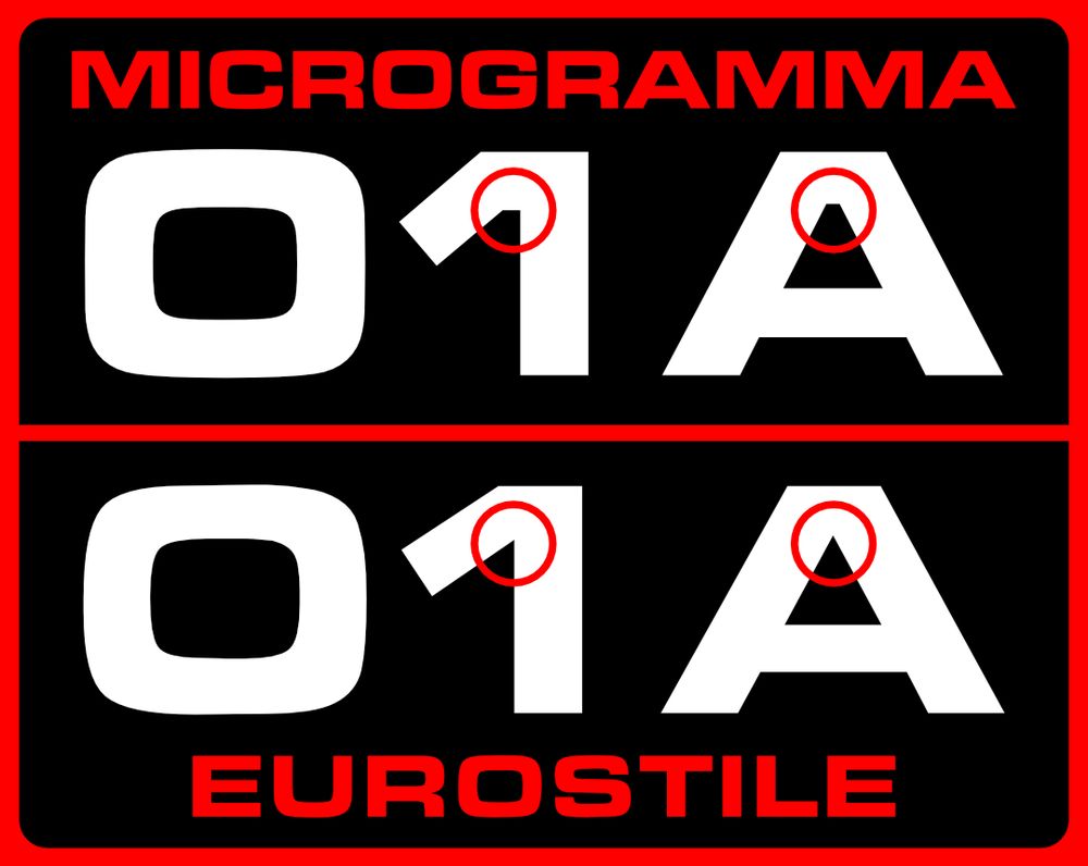
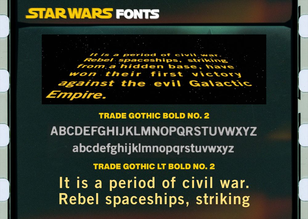
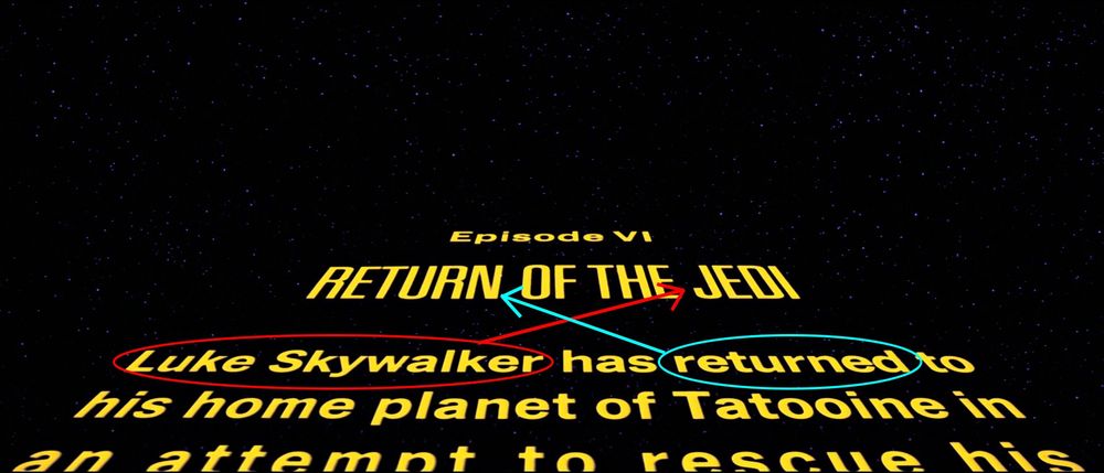
Star Wars Fonts
@starwarsfonts.bsky.social
540 followers 36 following 69 posts
your guide to the fonts of star wars, both on screen and off
Posts Media Videos Starter Packs
Pinned
starwarsfonts.bsky.social
STAR WARS (1977)
the first movie in our beloved franchise almost exclusively used TRADE GOTHIC BOLD NO. 2. closest digital equivalent: TRADE GOTHIC LT BOLD NO. 2
starwarsfonts.bsky.social
honestly in my top 10 movies. maybe even top 5
starwarsfonts.bsky.social
common misconception! Jedi is actually of greek origin, not latin, and was originally Jedis (which looks plural in english, so the s was dropped) making the plural Jedids or Jedes
edcando.bsky.social
Ok, but if the title is just referring to Luke, rather than the order in general, surely the movie should be called Return of the Jedus?
starwarsfonts.bsky.social
it’s called unifying the brand and it’s all the rage
starwarsfonts.bsky.social
i mean, it’s doing well in the other place,
Reposted by Star Wars Fonts
aurekfonts.bsky.social
New font for sale!

NABOUVEAU is an art nouveau typeface inspired by the planet and people of Naboo.

crowntype.com/nabouveau/
Carved in wood: "NABOUVEAU." Below, painted on lush maroon curtains: "Art nouveau for a galaxy far, far away...." The text is then repeated in in the Naboo Futhork alphabet.
starwarsfonts.bsky.social
i liked this post and 10 minutes later got a fedex notice of my own. what kind of scam are you running here??
Reposted by Star Wars Fonts
starfleetdesign.bsky.social
MICROGRAMMA or EUROSTILE? A handy guide for you to print out and keep in your wallet.
MICROGRAMMA interior corners are usually flattened whereas EUROSTILE interior corners come to a point. The more you know!
starwarsfonts.bsky.social
hey guys i know i don't post here a lot, and i know i don't have many fonts for sale at the moment, but i just moved to a new apartment and could simply use some sales to offset all the expenses
ko-fi.com/starwarsfont...
Visit Star Wars Fonts's Shop!
I've opened a shop. Come take a look!
ko-fi.com
starwarsfonts.bsky.social
what year is this supposed to be from? TRILOGY looks to be the same as in the SE branding, and the C looks like a helvetica or univers or something extra extra bold, probably squished. and it looks insane next to the H
starwarsfonts.bsky.social
my hand slipped! for like a whole hour but it slipped
starwarsfonts.bsky.social
DROIDS (1985)
just like ewoks, droids' end credits are set in AVANT GARDE DEMI
starwarsfonts.bsky.social
DROIDS (1985)
the episode titles are set in SERIF GOTHIC BOLD, a font family that made a resurgence 30 years later in the branding for the sequel trilogy
starwarsfonts.bsky.social
DROIDS (1985)
and another happy 40th to droids, whose main title seems to be fully custom (or at least based on a font i've never found), but whose subtitle is GROTESQUE NO. 9 ITALIC (with LUCASFILM being set in what looks like NEWS GOTHIC with numbers from AKZIDENZ-GROTESK)
starwarsfonts.bsky.social
EWOKS (1985)
the end credits are set in AVANT GARDE DEMI, a staple in the 80s and 90s eras of star wars media
starwarsfonts.bsky.social
EWOKS (1985)
episode title cards are set in HOBO EXTRA BOLD, similar but very distinct to the font used for the show title
starwarsfonts.bsky.social
EWOKS (1985)
happy 40th to the animated ewoks, whose title is set in a slightly altered PUTTY BOLD (with LUCASFILM being set in FUTURA BOOK)
starwarsfonts.bsky.social
i messed up and identified some star trek fonts by accident. @starfleetdesign.bsky.social was kind enough to not yell at me and tell me to stay in my lane
starfleetdesign.bsky.social
Credit to @starwarsfonts.bsky.social for likely solving some of the bigger mystery fonts from earlier ☝️ in this thread.

The vintage NBC logo closely resembles BENGUIAT EPHRAM ARISTALIC while the James Blish cover logo seems to be GUSTAV MONOGOTHIC or RHEIN GUSTAV GOTHIC.
Comparing the vintage 1966 NOB Star Trek logo and the logo from a James Blish cover with samples from a PLINC catalog.
starwarsfonts.bsky.social
i thought these were wolfenstein difficulties
starwarsfonts.bsky.social
kyber crystal light or cerveza cristal?
starwarsfonts.bsky.social
the thing that kills me is that agency is ON ADOBE and this is. some awful frankenstein. ugh
starwarsfonts.bsky.social
i'm hearing a lot of chatter that it might depend
starwarsfonts.bsky.social
a number of years ago i was doing recreations of old NES logos and i never really landed on answer to this. just nice to see i'm not alone