


Typofonderie: fonts & typography
@typofonderie.com
https://typofonderie.com/links
Join any graphic designer, art director, web designer who use our fonts! Buy the best quality typefaces you need. Est. 1994.
👋 Annual graphic & typography design conference + learn type design @typeparis.com
Join any graphic designer, art director, web designer who use our fonts! Buy the best quality typefaces you need. Est. 1994.
👋 Annual graphic & typography design conference + learn type design @typeparis.com
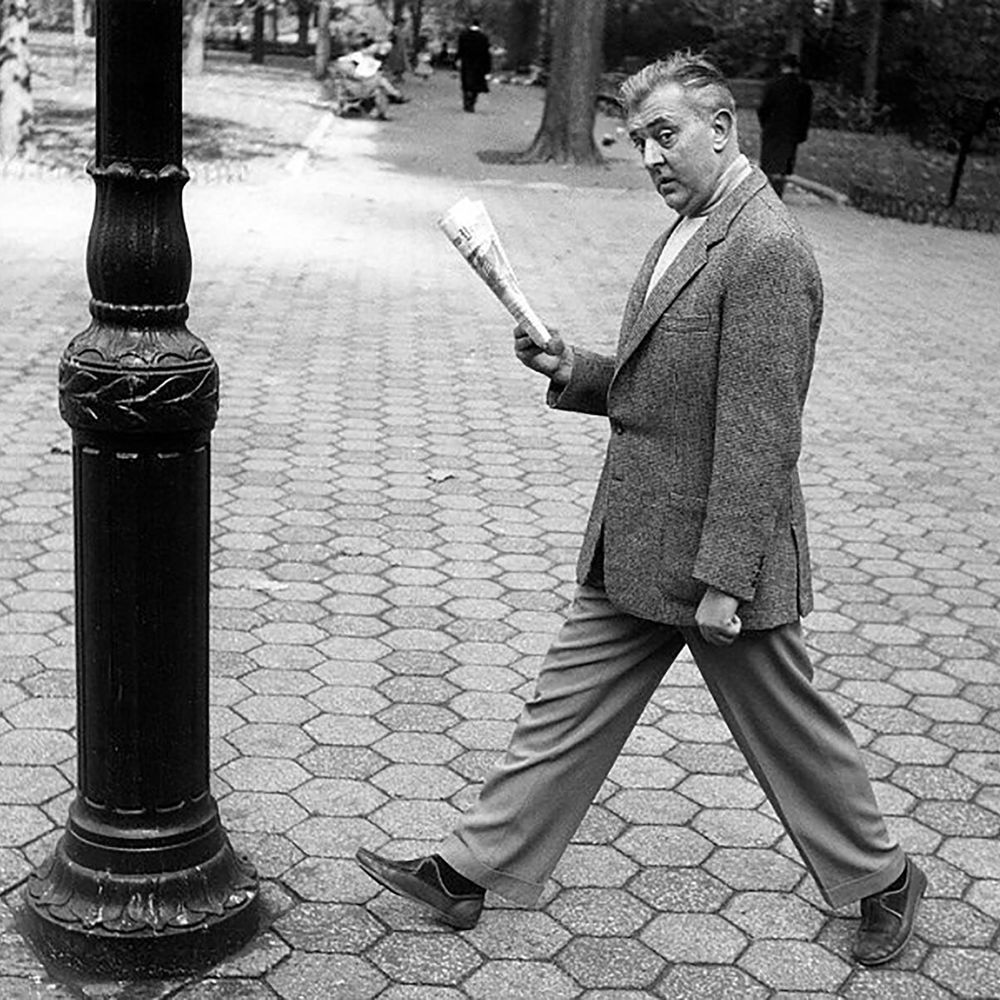
Yes, 1967.

Vintage TV Station identification WDR-SWF
The fixed stationary patterns WDR-SWF mark the beginning and end of a film whose length can be adapted to time requirements. Scanned from Gebrauchsgraphik, 8, 1967. designreviewed.com/artefacts/ge... #gebrauchsgraphik #vintagedesign #digitaldesign
The fixed stationary patterns WDR-SWF mark the beginning and end of a film whose length can be adapted to time requirements. Scanned from Gebrauchsgraphik, 8, 1967. designreviewed.com/artefacts/ge... #gebrauchsgraphik #vintagedesign #digitaldesign


January 11, 2026 at 10:29 AM
Yes, 1967.
Reposted by Typofonderie: fonts & typography

Welcome to Rainer Erich Scheichelbauert #typeparis26 instructor typeparis.com/summer26 😍Learn type design in 6 weeks, from 2 June and ends 10 July 2026.🍾🇫🇷 Apply before the 14 March 2026 to be selected.


January 11, 2026 at 7:05 AM
Welcome to Rainer Erich Scheichelbauert #typeparis26 instructor typeparis.com/summer26 😍Learn type design in 6 weeks, from 2 June and ends 10 July 2026.🍾🇫🇷 Apply before the 14 March 2026 to be selected.
Reposted by Typofonderie: fonts & typography
Many thanks to Robin Kinross for his post about James Mosley. 👀

January 8, 2026 at 11:27 PM
Many thanks to Robin Kinross for his post about James Mosley. 👀
Reposted by Typofonderie: fonts & typography
Searching for the right interpretation.

January 9, 2026 at 7:30 PM
Searching for the right interpretation.
Searching for the right interpretation.
January 9, 2026 at 7:30 PM
Searching for the right interpretation.
Many thanks to Robin Kinross for his post about James Mosley. 👀
January 8, 2026 at 11:27 PM
Many thanks to Robin Kinross for his post about James Mosley. 👀
Reposted by Typofonderie: fonts & typography
‼️The year starts well with the results of the Tokyo TDC Annual Awards 2026. We have Alembert and Caslonian who are Nominee Works in 2026.
🏆 Caslonian and Alembert have received awards at the Club des directeurs artistiques, 56e palmarès. And Caslonian at D&AD competition, a Graphite Pencil.
🏆 Caslonian and Alembert have received awards at the Club des directeurs artistiques, 56e palmarès. And Caslonian at D&AD competition, a Graphite Pencil.
January 7, 2026 at 6:01 PM
‼️The year starts well with the results of the Tokyo TDC Annual Awards 2026. We have Alembert and Caslonian who are Nominee Works in 2026.
🏆 Caslonian and Alembert have received awards at the Club des directeurs artistiques, 56e palmarès. And Caslonian at D&AD competition, a Graphite Pencil.
🏆 Caslonian and Alembert have received awards at the Club des directeurs artistiques, 56e palmarès. And Caslonian at D&AD competition, a Graphite Pencil.
January 7, 2026 at 6:01 PM
‼️The year starts well with the results of the Tokyo TDC Annual Awards 2026. We have Alembert and Caslonian who are Nominee Works in 2026.
🏆 Caslonian and Alembert have received awards at the Club des directeurs artistiques, 56e palmarès. And Caslonian at D&AD competition, a Graphite Pencil.
🏆 Caslonian and Alembert have received awards at the Club des directeurs artistiques, 56e palmarès. And Caslonian at D&AD competition, a Graphite Pencil.
Reposted by Typofonderie: fonts & typography
Beautiful Didot, Panthéon, Paris.

January 4, 2026 at 9:23 PM
Beautiful Didot, Panthéon, Paris.
Beautiful Didot, Panthéon, Paris.
January 4, 2026 at 9:23 PM
Beautiful Didot, Panthéon, Paris.
Reposted by Typofonderie: fonts & typography
📄 “Every page should explode, either because of its staggering absurdity, the enthusiasm of its principles, or its typography.”
— Tristan Tzara
— Tristan Tzara
📖 “The book is dead. Long live the book.”
— Irma Boom
— Irma Boom
January 2, 2026 at 10:17 PM
📄 “Every page should explode, either because of its staggering absurdity, the enthusiasm of its principles, or its typography.”
— Tristan Tzara
— Tristan Tzara
📄 “Every page should explode, either because of its staggering absurdity, the enthusiasm of its principles, or its typography.”
— Tristan Tzara
— Tristan Tzara
📖 “The book is dead. Long live the book.”
— Irma Boom
— Irma Boom
January 2, 2026 at 10:17 PM
📄 “Every page should explode, either because of its staggering absurdity, the enthusiasm of its principles, or its typography.”
— Tristan Tzara
— Tristan Tzara
📖 “The book is dead. Long live the book.”
— Irma Boom
— Irma Boom
January 1, 2026 at 2:04 PM
📖 “The book is dead. Long live the book.”
— Irma Boom
— Irma Boom
Reposted by Typofonderie: fonts & typography
As the year draws to an end, it is the perfect time to take stock of our adventures. We’re looking forward to 2026 with several new typeface releases planned, including a new sans serif by Raphaël Ronot and others…
🤩 Read the full piece on our Gazette (link on profile).
🤩 Read the full piece on our Gazette (link on profile).
December 31, 2025 at 7:15 AM
As the year draws to an end, it is the perfect time to take stock of our adventures. We’re looking forward to 2026 with several new typeface releases planned, including a new sans serif by Raphaël Ronot and others…
🤩 Read the full piece on our Gazette (link on profile).
🤩 Read the full piece on our Gazette (link on profile).
Reposted by Typofonderie: fonts & typography
La famille de caractères s’appelle désormais le Capek, dont une variante unique est distribuée chez @typofonderie.com. Le logiciel de fonte est maintenant fixé, la forme des glyphes arrêtée. J’ai codé une nouvelle version polychrome que je vais étendre aux autres graisses.
bsky.app/profile/typo...
bsky.app/profile/typo...
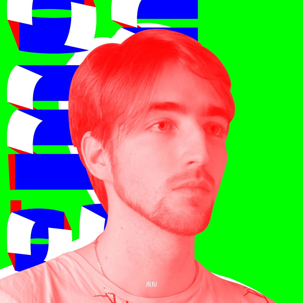
Capek by Aurélien Vret.
➽ typofonderie.com/fonts/capek/
Capek is a blackletter sans serif, whose forms are inspired by the technophile universe and science fiction. Capek is atypical, which will bring an undeniably original touch to your projects.
1/4
➽ typofonderie.com/fonts/capek/
Capek is a blackletter sans serif, whose forms are inspired by the technophile universe and science fiction. Capek is atypical, which will bring an undeniably original touch to your projects.
1/4


December 31, 2025 at 1:08 PM
La famille de caractères s’appelle désormais le Capek, dont une variante unique est distribuée chez @typofonderie.com. Le logiciel de fonte est maintenant fixé, la forme des glyphes arrêtée. J’ai codé une nouvelle version polychrome que je vais étendre aux autres graisses.
bsky.app/profile/typo...
bsky.app/profile/typo...
As the year draws to an end, it is the perfect time to take stock of our adventures. We’re looking forward to 2026 with several new typeface releases planned, including a new sans serif by Raphaël Ronot and others…
🤩 Read the full piece on our Gazette (link on profile).
🤩 Read the full piece on our Gazette (link on profile).
December 31, 2025 at 7:15 AM
As the year draws to an end, it is the perfect time to take stock of our adventures. We’re looking forward to 2026 with several new typeface releases planned, including a new sans serif by Raphaël Ronot and others…
🤩 Read the full piece on our Gazette (link on profile).
🤩 Read the full piece on our Gazette (link on profile).
Reposted by Typofonderie: fonts & typography
🚀 77 days left! The #typeparis26 programme teaches typeface design and calligraphy techniques, type history, and modern software practices. typeparis.com/summer26
December 28, 2025 at 7:30 AM
🚀 77 days left! The #typeparis26 programme teaches typeface design and calligraphy techniques, type history, and modern software practices. typeparis.com/summer26
Reposted by Typofonderie: fonts & typography
Univers by Adrian Frutiger.
Look how this metal type version is more sharp and dynamic than our digital versions.
Look how this metal type version is more sharp and dynamic than our digital versions.

July 21, 2025 at 5:07 PM
Univers by Adrian Frutiger.
Look how this metal type version is more sharp and dynamic than our digital versions.
Look how this metal type version is more sharp and dynamic than our digital versions.
Reposted by Typofonderie: fonts & typography
Not a lot of sans serifs. Better for the health of readers.
Linotype faces used by winners of @AIGAdesign’s “Fifty Books” award, 1924–36. https://archive.org/stream/Mergenthaler1935TheLegibilityOfType/mlc-legibility-of-type-1935-0600rgbjpg#page/n37/mode/2up

December 26, 2025 at 1:13 PM
Not a lot of sans serifs. Better for the health of readers.
Reposted by Typofonderie: fonts & typography
Choisir un caractère typographique, une fonte, une police de caractères, un alphabet…, c'est choisir la voix du texte qui va être lu. Ça change pas le texte, mais ça change tout le reste.
Un mauvais choix typo, c'est comme un mauvais doublage: ça craint.
Un mauvais choix typo, c'est comme un mauvais doublage: ça craint.
Eight meticulously crafted typefaces with passion by the Typofonderie team.
Part two ↣ Astronef, Zingiber, Caslonian, Capek, Arbale, Alyssa, Arsen, Aukio.
Part two ↣ Astronef, Zingiber, Caslonian, Capek, Arbale, Alyssa, Arsen, Aukio.
December 26, 2025 at 5:52 PM
Choisir un caractère typographique, une fonte, une police de caractères, un alphabet…, c'est choisir la voix du texte qui va être lu. Ça change pas le texte, mais ça change tout le reste.
Un mauvais choix typo, c'est comme un mauvais doublage: ça craint.
Un mauvais choix typo, c'est comme un mauvais doublage: ça craint.
Eight meticulously crafted typefaces with passion by the Typofonderie team.
Part two ↣ Astronef, Zingiber, Caslonian, Capek, Arbale, Alyssa, Arsen, Aukio.
Part two ↣ Astronef, Zingiber, Caslonian, Capek, Arbale, Alyssa, Arsen, Aukio.
December 26, 2025 at 5:47 PM
Eight meticulously crafted typefaces with passion by the Typofonderie team.
Part two ↣ Astronef, Zingiber, Caslonian, Capek, Arbale, Alyssa, Arsen, Aukio.
Part two ↣ Astronef, Zingiber, Caslonian, Capek, Arbale, Alyssa, Arsen, Aukio.
From the Typofonderie archives.

December 26, 2025 at 3:13 PM
From the Typofonderie archives.
Not a lot of sans serifs. Better for the health of readers.
Linotype faces used by winners of @AIGAdesign’s “Fifty Books” award, 1924–36. https://archive.org/stream/Mergenthaler1935TheLegibilityOfType/mlc-legibility-of-type-1935-0600rgbjpg#page/n37/mode/2up
December 26, 2025 at 1:13 PM
Not a lot of sans serifs. Better for the health of readers.
Reposted by Typofonderie: fonts & typography
Joyeux Noël à la planète typographie. #typography #printing #letterpress #punchcutting
[Lucien Mathelin, Dixième fête, galerie Recio, dans: Caractère Noël, Hors série № 13, Fédération française des syndicats patronaux de l’imprimerie et des industries graphiques, décembre 1960.]
[Lucien Mathelin, Dixième fête, galerie Recio, dans: Caractère Noël, Hors série № 13, Fédération française des syndicats patronaux de l’imprimerie et des industries graphiques, décembre 1960.]


December 24, 2025 at 6:14 PM
Joyeux Noël à la planète typographie. #typography #printing #letterpress #punchcutting
[Lucien Mathelin, Dixième fête, galerie Recio, dans: Caractère Noël, Hors série № 13, Fédération française des syndicats patronaux de l’imprimerie et des industries graphiques, décembre 1960.]
[Lucien Mathelin, Dixième fête, galerie Recio, dans: Caractère Noël, Hors série № 13, Fédération française des syndicats patronaux de l’imprimerie et des industries graphiques, décembre 1960.]