


Typofonderie: fonts & typography
@typofonderie.com
https://typofonderie.com/links
Join any graphic designer, art director, web designer who use our fonts! Buy the best quality typefaces you need. Est. 1994.
👋 Annual graphic & typography design conference + learn type design @typeparis.com
Join any graphic designer, art director, web designer who use our fonts! Buy the best quality typefaces you need. Est. 1994.
👋 Annual graphic & typography design conference + learn type design @typeparis.com
🔥NEW🔥Former, Germano-Swiss humano-rationalism!
A néo-grotesque in 18 styles, designed by Raphaël Ronot, exclusively available at typofonderie.com
📡 Former is not just good-looking, it’s a fully-featured typographic tool: 787 glyphs by font! Whether you need small caps, alternates, ligatures…
A néo-grotesque in 18 styles, designed by Raphaël Ronot, exclusively available at typofonderie.com
📡 Former is not just good-looking, it’s a fully-featured typographic tool: 787 glyphs by font! Whether you need small caps, alternates, ligatures…
January 13, 2026 at 6:55 AM
🔥NEW🔥Former, Germano-Swiss humano-rationalism!
A néo-grotesque in 18 styles, designed by Raphaël Ronot, exclusively available at typofonderie.com
📡 Former is not just good-looking, it’s a fully-featured typographic tool: 787 glyphs by font! Whether you need small caps, alternates, ligatures…
A néo-grotesque in 18 styles, designed by Raphaël Ronot, exclusively available at typofonderie.com
📡 Former is not just good-looking, it’s a fully-featured typographic tool: 787 glyphs by font! Whether you need small caps, alternates, ligatures…
Searching for the right interpretation.

January 9, 2026 at 7:30 PM
Searching for the right interpretation.
‼️The year starts well with the results of the Tokyo TDC Annual Awards 2026. We have Alembert and Caslonian who are Nominee Works in 2026.
🏆 Caslonian and Alembert have received awards at the Club des directeurs artistiques, 56e palmarès. And Caslonian at D&AD competition, a Graphite Pencil.
🏆 Caslonian and Alembert have received awards at the Club des directeurs artistiques, 56e palmarès. And Caslonian at D&AD competition, a Graphite Pencil.
January 7, 2026 at 6:01 PM
‼️The year starts well with the results of the Tokyo TDC Annual Awards 2026. We have Alembert and Caslonian who are Nominee Works in 2026.
🏆 Caslonian and Alembert have received awards at the Club des directeurs artistiques, 56e palmarès. And Caslonian at D&AD competition, a Graphite Pencil.
🏆 Caslonian and Alembert have received awards at the Club des directeurs artistiques, 56e palmarès. And Caslonian at D&AD competition, a Graphite Pencil.
Beautiful Didot, Panthéon, Paris.

January 4, 2026 at 9:23 PM
Beautiful Didot, Panthéon, Paris.
As the year draws to an end, it is the perfect time to take stock of our adventures. We’re looking forward to 2026 with several new typeface releases planned, including a new sans serif by Raphaël Ronot and others…
🤩 Read the full piece on our Gazette (link on profile).
🤩 Read the full piece on our Gazette (link on profile).
December 31, 2025 at 7:15 AM
As the year draws to an end, it is the perfect time to take stock of our adventures. We’re looking forward to 2026 with several new typeface releases planned, including a new sans serif by Raphaël Ronot and others…
🤩 Read the full piece on our Gazette (link on profile).
🤩 Read the full piece on our Gazette (link on profile).
Eight meticulously crafted typefaces with passion by the Typofonderie team.
Part two ↣ Astronef, Zingiber, Caslonian, Capek, Arbale, Alyssa, Arsen, Aukio.
Part two ↣ Astronef, Zingiber, Caslonian, Capek, Arbale, Alyssa, Arsen, Aukio.
December 26, 2025 at 5:47 PM
Eight meticulously crafted typefaces with passion by the Typofonderie team.
Part two ↣ Astronef, Zingiber, Caslonian, Capek, Arbale, Alyssa, Arsen, Aukio.
Part two ↣ Astronef, Zingiber, Caslonian, Capek, Arbale, Alyssa, Arsen, Aukio.
From the Typofonderie archives.

December 26, 2025 at 3:13 PM
From the Typofonderie archives.
This is the necessary volume of metal type to set and layout pages of books. On the right, the shelves for spaces!
Images from Imprimerie Nationale in 2004, Paris.
Images from Imprimerie Nationale in 2004, Paris.


December 19, 2025 at 12:57 PM
This is the necessary volume of metal type to set and layout pages of books. On the right, the shelves for spaces!
Images from Imprimerie Nationale in 2004, Paris.
Images from Imprimerie Nationale in 2004, Paris.
The most interesting feature in Banjo published by Deberny & Peignot in ~1930, are the usage tips of the wide and narrow version.
➽ typofonderie.com/fonts/anisette
This is mainly what remains in Anisette Pro, but it is automated in OpenType! The design is as you can see, different.
➽ typofonderie.com/fonts/anisette
This is mainly what remains in Anisette Pro, but it is automated in OpenType! The design is as you can see, different.

December 14, 2025 at 7:48 AM
The most interesting feature in Banjo published by Deberny & Peignot in ~1930, are the usage tips of the wide and narrow version.
➽ typofonderie.com/fonts/anisette
This is mainly what remains in Anisette Pro, but it is automated in OpenType! The design is as you can see, different.
➽ typofonderie.com/fonts/anisette
This is mainly what remains in Anisette Pro, but it is automated in OpenType! The design is as you can see, different.
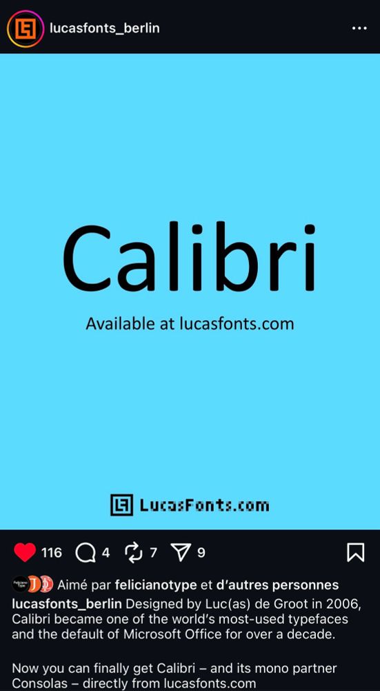
And indeed, Calibri is a great typeface by a fantastic type designer, Lucas de Groot. @lucasfonts.bsky.social
December 11, 2025 at 12:49 PM
And indeed, Calibri is a great typeface by a fantastic type designer, Lucas de Groot. @lucasfonts.bsky.social
Different experience here! See how the bottom show language highlighted.
Maybe iOS IP protection on your side?
Maybe iOS IP protection on your side?
December 9, 2025 at 9:50 PM
Different experience here! See how the bottom show language highlighted.
Maybe iOS IP protection on your side?
Maybe iOS IP protection on your side?
Strange! Are you using a VPN? Are you sure the url doesn’t display the /fr/ Even with a click on footer?
If not, we have to investigate, as by defaut the website is EN, French switch with /fr/ url only based on French dns. But can be be switched back.
If not, we have to investigate, as by defaut the website is EN, French switch with /fr/ url only based on French dns. But can be be switched back.


December 9, 2025 at 8:59 PM
Strange! Are you using a VPN? Are you sure the url doesn’t display the /fr/ Even with a click on footer?
If not, we have to investigate, as by defaut the website is EN, French switch with /fr/ url only based on French dns. But can be be switched back.
If not, we have to investigate, as by defaut the website is EN, French switch with /fr/ url only based on French dns. But can be be switched back.
We re-publish this article initially written in 2000 by Evert Bloemsma (1958-2005), and never published to our knowledge. Evert discusses the challenges and considerations involved in typeface design:
➽ typofonderie.com/gazette/look...
➽ typofonderie.com/gazette/look...

December 9, 2025 at 6:04 PM
We re-publish this article initially written in 2000 by Evert Bloemsma (1958-2005), and never published to our knowledge. Evert discusses the challenges and considerations involved in typeface design:
➽ typofonderie.com/gazette/look...
➽ typofonderie.com/gazette/look...
Eight meticulously crafted typefaces with passion by the Typofonderie team.
Part one ↣ Arteria, Altesse, Allumi Inline, Astronef Super, AW Conqueror Sans, AW Conqueror Stincilla, Aiglon, Austerlitz.
Part one ↣ Arteria, Altesse, Allumi Inline, Astronef Super, AW Conqueror Sans, AW Conqueror Stincilla, Aiglon, Austerlitz.
December 8, 2025 at 7:32 AM
Eight meticulously crafted typefaces with passion by the Typofonderie team.
Part one ↣ Arteria, Altesse, Allumi Inline, Astronef Super, AW Conqueror Sans, AW Conqueror Stincilla, Aiglon, Austerlitz.
Part one ↣ Arteria, Altesse, Allumi Inline, Astronef Super, AW Conqueror Sans, AW Conqueror Stincilla, Aiglon, Austerlitz.
It’s odd to write about Helvetica without mentioning Linotype.

December 5, 2025 at 7:30 AM
It’s odd to write about Helvetica without mentioning Linotype.
This history of New Haas Grotesque aka Helvetica confirms that unlike Univers methodically thought of as a global project by Adrian Frutiger, Helvetica remains a very traditional typeface in its design.
Source www.flickr.com/photos/linot...
Source www.flickr.com/photos/linot...

December 4, 2025 at 9:59 PM
This history of New Haas Grotesque aka Helvetica confirms that unlike Univers methodically thought of as a global project by Adrian Frutiger, Helvetica remains a very traditional typeface in its design.
Source www.flickr.com/photos/linot...
Source www.flickr.com/photos/linot...
🐪Akhen, our Egypto-Slab🐪
➽ typofonderie.com/fonts/akhen-...
It offers versatility with OpenType features for stylistic combinations and a comprehensive glyph set. Its rigorous design and short serifs make it ideal for creating unique and visually appealing designs.
➽ typofonderie.com/fonts/akhen-...
It offers versatility with OpenType features for stylistic combinations and a comprehensive glyph set. Its rigorous design and short serifs make it ideal for creating unique and visually appealing designs.
November 30, 2025 at 9:18 PM
🐪Akhen, our Egypto-Slab🐪
➽ typofonderie.com/fonts/akhen-...
It offers versatility with OpenType features for stylistic combinations and a comprehensive glyph set. Its rigorous design and short serifs make it ideal for creating unique and visually appealing designs.
➽ typofonderie.com/fonts/akhen-...
It offers versatility with OpenType features for stylistic combinations and a comprehensive glyph set. Its rigorous design and short serifs make it ideal for creating unique and visually appealing designs.
Roman numerals instead?
Question: what about fractions in roman numerals?
Question: what about fractions in roman numerals?

November 27, 2025 at 9:48 AM
Roman numerals instead?
Question: what about fractions in roman numerals?
Question: what about fractions in roman numerals?
FF Balance, Evert Bloemsma. Specimen designed by himself (two printed version!), 1993. German-French-English.

November 24, 2025 at 4:32 PM
FF Balance, Evert Bloemsma. Specimen designed by himself (two printed version!), 1993. German-French-English.
Trying Apple Pencil Pro on iPad using Freeform app. Rather impressed by the quality of the tool and how it is comparable to a real calligraphic pen on paper.
Have a nice weekend! — @jf.porchez.com
Have a nice weekend! — @jf.porchez.com

November 21, 2025 at 6:47 PM
Trying Apple Pencil Pro on iPad using Freeform app. Rather impressed by the quality of the tool and how it is comparable to a real calligraphic pen on paper.
Have a nice weekend! — @jf.porchez.com
Have a nice weekend! — @jf.porchez.com
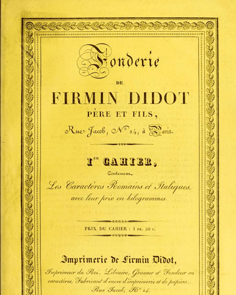
…but it was at the beginning of the following century, due to the typefaces of Firmin Didot and the editions of his brother, Pierre, that it began the saga that would dominate typography worldwide for decades.
➽ typofonderie.com/gazette/dido...
3-3
➽ typofonderie.com/gazette/dido...
3-3


November 19, 2025 at 2:06 PM
…but it was at the beginning of the following century, due to the typefaces of Firmin Didot and the editions of his brother, Pierre, that it began the saga that would dominate typography worldwide for decades.
➽ typofonderie.com/gazette/dido...
3-3
➽ typofonderie.com/gazette/dido...
3-3
Gazette: The didots or the typographic ideal of the 19th century
The Didot family established itself in the printing trade in the 18th century…
2-3
The Didot family established itself in the printing trade in the 18th century…
2-3


November 19, 2025 at 2:06 PM
Gazette: The didots or the typographic ideal of the 19th century
The Didot family established itself in the printing trade in the 18th century…
2-3
The Didot family established itself in the printing trade in the 18th century…
2-3
Read about Didot, the typeface and the family, François-Ambroise, Pierre, Jules…, as well punchcutters such Vafflard, Vibert.
➽ typofonderie.com/gazette/dido...
By Michel Wlassikoff, the eminent French historian of graphic and type history.
1-3
➽ typofonderie.com/gazette/dido...
By Michel Wlassikoff, the eminent French historian of graphic and type history.
1-3

November 19, 2025 at 2:06 PM
Read about Didot, the typeface and the family, François-Ambroise, Pierre, Jules…, as well punchcutters such Vafflard, Vibert.
➽ typofonderie.com/gazette/dido...
By Michel Wlassikoff, the eminent French historian of graphic and type history.
1-3
➽ typofonderie.com/gazette/dido...
By Michel Wlassikoff, the eminent French historian of graphic and type history.
1-3
We switched to Xerox color printers years ago, few models along the years. Genuine Adobe PostScript. Quite happy.

November 18, 2025 at 12:00 PM
We switched to Xerox color printers years ago, few models along the years. Genuine Adobe PostScript. Quite happy.
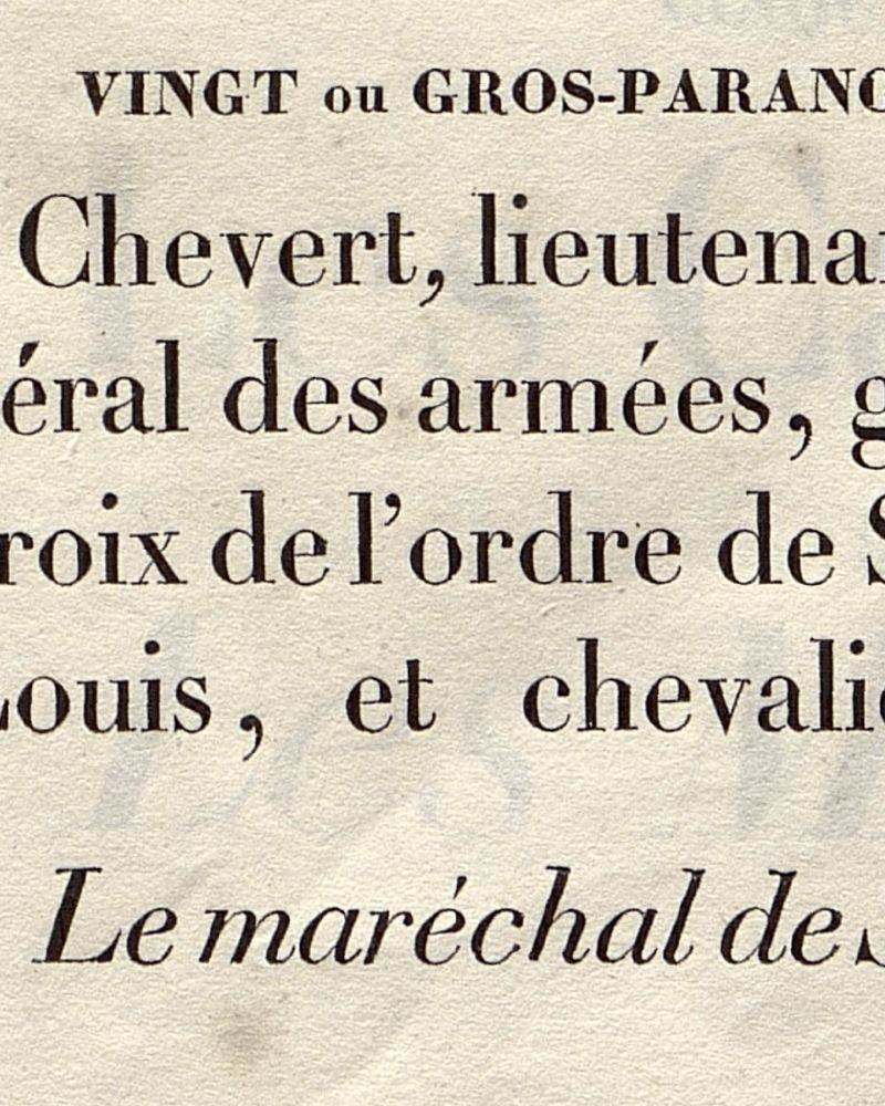
Contrasts!

November 16, 2025 at 10:20 AM
Contrasts!