


Arkylie
@arkylie.bsky.social
Writer with a lifelong love of learning, backlog of sporadically updated projects, and eclectic taste in music.
Longer Posts:
https://www.pillowfort.social/Arkylie
Consider buying me a Ko-fi!
https://ko-fi.com/arkylie
Longer Posts:
https://www.pillowfort.social/Arkylie
Consider buying me a Ko-fi!
https://ko-fi.com/arkylie
@tailsteak.bsky.social
This submission call reminded me of many facets of Forward, and I thought it might amuse you 😁
(Got it from the Authors Publish compilation; the call is far down the page on the Raconteur site.)
raconteurpress.substack.com/p/open-calls...
authorspublish.com/32-themed-su...
This submission call reminded me of many facets of Forward, and I thought it might amuse you 😁
(Got it from the Authors Publish compilation; the call is far down the page on the Raconteur site.)
raconteurpress.substack.com/p/open-calls...
authorspublish.com/32-themed-su...

November 3, 2025 at 9:42 PM
@tailsteak.bsky.social
This submission call reminded me of many facets of Forward, and I thought it might amuse you 😁
(Got it from the Authors Publish compilation; the call is far down the page on the Raconteur site.)
raconteurpress.substack.com/p/open-calls...
authorspublish.com/32-themed-su...
This submission call reminded me of many facets of Forward, and I thought it might amuse you 😁
(Got it from the Authors Publish compilation; the call is far down the page on the Raconteur site.)
raconteurpress.substack.com/p/open-calls...
authorspublish.com/32-themed-su...
Wouldn't have thought twice about signing the updated EULA for #7DaysToDie if it weren't phrased as though there's an OPTION to do otherwise.
It won't let me play unless I accept the EULA. That's not "certain game features," that's THE WHOLE FUCKING GAME. Which features are exempt, the menus??? 😡
It won't let me play unless I accept the EULA. That's not "certain game features," that's THE WHOLE FUCKING GAME. Which features are exempt, the menus??? 😡

June 28, 2025 at 7:47 AM
Wouldn't have thought twice about signing the updated EULA for #7DaysToDie if it weren't phrased as though there's an OPTION to do otherwise.
It won't let me play unless I accept the EULA. That's not "certain game features," that's THE WHOLE FUCKING GAME. Which features are exempt, the menus??? 😡
It won't let me play unless I accept the EULA. That's not "certain game features," that's THE WHOLE FUCKING GAME. Which features are exempt, the menus??? 😡
I presume Tedd's theory about Layers of Reality is about to make another appearance, and perhaps get some feedback from someone who actually knows some of the mystical "quantum mechanics" of this worldbuild.

June 16, 2025 at 7:33 AM
I presume Tedd's theory about Layers of Reality is about to make another appearance, and perhaps get some feedback from someone who actually knows some of the mystical "quantum mechanics" of this worldbuild.
Was looking stuff up and found a site that covered half the vertical landscape with a title bar (horrible site design), and then gave this gem, revealing that its contents are AI-generated with no editing pass.
Nice to know I can ignore that site in search results.
Nice to know I can ignore that site in search results.
June 12, 2025 at 2:40 AM
Was looking stuff up and found a site that covered half the vertical landscape with a title bar (horrible site design), and then gave this gem, revealing that its contents are AI-generated with no editing pass.
Nice to know I can ignore that site in search results.
Nice to know I can ignore that site in search results.
Past few weeks, I've been playing #FarmRPG
part Abnegation (turn brain off)
part a study of bad game design (can't look away from this bizarre train wreck)
to be fair, it's apparently made by one person, so I'll cut them some slack
but just look at this latest affront to good game design:
part Abnegation (turn brain off)
part a study of bad game design (can't look away from this bizarre train wreck)
to be fair, it's apparently made by one person, so I'll cut them some slack
but just look at this latest affront to good game design:


June 7, 2025 at 11:36 AM
Past few weeks, I've been playing #FarmRPG
part Abnegation (turn brain off)
part a study of bad game design (can't look away from this bizarre train wreck)
to be fair, it's apparently made by one person, so I'll cut them some slack
but just look at this latest affront to good game design:
part Abnegation (turn brain off)
part a study of bad game design (can't look away from this bizarre train wreck)
to be fair, it's apparently made by one person, so I'll cut them some slack
but just look at this latest affront to good game design:
So there's this #ProductivityApp called "Do It Now"
Out of all such apps I've tried, it's the only one I ever paid money for, and I think it was worth it
It's a useful app
But
I don't use it anymore
Because every time I remember that it exists, and open it anew, I get hit with THIS bullshit:
Out of all such apps I've tried, it's the only one I ever paid money for, and I think it was worth it
It's a useful app
But
I don't use it anymore
Because every time I remember that it exists, and open it anew, I get hit with THIS bullshit:

June 7, 2025 at 4:57 AM
So there's this #ProductivityApp called "Do It Now"
Out of all such apps I've tried, it's the only one I ever paid money for, and I think it was worth it
It's a useful app
But
I don't use it anymore
Because every time I remember that it exists, and open it anew, I get hit with THIS bullshit:
Out of all such apps I've tried, it's the only one I ever paid money for, and I think it was worth it
It's a useful app
But
I don't use it anymore
Because every time I remember that it exists, and open it anew, I get hit with THIS bullshit:
I've contacted my representatives repeatedly regarding legislation unfairly impacting minorities.
I've even received a reply once (albeit likely a form letter).
But the attacks just keep rolling in.
Not just hurting individuals in the short-term,
but targeting whole groups in the long-term.
I've even received a reply once (albeit likely a form letter).
But the attacks just keep rolling in.
Not just hurting individuals in the short-term,
but targeting whole groups in the long-term.

May 14, 2025 at 1:16 AM
I've contacted my representatives repeatedly regarding legislation unfairly impacting minorities.
I've even received a reply once (albeit likely a form letter).
But the attacks just keep rolling in.
Not just hurting individuals in the short-term,
but targeting whole groups in the long-term.
I've even received a reply once (albeit likely a form letter).
But the attacks just keep rolling in.
Not just hurting individuals in the short-term,
but targeting whole groups in the long-term.
I rarely go on ex-Twitter anymore; mostly it's for feedback to companies who likely won't listen.
Today it's raging against #clickbait game ads and how the GooglePlay store has become utterly useless.
I can't find games worth playing and can't narrow search results to exclude the nonsense 😡
Today it's raging against #clickbait game ads and how the GooglePlay store has become utterly useless.
I can't find games worth playing and can't narrow search results to exclude the nonsense 😡

April 16, 2025 at 9:48 PM
I rarely go on ex-Twitter anymore; mostly it's for feedback to companies who likely won't listen.
Today it's raging against #clickbait game ads and how the GooglePlay store has become utterly useless.
I can't find games worth playing and can't narrow search results to exclude the nonsense 😡
Today it's raging against #clickbait game ads and how the GooglePlay store has become utterly useless.
I can't find games worth playing and can't narrow search results to exclude the nonsense 😡
suppose I should point out where the font improves
(or just looks nice)
"ante" here expresses opposition (different viewpoints) better than the original
"sewi" better expresses "up" and doesn't look like two glyphs next to each other
"apeja" expresses the feeling of isolation decently via emoji
(or just looks nice)
"ante" here expresses opposition (different viewpoints) better than the original
"sewi" better expresses "up" and doesn't look like two glyphs next to each other
"apeja" expresses the feeling of isolation decently via emoji

March 13, 2025 at 7:56 PM
suppose I should point out where the font improves
(or just looks nice)
"ante" here expresses opposition (different viewpoints) better than the original
"sewi" better expresses "up" and doesn't look like two glyphs next to each other
"apeja" expresses the feeling of isolation decently via emoji
(or just looks nice)
"ante" here expresses opposition (different viewpoints) better than the original
"sewi" better expresses "up" and doesn't look like two glyphs next to each other
"apeja" expresses the feeling of isolation decently via emoji
same with "monster/scary" here
which no longer looks like a fanged mouth
just a regular M
which no longer looks like a fanged mouth
just a regular M

March 13, 2025 at 7:54 PM
same with "monster/scary" here
which no longer looks like a fanged mouth
just a regular M
which no longer looks like a fanged mouth
just a regular M
in theory, switching from dots on the side to lines in the middle isn't the worst idea, and it prevents some issues
...but it loses the connection between these glyphs
and now two of the glyphs look like LETTERS instead of CONCEPTS, again destroying one of the best aspects of this writing system
...but it loses the connection between these glyphs
and now two of the glyphs look like LETTERS instead of CONCEPTS, again destroying one of the best aspects of this writing system

March 13, 2025 at 7:53 PM
in theory, switching from dots on the side to lines in the middle isn't the worst idea, and it prevents some issues
...but it loses the connection between these glyphs
and now two of the glyphs look like LETTERS instead of CONCEPTS, again destroying one of the best aspects of this writing system
...but it loses the connection between these glyphs
and now two of the glyphs look like LETTERS instead of CONCEPTS, again destroying one of the best aspects of this writing system
here we've got "stick"
for some reason flattened at one end???
"flat thing / paper"
now square, looks less like paper
and "grain / bread / pasta"
which is down from three ticks to two
which, in theory, I don't mind,
but between that and getting WIDE
it no longer looks like wheat grains on a stalk
for some reason flattened at one end???
"flat thing / paper"
now square, looks less like paper
and "grain / bread / pasta"
which is down from three ticks to two
which, in theory, I don't mind,
but between that and getting WIDE
it no longer looks like wheat grains on a stalk

March 13, 2025 at 7:47 PM
here we've got "stick"
for some reason flattened at one end???
"flat thing / paper"
now square, looks less like paper
and "grain / bread / pasta"
which is down from three ticks to two
which, in theory, I don't mind,
but between that and getting WIDE
it no longer looks like wheat grains on a stalk
for some reason flattened at one end???
"flat thing / paper"
now square, looks less like paper
and "grain / bread / pasta"
which is down from three ticks to two
which, in theory, I don't mind,
but between that and getting WIDE
it no longer looks like wheat grains on a stalk
why is the sun smaller than a MOUTH
why no consistency of size
(those are the colors "yellow" and "red", respectively)
why no consistency of size
(those are the colors "yellow" and "red", respectively)

March 13, 2025 at 7:34 PM
why is the sun smaller than a MOUTH
why no consistency of size
(those are the colors "yellow" and "red", respectively)
why no consistency of size
(those are the colors "yellow" and "red", respectively)
canon big/little: in isolation, you might confuse them
(exact same shape just one is smaller)
this font: "little" is EXACTLY AS BIG AS "BIG"
PLUS they no longer look related or convey semantics by shape alone
I mean I *kinda* like the up/down indication, but the implementation fails
(exact same shape just one is smaller)
this font: "little" is EXACTLY AS BIG AS "BIG"
PLUS they no longer look related or convey semantics by shape alone
I mean I *kinda* like the up/down indication, but the implementation fails

March 13, 2025 at 7:32 PM
canon big/little: in isolation, you might confuse them
(exact same shape just one is smaller)
this font: "little" is EXACTLY AS BIG AS "BIG"
PLUS they no longer look related or convey semantics by shape alone
I mean I *kinda* like the up/down indication, but the implementation fails
(exact same shape just one is smaller)
this font: "little" is EXACTLY AS BIG AS "BIG"
PLUS they no longer look related or convey semantics by shape alone
I mean I *kinda* like the up/down indication, but the implementation fails
these are not related
one is "fun/amusement"
the other is an animal making a noise (moooo)
"mu" used to be an enclosed shape (a head) with ears and a mouth
the mouth being central is bad enough, but now it's not even a head shape anymore
one is "fun/amusement"
the other is an animal making a noise (moooo)
"mu" used to be an enclosed shape (a head) with ears and a mouth
the mouth being central is bad enough, but now it's not even a head shape anymore

March 13, 2025 at 7:28 PM
these are not related
one is "fun/amusement"
the other is an animal making a noise (moooo)
"mu" used to be an enclosed shape (a head) with ears and a mouth
the mouth being central is bad enough, but now it's not even a head shape anymore
one is "fun/amusement"
the other is an animal making a noise (moooo)
"mu" used to be an enclosed shape (a head) with ears and a mouth
the mouth being central is bad enough, but now it's not even a head shape anymore
I've found it hard to recall "body", as it's just basically a line between two other lines
but this font makes it nearly identical to "border/boundary" by making the lines equidistant
the original had two lines on one side, two lines on the order
and "surface" has nearly lost its table look
but this font makes it nearly identical to "border/boundary" by making the lines equidistant
the original had two lines on one side, two lines on the order
and "surface" has nearly lost its table look

March 13, 2025 at 7:26 PM
I've found it hard to recall "body", as it's just basically a line between two other lines
but this font makes it nearly identical to "border/boundary" by making the lines equidistant
the original had two lines on one side, two lines on the order
and "surface" has nearly lost its table look
but this font makes it nearly identical to "border/boundary" by making the lines equidistant
the original had two lines on one side, two lines on the order
and "surface" has nearly lost its table look
the heads are now the same size as the (small) sun, and we've lost connection to "throwing arms up excitedly" (power)
and "a face with dead eyes" which is entirely abstraction now
meanwhile, "mouth" and "eye" are bigger than those heads and the eye isn't eye-shaped (horizontal ellipse)
and "a face with dead eyes" which is entirely abstraction now
meanwhile, "mouth" and "eye" are bigger than those heads and the eye isn't eye-shaped (horizontal ellipse)

March 13, 2025 at 7:19 PM
the heads are now the same size as the (small) sun, and we've lost connection to "throwing arms up excitedly" (power)
and "a face with dead eyes" which is entirely abstraction now
meanwhile, "mouth" and "eye" are bigger than those heads and the eye isn't eye-shaped (horizontal ellipse)
and "a face with dead eyes" which is entirely abstraction now
meanwhile, "mouth" and "eye" are bigger than those heads and the eye isn't eye-shaped (horizontal ellipse)
if you WERE going to make some shapes smaller, it'd make sense to do so for pronouns (me / you / they) -- but NOOO
no, let's make "sleep" smaller
while also taking the ballcap edge away from "head"
and also putting the line directly in the middle
so it bears no resemblance to a person in a cap
no, let's make "sleep" smaller
while also taking the ballcap edge away from "head"
and also putting the line directly in the middle
so it bears no resemblance to a person in a cap

March 13, 2025 at 7:11 PM
if you WERE going to make some shapes smaller, it'd make sense to do so for pronouns (me / you / they) -- but NOOO
no, let's make "sleep" smaller
while also taking the ballcap edge away from "head"
and also putting the line directly in the middle
so it bears no resemblance to a person in a cap
no, let's make "sleep" smaller
while also taking the ballcap edge away from "head"
and also putting the line directly in the middle
so it bears no resemblance to a person in a cap
THESE ARE NOT IKE AND PONA
pona (good): a smile
ike (bad): a frown
nena: a bump
lupa: a hole
he's taken the shapes that ought to go with nena/lupa and given them to ike/pona, losing the connection to facial expressions, and then made the nena/lupa more complicated and less obvious
WHYYY
pona (good): a smile
ike (bad): a frown
nena: a bump
lupa: a hole
he's taken the shapes that ought to go with nena/lupa and given them to ike/pona, losing the connection to facial expressions, and then made the nena/lupa more complicated and less obvious
WHYYY

March 13, 2025 at 7:06 PM
THESE ARE NOT IKE AND PONA
pona (good): a smile
ike (bad): a frown
nena: a bump
lupa: a hole
he's taken the shapes that ought to go with nena/lupa and given them to ike/pona, losing the connection to facial expressions, and then made the nena/lupa more complicated and less obvious
WHYYY
pona (good): a smile
ike (bad): a frown
nena: a bump
lupa: a hole
he's taken the shapes that ought to go with nena/lupa and given them to ike/pona, losing the connection to facial expressions, and then made the nena/lupa more complicated and less obvious
WHYYY
by making the heads tiny, we lose the connection to jan (person); they're less easy to pick up as meaning people (with hair or a head covering, and broad shoulders, respectively)
and why is jan extending down instead of resting on the mainline? why would you have other glyphs above the head??
and why is jan extending down instead of resting on the mainline? why would you have other glyphs above the head??

March 13, 2025 at 6:59 PM
by making the heads tiny, we lose the connection to jan (person); they're less easy to pick up as meaning people (with hair or a head covering, and broad shoulders, respectively)
and why is jan extending down instead of resting on the mainline? why would you have other glyphs above the head??
and why is jan extending down instead of resting on the mainline? why would you have other glyphs above the head??
THESE WORDS ARE NOT EVEN SLIGHTLY RELATED 😠
One is a content word -- ear/listen -- and the other is a functional particle marking the topic/context for the sentence
and now the actual resemblance to an ear is lost by making it more abstract, so again, newbies get locked out
One is a content word -- ear/listen -- and the other is a functional particle marking the topic/context for the sentence
and now the actual resemblance to an ear is lost by making it more abstract, so again, newbies get locked out

March 13, 2025 at 6:56 PM
THESE WORDS ARE NOT EVEN SLIGHTLY RELATED 😠
One is a content word -- ear/listen -- and the other is a functional particle marking the topic/context for the sentence
and now the actual resemblance to an ear is lost by making it more abstract, so again, newbies get locked out
One is a content word -- ear/listen -- and the other is a functional particle marking the topic/context for the sentence
and now the actual resemblance to an ear is lost by making it more abstract, so again, newbies get locked out
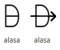
yes, alasa isn't mistaken for any other glyphs, and so *technically* can be reduced to a D with a line through it
but it loses the extra information that informs newbies that this is, in fact, a bow and arrow
(the meaning is "hunt" or "search for")
changes automatic recognition to memorization
but it loses the extra information that informs newbies that this is, in fact, a bow and arrow
(the meaning is "hunt" or "search for")
changes automatic recognition to memorization
March 13, 2025 at 6:54 PM
yes, alasa isn't mistaken for any other glyphs, and so *technically* can be reduced to a D with a line through it
but it loses the extra information that informs newbies that this is, in fact, a bow and arrow
(the meaning is "hunt" or "search for")
changes automatic recognition to memorization
but it loses the extra information that informs newbies that this is, in fact, a bow and arrow
(the meaning is "hunt" or "search for")
changes automatic recognition to memorization
like okay
I grant that the extra lines aren't truly needed for animals
but they do make it clear to absolute newbies what's going on
"akesi" here doesn't even look like an animal anymore
(also "waso" looks ugly to me in this font)
I grant that the extra lines aren't truly needed for animals
but they do make it clear to absolute newbies what's going on
"akesi" here doesn't even look like an animal anymore
(also "waso" looks ugly to me in this font)

March 13, 2025 at 6:51 PM
like okay
I grant that the extra lines aren't truly needed for animals
but they do make it clear to absolute newbies what's going on
"akesi" here doesn't even look like an animal anymore
(also "waso" looks ugly to me in this font)
I grant that the extra lines aren't truly needed for animals
but they do make it clear to absolute newbies what's going on
"akesi" here doesn't even look like an animal anymore
(also "waso" looks ugly to me in this font)
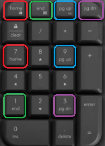
I think that might be a connectivity issue, as it's wireless.
Anyway, returned it for now, picked up #4: Logitech Wave Keys
I do trust Logitech.
...dang this keyboard is Small
also the keys are in weird positions
also what the hell is this???
Anyway, returned it for now, picked up #4: Logitech Wave Keys
I do trust Logitech.
...dang this keyboard is Small
also the keys are in weird positions
also what the hell is this???
February 12, 2025 at 3:10 AM
I think that might be a connectivity issue, as it's wireless.
Anyway, returned it for now, picked up #4: Logitech Wave Keys
I do trust Logitech.
...dang this keyboard is Small
also the keys are in weird positions
also what the hell is this???
Anyway, returned it for now, picked up #4: Logitech Wave Keys
I do trust Logitech.
...dang this keyboard is Small
also the keys are in weird positions
also what the hell is this???
I could read six of these, but only because the context clued me in. Found them hilarious, though. How many can you work out without scrolling down below the original tweet?
x.com/beach_fox/st...
x.com/beach_fox/st...

November 12, 2024 at 6:37 PM
I could read six of these, but only because the context clued me in. Found them hilarious, though. How many can you work out without scrolling down below the original tweet?
x.com/beach_fox/st...
x.com/beach_fox/st...