David Waldron
@davidawaldron.bsky.social
390 followers 620 following 70 posts
Economist in Indianapolis. Dataviz, labor markets, education, workforce development. waldrn.com
Posts Media Videos Starter Packs
davidawaldron.bsky.social
At a time when skepticism about college is popular, and many suggest trades as an alternative, this should lead some to reassess whether that advice is helpful or harmful to young people looking for guidance.

Full post here:

blog.waldrn.com/p/the-truth-...
The truth about middle-skills jobs
What decades of Census data can tell us about jobs, college and economic opportunity
blog.waldrn.com
davidawaldron.bsky.social
Healthcare-related middle skills jobs have performed better. Cops and firefighters also continue to get paid well.

Jobs that require a college degree still tend to pay above the median wage and many, especially healthcare-related, have increased their standing relative to the median.
Chart comparing median wages by occupation relative to overall median wage, showing 1980 to 2023 on a log scale. Organized by education level: Middle Skills - Other category includes hairdressers (declined below median), healthcare workers like dental hygienists and respiratory therapists (maintained above-median wages), and public safety roles like firefighters and police officers (maintained above-median positions). Bachelor's degree jobs show accountants, engineers, and software developers maintaining strong wage premiums, with airplane pilots earning around 2.5x median. Graduate degree occupations all remain well above median, with physicians earning over 3x median wage in both periods, followed by dentists and lawyers at 2-2.5x median. Chart demonstrates most jobs requiring post-secondary education have maintained or improved their wage advantage over four decades.
davidawaldron.bsky.social
We hear a lot about the promise of middle-skills jobs, with a heavy emphasis on blue collar trades. But in the past four decades, those are the jobs where wages have fallen below the median wage.
Chart showing median wages by occupation relative to overall median wage, comparing 1980 to 2023 on a log scale. Jobs are grouped by education level. Key findings: Many blue-collar jobs requiring only high school diplomas (forklift operators, taxi drivers, janitors) earned above median in 1980 but fell below median by 2023. Middle-skill construction and manufacturing jobs mostly remain near or above median. Healthcare occupations have increased relative to median wage over time. Jobs requiring bachelor's or graduate degrees consistently pay above median, with highest earners including physicians, lawyers, and software developers. Chart illustrates declining relative wages for traditionally blue-collar work over four decades.
davidawaldron.bsky.social
The yield curve inverted in April 2022, typically signaling recession within 6-24 months. But 38 months later, the U.S. economy still hasn’t entered recession—the longest streak since 1978.
Chart titled “Defying gravity (so far)” showing unemployment rate and non-farm payroll employment changes following yield curve inversions since 1978. Gray dashed lines show past recessions with sharp rises in unemployment and job losses. Red dotted line shows current period since 2022 inversion with unemployment staying flat around 4% and employment continuing to grow modestly, unlike historical patterns.
davidawaldron.bsky.social
So we’re cutting a survey that’s getting its first update since 2002 and has already completed data collection in February?
davidawaldron.bsky.social
This chart shows the common evolution of economic development in OECD countries and China:

Beginning as agricultural economies, industrializing, then ultimately becoming service-based (tertiarization).

blog.waldrn.com/p/what-happe...
This chart titled "All developed economies become service-based" shows sector employment share by total output per worker (2017 USD) across agriculture, manufacturing, and services in 10 developed countries and China.
The chart contains three panels:

Left panel (Agriculture): Shows declining employment share (from 80% to near 0%) as output per worker increases. China starts highest, followed by South Korea, with USA reaching lowest agricultural employment.

Middle panel (Manufacturing): Shows an inverted U-shape pattern, with manufacturing employment first rising then falling as productivity increases. All three highlighted countries peak around 20-35% before declining.

Right panel (Services): Shows increasing employment share (from 10% to 80%) as productivity rises. USA leads with highest service employment share (80%), followed by South Korea, with China showing rapid growth but still trailing.

The data visualizes economic tertiarization - the shift from agriculture to manufacturing to services as economies develop and worker productivity increases. The x-axis (logarithmic scale) shows output per worker from 2.5k to 80k USD.
davidawaldron.bsky.social
Median number of authors on an top econ journal publication:

1963-1983: One
1993-2011: Two
2024: Three
This bar chart shows the distribution of number of authors in leading U.S. general economics journals from 1963 to 2024. The y-axis represents the percent of articles (0-90%), and the x-axis shows publication years (1963, 1973, 1983, 1993, 2003, 2011, 2024). Different colored bars represent the number of authors: black (1 author), blue (2 authors), red (3 authors), green (4 authors), and yellow (5-7 authors). The trend shows a clear decline in single-authored papers (from over 80% in 1963 to about 12% in 2024) and a rise in multi-authored papers, particularly 2-author papers (increasing from about 17% to approximately 27%) and 3-author papers (growing to about 32% by 2024). By 2024, articles with 4 authors (17%) and 5-7 authors (11%) became significant portions of publications, categories that barely existed in earlier decades.​​​​​​​​​​​​​​​​
davidawaldron.bsky.social
Base on 2019 data, where both modes were tested, the mode change could account for around 1.5 points of the 15.2 point drop in complete agreement on the equal pay question, and 5.6 points of the 17.8 point drop on the equal opportunity question.
davidawaldron.bsky.social
Two quick updates:

First, the analysis script is available here: github.com/dawaldron/bo...

Second, I've realized that there was a mode change that I didn't note in the initial post. The Monitoring the Future survey switched from paper forms to electronics tablets between 2018 and 2020.
davidawaldron.bsky.social
One clue that is evident in the survey is that trend away from feminist views appears to be strongest among boys who say that religion is important in their lives.
This chart examines gender equality attitudes among 8th and 10th grade boys from 1991-2023, comparing those who consider religion important versus those who don't.

Left graph: For job opportunity equality, religious and non-religious boys followed similar patterns until around 2018, when a dramatic divergence occurred. By 2023, boys who consider religion important dropped to just 38%, while non-religious boys maintained higher support at 52%.

Right graph: For equal pay, the pattern repeats, with religious boys falling to 50% by 2023 compared to 64% for non-religious boys.

The data reveals religion as the strongest correlating factor with declining feminist attitudes, with religious boys showing much steeper drops in support for gender equality since 2018. This suggests a potential cultural shift within religious communities affecting young males' views. Source: Monitoring the Future.​​​​​​​​​​​​​​​​
davidawaldron.bsky.social
The trend also appears to be independent of fathers being present, education of mothers and communication with parents.
This chart examines gender equality support among 8th and 10th grade boys from 1991-2023, comparing those with and without fathers in the home.

Left graph: For job opportunity equality, both groups show nearly identical trend lines throughout the period, including the recent decline after 2018, reaching 45% by 2023 regardless of father presence.

Right graph: For equal pay, the pattern repeats with both groups tracking closely together, ending at similar levels in 2023 (57% for boys with fathers, 59% for those without).

The data decisively refutes the hypothesis that absent fathers drive decreasing support for gender equality, as both groups show virtually identical attitudes and trends over three decades. Source: Monitoring the Future.​​​​​​​​​​​​​​​​ This chart examines gender equality attitudes among 8th and 10th grade boys from 1991-2023, comparing those with college-educated versus non-college-educated mothers.

Left graph: For job opportunity equality, boys with college-educated mothers historically showed higher support, but experienced a steeper decline after 2018, narrowing the gap. By 2023, college-educated mothers' sons fell to 45%, while non-college-educated mothers' sons ended at 47%.

Right graph: For equal pay, both groups converged at identical levels by 2023 (57%), erasing the previous advantage seen among boys with college-educated mothers.

The data reveals a surprising trend: the education gap in feminist attitudes is closing, but through a larger decline among boys from more educated households. Source: Monitoring the Future.​​​​​​​​​​​​​​​​ This chart examines gender equality attitudes among 8th and 10th grade boys from 1991-2023, comparing those who can talk openly with parents versus those who cannot.

Left graph: For job opportunity equality, boys who can talk openly with parents maintained consistently higher support levels, but both groups experienced similar declines after 2018. By 2023, boys with open communication reached 50%, while those without fell to 42%.

Right graph: For equal pay, the pattern continues with open-communication boys at 60% by 2023, compared to 55% for those who can't discuss everything with parents.

While parental communication correlates with higher baseline support for gender equality, the significant decline since 2018 affected both groups similarly, suggesting parenting style isn't a key factor in the recent trend. Source: Monitoring the Future.​​​​​​​​​​​​​​​​
davidawaldron.bsky.social
Support for gender equality dropped regardless of whether boys regularly hung out with friends or went on dates.
This chart compares gender equality attitudes of 8th and 10th grade boys based on social habits from 1991-2023.

Left graph: For job opportunity equality, support dropped for both groups after 2018, with socially active boys ("Hangs out with friends") declining more steeply to 40% by 2023, compared to 48% for socially isolated boys ("Doesn't hang out").

Right graph: For equal pay, support also fell after 2018, with socially active boys dropping to 55% while isolated boys ended at 59%.

Contrary to expectations, the data shows that declining feminist attitudes were actually more pronounced among socially active boys, challenging assumptions that social isolation drives anti-feminist beliefs. Source: Monitoring the Future.​​​​​​​​​​​​​​​​ This chart tracks gender equality support among 8th and 10th grade boys from 1991-2023, comparing those who date versus those who don't.

Left graph: For job opportunity equality, support consistently remained higher among non-dating boys, but declined for both groups after 2018. By 2023, boys who "Never goes on dates" fell to 49%, while those who "Goes on dates" dropped more steeply to 39%.

Right graph: For equal pay, the pattern repeats with non-dating boys showing higher support (60% by 2023) compared to dating boys (52%).

The data challenges assumptions that romantic frustration drives anti-feminist attitudes, as boys who date actually show consistently lower support for gender equality. Both groups experienced similar declines since 2018. Source: Monitoring the Future.​​​​​​​​​​​​​​​​
davidawaldron.bsky.social
The data defies most simple explanations. The drop appears to be greater among boys who spent the least amount of time using social networks, watching videos or playing video games.
This chart displays two side-by-side line graphs showing the percentage of American 8th and 10th grade boys who completely agree with gender equality statements from 1991 to 2023, broken down by social media usage after 2018.

The left graph tracks responses to "A woman should have the same job opportunities as a man." Support declined from about 60% in 2018 to 45% in 2020, with boys who spend less than 1 hour daily on social media (green line) and those who spend 5 or more hours (orange line) both ending at approximately 45%.

The right graph shows responses to "Men and women should be paid the same money if they do the same work." Support fell from around 70% in 2018, with boys spending less than 1 hour daily on social media dropping to 59% by 2023, while heavy users (5+ hours) declined to 54%.

Vertical dashed lines mark 2018-2023, when data was segmented by social media usage. The chart illustrates that decreasing support for gender equality occurred across both low and high social media users, contradicting assumptions that heavy social media use drives anti-feminist attitudes. Data source: Monitoring the Future.​​​​​​​​​​​​​​​​ This chart shows two side-by-side graphs tracking American 8th and 10th grade boys who completely agree with gender equality statements, comparing those who watch videos less than 2 hours daily (green) versus 4+ hours (orange).

Left graph: For job opportunities equality, support dropped sharply after 2018, with low video users falling more dramatically to 37% (compared to 47% for heavy users).

Right graph: For equal pay, support also declined after 2018, with low video users dropping to 51% (compared to 58% for heavy users).

Data reveals the counterintuitive finding that decreased support for gender equality was more pronounced among boys with less video consumption. Source: Monitoring the Future.​​​​​​​​​​​​​​​​ This chart compares support for gender equality among 8th and 10th grade boys based on gaming habits. Two side-by-side graphs track percentages of those who completely agree with equality statements from 1991-2023.

Left graph: For job opportunity equality, support for non-gamers (less than 1 hour daily) dropped more dramatically to 42% after 2018, compared to heavy gamers (5+ hours) who fell to 48%.

Right graph: For equal pay, support also declined after 2018, with non-gamers falling to 53% while heavy gamers ended at 60%.

The data contradicts assumptions that video games promote sexist attitudes, as boys who game least showed steeper declines in feminist views. Source: Monitoring the Future.​​​​​​​​​​​​​​​​
davidawaldron.bsky.social
A concerning trend has emerged among American boys. The share of 8th and 10th graders who support gender equality has dropped from 2018 to 2023.
This chart shows two side-by-side line graphs tracking the percentage of American 8th and 10th grade boys who support gender equality from 1990 to 2023. 

The left graph shows responses to "A woman should have the same job opportunities as a man." The percentage who "Agree at all" dropped from 84% in 2018 to 72% in 2023, while those who "Agree completely" fell more sharply from 63% to 45%.

The right graph shows responses to "Men and women should be paid the same money if they do the same work." The percentage who "Agree at all" declined from 87% in 2018 to 79% in 2023, while those who "Agree completely" dropped from 72% to 57%.

Both graphs show relatively stable attitudes from 1990 until 2018, followed by notable declines through 2023. The data comes from the Monitoring the Future study.​​​​​​​​​​​​​​​​
davidawaldron.bsky.social
⚾️New side project for baseball fans:

Minimalist newspaper-style MLB box scores, available daily at waldrn.com/boxscores/.

Code available at github.com/dawaldron/ba... for those interested.
Baseball Box Scores - April 06, 2025
waldrn.com
Reposted by David Waldron
josephpolitano.bsky.social
Today's annual benchmark revisions to jobs data turned tech job growth from bad to worse—instead of only slow growth from late 2023 through 2024, the industry has actually been losing jobs at a rate not seen since the Great Recession
a graph of tech job growth over time, showing a large decline in employment starting in late 2023 to early 2025
Reposted by David Waldron
samd.bsky.social
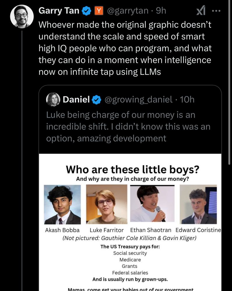
“Actually it’s good that a bunch of teenagers are unilaterally firing thousands of government employees because they have ChatGPT”

i can’t get over how unfathomably stupid the average SF venture capitalist is
Garry Tan
@garrytan.9h
XI
Whoever made the original graphic doesn't understand the scale and speed of smart high IQ people who can program, and what they can do in a moment when intelligence now on infinite tap using LLMs
Daniel
@growing_daniel • 10h
Luke being charge of our money is an incredible shift. I didn't know this was an option, amazing development
Who are these little boys?
And why are they in charge of our money?
Akash Bobba
Luke Farritor Ethan Shaotran Edward Coristine
(Not pictured: Gauthier Cole Killian & Gavin Kliger)
The US Treasury pays for:
Social security
Medicare
Grants
Federal salaries
And is usually run by grown-ups.
davidawaldron.bsky.social
Here's a map of where high-tech manufacturing is located in the U.S.:
Map of the U.S. showing cities with high-tech manufacturing employment, with cones representing the amount of workers based on the height of the cone, and the color of the cone representing the dominant industry