
Jonas Oesch
@jonasoesch.ch
180 followers
120 following
23 posts
Visual journalist at @visuals.nzz.ch
Personal: jonasoesch.ch
Posts
Media
Videos
Starter Packs

Jonas Oesch
@jonasoesch.ch
· Aug 29
Jonas Oesch
@jonasoesch.ch
· Aug 15
Jonas Oesch
@jonasoesch.ch
· Aug 15

Statistical Graphics and Comics: Parallel Histories of Visual Storytelling, Nightingale
What do data visualization and comics have in common? One of these is used to communicate in science and journalism, and the other appears in fine art and...
nightingaledvs.com
Jonas Oesch
@jonasoesch.ch
· Jul 4


Reposted by Jonas Oesch

Reposted by Jonas Oesch


Reposted by Jonas Oesch

Jonas Oesch
@jonasoesch.ch
· May 19
Jonas Oesch
@jonasoesch.ch
· May 16
Reposted by Jonas Oesch


Reposted by Jonas Oesch


Jonas Oesch
@jonasoesch.ch
· May 14
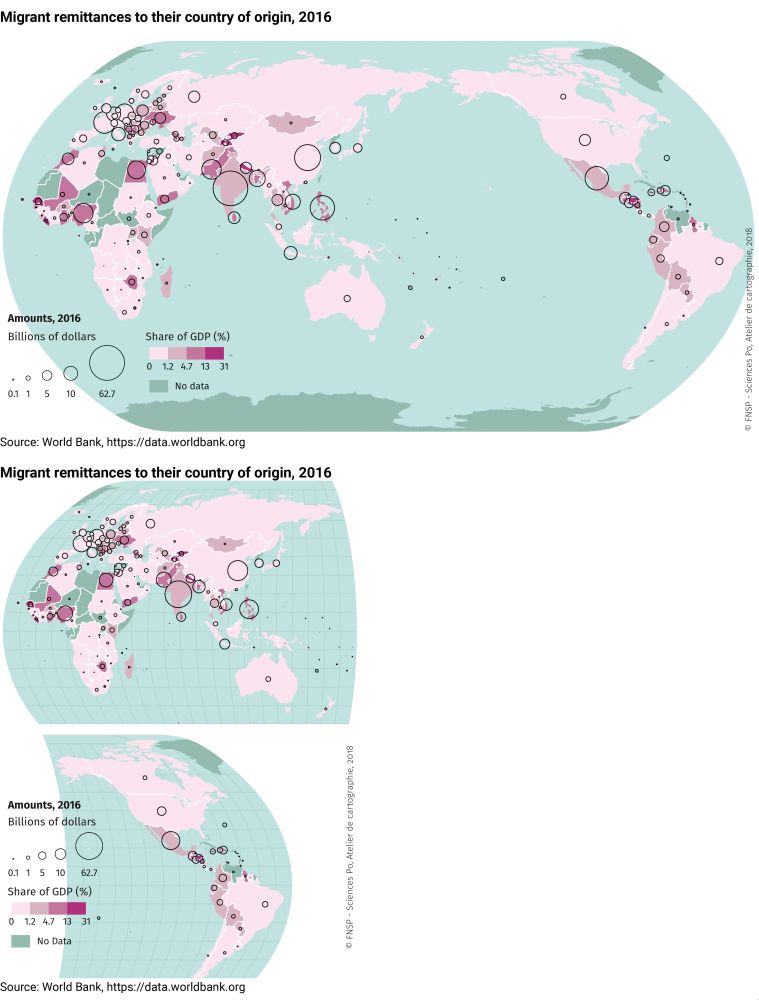
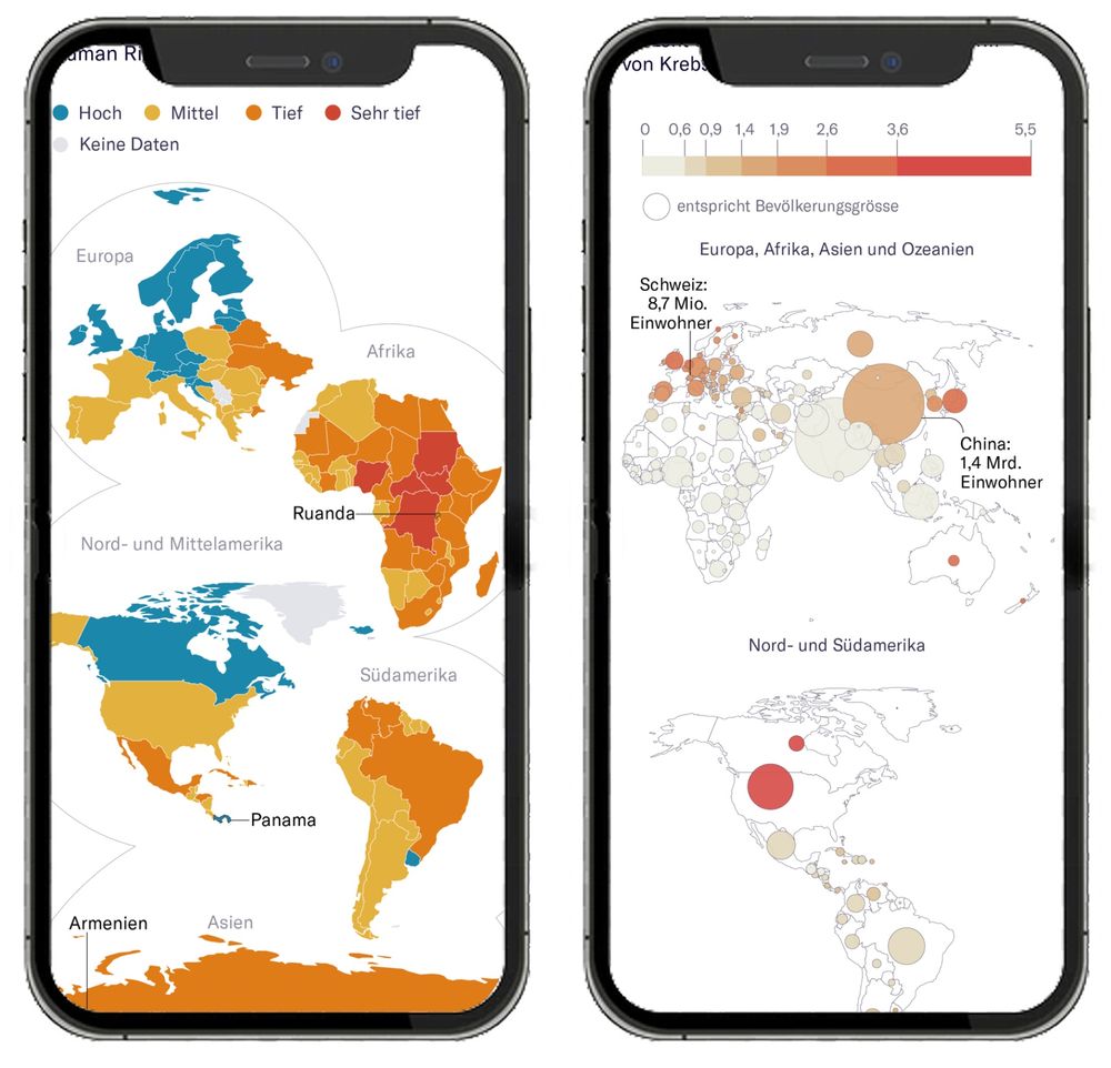
Thematic World Maps in the News: How Effective are They on Smartphones?
Thematic world maps are commonly used in online news media, but rarely optimized for mobile devices. Scaling down world maps to fit small screens makes many smaller countries difficult to identify,...
www.tandfonline.com
Jonas Oesch
@jonasoesch.ch
· May 14
Reposted by Jonas Oesch

Feodora Teti
@feodorateti.bsky.social
· Mar 31
Reposted by Jonas Oesch

Martin Wattenberg
@wattenberg.bsky.social
· Mar 24

Reposted by Jonas Oesch

Shirley Wu
@shirleywu.studio
· Mar 21

what killed innovation?: the past decade of interactive graphics, a brief recounting - Shirley Wu
Over the past decade, interactive data visualization has gone from bold experimentation to polished, predictable formats. I’ve been reflecting on why—and after speaking with some of the best in the fi...
www.shirleywu.studio
Reposted by Jonas Oesch


Reposted by Jonas Oesch
