


Kyle Walker
@kylewalker.bsky.social
Demographics | Geospatial | Data Science | Open Source
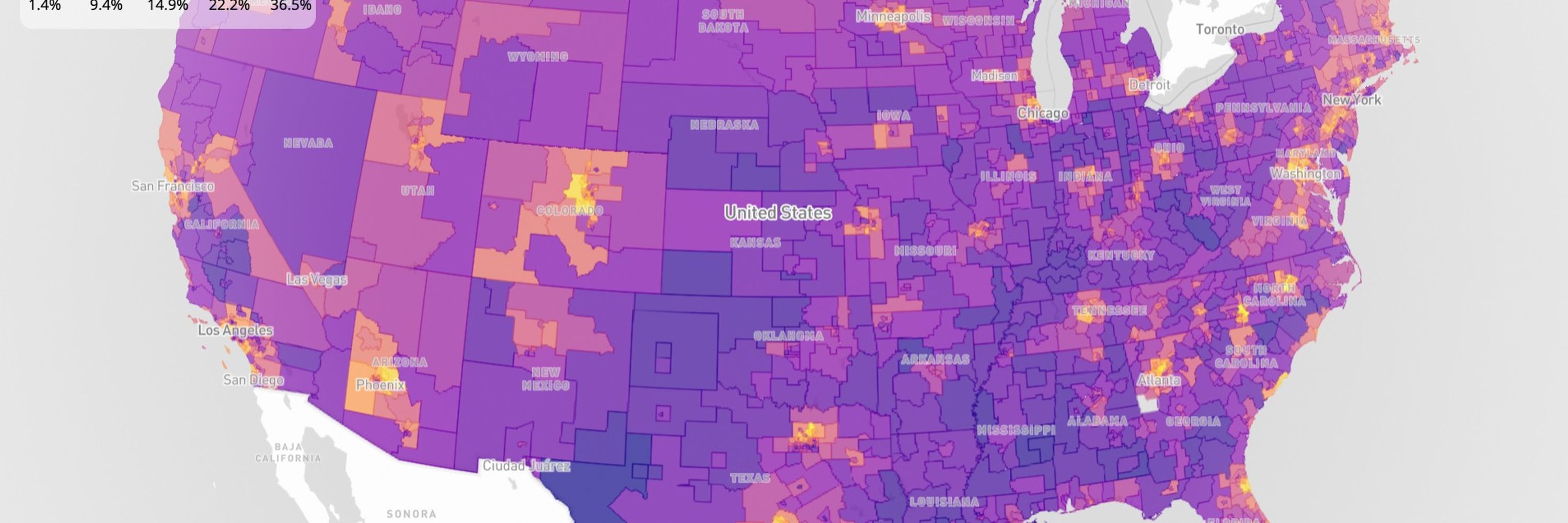
My most popular map ever, Educational Attainment in America, gets a fresh look for 2026:
- Updated to the 2024 ACS
- MapLibre via R's mapgl with built-in interactivity
- OpenFreeMap basemap, Cloudflare-hosted PMTiles (blazing fast!)
Explore your city: personal.tcu.edu/kylewalker/m...
- Updated to the 2024 ACS
- MapLibre via R's mapgl with built-in interactivity
- OpenFreeMap basemap, Cloudflare-hosted PMTiles (blazing fast!)
Explore your city: personal.tcu.edu/kylewalker/m...
February 10, 2026 at 2:52 PM
My most popular map ever, Educational Attainment in America, gets a fresh look for 2026:
- Updated to the 2024 ACS
- MapLibre via R's mapgl with built-in interactivity
- OpenFreeMap basemap, Cloudflare-hosted PMTiles (blazing fast!)
Explore your city: personal.tcu.edu/kylewalker/m...
- Updated to the 2024 ACS
- MapLibre via R's mapgl with built-in interactivity
- OpenFreeMap basemap, Cloudflare-hosted PMTiles (blazing fast!)
Explore your city: personal.tcu.edu/kylewalker/m...
Showed my Advanced GIS students Claude Code this week.
We built this map of code compliance violations in Fort Worth; heatmap giving way to points on zoom.
Used the ArcGIS SDK for JavaScript.
Took 10 minutes.
I believe in Jevons Paradox.
But we need to be teaching skills for 2026, not for 2016.
We built this map of code compliance violations in Fort Worth; heatmap giving way to points on zoom.
Used the ArcGIS SDK for JavaScript.
Took 10 minutes.
I believe in Jevons Paradox.
But we need to be teaching skills for 2026, not for 2016.
February 6, 2026 at 3:09 PM
Showed my Advanced GIS students Claude Code this week.
We built this map of code compliance violations in Fort Worth; heatmap giving way to points on zoom.
Used the ArcGIS SDK for JavaScript.
Took 10 minutes.
I believe in Jevons Paradox.
But we need to be teaching skills for 2026, not for 2016.
We built this map of code compliance violations in Fort Worth; heatmap giving way to points on zoom.
Used the ArcGIS SDK for JavaScript.
Took 10 minutes.
I believe in Jevons Paradox.
But we need to be teaching skills for 2026, not for 2016.
Quality-of-life improvements to the #rstats {geosam} package:
- Interactive swatches let you customize extraction color in the explorer;
- The explorer sidebar is now collapsible;
- The package installs the stable version of HuggingFace Transformers
walker-data.com/geosam
- Interactive swatches let you customize extraction color in the explorer;
- The explorer sidebar is now collapsible;
- The package installs the stable version of HuggingFace Transformers
walker-data.com/geosam
February 2, 2026 at 7:04 PM
Quality-of-life improvements to the #rstats {geosam} package:
- Interactive swatches let you customize extraction color in the explorer;
- The explorer sidebar is now collapsible;
- The package installs the stable version of HuggingFace Transformers
walker-data.com/geosam
- Interactive swatches let you customize extraction color in the explorer;
- The explorer sidebar is now collapsible;
- The package installs the stable version of HuggingFace Transformers
walker-data.com/geosam
Distributed energy is harder to map than centralized infrastructure, but cutting-edge AI tools can help.
Shown: identifying rooftop solar panels in a suburban neighborhood with Mapbox imagery, Meta's SAM3.
Useful for utilities, grid planners, and solar prospecting.
Shown: identifying rooftop solar panels in a suburban neighborhood with Mapbox imagery, Meta's SAM3.
Useful for utilities, grid planners, and solar prospecting.
February 1, 2026 at 5:53 PM
Distributed energy is harder to map than centralized infrastructure, but cutting-edge AI tools can help.
Shown: identifying rooftop solar panels in a suburban neighborhood with Mapbox imagery, Meta's SAM3.
Useful for utilities, grid planners, and solar prospecting.
Shown: identifying rooftop solar panels in a suburban neighborhood with Mapbox imagery, Meta's SAM3.
Useful for utilities, grid planners, and solar prospecting.
Mapped every pipeline in Texas: 368,000 miles of infrastructure at your fingertips.
For energy operators, midstream companies, and data center site selectors, understanding pipeline proximity matters.
Open data + modern GIS makes it accessible.
For energy operators, midstream companies, and data center site selectors, understanding pipeline proximity matters.
Open data + modern GIS makes it accessible.
January 31, 2026 at 4:14 PM
Mapped every pipeline in Texas: 368,000 miles of infrastructure at your fingertips.
For energy operators, midstream companies, and data center site selectors, understanding pipeline proximity matters.
Open data + modern GIS makes it accessible.
For energy operators, midstream companies, and data center site selectors, understanding pipeline proximity matters.
Open data + modern GIS makes it accessible.
It's 2024 5-year American Community Survey release day!
The ACS is the best resource for small-area analysis of US demographics.
In R, use tidycensus and mapgl to dive into the data right now.
Copy-paste the code below for an interactive income map with a legend filter:
The ACS is the best resource for small-area analysis of US demographics.
In R, use tidycensus and mapgl to dive into the data right now.
Copy-paste the code below for an interactive income map with a legend filter:
January 29, 2026 at 6:46 PM
It's 2024 5-year American Community Survey release day!
The ACS is the best resource for small-area analysis of US demographics.
In R, use tidycensus and mapgl to dive into the data right now.
Copy-paste the code below for an interactive income map with a legend filter:
The ACS is the best resource for small-area analysis of US demographics.
In R, use tidycensus and mapgl to dive into the data right now.
Copy-paste the code below for an interactive income map with a legend filter:
Nearly 18 million California jobs in 2023, visualized by 2-digit NAICS category with block-level precision.
Open data and modern geospatial technology make powerful labor market analytics possible.
Open data and modern geospatial technology make powerful labor market analytics possible.
January 27, 2026 at 5:20 PM
Nearly 18 million California jobs in 2023, visualized by 2-digit NAICS category with block-level precision.
Open data and modern geospatial technology make powerful labor market analytics possible.
Open data and modern geospatial technology make powerful labor market analytics possible.
Identifying possible empty lots in Fort Worth's South Main district with Meta's Segment Anything Model 3.
Draw an "exemplar" prompt, find similar areas in the satellite image. Useful for urban redevelopment, real estate, and more.
Try out {geosam}: walker-data.com/geosam
Draw an "exemplar" prompt, find similar areas in the satellite image. Useful for urban redevelopment, real estate, and more.
Try out {geosam}: walker-data.com/geosam
January 26, 2026 at 6:39 PM
Identifying possible empty lots in Fort Worth's South Main district with Meta's Segment Anything Model 3.
Draw an "exemplar" prompt, find similar areas in the satellite image. Useful for urban redevelopment, real estate, and more.
Try out {geosam}: walker-data.com/geosam
Draw an "exemplar" prompt, find similar areas in the satellite image. Useful for urban redevelopment, real estate, and more.
Try out {geosam}: walker-data.com/geosam
spopt for R implements the Max-P-compact regions algorithm. Draw contiguous regions that optimize both for attribute similarity and compactness.
Shown here: regular Max-P with queen weights (left), Max-P-compact with rook weights (right)
Learn more: walker-data.com/spopt-r/arti...
Shown here: regular Max-P with queen weights (left), Max-P-compact with rook weights (right)
Learn more: walker-data.com/spopt-r/arti...
January 25, 2026 at 3:06 PM
spopt for R implements the Max-P-compact regions algorithm. Draw contiguous regions that optimize both for attribute similarity and compactness.
Shown here: regular Max-P with queen weights (left), Max-P-compact with rook weights (right)
Learn more: walker-data.com/spopt-r/arti...
Shown here: regular Max-P with queen weights (left), Max-P-compact with rook weights (right)
Learn more: walker-data.com/spopt-r/arti...
Nearly 1500 swimming pools found across a 10 square kilometer suburban area, all from a single text prompt.
Meta's SAM3 and Mapbox imagery combine for incredible zero-shot geospatial intelligence.
Meta's SAM3 and Mapbox imagery combine for incredible zero-shot geospatial intelligence.
January 22, 2026 at 8:22 PM
Nearly 1500 swimming pools found across a 10 square kilometer suburban area, all from a single text prompt.
Meta's SAM3 and Mapbox imagery combine for incredible zero-shot geospatial intelligence.
Meta's SAM3 and Mapbox imagery combine for incredible zero-shot geospatial intelligence.
It didn't make it into the CRAN release, but I've just implemented draggable legends in the dev version of {mapgl}.
It's quite useful when the legend is getting in the way of your analysis!
#rstats
It's quite useful when the legend is getting in the way of your analysis!
#rstats
January 14, 2026 at 5:59 PM
It didn't make it into the CRAN release, but I've just implemented draggable legends in the dev version of {mapgl}.
It's quite useful when the legend is getting in the way of your analysis!
#rstats
It's quite useful when the legend is getting in the way of your analysis!
#rstats
New post: learn how to use the new interactive legends and screenshot control in R's mapgl package.
These features are great for interactive demos and visualizing custom scenarios without Shiny.
The new release (v0.4.4) is on CRAN now, so go get it!
walker-data.com/posts/mapgl-...
These features are great for interactive demos and visualizing custom scenarios without Shiny.
The new release (v0.4.4) is on CRAN now, so go get it!
walker-data.com/posts/mapgl-...
January 13, 2026 at 7:57 PM
New post: learn how to use the new interactive legends and screenshot control in R's mapgl package.
These features are great for interactive demos and visualizing custom scenarios without Shiny.
The new release (v0.4.4) is on CRAN now, so go get it!
walker-data.com/posts/mapgl-...
These features are great for interactive demos and visualizing custom scenarios without Shiny.
The new release (v0.4.4) is on CRAN now, so go get it!
walker-data.com/posts/mapgl-...
In the latest mapgl release: a native screenshot control.
Workflow: spin up a quick map; use the new interactive legend to filter your data; drag a marker; take a screenshot; share with colleagues.
Uses html2canvas internally to capture the exact state of your map view.
#rstats
Workflow: spin up a quick map; use the new interactive legend to filter your data; drag a marker; take a screenshot; share with colleagues.
Uses html2canvas internally to capture the exact state of your map view.
#rstats
January 12, 2026 at 8:51 PM
In the latest mapgl release: a native screenshot control.
Workflow: spin up a quick map; use the new interactive legend to filter your data; drag a marker; take a screenshot; share with colleagues.
Uses html2canvas internally to capture the exact state of your map view.
#rstats
Workflow: spin up a quick map; use the new interactive legend to filter your data; drag a marker; take a screenshot; share with colleagues.
Uses html2canvas internally to capture the exact state of your map view.
#rstats
Here's how the new interactive categorical legends in {mapgl} work.
Click a category in the legend to turn the corresponding features on/off on the map.
Not groundbreaking, but you get this out of the box with one argument.
It used to take me forever to code this manually!
Click a category in the legend to turn the corresponding features on/off on the map.
Not groundbreaking, but you get this out of the box with one argument.
It used to take me forever to code this manually!
January 11, 2026 at 8:58 PM
Here's how the new interactive categorical legends in {mapgl} work.
Click a category in the legend to turn the corresponding features on/off on the map.
Not groundbreaking, but you get this out of the box with one argument.
It used to take me forever to code this manually!
Click a category in the legend to turn the corresponding features on/off on the map.
Not groundbreaking, but you get this out of the box with one argument.
It used to take me forever to code this manually!
Since I started developing the mapgl R package I've envisioned built-in interactive legends.
They're finally here in the upcoming package release: a filter slider for continuous legends, and click-to-filter for categorical legends.
Blog post coming this week!
They're finally here in the upcoming package release: a filter slider for continuous legends, and click-to-filter for categorical legends.
Blog post coming this week!
January 11, 2026 at 6:23 PM
Since I started developing the mapgl R package I've envisioned built-in interactive legends.
They're finally here in the upcoming package release: a filter slider for continuous legends, and click-to-filter for categorical legends.
Blog post coming this week!
They're finally here in the upcoming package release: a filter slider for continuous legends, and click-to-filter for categorical legends.
Blog post coming this week!