


Kyle Walker
@kylewalker.bsky.social
Demographics | Geospatial | Data Science | Open Source
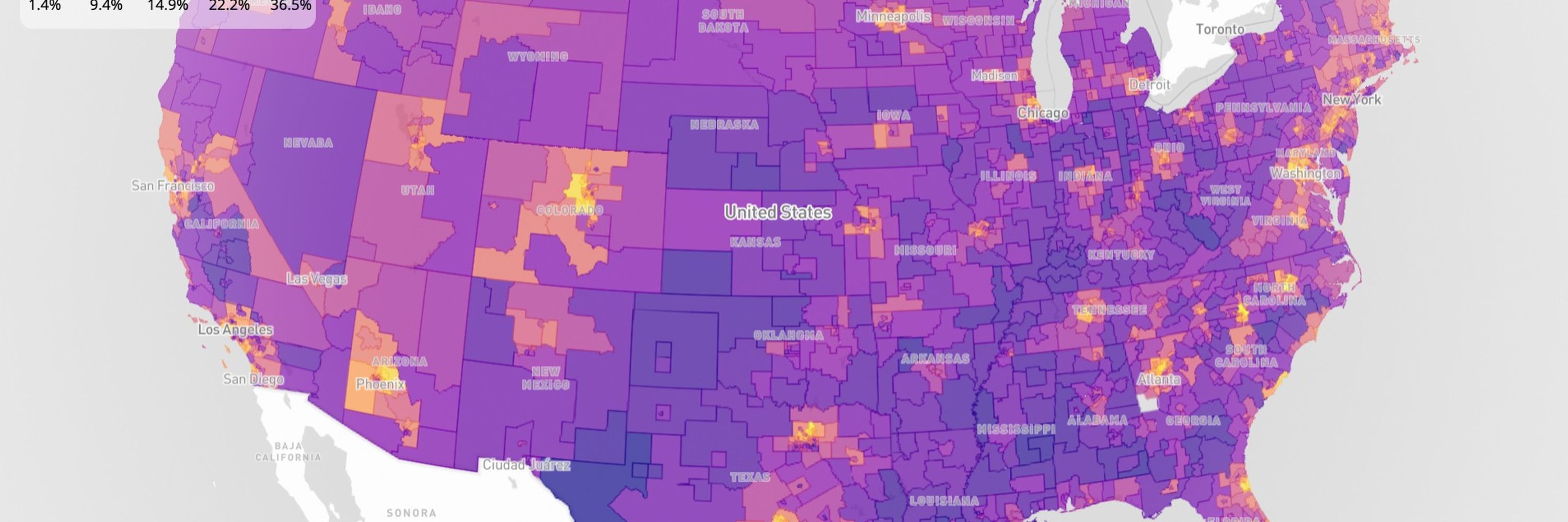
It didn't make it into the CRAN release, but I've just implemented draggable legends in the dev version of {mapgl}.
It's quite useful when the legend is getting in the way of your analysis!
#rstats
It's quite useful when the legend is getting in the way of your analysis!
#rstats
January 14, 2026 at 5:59 PM
It didn't make it into the CRAN release, but I've just implemented draggable legends in the dev version of {mapgl}.
It's quite useful when the legend is getting in the way of your analysis!
#rstats
It's quite useful when the legend is getting in the way of your analysis!
#rstats
New post: learn how to use the new interactive legends and screenshot control in R's mapgl package.
These features are great for interactive demos and visualizing custom scenarios without Shiny.
The new release (v0.4.4) is on CRAN now, so go get it!
walker-data.com/posts/mapgl-...
These features are great for interactive demos and visualizing custom scenarios without Shiny.
The new release (v0.4.4) is on CRAN now, so go get it!
walker-data.com/posts/mapgl-...
January 13, 2026 at 7:57 PM
New post: learn how to use the new interactive legends and screenshot control in R's mapgl package.
These features are great for interactive demos and visualizing custom scenarios without Shiny.
The new release (v0.4.4) is on CRAN now, so go get it!
walker-data.com/posts/mapgl-...
These features are great for interactive demos and visualizing custom scenarios without Shiny.
The new release (v0.4.4) is on CRAN now, so go get it!
walker-data.com/posts/mapgl-...
In the latest mapgl release: a native screenshot control.
Workflow: spin up a quick map; use the new interactive legend to filter your data; drag a marker; take a screenshot; share with colleagues.
Uses html2canvas internally to capture the exact state of your map view.
#rstats
Workflow: spin up a quick map; use the new interactive legend to filter your data; drag a marker; take a screenshot; share with colleagues.
Uses html2canvas internally to capture the exact state of your map view.
#rstats
January 12, 2026 at 8:51 PM
In the latest mapgl release: a native screenshot control.
Workflow: spin up a quick map; use the new interactive legend to filter your data; drag a marker; take a screenshot; share with colleagues.
Uses html2canvas internally to capture the exact state of your map view.
#rstats
Workflow: spin up a quick map; use the new interactive legend to filter your data; drag a marker; take a screenshot; share with colleagues.
Uses html2canvas internally to capture the exact state of your map view.
#rstats
Here's how the new interactive categorical legends in {mapgl} work.
Click a category in the legend to turn the corresponding features on/off on the map.
Not groundbreaking, but you get this out of the box with one argument.
It used to take me forever to code this manually!
Click a category in the legend to turn the corresponding features on/off on the map.
Not groundbreaking, but you get this out of the box with one argument.
It used to take me forever to code this manually!
January 11, 2026 at 8:58 PM
Here's how the new interactive categorical legends in {mapgl} work.
Click a category in the legend to turn the corresponding features on/off on the map.
Not groundbreaking, but you get this out of the box with one argument.
It used to take me forever to code this manually!
Click a category in the legend to turn the corresponding features on/off on the map.
Not groundbreaking, but you get this out of the box with one argument.
It used to take me forever to code this manually!
Since I started developing the mapgl R package I've envisioned built-in interactive legends.
They're finally here in the upcoming package release: a filter slider for continuous legends, and click-to-filter for categorical legends.
Blog post coming this week!
They're finally here in the upcoming package release: a filter slider for continuous legends, and click-to-filter for categorical legends.
Blog post coming this week!
January 11, 2026 at 6:23 PM
Since I started developing the mapgl R package I've envisioned built-in interactive legends.
They're finally here in the upcoming package release: a filter slider for continuous legends, and click-to-filter for categorical legends.
Blog post coming this week!
They're finally here in the upcoming package release: a filter slider for continuous legends, and click-to-filter for categorical legends.
Blog post coming this week!
Reposted by Kyle Walker

My weekly newsletter is out!
This week:
🔹 Open Source of the Week - The spopt project by Kyle Walker
🔹 New learning resources
🔹 Book of the week - Building Natural Language and LLM Pipelines by Laura Funderburk
ramikrispin.substack.com/p/building-n...
This week:
🔹 Open Source of the Week - The spopt project by Kyle Walker
🔹 New learning resources
🔹 Book of the week - Building Natural Language and LLM Pipelines by Laura Funderburk
ramikrispin.substack.com/p/building-n...

Building Natural Language & LLM Pipelines, Spopt Project & AI Resources | Issue 70
Explore the Spopt open-source project, NLP and LLM pipelines, book recommendation, and new learning resources for data science, Python, agents, and trend detection.
ramikrispin.substack.com
January 10, 2026 at 5:32 PM
My weekly newsletter is out!
This week:
🔹 Open Source of the Week - The spopt project by Kyle Walker
🔹 New learning resources
🔹 Book of the week - Building Natural Language and LLM Pipelines by Laura Funderburk
ramikrispin.substack.com/p/building-n...
This week:
🔹 Open Source of the Week - The spopt project by Kyle Walker
🔹 New learning resources
🔹 Book of the week - Building Natural Language and LLM Pipelines by Laura Funderburk
ramikrispin.substack.com/p/building-n...
I'm as excited about Claude Code / Opus 4.5 as anyone.
It's helped me create things this year that I couldn't have done otherwise.
But I notice often it lacks "common sense."
Meaning, it makes decisions that "work" but shouldn't be made.
It's helped me create things this year that I couldn't have done otherwise.
But I notice often it lacks "common sense."
Meaning, it makes decisions that "work" but shouldn't be made.

January 10, 2026 at 5:13 PM
I'm as excited about Claude Code / Opus 4.5 as anyone.
It's helped me create things this year that I couldn't have done otherwise.
But I notice often it lacks "common sense."
Meaning, it makes decisions that "work" but shouldn't be made.
It's helped me create things this year that I couldn't have done otherwise.
But I notice often it lacks "common sense."
Meaning, it makes decisions that "work" but shouldn't be made.
All 13.5 million jobs in Texas, visualized by sector with block-level precision.
The just-released 2023 LODES data is one of the most underrated public datasets.
The just-released 2023 LODES data is one of the most underrated public datasets.
January 8, 2026 at 9:05 PM
All 13.5 million jobs in Texas, visualized by sector with block-level precision.
The just-released 2023 LODES data is one of the most underrated public datasets.
The just-released 2023 LODES data is one of the most underrated public datasets.
Reposted by Kyle Walker

another sweet port from Kyle! A touch of background on the original, for those interested:
knaaptime.com/urban_analys...
knaaptime.com/urban_analys...
January 7, 2026 at 8:01 PM
another sweet port from Kyle! A touch of background on the original, for those interested:
knaaptime.com/urban_analys...
knaaptime.com/urban_analys...
Announcing spopt-r: spatial optimization for regionalization, facility location, and market analysis in R.
My all-time favorite Python package is PySAL's spopt - and until now, it did not have an R equivalent.
Get started here: walker-data.com/spopt-r
My all-time favorite Python package is PySAL's spopt - and until now, it did not have an R equivalent.
Get started here: walker-data.com/spopt-r


January 7, 2026 at 1:46 PM
Announcing spopt-r: spatial optimization for regionalization, facility location, and market analysis in R.
My all-time favorite Python package is PySAL's spopt - and until now, it did not have an R equivalent.
Get started here: walker-data.com/spopt-r
My all-time favorite Python package is PySAL's spopt - and until now, it did not have an R equivalent.
Get started here: walker-data.com/spopt-r
"How can you be sure that the code the LLM wrote is accurate without manually reviewing all of it?"
Here's my advice:
1. Make sure that you can review *outputs*. If something looks wrong, it probably is.
2. Have another LLM review it. I write with Opus, review with Gemini.
Here's my advice:
1. Make sure that you can review *outputs*. If something looks wrong, it probably is.
2. Have another LLM review it. I write with Opus, review with Gemini.
January 6, 2026 at 8:41 PM
"How can you be sure that the code the LLM wrote is accurate without manually reviewing all of it?"
Here's my advice:
1. Make sure that you can review *outputs*. If something looks wrong, it probably is.
2. Have another LLM review it. I write with Opus, review with Gemini.
Here's my advice:
1. Make sure that you can review *outputs*. If something looks wrong, it probably is.
2. Have another LLM review it. I write with Opus, review with Gemini.
Mapping US wind energy infrastructure with hexagonal binning and "fade-on-zoom" effects.
Learn how: gist.github.com/walkerke/a4b...
Learn how: gist.github.com/walkerke/a4b...
January 5, 2026 at 4:16 PM
Mapping US wind energy infrastructure with hexagonal binning and "fade-on-zoom" effects.
Learn how: gist.github.com/walkerke/a4b...
Learn how: gist.github.com/walkerke/a4b...
The interactive explorer in R's {geosam} package gets you started with @Meta's Segment Anything Model 3 for object detection from satellite imagery.
Shown: sand trap detection on a golf course from text, exemplar, and point prompts.
Try out {geosam}: walker-data.com/geos...
Shown: sand trap detection on a golf course from text, exemplar, and point prompts.
Try out {geosam}: walker-data.com/geos...


January 5, 2026 at 2:57 PM
The interactive explorer in R's {geosam} package gets you started with @Meta's Segment Anything Model 3 for object detection from satellite imagery.
Shown: sand trap detection on a golf course from text, exemplar, and point prompts.
Try out {geosam}: walker-data.com/geos...
Shown: sand trap detection on a golf course from text, exemplar, and point prompts.
Try out {geosam}: walker-data.com/geos...
The world's time zones, visualized on an interactive, spinnable globe.
Try it out- it'll default to your current time and (approximate) time zone: gist.github.com/walkerke/c4a...
Try it out- it'll default to your current time and (approximate) time zone: gist.github.com/walkerke/c4a...
January 4, 2026 at 4:29 PM
The world's time zones, visualized on an interactive, spinnable globe.
Try it out- it'll default to your current time and (approximate) time zone: gist.github.com/walkerke/c4a...
Try it out- it'll default to your current time and (approximate) time zone: gist.github.com/walkerke/c4a...
Reposted by Kyle Walker

#Rstats slides back into the top 10 programming languages. R is far from dead. www.tiobe.com/tiobe-index/

January 4, 2026 at 10:03 AM
#Rstats slides back into the top 10 programming languages. R is far from dead. www.tiobe.com/tiobe-index/
January 3, 2026 at 3:58 PM
Spatial optimization has applications in nearly every field but it's underutilized.
In 2026, I'm working on open source and lightning-fast tools to make spatial optimization accessible.
Shown: interactively solving a "location-allocation" problem in an app with instant results.
In 2026, I'm working on open source and lightning-fast tools to make spatial optimization accessible.
Shown: interactively solving a "location-allocation" problem in an app with instant results.
January 2, 2026 at 6:30 PM
Spatial optimization has applications in nearly every field but it's underutilized.
In 2026, I'm working on open source and lightning-fast tools to make spatial optimization accessible.
Shown: interactively solving a "location-allocation" problem in an app with instant results.
In 2026, I'm working on open source and lightning-fast tools to make spatial optimization accessible.
Shown: interactively solving a "location-allocation" problem in an app with instant results.
2025 was a massive year for me as an R developer.
This past year I've branched out and focused on bringing interfaces to some of the most exciting geospatial technologies to the R community.
Here's a summary:
This past year I've branched out and focused on bringing interfaces to some of the most exciting geospatial technologies to the R community.
Here's a summary:


December 31, 2025 at 5:30 PM
2025 was a massive year for me as an R developer.
This past year I've branched out and focused on bringing interfaces to some of the most exciting geospatial technologies to the R community.
Here's a summary:
This past year I've branched out and focused on bringing interfaces to some of the most exciting geospatial technologies to the R community.
Here's a summary:
Reposted by Kyle Walker

Working with big spatial data sets in #rstats? You should try {duckspatial}. The dev version of #duckspatial (soon on CRAN) uses #duckdb to perform super fast and memory efficient spatial operations cidree.github.io/duckspatial/...
In a benchmark against, {sf}....
In a benchmark against, {sf}....

December 30, 2025 at 5:28 PM
Working with big spatial data sets in #rstats? You should try {duckspatial}. The dev version of #duckspatial (soon on CRAN) uses #duckdb to perform super fast and memory efficient spatial operations cidree.github.io/duckspatial/...
In a benchmark against, {sf}....
In a benchmark against, {sf}....
Spatial data science in 2026:
- Pull demographic data for all ~7k Census tracts in Texas;
- Create a territory design solution with spatial and demographic constraints;
- Explore the result on a WebGL map;
All in seconds.
Technology is no longer the bottleneck.
- Pull demographic data for all ~7k Census tracts in Texas;
- Create a territory design solution with spatial and demographic constraints;
- Explore the result on a WebGL map;
All in seconds.
Technology is no longer the bottleneck.
December 29, 2025 at 9:48 PM
Spatial data science in 2026:
- Pull demographic data for all ~7k Census tracts in Texas;
- Create a territory design solution with spatial and demographic constraints;
- Explore the result on a WebGL map;
All in seconds.
Technology is no longer the bottleneck.
- Pull demographic data for all ~7k Census tracts in Texas;
- Create a territory design solution with spatial and demographic constraints;
- Explore the result on a WebGL map;
All in seconds.
Technology is no longer the bottleneck.
I’ve always been better at ideas than at coding.
I’ve had no shortage of ideas, but coding was always the bottleneck.
Which is why I’m unbelievably excited about the moment we are in.
However, I get why people whose value proposition is coding itself are skeptical and anxious.
I’ve had no shortage of ideas, but coding was always the bottleneck.
Which is why I’m unbelievably excited about the moment we are in.
However, I get why people whose value proposition is coding itself are skeptical and anxious.
December 29, 2025 at 6:59 PM
I’ve always been better at ideas than at coding.
I’ve had no shortage of ideas, but coding was always the bottleneck.
Which is why I’m unbelievably excited about the moment we are in.
However, I get why people whose value proposition is coding itself are skeptical and anxious.
I’ve had no shortage of ideas, but coding was always the bottleneck.
Which is why I’m unbelievably excited about the moment we are in.
However, I get why people whose value proposition is coding itself are skeptical and anxious.
This type of post is hardly unique, but I had one of those "Opus 4.5 moments" yesterday.
There's a spatial algorithm I've long wanted in R. It's complex, so I wanted a Rust backend for speed. I don't know Rust, and I don't have time to learn it.
There's a spatial algorithm I've long wanted in R. It's complex, so I wanted a Rust backend for speed. I don't know Rust, and I don't have time to learn it.
December 28, 2025 at 6:36 PM
This type of post is hardly unique, but I had one of those "Opus 4.5 moments" yesterday.
There's a spatial algorithm I've long wanted in R. It's complex, so I wanted a Rust backend for speed. I don't know Rust, and I don't have time to learn it.
There's a spatial algorithm I've long wanted in R. It's complex, so I wanted a Rust backend for speed. I don't know Rust, and I don't have time to learn it.
My favorite #Python package to use is spopt, a library for spatial optimization.
It helps you with:
📊 Facility location planning;
📊 Sales territory design;
📊 Maximizing market share;
And much more! Check it out here:
pysal.org/spopt/
It helps you with:
📊 Facility location planning;
📊 Sales territory design;
📊 Maximizing market share;
And much more! Check it out here:
pysal.org/spopt/

December 27, 2025 at 2:56 PM
My favorite #Python package to use is spopt, a library for spatial optimization.
It helps you with:
📊 Facility location planning;
📊 Sales territory design;
📊 Maximizing market share;
And much more! Check it out here:
pysal.org/spopt/
It helps you with:
📊 Facility location planning;
📊 Sales territory design;
📊 Maximizing market share;
And much more! Check it out here:
pysal.org/spopt/
It’s been a week since I released the geosam package bringing Meta’s SAM3 image segmentation model to R.
This week, users have:
- Segmented trees in Belgium;
- Found paths in rural areas;
- Identified boats in harbors;
All in R!
Try out geosam: walker-data.com/geosam
This week, users have:
- Segmented trees in Belgium;
- Found paths in rural areas;
- Identified boats in harbors;
All in R!
Try out geosam: walker-data.com/geosam


December 24, 2025 at 4:28 PM
It’s been a week since I released the geosam package bringing Meta’s SAM3 image segmentation model to R.
This week, users have:
- Segmented trees in Belgium;
- Found paths in rural areas;
- Identified boats in harbors;
All in R!
Try out geosam: walker-data.com/geosam
This week, users have:
- Segmented trees in Belgium;
- Found paths in rural areas;
- Identified boats in harbors;
All in R!
Try out geosam: walker-data.com/geosam
While some have made the claim that "R is dead!" this year on social media...
Claude Code is going mainstream, and guess what language it's using.
#LongLiveR
#rstats
Claude Code is going mainstream, and guess what language it's using.
#LongLiveR
#rstats


December 24, 2025 at 2:31 PM
While some have made the claim that "R is dead!" this year on social media...
Claude Code is going mainstream, and guess what language it's using.
#LongLiveR
#rstats
Claude Code is going mainstream, and guess what language it's using.
#LongLiveR
#rstats